Chapter 1 Indicators for Transit Oriented Development
1.1 Why Start With Indicators?
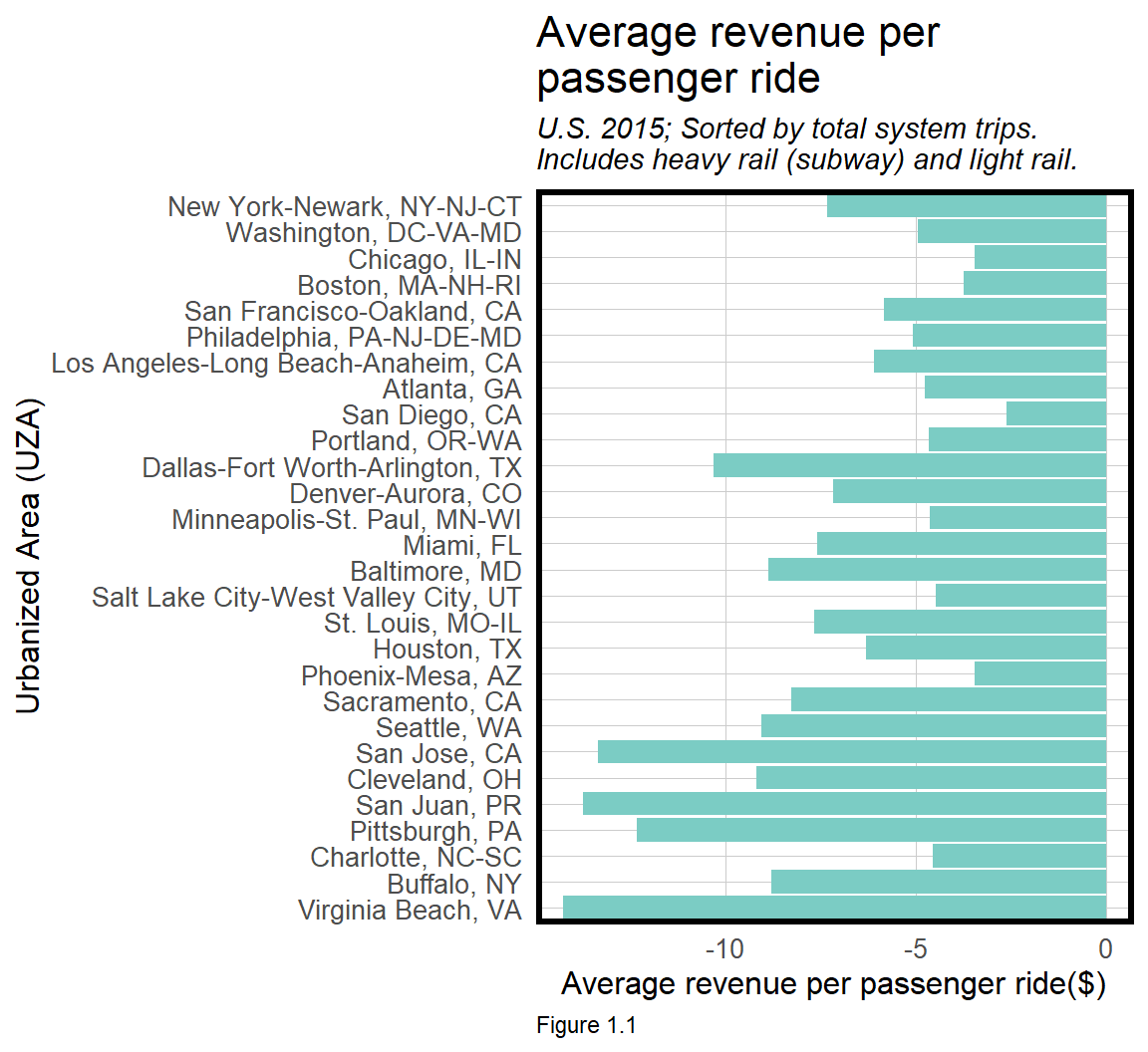
According to the Federal Transit Administration, not one of America’s largest passenger subway systems saw fare revenues exceed operating expenses in 2015.6
This is an indicator - a stylized fact that gives simple insight into a complicated phenomena. Mastering indicators is critical for conveying nuanced context to non-technical audiences. Here are four suggestions on what makes a good indicator:
A relatable indicator is typically motivated by a pressing policy concern. “How is it possible that passenger rail in New York City has such widespread delays, service suspensions, and rider discontent?” A great indicator solicits interest from an audience.
A simple indicator may be used as an exploratory tool in place of more complex statistics. Simplicity helps the audience understand the indicator’s significance and keeps them engaged in the analysis.
A relative indicator draws a contrast. “How can New York City passenger rail, with the most trips, still loose more money than each of the next ten largest cities?” Contextualizing an indicator with a relevant comparison makes for greater impact.
A good indicator typically generates more questions than answers. Thus, a good indicator fits into a broader narrative which helps motivate a more robust research agenda and ultimately, more applied analytics.
Simplicity is an indicator’s strength, but it may also be its weakness. Most statistics make assumptions. You should be aware of these assumptions, how they affect your conclusions, and ultimately how the audience interprets your results.
In this first chapter, space/time indicators are built from Census data to explore Transit Oriented Development (TOD) potential in Philadelphia. Along the way, we will learn how assumptions can lead to incorrect policy conclusions.
TOD advocates for increased housing and amenity density around transit (rail, subway, bus, etc.). There are many benefits to promoting this density, but two examples are particularly noteworthy.
First, transit needs scale to exist. Transit demand is a function of density and the more households, customers, and businesses around transit, the more efficient it is to operate a transit system. Efficiency means less maintenance, staffing, etc. Interestingly, Figure 1.1 suggests that most transit systems are remarkably inefficient despite being in cities with density of just about everything.
Second, TOD is important for land value capitalization, which is essential to both developers and governments. If renters and home buyers are willing to pay more to locate near transit amenities, it should be reflected in higher land values and property tax returns near stations.
In this chapter, we play the role of Transportation Planner for the City of Philadelphia, and assess whether rents are higher in transit-rich areas relative to places without transit access. If residents value these locations, officials might consider changing the zoning code to allow increased density around transit.
As the analysis progresses, spatial data wrangling and visualization fundamentals are presented with the tidyverse, sf and ggplot2 packages. The tidycensus package is used to gather U.S. Census tract data. We begin by identifying some of the key assumptions made when working with geospatial Census data.
1.1.1 Mapping & scale bias in areal aggregate data
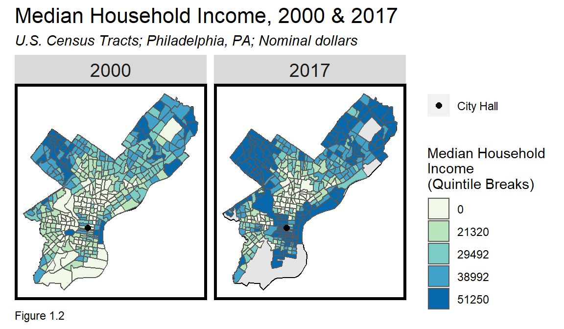
Data visualization is a data scientist’s strongest communication tool because a picture tells a thousand words. However, visualizations and maps in particular, can mislead. Figure x.x maps Median Household Income for Philadelphia Census tracts in 2000 and 2017. The narrative suggests that incomes in Center City (around City Hall) have increased. While this is likely true, the precise narrative is in part, driven by how colors are assigned to incomes on the map.
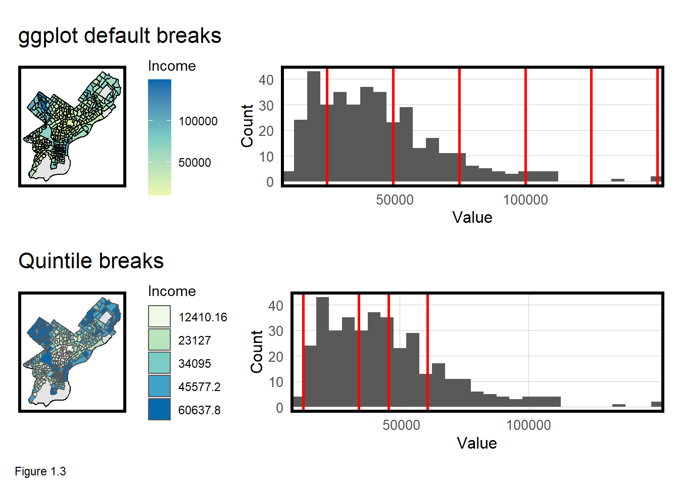
Figure 1.3 below illustrates two different approaches for coloring maps. The topmost plots use ggplot‘s default ’equal interval’ breaks, while those on the bottom bin income into 5 quintile groups, which are intervals at the 1st, 20th, 40th, 60th and 80th percentiles of the data.
Setting map breaks can alter the narrative of a map. Ultimately, breaks should ‘hug the cliffs’ of the distribution. Compared to the equal interval breaks, the quintile breaks map portrays a sharper contrast in incomes across the city.
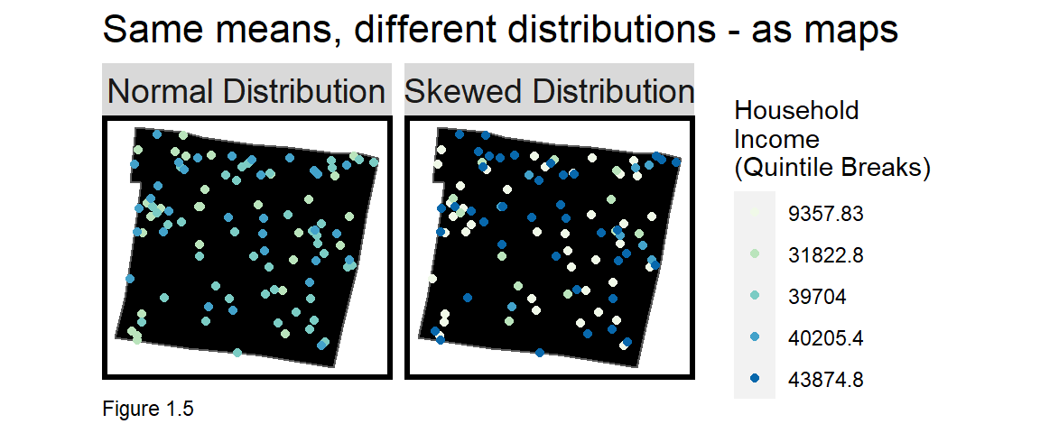
Census tract maps also introduce bias related to scale. To start, when summary statistics like mean or median are used to summarize individuals, results may be biased by the ‘Ecological Fallacy’. For example, consider Figure 1.4 below which visualizes three household income distributions in a tract.
One plot has a normal (i.e. bell curve) distribution with values close to the mean; one with much greater variance around the mean; and one skewed. These tracts are all very different, but they all share the same ‘mean income’.
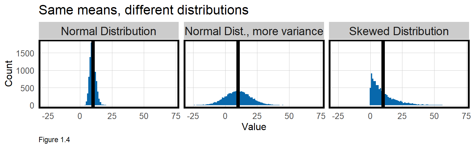
Figure 1.5 shows these differences geographically, drawing two of the above household income distributions across the same census tract. The “Normal Distribution” seems relatively homogeneous while the “Skewed Distribution”, appears like a mixed income community.
The ecological fallacy is made worse if we assume a Census tract polygon is akin to a neighborhood - an area of social, economic, and built environment homogeneity. The Census uses tracts to count people, not to reference social phenomena. When counting occurs inside arbitrarily drawn aggregate units like tracts, another source of bias emerges. This kind of scale bias is known as the ‘Modifiable Areal Unit Problem’ (MAUP).7.
For example, Figure 1.6 locates houses in one corner of a tract, assuming that the remaining area is a park, perhaps. Again, we can see how representing this area with a single summary statistic may be problematic.
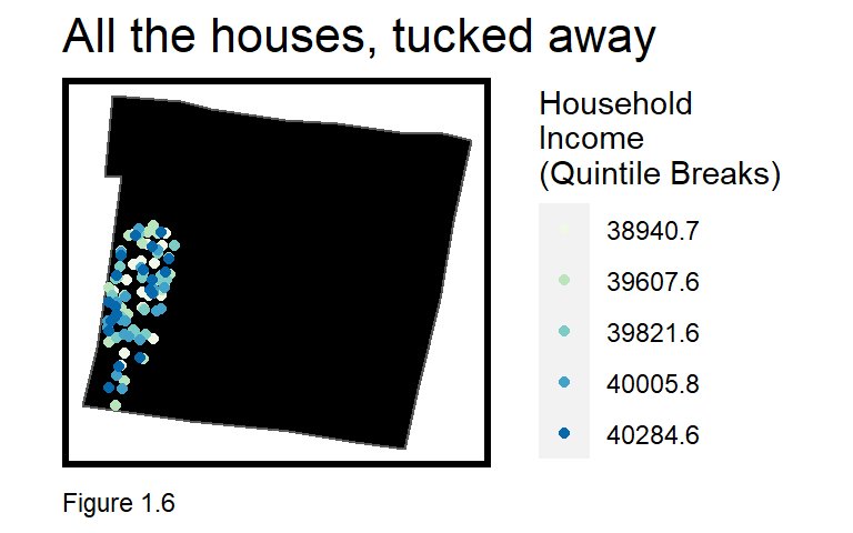
Scale bias is an important consideration when creating and interpreting indicators. We will continue to make scale assumptions throughout the remainder of this chapter, and in every other spatial chapter throughout the book. With experience, you will find it possible to create analytics that are useful despite scale bias.
1.2 Setup
The code blocks below include the libraries, options, and functions needed for the analysis. The tidyverse library enables data wrangling and visualization; tidycensus allows access to the Census API; sf wrangles and processes spatial data; and kableExtra helps create tables.
library(tidyverse)
library(tidycensus)
library(sf)
library(kableExtra)

options(scipen=999)
options(tigris_class = "sf")

root.dir = "https://raw.githubusercontent.com/urbanSpatial/Public-Policy-Analytics-Landing/master/DATA/"
source("https://raw.githubusercontent.com/urbanSpatial/Public-Policy-Analytics-Landing/master/functions.r")
Two global options are set to first tell R not to use scientific notation (scipen) and second, tigris_class tells tidycensus to download Census geometries in the sf or Simple Feature format. Finally, the functions used throughout this book are read in from a source file. This chapter uses the mapTheme and plotTheme to standardize the formatting of maps and plots, as well as the qBr and q5 functions to create quintile map breaks.
palette5 is a color palette comprised of a list of hex codes. The operation c ‘combines’ a set of values into a list. There are a variety of websites like ColorBrewer that can help you explore color ramps for maps.8
palette5 <- c("#f0f9e8","#bae4bc","#7bccc4","#43a2ca","#0868ac")1.2.1 Downloading & wrangling Census data
The tidycensus package provides an excellent interface for querying Census data in R. The below table shows a set of variables, variable codes, and the Short_name we will use for this analysis. For a list of the 2000 Census variables, use View(load_variables(2000, "sf3", cache = TRUE)).
| Variable | Census_code_in_2000 | Census_code_in_2017 | Short_name |
|---|---|---|---|
| Total Population | P001001 | B25026_001E | TotalPop |
| Number of white residents | P006002 | B02001_002E | NumberWhites |
| Total: Female: 18 to 24 years: Bachelor’s degree | PCT025050 | B15001_050E | TotalFemaleBachelors |
| Total: Male: 18 to 24 years: Bachelor’s degree | PCT025009 | B15001_009E | TotalMaleBacheors |
| Median Household Income | P053001 | B19013_001E | MedHHInc |
| Median contract rent | H056001 | B25058_001E | MedRent |
| Total living in poverty | P092001 | B06012_002E | TotalPoverty |
|
|
|||
| Table 1.1 |
Before querying the Census API, you will need your own Census API key which can be downloaded for free.9 Once acquired, input the key with census_api_key("myKey...").
The get_decennial function downloads tract data for the variables in the table above. year is set to 2000 and state and county are set to Pennsylvania and Philadelphia, respectively. Setting geometry to true (T) ensures tract geometries are downloaded with the data.
st_transform is used to project the data from decimal degrees to feet. ‘Projection’ is the mathematical process by which the Earth is ‘flattened’ onto a plane, like a map. It is preferable to work in coordinate systems projected in feet or meters where distance can be measured reliably.
In this chapter, the tidycensus is used to query and return Census data directly into R. At the time of publication however, the Census has disabled the year 2000 endpoint/data.10 Instead, the code below downloads an equivalent data frame called tracts00. A data frame is the most common way to store data in R. The code block at the end of this section demonstrates a tidycensus call to return 2017 data.
class(tracts00) shows that tracts00 is a unique type of data frame as it is also a Simple Features or sf object with polygon geometries for each census tract.
tracts00 <-
  st_read(file.path(root.dir,"/Chapter1/PHL_CT00.geojson")) %>%
    st_transform('ESRI:102728')
tracts00[1:3,] is an example of matrix notation and can be used to reference rows and columns of a data frame. This tells R to return the first three rows and all of the columns from the tracts00 data frame. tracts00[1:3,1] returns the first three rows and the first column. In both instances, the geometry field is also returned. A specific set of columns can be returned by specifying a list, like so - tracts00[1:3,c(1:3,5)]. The first three rows are returned along with the first through third columns and column five.
GEOID is a unique identifier the Census gives for each geography nationwide. ‘42’ is the state of Pennsylvania; ‘101’ is Philadelphia County; and the remaining digits identify a Census tract.
Note the header information that outputs as well, including the geometry type, in this case, polygons; the layer’s spatial extent, or bounding box, bbox; and the coordinate system, CRS. Google the CRS and find it on spatialreference.org to reveal its code, 102728. This parameter is passed to st_transform to project the layer into feet.11
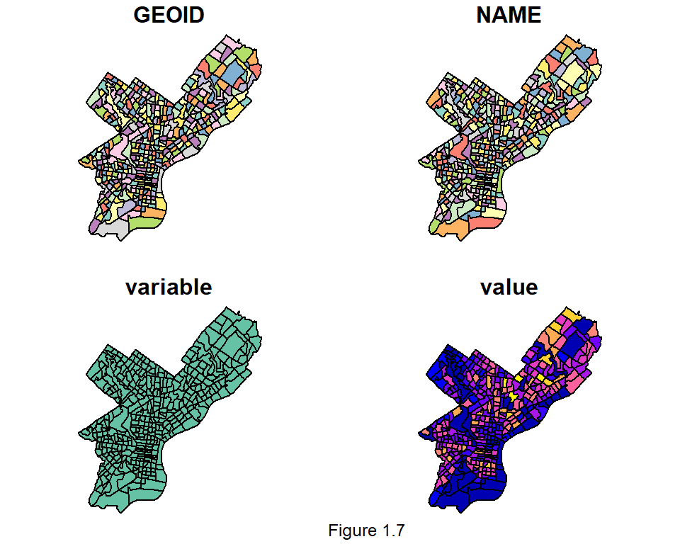
The seven variables downloaded are structured in a strange way. You may be most familiar with data in ‘wide’ form, where each row represents a Census tract and each column, a variable. This data is formatted in ‘long’ form, which provides some interesting advantages.
table(tracts00$variable) returns a frequency count of rows associated with each variable. Note the $ operator, which points to a specific column in a data frame. The output shows seven variables have been downloaded, each consisting of 381 rows, suggesting there are 381 census tracts in Philadelphia. In this long form, 381 tracts across seven variables are ‘stacked’ atop one another for a total 2,667 rows.
As an intro to mapping with sf layers, the code below creates a new data frame, totalPop00, including only Total Population in 2000, P001001. The tracts00 data frame is ‘piped’ into the filter function using the %>% operator. A pipe is a shorthand method for enchaining successive functions. Many larger code blocks throughout the book are spliced together with pipes. Running each function successively will help new R users learn. filter performs a subset by evaluating a specific query, in this case, looking for any row where the variable field equals P001001. The result is set equal to (<-) the sf data frame, totalPop00.
totalPop00 <-
  tracts00 %>%
  filter(variable == "P001001")
nrow(totalPop00) tells us that the data frame has 381 rows. names(totalPop00) returns the data frame’s column names. Finally, head(totalPop00) returns just the first six rows and all the columns.
A geometry field is included in a sf layer and the sf package has some quick and useful plotting functions. plot is the base R plotting function, but when called with an sf layer, a map of each variable is returned. Matrix notation can be used to map a single variable, such as, plot(totalPop00[,4]).
plot(totalPop00)ggplot2 is a powerful tool for designing maps and visualization. A ggplot is constructed from a series of ‘geoms’ or geometric objects. Many different geoms12 exist, but geom_sf is used to map a Simple Features data frame.
The code block below and Figure 1.8 illustrates incrementally, how nuance can be added to a ggplot. Here, plot A maps totalPop00, using the aes or aesthetic parameter to fill the tract polygons by the value field.
Plot B converts value to 5 quintile categories using the q5 function. These 5 categories are of class factor. Try q5(totalPop00$value).
Plot C adds fill color and legend improvements using the scale_fill_manual function. Many different scale types are possible.13 values is set to a list of colors, palette5. labels is set to the values of the associated quintiles (try qBr(totalPop00, "value")). Finally, a legend name is added. \n inserts a hard return.
Plot D inserts a title using the labs parameter, as well as a mapTheme.
A <-
  ggplot() +
  geom_sf(data = totalPop00, aes(fill = value))

B <-
  ggplot() +
  geom_sf(data = totalPop00, aes(fill = q5(value)))

C <-
  ggplot() +
  geom_sf(data = totalPop00, aes(fill = q5(value))) +
  scale_fill_manual(values = palette5,
                    labels = qBr(totalPop00, "value"),
                    name = "Total\nPopluation\n(Quintile Breaks)")

D <-
  ggplot() +
  geom_sf(data = totalPop00, aes(fill = q5(value))) +
  scale_fill_manual(values = palette5,
                    labels = qBr(totalPop00, "value"),
                    name = "Popluation\n(Quintile Breaks)") +
  labs(title = "Total Population", subtitle = "Philadelphia; 2000") +
  mapTheme()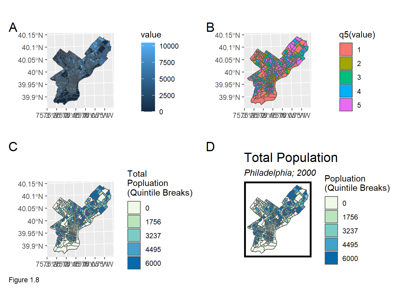
To demonstrate how to calculate new variables, the raw Census data is converted to rates. tracts00 is converted from long to the more common, wide form using the spread function. The select function drops one of the tract identifiers and rename is used to rename the variables.
Note the wide form output now shows 381 rows, one for each unique tract. This is likely a more familiar format for most readers.
tracts00 <-
  dplyr::select(tracts00, -NAME) %>%
    spread(variable, value) %>%
    dplyr::select(-geometry) %>%
    rename(TotalPop = P001001, Whites = P006002, MaleBachelors = PCT025009,
           FemaleBachelors = PCT025050, MedHHInc = P053001, MedRent = H056001,
           TotalPoverty = P092001)

st_drop_geometry(tracts00)[1:3,]
## GEOID MedRent TotalPop Whites MedHHInc TotalPoverty MaleBachelors
## 1 42101000100 858 2576 2095 48886 1739 64
## 2 42101000200 339 1355 176 8349 505 23
## 3 42101000300 660 2577 1893 40625 1189 41
## FemaleBachelors
## 1 48
## 2 73
## 3 103Next, mutate is used to create the new rate variables; then extraneous columns are dropped using select. The ifelse prevents divide by 0 errors.
tracts00 <-
  tracts00 %>%
  mutate(pctWhite = ifelse(TotalPop > 0, Whites / TotalPop, 0),
         pctBachelors = ifelse(TotalPop > 0, ((FemaleBachelors + MaleBachelors) / TotalPop), 0),
         pctPoverty = ifelse(TotalPop > 0, TotalPoverty / TotalPop, 0),
         year = "2000") %>%
  dplyr::select(-Whites,-FemaleBachelors,-MaleBachelors,-TotalPoverty)
tracts00 is now a complete dataset for the year 2000, but the TOD study requires data in the future as well. To download the 2017 American Community Survey or ACS data (get_acs), the below code block uses the pipe, %>%, to enable a more concise workflow.
The 2017 variable names are different from 2000, and the 2017 equivalent value field is called estimate. Setting output="wide", automatically downloads the data into wide form. mutate calculates rates. Finally, the select function is used with starts_with to remove all the original census codes (which happen to begin with B).
tracts17 <-
  get_acs(geography = "tract", variables = c("B25026_001E","B02001_002E","B15001_050E",
                                             "B15001_009E","B19013_001E","B25058_001E",
                                             "B06012_002E"),
          year=2017, state=42, county=101, geometry=T, output="wide") %>%
  st_transform('ESRI:102728') %>%
  rename(TotalPop = B25026_001E, Whites = B02001_002E,
         FemaleBachelors = B15001_050E, MaleBachelors = B15001_009E,
         MedHHInc = B19013_001E, MedRent = B25058_001E,
         TotalPoverty = B06012_002E) %>%
  dplyr::select(-NAME, -starts_with("B")) %>%
  mutate(pctWhite = ifelse(TotalPop > 0, Whites / TotalPop,0),
         pctBachelors = ifelse(TotalPop > 0, ((FemaleBachelors + MaleBachelors) / TotalPop),0),
         pctPoverty = ifelse(TotalPop > 0, TotalPoverty / TotalPop, 0),
         year = "2017") %>%
  dplyr::select(-Whites, -FemaleBachelors, -MaleBachelors, -TotalPoverty)
The last step then is to combine the 2000 and 2017 tracts together, stacking both layers atop one another with rbind. allTracts is now a complete time/space dataset.
allTracts <- rbind(tracts00,tracts17)1.2.2 Wrangling transit open data
The next task is to relate the Census tracts to subway stops, in space. Subway stations are downloaded directly into R from the SEPTA open data site.14 Philadelphia has two subway lines, the “El” or Elevated Subway which runs east to west down Market Street, and the Broad Street Line, which runs north to south on Broad Street.
The code below downloads and binds together El and Broad St. station locations into a single layer, septaStops. st_read downloads the data in geojson form (with geometries) from the web. A Line field is generated and selected along with the Station field. Lastly, the data is projected into the same coordinate system as tracts00.
septaStops <-
  rbind(
    st_read("https://opendata.arcgis.com/datasets/8c6e2575c8ad46eb887e6bb35825e1a6_0.geojson") %>%
    mutate(Line = "El") %>%
    select(Station, Line),
      st_read("https://opendata.arcgis.com/datasets/2e9037fd5bef406488ffe5bb67d21312_0.geojson") %>%
      mutate(Line ="Broad_St") %>%
      select(Station, Line)) %>%
   st_transform(st_crs(tracts00))
septaStops are mapped in Figure 1.9 to illustrate a ggplot map overlay. The first geom_sf plots a Philadelphia basemap using st_union to ‘dissolve’ tract boundaries into a city boundary. The second geom_sf maps septaStops, assigning colour to the Line attribute. show.legend ensures the legend displays points. Note that a data parameter is specified for each geom_sf.
Above, scale_fill_manual was used to fill the totalPop00 tract polygons with color. In this case septaStops points are coloured using scale_colour_manual.
ggplot() +
  geom_sf(data=st_union(tracts00)) +
  geom_sf(data=septaStops, aes(colour = Line), show.legend = "point", size= 2) +
  scale_colour_manual(values = c("orange","blue")) +
  labs(title="Septa Stops", subtitle="Philadelphia, PA") +
  mapTheme()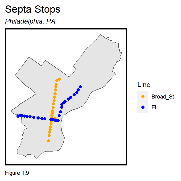
1.2.3 Relating tracts & subway stops in space
To understand whether TOD tracts are valued more than non-TOD tracts, a methodology is needed to assign tracts to one of these two groups. Several overlay techniques are demonstrated below to find tracts close to subway stations. Defining ‘close’ provides another important lesson on spatial scale.
Human beings have a very instinctual understanding of closeness. You may be willing to ride a bike 3 miles to work everyday, but getting up to fetch the remote control from across the room is a noticeable burden. It’s fine for near and far to be subjective in the real world, but here, spatial relationships must be defined explicitly. Below, close is defined as tracts within a half mile (2,640 ft.) of stations.
st_buffer generates polygon ‘buffers’ with boundaries exactly half mile from the stations. A long form layer stacks two sets of station buffers, dissolving (st_union) the second set into one large polygon. 2640 is understood as feet because septaBuffers is projected in feet. Note the two Legend items and that the st_union output is converted to an sf layer with st_sf.
The resulting ‘small multiple’ map (Figure 1.10) is only possible when data is organized in long form. facet_wrap is used to create the small multiple map, ensuring both are perfectly aligned.
septaBuffers <-
  rbind(
    st_buffer(septaStops, 2640) %>%
      mutate(Legend = "Buffer") %>%
      dplyr::select(Legend),
    st_union(st_buffer(septaStops, 2640)) %>%
      st_sf() %>%
      mutate(Legend = "Unioned Buffer"))

ggplot() +
  geom_sf(data=septaBuffers) +
  geom_sf(data=septaStops, show.legend = "point") +
  facet_wrap(~Legend) +
  mapTheme()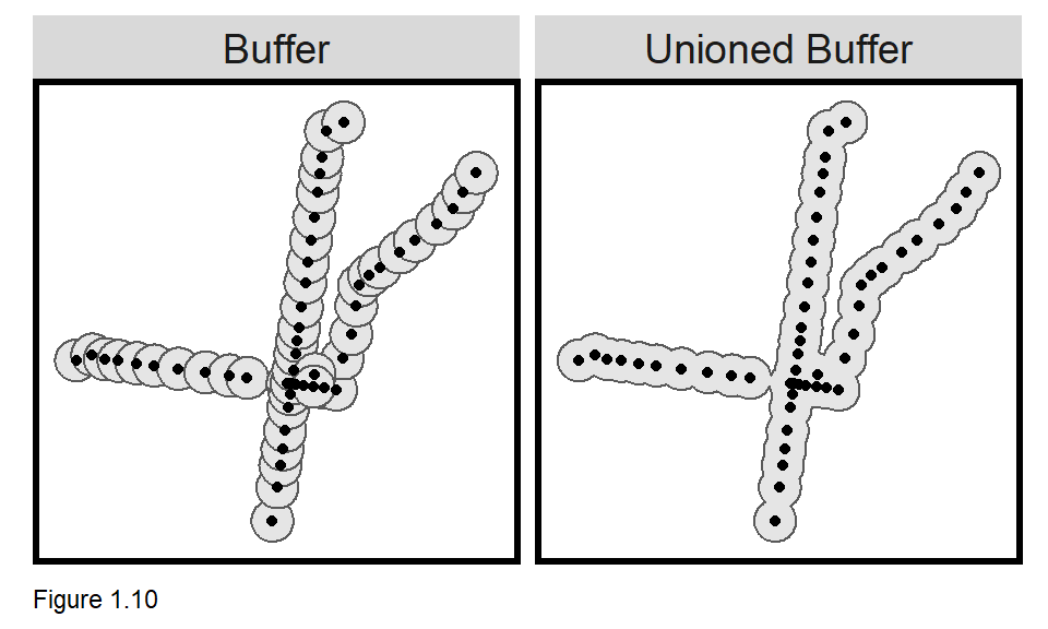
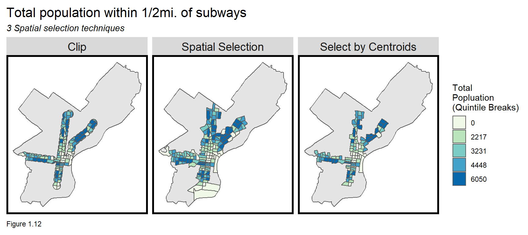
Now to select tracts that fall inside of the buffer. The Unioned Buffer is used because it enables a cleaner overlay. Below, three different approaches for selecting tracts that are with 0.5 miles of subway stations are considered.
- Intersection or
Clip- Relate tracts and the buffer using the latter to ‘cookie cutter’ the former. Spatial Selection- Select all tracts that intersect or touch the buffer.Select by Centroids- Select all the tract centroids that intersect the buffer.
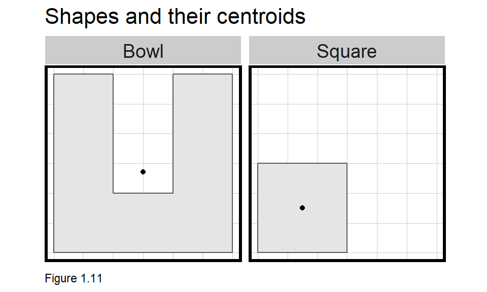
A centroid is the gravitational center of a polygon. The centroid for a circle is the point at which you can balance it on your finger. Interestingly, very irregular shapes may have centroids outside of a polygon’s boundary as Figure 1.11 illustrates.
In the code block below, the buffer object pulls out just the Unioned Buffer. The first approach, clip uses st_intersection to cookie cutter the tracts. TotalPop is selected and a Legend is created. The second approach, selection uses matrix notation to select all tracts00 that touch the buffer.
The third approach, selectCentroids is more complicated. Run each line separately to see how it works. A spatial selection is used again, but this time, st_centroid returns tract centroid points instead of polygons. A polygon output is needed, so st_drop_geometry converts the sf to a data frame and left_join joins it back to the original tracts00, complete with the polygon geometries. st_sf then converts the data frame to sf with polygon geometries. Joining two tables together requires a unique identifier, in this case GEOID.
buffer <- filter(septaBuffers, Legend=="Unioned Buffer")

clip <-
  st_intersection(buffer, tracts00) %>%
    dplyr::select(TotalPop) %>%
    mutate(Selection_Type = "Clip")

selection <-
  tracts00[buffer,] %>%
    dplyr::select(TotalPop) %>%
    mutate(Selection_Type = "Spatial Selection")

selectCentroids <-
  st_centroid(tracts00)[buffer,] %>%
    st_drop_geometry() %>%
    left_join(dplyr::select(tracts00, GEOID)) %>%
    st_sf() %>%
    dplyr::select(TotalPop) %>%
    mutate(Selection_Type = "Select by Centroids")
Can you create the below small multiple map? To do so, rbind the three selection types together and use facet_wrap to return three maps. Remember, st_union(tracts00) creates a basemap. What are the apparent differences across the selection criteria?
Clip is the worst choice as changing the geometries exasperates ecological fallacy and MAUP bias. Spatial Selection is better, but a tract is included even if only sliver of its area touches the buffer. This approach selects perhaps too many tracts.
Select by Centroids is my choice because it captures a concise set of tracts without altering geometries. While well-reasoned, it is still subjective, and each choice will ultimately lead to different results. Such is the impact of scale problems in spatial analysis.
1.3 Developing TOD Indicators
1.3.1 TOD indicator maps
Let us now explore the hypothesis that if residents value TOD, then rents should be higher in areas close to transit relative to places at greater distances.
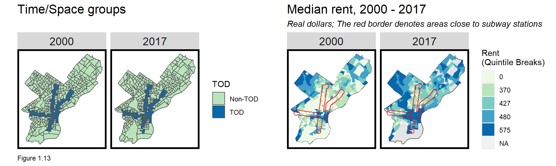
The code block below replicates the select by centroid approach to return allTracts within and beyond the 0.5 mile buffer (the TOD and Non-TOD groups, respectively). The second spatial selection uses st_disjoint to select centroids that do not intersect the buffer and are thus beyond half mile. mutate is used to adjust 2000 rents for inflation.
allTracts.group <-
  rbind(
    st_centroid(allTracts)[buffer,] %>%
      st_drop_geometry() %>%
      left_join(allTracts) %>%
      st_sf() %>%
      mutate(TOD = "TOD"),
    st_centroid(allTracts)[buffer, op = st_disjoint] %>%
      st_drop_geometry() %>%
      left_join(allTracts) %>%
      st_sf() %>%
      mutate(TOD = "Non-TOD")) %>%
  mutate(MedRent.inf = ifelse(year == "2000", MedRent * 1.42, MedRent))
The small multiple map in Figure 1.13 below visualizes both the year and TOD groups. The rightmost figure then then maps inflation-adjusted rent for 2000 and 2017. Can you re-create this figure using three geom_sf layers? The first is a basemap; the second maps rents using fill = q5(MedRent.inf), removing tract boundaries by setting colour=NA; and the third overlays buffer, setting colour = "red" and fill = NA.
The map suggests that although rents increased dramatically in Philadelphia’s central business district, many areas close to transit did not see significant rent increases.
1.3.2 TOD indicator tables
Tables are often the least compelling approach for presenting data, but they can be useful. The table below shows the average difference for variables across year and TOD_Group.
The tidyverse package makes summary statistics easy. group_by defines the grouping variables and summarize calculates the across-group means. na.rm = T removes any missing or NA values from the calculation. Without their removal, the calculation would return NA. The result is TOD by year group means.
A clean table is then generated using the kable function. Is this the best format for comparing across space and time?
allTracts.Summary <-
  st_drop_geometry(allTracts.group) %>%
    group_by(year, TOD) %>%
    summarize(Rent = mean(MedRent, na.rm = T),
              Population = mean(TotalPop, na.rm = T),
              Percent_White = mean(pctWhite, na.rm = T),
              Percent_Bach = mean(pctBachelors, na.rm = T),
              Percent_Poverty = mean(pctPoverty, na.rm = T))

kable(allTracts.Summary) %>%
  kable_styling() %>%
  footnote(general_title = "\n",
general = "Table 1.2")| year | TOD | Rent | Population | Percent_White | Percent_Bach | Percent_Poverty |
|---|---|---|---|---|---|---|
| 2000 | Non-TOD | 470.5458 | 3966.789 | 0.4695256 | 0.0096146 | 0.3735100 |
| 2000 | TOD | 469.8247 | 4030.742 | 0.3848745 | 0.0161826 | 0.4031254 |
| 2017 | Non-TOD | 821.1642 | 4073.547 | 0.4396967 | 0.0116228 | 0.2373258 |
| 2017 | TOD | 913.3750 | 3658.500 | 0.4803197 | 0.0288166 | 0.3080936 |
|
|
||||||
| Table 1.2 |
How about an approach with variables as rows and the groups as columns? The year and TOD fields are ‘spliced’ together into a year.TOD field with the unite function. gather converts the data to long form using year.TOD as the grouping variable. mutate can round the Value field and spread transposes the rows and columns allowing for comparisons across both group types.
Is this table better? What can you conclude about our hypothesis?
allTracts.Summary %>%
  unite(year.TOD, year, TOD, sep = ": ", remove = T) %>%
  gather(Variable, Value, -year.TOD) %>%
  mutate(Value = round(Value, 2)) %>%
  spread(year.TOD, Value) %>%
  kable() %>%
    kable_styling() %>%
    footnote(general_title = "\n",
general = "Table 1.3")| Variable | 2000: Non-TOD | 2000: TOD | 2017: Non-TOD | 2017: TOD |
|---|---|---|---|---|
| Percent_Bach | 0.01 | 0.02 | 0.01 | 0.03 |
| Percent_Poverty | 0.37 | 0.40 | 0.24 | 0.31 |
| Percent_White | 0.47 | 0.38 | 0.44 | 0.48 |
| Population | 3966.79 | 4030.74 | 4073.55 | 3658.50 |
| Rent | 470.55 | 469.82 | 821.16 | 913.38 |
|
|
||||
| Table 1.3 |
1.3.3 TOD indicator plots
The best way to visualize group differences is with a grouped bar plot. Below one is created by moving the data into long form with gather. Explore how the minus sign works inside gather.
In the plotting code, year is defined on the x-axis, with each bar color filled by TOD. geom_bar defines a bar plot with two critical parameters. stat tells ggplot that a y-axis Value is provided and position ensures the bars are side-by-side. What happens when the position parameter is removed?
facet_wrap is used to create small multiple plots across Variables, and scales = "free" allows the y-axis to vary with the scale of each variable (percentages vs. dollars).
allTracts.Summary %>%
  gather(Variable, Value, -year, -TOD) %>%
  ggplot(aes(year, Value, fill = TOD)) +
    geom_bar(stat = "identity", position = "dodge") +
    facet_wrap(~Variable, scales = "free", ncol=5) +
    scale_fill_manual(values = c("#bae4bc", "#0868ac")) +
    labs(title = "Indicator differences across time and space") +
    plotTheme() + theme(legend.position="bottom")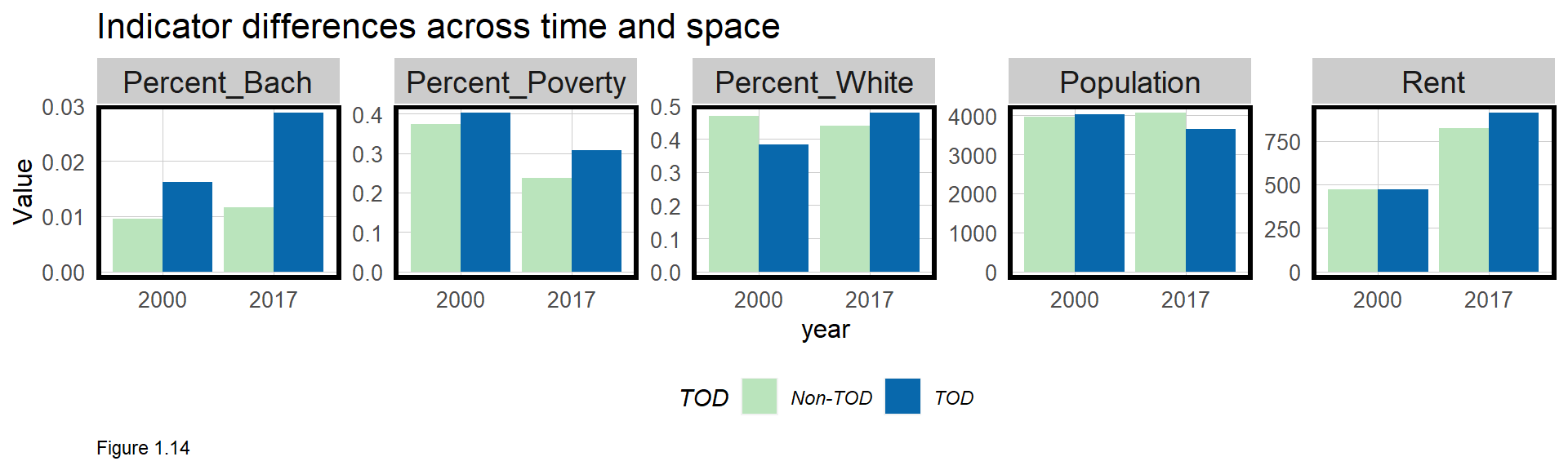
What do these indicators tell us about TOD in Philadelphia? Between 2000 and 2017, the City became slightly more educated and less impoverished while rents increased dramatically. In 2000, there was almost no difference in rents between TOD and Non-TOD tracts, but in 2017, that difference increased to more than $100. It appears that residents increasingly are willing to pay more for transit access.
This is not the end of the story, however. Thus far, our analysis has ignored a key question - what is the relevant spatial process? The Introduction discusses how the spatial process or pattern relates to decision-making. Residents may be willing to pay more for transit, but perhaps there are other reasons behind rent increases?
It turns out that some TOD areas also happen to be in Center City, Philadelphia’s central business district. Living in and around Center City affords access to many other amenities beyond transit. Could omitting this critical spatial process from our analysis bias our results?
Let’s find out by creating three housing submarkets, one for each of the two subway lines and a third, Center City area, where the two subway lines intersect.
1.4 Capturing three submarkets of interest
In this section, three new submarkets are created. The centerCity submarket is created where the unioned El and Broad Street Line buffers intersect (st_intersection).
The el and broad.st submarket areas are created a bit differently. st_difference is used to erase any portion of the unioned El and Broad Street Line buffers areas that intersect centerCity. The three buffers are then bound into one layer and the result is mapped.
centerCity <-
  st_intersection(
    st_buffer(filter(septaStops, Line == "El"), 2640) %>% st_union(),
    st_buffer(filter(septaStops, Line == "Broad_St"), 2640) %>% st_union()) %>%
      st_sf() %>%
      mutate(Submarket = "Center City")

el <-
  st_buffer(filter(septaStops, Line == "El"), 2640) %>% st_union() %>%
    st_sf() %>%
    st_difference(centerCity) %>%
    mutate(Submarket = "El")

broad.st <-
  st_buffer(filter(septaStops, Line == "Broad_St"), 2640) %>% st_union() %>%
    st_sf() %>%
    st_difference(centerCity) %>%
    mutate(Submarket = "Broad Street")

threeMarkets <- rbind(el, broad.st, centerCity) 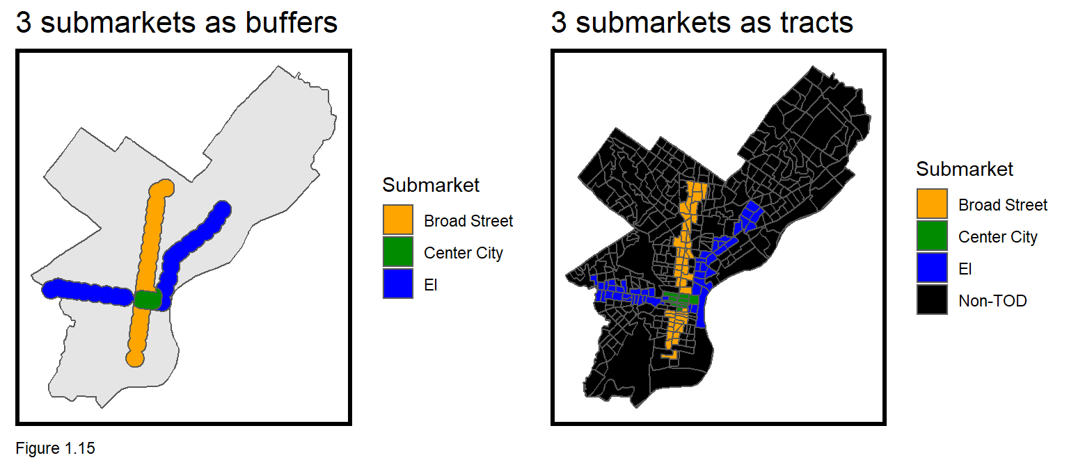
allTracts is then related to the threeMarkets. A spatial join (st_join) is used to ‘stamp’ each tract centroid with the submarket it falls into. Note a spatial selection will not work here because there are now 3 submarket groups instead of one unioned buffer.
The spatial join result then takes the polygon geometries with a left_join to allTracts. Any tract that is not overlayed by one of threeMarkets receives NA. The mutate then converts NA to a Non-TOD submarket with replace_na. st_sf finally converts the output with polygon geometries to an sf data frame which can be mapped as Figure 1.15 above.
allTracts.threeMarkets <-
st_join(st_centroid(allTracts), threeMarkets) %>%
st_drop_geometry() %>%
left_join(allTracts) %>%
mutate(Submarket = replace_na(Submarket, "Non-TOD")) %>%
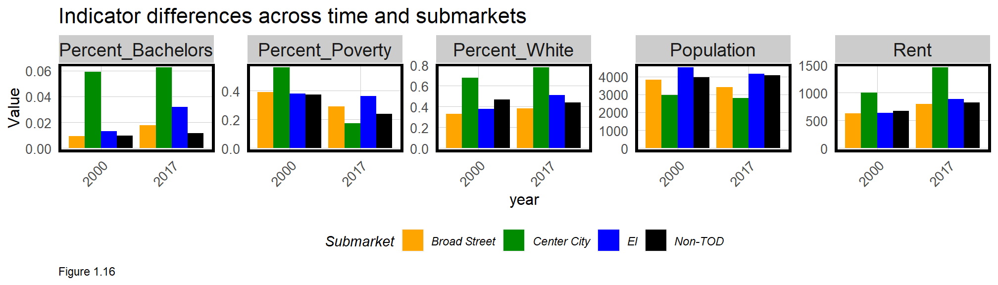
st_sf() Finally, as before, rent is adjusted for inflation and a grouped bar plot is created.
It was previously estimated that Philadelphians were willing to pay an additional $100 on average, to rent in tracts with transit access. However, now that the Center City effect has been controlled for, it seems these differences are negligible. It is now clear that rents in Center City may have been driving these results.
1.5 Conclusion: Are Philadelphians willing to pay for TOD?
Are Philadelphians willing to pay a premium to live in transit-rich areas? I hate to tell you this, but not enough has been done to fully answer this question - which is one of the two main takeaways of this chapter.
It is critical to understand how omitted variables affect the relevant spatial process and ultimately, the results of an analysis. We suggested that the Center City effect played a role. Another way to think about the Center City effect is in the context of decision-making:
It could be that households are willing to pay more for transit amenities, or that they pay more for other amenities in neighborhoods that happen to also be transit-rich. These selection dynamics will play a massive role in our analytics later in the book.
The second takeaway from this chapter is that although indicators enable the data scientist to simplify complex ideas, those ideas must be interpreted responsibly. This means acknowledging important assumptions in the data.
How useful are the indicators we’ve created? They are relatable. Philadelphia is gentrifying and there is a need to add new housing supply in areas with transit access. These indicators, built from Census data, calculated from means, and visualized as maps and bar plots are simple. Comparisons made across time and submarket, make them relative. The final reason these indicators are useful is that they have clearly generated more questions than answers. Should Philadelphia wish to learn more about how renters value transit, these results suggest a more thorough study is needed.
1.6 Assignment - Study TOD in your city
Recreate this analysis in a city of your choosing and prepare a policy brief for local City Council representatives. Do households value transit-rich neighborhoods compared to others? How certain can you be about your conclusions given some of the spatial biases we’ve discussed? You must choose a city with open transit station data and crime data.
Prepare an accessible (non-technical) R markdown document with the following deliverables. Provide a brief motivation at the beginning, annotate each visualization appropriately, and then provide brief policy-relevant conclusions. Please show all code blocks. Here are the specific deliverables:
- Show your data wrangling work.
- Four small-multiple (2000 & 2017+) visualizations comparing four selected Census variables across time and space (TOD vs. non-TOD).
- One grouped bar plot making these same comparisons.
- One table making these same comparisons.
- Create two graduated symbol maps of population and rent within 0.5 mile of each transit station. Google for more information, but a graduate symbol map represents quantities for each transit station proportionally.
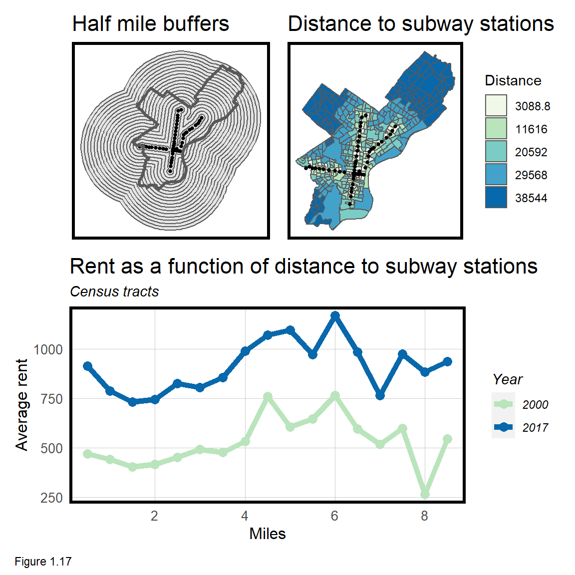
- Create a
geom_lineplot that shows mean rent as a function of distance to subway stations (Figure 1.17). To do this you will need to use themultipleRingBufferfunction found in thefunctions.Rscript. - Download and wrangle point-level crime data (pick a crime type). What is the relationship between crime, transit access and rents?
Below is an example of how the multipleRingsBuffer tool works. The first parameter of st_join are tract centroids. The second parameter is the buffer tool, drawing buffers in half mile intervals, out to a 9 mile distance.
allTracts.rings <-
  st_join(st_centroid(dplyr::select(allTracts, GEOID, year)),
          multipleRingBuffer(st_union(septaStops), 47520, 2640)) %>%
  st_drop_geometry() %>%
  left_join(dplyr::select(allTracts, GEOID, MedRent, year),
            by=c("GEOID"="GEOID", "year"="year")) %>%
  st_sf() %>%
mutate(distance = distance / 5280) #convert to milesOpenshaw, Stan, and S. Openshaw. “The modifiable areal unit problem.” Geo Abstracts University of East Anglia, 1984.↩︎
Request a Census API Key http://api.census.gov/data/key_signup.html↩︎
When the service is again live, the change will be reflected in this book’s online version↩︎
https://ggplot2.tidyverse.org/reference/#section-layer-geoms↩︎
Septa is ‘Southeastern Pennsylvania Transit Authority’, and is the transit provider for Philadelphia. SEPTA Open Data. http://septaopendata-septa.opendata.arcgis.com/search↩︎