Chapter 3 Intro to geospatial machine learning, Part 1
3.1 Machine learning as a Planning tool
The descriptive analytics in the first two chapters provide context to non-technical decision-makers. The predictive analytics in this and subsequent chapters help convert those insights into actionable intelligence.
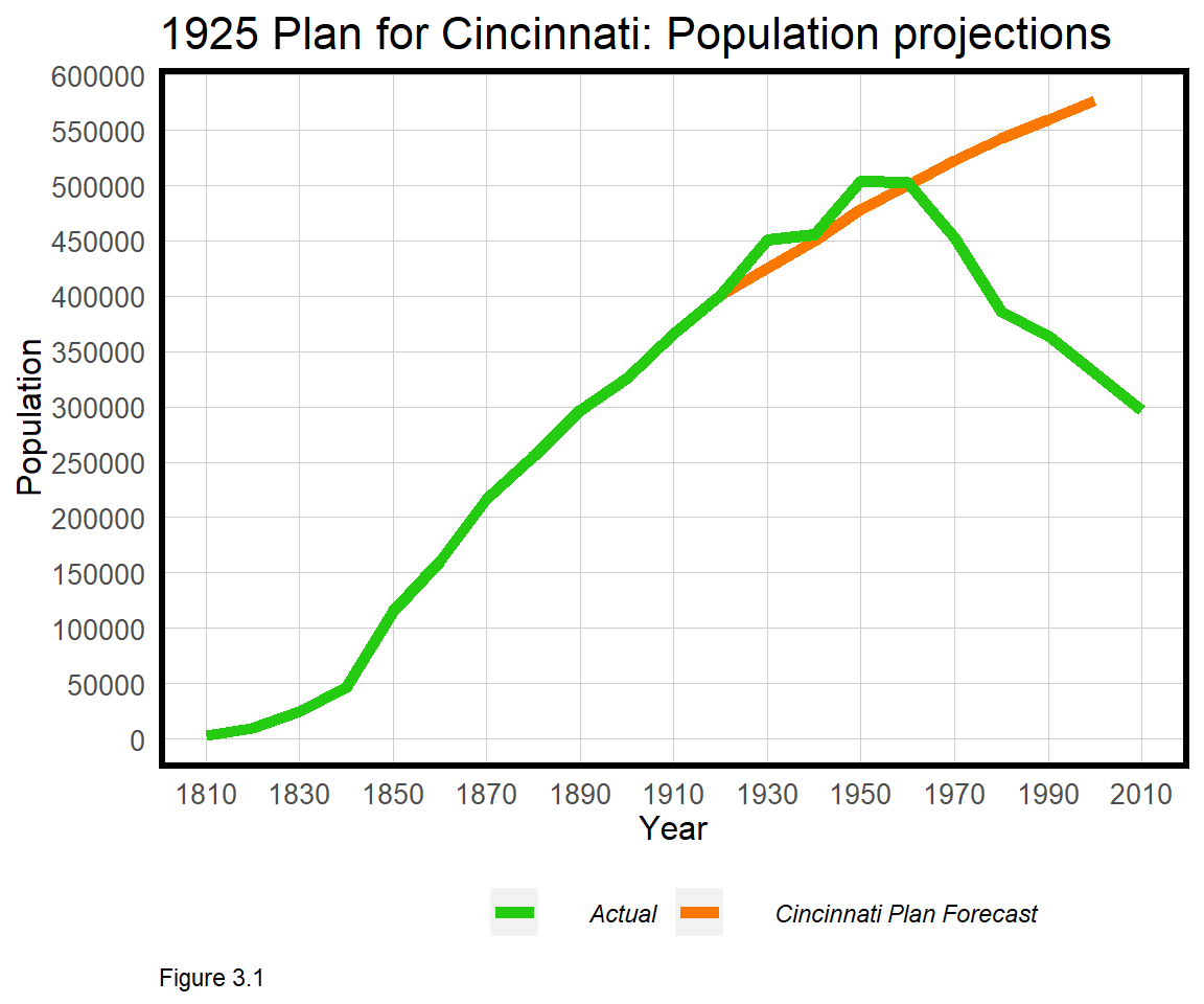
Prediction is not new to Planners. Throughout history, Planners have made ill-fated forecasts into an uncertain future. The 1925 Plan for Cincinnati is one such example. Cincinnati, delighted with the prosperity it had achieved up to 1925, set out to plan for the next hundred years by understanding future demand for land, housing, employment and more.
Population forecasting, the author wrote, is the “obvious…basis upon which scientific city planning must be formulated”. Rebuilt from the actual plan, Figure 3.1 visualizes the city’s dubious population forecast18, which made the assumption that historical growth would continue or ‘generalize’ long into the future. In reality, a great depression, suburbanization, and deindustrialization caused the city’s population to fall nearly 70% below its 1950 peak. So much for the ‘the plan’.
To reasonably assume Cincinnati’s past would generalize to its future, Planners would have had to understand how complex systems like housing markets, labor markets, credit markets, immigration, politics, and technology all interrelate. If those systems were understood, Planners would know which levers to pull to bring health, happiness and prosperity to all.
We are far from such an understanding. Thus, our goal will be to make predictions in more bounded systems, where recent experiences more reasonably generalize to the near future. We will ‘borrow’ experiences from observed data, and test whether they can be used to predict outcomes where and when they are unknown. Throughout the remainder of the book, we will learn that generalizability is the most important concept for applying machine learning in government.
3.1.1 Accuracy & generalizability
This chapter focuses on home price prediction, which is a common use case in cities that use data to assess property taxes. The goal is to train a model from recent transactions, the ‘training set’, and test whether that model generalizes to properties that have not recently sold. This is comparable to the Zestimate algorithm that Zillow uses to estimate home prices.
One way to evaluate such a model is to judge its accuracy, defined as the difference between predicted and observed home prices. Another, more nuanced criteria is generalizability, which has two different meanings:
Imagine training an age-prediction robot on data from 1000 people, including you and I. It is far less impressive for the robot to predict my age compared to a random person, because it was trained in part, on my data. Thus, a generalizable model is one that accurately predicts on new data - like every house that hasn’t sold in recent years.19
Now imagine the age-prediction robot was trained on data from a retirement community and tasked to predict in a middle school. The robot might be accurate for seniors but would likely fail for young adults. Thus, a generalizable model is also one that predicts with comparable accuracy across different groups - like houses in different neighborhoods. As we will learn, a predictive model lacking accuracy and generalizability will not be a useful decision-making tool.
3.1.2 The machine learning process
Curiosity, creativity and problem solving are the key to useful data science solutions, but organization ensures a reproducible work flow. The below framework highlights the major steps in the predictive modeling process:
Data wrangling: The first step is to compile the required data into one dataset, often from multiple sources. This includes the outcome of interest (the ‘dependent variable’) and the ‘features’ needed to predict that outcome. Data wrangling often involves data cleaning, which is both arduous and critical. If mistakes are made at the data wrangling stage, all the downstream work may be for not.
Exploratory analysis: Exploratory analysis, like the indicators we have already discussed, is critical for understanding the system of interest. Exploratory analysis investigates both the underlying spatial process in the outcome of interest as well as trends and correlations between the outcome and the predictive features.
Feature engineering: Feature engineering is the difference between a good machine learning model and a great one. Features are the variables used to predict the outcome of interest by mining the data for predictive insight. Social scientists refer to these as ‘independent variables’, but features are a bit different.
Social scientists fear that transforming a variable (ie. changing its context without a good theoretical reason) may muddle the interpretation of a statistical result. In prediction, interpretation is not as important as accuracy and generalizability, so transformation or feature engineering becomes imperative.
The first key to strong feature engineering is experience with feature engineering. While we practice here, many transformation and ‘dimensionality reduction’ techniques are beyond the scope of this book, but critical to machine learning. The second key is domain expertise. It may seem that reducing machine learning success to accuracy and generalizability negates the importance of context. In fact, the more the data scientist understands the problem, the better she will be at parameterizing the underlying system.
Geospatial feature engineering is about measuring ‘exposure’ from an outcome, like a house sale, to the locational phenomena that can help predict it, like crime. We will spend a great deal of time discussing this.
Feature selection: While hundreds of features may be engineered for a single project, often only a concise set is included in a model. Many features may be correlated with each other, a phenomenon known as ‘colinearity’, and feature selection is the process of whittling features down to a parsimonious set.
Model estimation and validation: A statistical model is an abstraction of reality that produces ‘estimates’, not facts. There are many different models, some more simple than others. In this book, the focus is on Linear and Generalized Linear regression models because they are more transparent and computationally more efficient. Once one is familiar with the machine learning framework however, more advanced algorithms can be substituted.
3.1.3 The hedonic model
The hedonic model is a theoretical framework for predicting home prices by deconstructing house price into the value of its constituent parts, like an additional bedroom, the presence of a pool, or the amount of local crime.20
For our purposes, home prices can be deconstructed into three constituent parts - 1) physical characteristics, like the number of bedrooms; 2) public services/(dis)amenities, like crime; and 3) the spatial process of prices - namely that house prices cluster at the neighborhood, city and regional scales. The regression model developed below omits the spatial process, which is then added in Chapter 4. Pay close attention to how this omission leads to a less accurate and generalizable model.
In this chapter, key concepts like colinearity and feature engineering are returned to at different stages throughout. While this makes for a less linear narrative, a focus on these skills is necessary to prepare us for the more nuanced use cases that lie ahead. In the next section, data is wrangled, followed by an introduction to feature engineering. Ordinary Least Squares regression is introduced, and models are validated for their generalizability using cross-validation.
3.2 Data wrangling - Home price & crime data
Libraries are loaded in the code block below.
library(tidyverse)
library(sf)
library(spdep)
library(caret)
library(ckanr)
library(FNN)
library(grid)
library(gridExtra)
library(ggcorrplot)

root.dir = "https://raw.githubusercontent.com/urbanSpatial/Public-Policy-Analytics-Landing/master/DATA/"
source("https://raw.githubusercontent.com/urbanSpatial/Public-Policy-Analytics-Landing/master/functions.r")

palette5 <- c("#25CB10", "#5AB60C", "#8FA108",   "#C48C04", "#FA7800")
Our model will be trained on home price data from Boston, Massachusetts. The code block below downloads a neighborhoods geojson from the Boston Open Data site; reads in the home sale price data as a csv; converts to an sf layer (st_as_sf); and projects.
nhoods <-
  st_read("http://bostonopendata-boston.opendata.arcgis.com/datasets/3525b0ee6e6b427f9aab5d0a1d0a1a28_0.geojson") %>%
  st_transform('ESRI:102286')

boston <-
  read.csv(file.path(root.dir,"/Chapter3_4/bostonHousePriceData_clean.csv"))

boston.sf <-
  boston %>%
  st_as_sf(coords = c("Longitude", "Latitude"), crs = 4326, agr = "constant") %>%
  st_transform('ESRI:102286')
Sale prices are then mapped in quintile breaks using the nhoods basemap. What do you notice about the spatial process of home prices? Are they randomly distributed throughout the city or do they seem clustered? Why do you think prices are spatially distributed the way they are?
ggplot() +
  geom_sf(data = nhoods, fill = "grey40") +
  geom_sf(data = boston.sf, aes(colour = q5(PricePerSq)),
          show.legend = "point", size = .75) +
  scale_colour_manual(values = palette5,
                   labels=qBr(boston,"PricePerSq"),
                   name="Quintile\nBreaks") +
  labs(title="Price Per Square Foot, Boston") +
  mapTheme()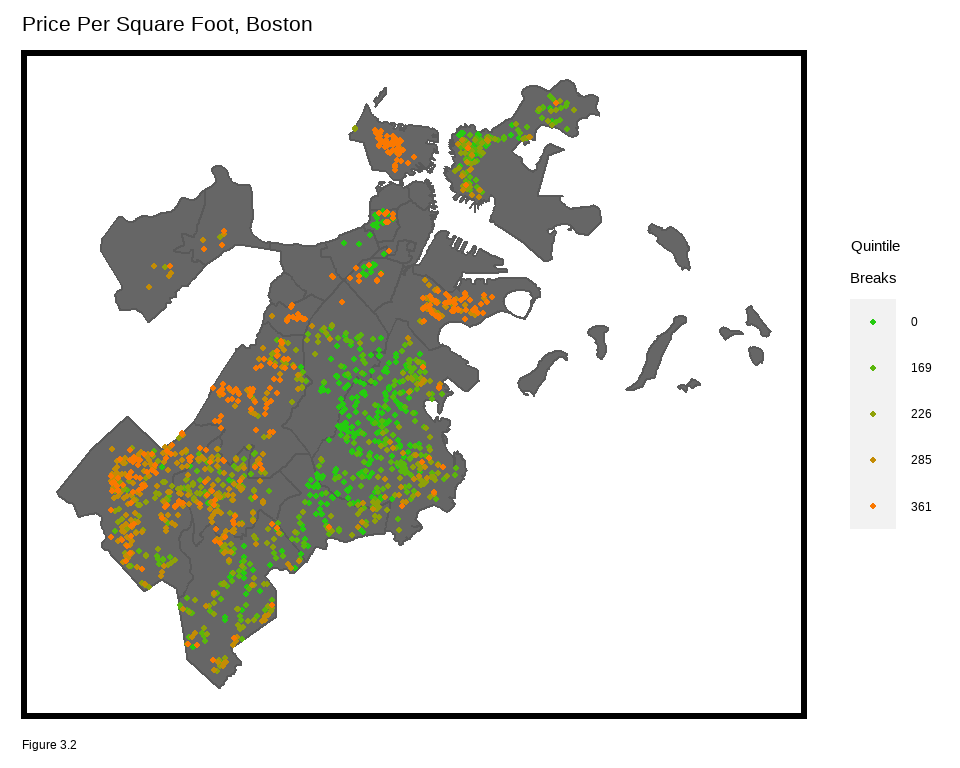
names(boston.sf) suggests the data includes many parcel and building-specific features, but no neighborhood characteristics. The Analyze Boston open data site has many datasets that could be engineered into useful features.21
The site runs on the Comprehensive Knowledge Archive Network or CKAN open data framework which includes an API on ‘Crime Incident Reports’.22 For a glimpse into the API, paste the commented out query in the code block below in to your browser.
The R package, ckanr, can talk directly to open data APIs built on CKAN technology, like Analyze Boston. In the code block below, resource_id corresponds to the Incidents dataset. The below code block returns the first row and several select fields of the records table. Note for this resource, the maximum number of rows the API will return is 100, but a function can be created to return all the data incrementally.
#https://data.boston.gov/api/3/action/datastore_search_sql?sql=SELECT * from "12cb3883-56f5-47de-afa5-3b1cf61b257b" WHERE "OCCURRED_ON_DATE" = '2019-06-21 11:00:00'

ds_search(resource_id = '12cb3883-56f5-47de-afa5-3b1cf61b257b',
          url = "https://data.boston.gov/",
          as = "table")$records[1,c(2,7,11,13)]
To keep it simple, a downloaded and wrangled crime dataset has been provided as bostonCrimes.csv, which can be read in with read.csv. length(unique(bostonCrimes$OFFENSE_CODE_GROUP)) tells us there are 64 unique offenses in the data. Below, the five most frequent incident types are output.
group_by(bostonCrimes, OFFENSE_CODE_GROUP) %>%
  summarize(count = n()) %>%
  arrange(-count) %>% top_n(5)
## # A tibble: 5 x 2
## OFFENSE_CODE_GROUP count
## <chr> <int>
## 1 Motor Vehicle Accident Response 23717
## 2 Larceny 16869
## 3 Drug Violation 15815
## 4 Other 12797
## 5 Medical Assistance 12626For now, the code block below subsets Aggravated Assault crimes with XY coordinates. Note the st_as_sf function converts a data frame of coordinates to sf, and that the original crs of bostonCrimes.sf is in decimal degrees (4326). Map the points or visualize assault hotspots with the stat_density2d function, as below.
bostonCrimes.sf <-
  bostonCrimes %>%
    filter(OFFENSE_CODE_GROUP == "Aggravated Assault",
           Lat > -1) %>%
    dplyr::select(Lat, Long) %>%
    na.omit() %>%
    st_as_sf(coords = c("Long", "Lat"), crs = 4326, agr = "constant") %>%
    st_transform('ESRI:102286') %>%
    distinct()

ggplot() + geom_sf(data = nhoods, fill = "grey40") +
  stat_density2d(data = data.frame(st_coordinates(bostonCrimes.sf)),
                 aes(X, Y, fill = ..level.., alpha = ..level..),
                 size = 0.01, bins = 40, geom = 'polygon') +
  scale_fill_gradient(low = "#25CB10", high = "#FA7800",
                      breaks=c(0.000000003,0.00000003),
                      labels=c("Minimum","Maximum"), name = "Density") +
  scale_alpha(range = c(0.00, 0.35), guide = FALSE) +
  labs(title = "Density of Aggravated Assaults, Boston") +
  mapTheme()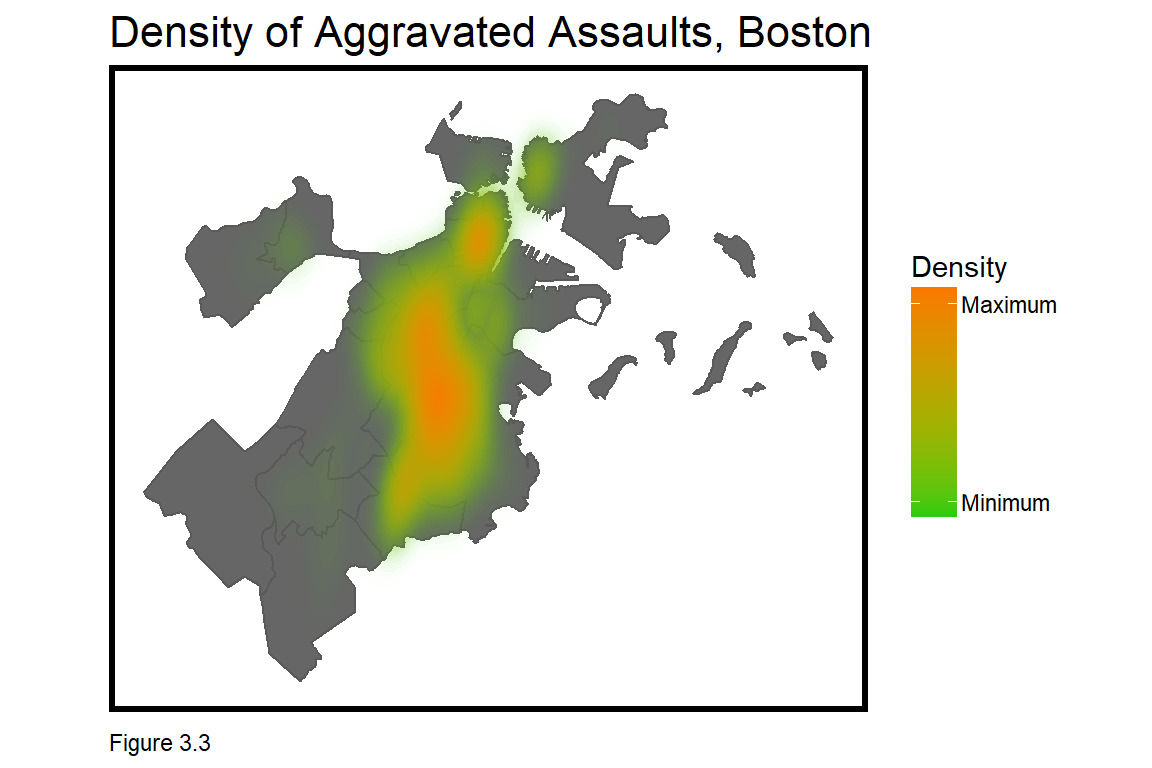
3.2.1 Feature Engineering - Measuring exposure to crime
Of a potential home purchase, many buyers ask, “Is there a lot of crime in this neighborhood?” What is ‘a lot’, how should one define ‘neighborhood’, and what is a good indicator of crime? Any set of choices will suffer from both ‘measurement error’ and scale bias, and different buyers in different neighborhoods will value crime exposure differently. Feature engineering is the art and science of defining these relationships in a model and below, three possible approaches are discussed.
The first is to sum crime incidents for an arbitrary areal unit, like Census tract. This is the least optimal as it introduces scale bias related to the Modifiable Areal Unit Problem (Section 1.1.1).
The second is to sum crimes within a fixed buffer distance of each home sale observation. This approach implies that the scale relationship between crime and home prices is uniform citywide, which is not likely true.
The code block below creates a new feature, crimes.Buffer, that uses a spatial join (aggregate) to count crimes within a 1/8 mi. buffer of each home sale observation. pull converts the output from an sf layer to a numeric vector.
boston.sf$crimes.Buffer =
st_buffer(boston.sf, 660) %>%
aggregate(mutate(bostonCrimes.sf, counter = 1),., sum) %>%
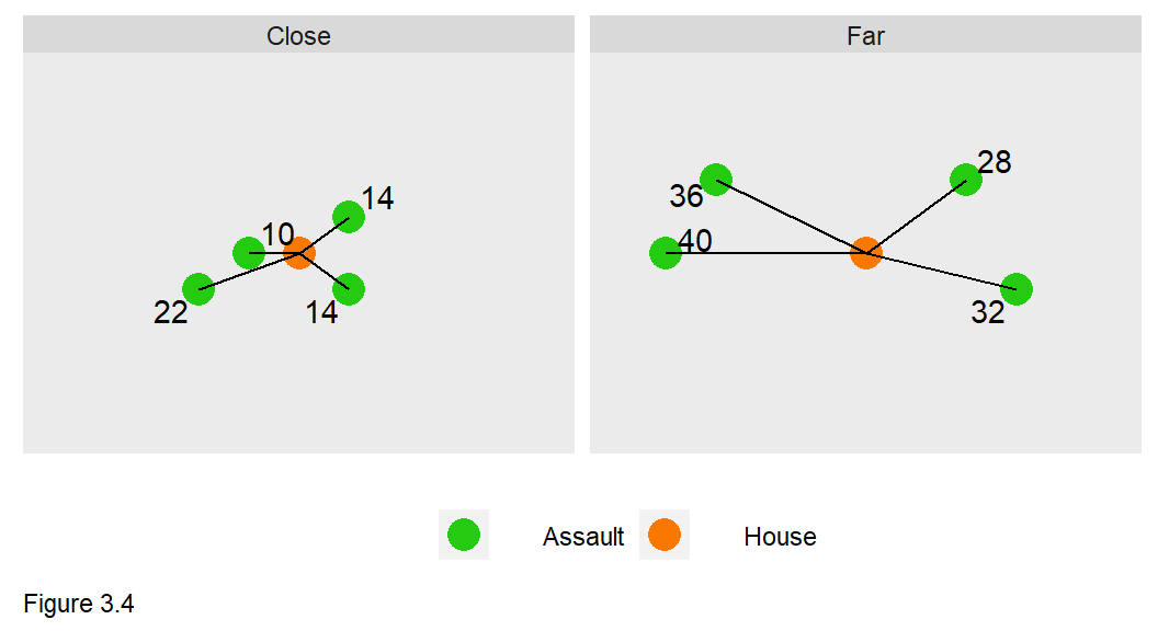
pull(counter)A third method calculates the ‘average nearest neighbor distance’ from each home sale to its k nearest neighbor crimes. Figure 3.4 provides an example when k=4. The average nearest neighbor distance for the “close” and “far” groups is 15 and 34, respectively, suggesting the close group is ‘more exposed’ to crime than the far group.
How is this approach advantageous over a fixed buffer? There are still scale biases in assuming one parameter of k is the ‘correct’ one. In my experience however, this approach allows for a model to capitalize on very small continuous variations in distance.
The functions.R file includes the function, nn_function for calculating average nearest neighbor distance. The function takes 3 parameters - coordinates of the point layer we wish to measureFrom; coordinates of the point layer we wish to measureTo; and the number of k nearest neighbors.
It is easier to understand how the nn_function works if the reader is willing to run through it line-by-line. The logic is as follows:
- The
get.knnxfunction creates a matrix of nearest neighbor distances,nn.dist, from eachmeasureFrompoint tokmeasureTopoints. - The
nn.distmatrix is converted into a data frame. rownames_to_columncreates a unique field denoting each uniquemeasureFrompoint.gatherconverts from wide to long form.arrangesorts themeasureFromfield ascending.group_byeachmeasureFrompoint and usesummarizeto take the meanpointDistance.- Convert
thisPointto numeric, sort ascending again, then removethisPoint. pullthe average nearest neighbor distance.
The nn_function is embedded in mutate to create five new features in boston.sf with up to 5 k nearest neighbors. st_c (shorthand for st_coordinates) converts the data frame to a matrix of XY coordinates. This section has provided a short introduction in geospatial feature engineering. In the next section, each of these features are correlated with house price.
st_c <- st_coordinates

boston.sf <-
  boston.sf %>%
    mutate(
      crime_nn1 = nn_function(st_c(boston.sf), st_c(bostonCrimes.sf), 1),
      crime_nn2 = nn_function(st_c(boston.sf), st_c(bostonCrimes.sf), 2),
      crime_nn3 = nn_function(st_c(boston.sf), st_c(bostonCrimes.sf), 3),
      crime_nn4 = nn_function(st_c(boston.sf), st_c(bostonCrimes.sf), 4),
      crime_nn5 = nn_function(st_c(boston.sf), st_c(bostonCrimes.sf), 5))
3.2.2 Exploratory analysis: Correlation
st_drop_geometry(boston.sf) %>%
  mutate(Age = 2015 - YR_BUILT) %>%
  dplyr::select(SalePrice, LivingArea, Age, GROSS_AREA) %>%
  filter(SalePrice <= 1000000, Age < 500) %>%
  gather(Variable, Value, -SalePrice) %>%
   ggplot(aes(Value, SalePrice)) +
     geom_point(size = .5) + geom_smooth(method = "lm", se=F, colour = "#FA7800") +
     facet_wrap(~Variable, ncol = 3, scales = "free") +
     labs(title = "Price as a function of continuous variables") +
     plotTheme()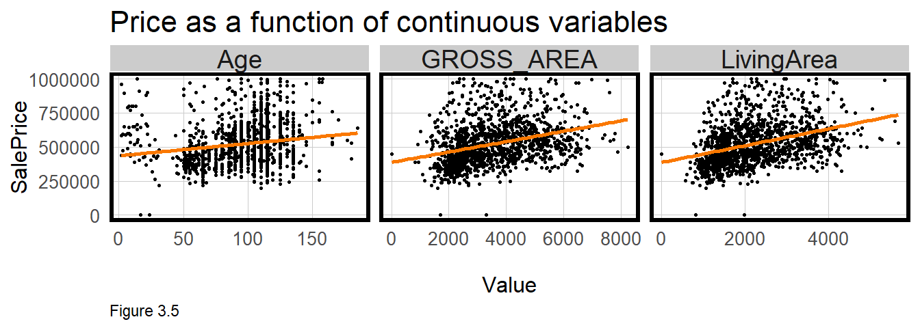
Correlation is an important form of exploratory analysis, identifying features that may be useful for predicting SalePrice. In this section, correlation is visualized and in the next, correlation is estimated.
In Figure 3.5, SalePrice is plotted as a function of three numeric features, Age (a feature created from YR_BUILT), LivingArea, and GROSS_AREA. Is home sale price related to these features? A ‘least squares’ line is drawn through the point cloud and the more the point cloud ‘hugs’ the line, the greater the correlation. In the code block above, the least squares line is generated with geom_smooth(method = "lm").
boston %>%
  dplyr::select(SalePrice, Style, OWN_OCC, NUM_FLOORS) %>%
  mutate(NUM_FLOORS = as.factor(NUM_FLOORS)) %>%
  filter(SalePrice <= 1000000) %>%
  gather(Variable, Value, -SalePrice) %>%
   ggplot(aes(Value, SalePrice)) +
     geom_bar(position = "dodge", stat = "summary", fun.y = "mean") +
     facet_wrap(~Variable, ncol = 1, scales = "free") +
     labs(title = "Price as a function of\ncategorical variables", y = "Mean_Price") +
     plotTheme() + theme(axis.text.x = element_text(angle = 45, hjust = 1))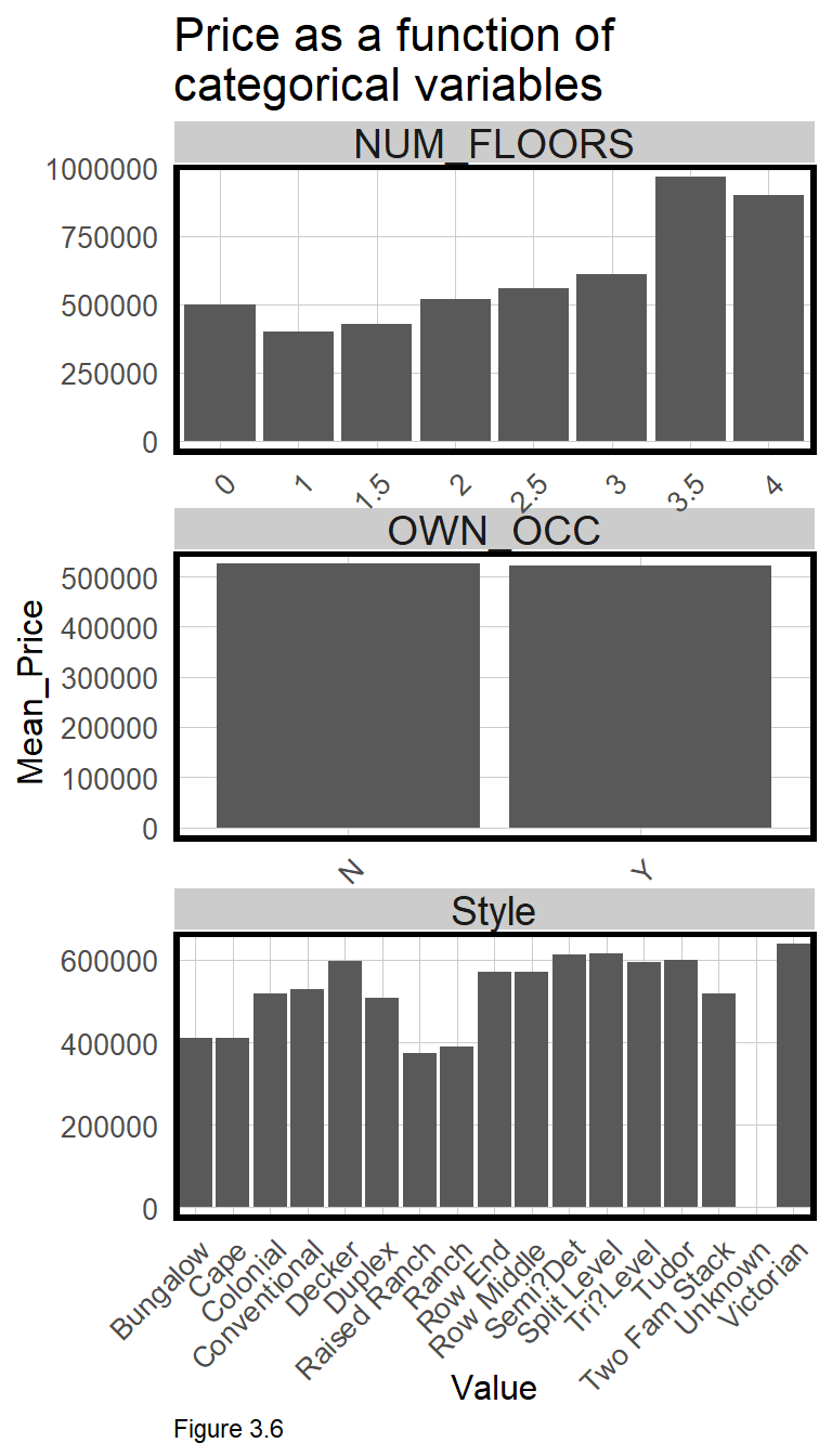
These plots suggest a correlation exists. In all cases, the regression line slopes upward from left to right, meaning that on average, as age and house size increase, so does price. Correlation can also be described by the slope of the line as well. The greater the slope, the greater the feature’s effect on price.
Many features in the boston.sf dataset are not numeric but categorical, making correlation more complex. Slope cannot be calculated when the x-axis is categorical. Instead, a significant difference in mean price is hypothesized across each category. For example, Figure 3.6 outputs bar plots for three categorical features, using geom_bar to calculate mean SalePrice by category.
OWN_OCC or ‘owner-occupied’, describes likely rental properties. Note that there is no difference on average, between owner and non-owner-occupied home sales. This is a good indicator that OWN_OCC may not be a good predictor of SalePrice. Conversely, there appears a significant premium associated with the Victorian architectural Style. Section 3.2.2 below discusses why feature engineering like recoding Style into fewer categories, or converting NUM_FLOORS from numeric to categorical, could lead to a significant improvement in a predictive model.
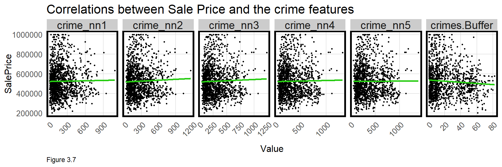
Finally, the relationship between SalePrice and crime exposure is visualized below for the six crime features. The small multiple below subsets with dplyr::select(starts_with("crime"). filter is used to remove sales less than $1000 and greater than $1 million.
These points do not ‘hug’ the line like the scatterplots above, suggesting little correlation between crime and price. However, the plots consider just two variables (ie. ‘bivariate’), while a regression is able to account for multiple features simultaneously (ie. multivariate). We will see how the multivariate regression makes crime a significant predictor.
A correlation matrix is another way to visualize correlation across numeric variables. In the code block below, cor and cor_pmat, calculate bivariate correlation and statistical significance, respectively. These statistics are explained below. In Figure 3.8, the darker the shade of orange or green, the stronger the correlation. The SalePrice row shows correlations relevant to our model, but this plot also shows features that may be colinear, like LivingArea and GROSS_AREA.
Correlation analysis is a critical component of the machine learning work flow, but exploratory analysis goes beyond just correlation. Keep in mind that good exploratory analysis adds valuable context, particularly for non-technical audiences. Next, statistical correlation and regression is introduced.
numericVars <-
  select_if(st_drop_geometry(boston.sf), is.numeric) %>% na.omit()

ggcorrplot(
  round(cor(numericVars), 1),
  p.mat = cor_pmat(numericVars),
  colors = c("#25CB10", "white", "#FA7800"),
  type="lower",
  insig = "blank") +
labs(title = "Correlation across numeric variables") 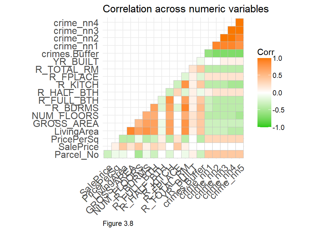
3.3 Introduction to Ordinary Least Squares Regression
This section gives a quick and applied introduction to regression that may not satisfy readers looking for a mathematical framework. The applied approach is designed for those primarily interested in interpretation and communication.
The purpose of Linear Regression or Ordinary Least Squares Regression (OLS), is to predict the SalePrice of house i, as a function of several components, as illustrated in the equation below. The first is the ‘intercept’, \(\beta _{0}\), which is the predicted value of SalePrice if nothing was known about any other features. Next, the regression ‘coefficient’, \(\beta _{1}\), is interpreted as the average change in SalePrice given a unit increase in X. X is a feature, such as the living area of a house.
Finally, \(\varepsilon_{i}\), is the error term or residual, which represents all the variation in SalePrice not explained by X. The goal is to account for all the systematic variation in SalePrice, such that anything leftover (\(\varepsilon_{i}\)) is just random noise. Consider the regression equation below can be used to explore the constituent parts of home prices as discussed in the hedonic model.
Of all the nuances of the regression model, one of the most important is the idea that regression models look for predictive ‘signals’ at the mean. This is very intuitive so long as a predictive feature does not vary substantially from its mean. For example, regressing home price and crime exposure assumes that the average relationship (the spatial process) is comparable for all neighborhoods. This is a significant assumption and one that will be discussed in the next chapter.
\[SalePrice_{i}=\beta _{0}+\beta _{1}X_{i}+\varepsilon_{i}\]
Let us now try to understand how a regression is estimated starting with the Pearson correlation coefficient, r. Correlation was visualized above, and here it is tested empirically. An r of 0 suggests no correlation between the two variables; -1 indicates a strong negative relationship; and 1, a strong positive relationship. The results of the cor.test below describe a marginal (r = 0.36) but statistically significant (p < 0.001) positive correlation between SalePrice and LivingArea.
cor.test(boston$LivingArea, boston$SalePrice, method = "pearson")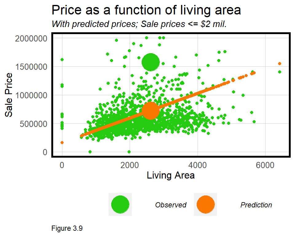 In correlation and regression, the slope of the linear relationship between
 SalePrice and LivingArea, \(\beta _{1}\), is calculated with a ‘least squares’ line fit to the data by minimizing the squared difference between the observed SalePrice and the predicted SalePrice. The algebra used to fit this line is relatively uncomplicated and provides the slope and y-intercept.
One very special characteristic of this line is that it represents the prediction. Figure 3.9 visualizes the observed relationship between SalePrice and LivingArea in green along with the resulting sale price regression prediction, in orange. Note that these predictions fit perfectly on the least squares line. Two larger points are shown for the same observation to illustrate the error or residual between predicted and observed SalePrice.
The large residual difference (or error), \(\varepsilon_{i}\), between the orange and green points, suggests that while LivingArea is a good predictor, other features are needed to make a more robust prediction.
3.3.1 Our first regression model
In R, OLS regression is performed with the lm or ‘linear model’ function. The dependent variable SalePrice, is modeled as a function of (~) LivingArea and output as an lm object called livingReg. The summary function is used to see the results of the regression.
livingReg <- lm(SalePrice ~ LivingArea, data = boston)

summary(livingReg)| SalePrice | |
| LivingArea | 216.539*** (14.466) |
| Constant | 157,968.300*** (35,855.590) |
| N | 1,485 |
| R2 | 0.131 |
| Adjusted R2 | 0.131 |
| Residual Std. Error | 563,811.900 (df = 1483) |
| F Statistic | 224.077*** (df = 1; 1483) |
| ⋆p<0.1; ⋆⋆p<0.05; ⋆⋆⋆p<0.01 | |
The actual summary looks different from the regression output above. The Intercept or ‘Constant’ is the value of SalePrice if living area was 0. In many instances, including this one, the Intercept interpretation is not particularly useful.
The estimated coefficient for LivingArea, is 216.54. The interpretation is that, “On average, a one foot increase in living area is associated with a $216.54 increase in sale price”. Note that the coefficient is on the scale of the dependent variable, dollars.
The Std. Error refers to the standard error of the coefficient and is a measure of precision. The best way to interpret the standard error is in the context of the coefficient. If the standard errors are large relative to the coefficient, then the coefficient may not be reliable.
The p-value is a more direct way to measure if the coefficient is reliable and is a standard measure of statistical significance.23 It is a hypothesis test based on the ‘null hypothesis’ that there is no relationship between SalePrice and LivingArea. If the p-value is say, 0.05, then there is 5% probability that the null hypothesis was mistakenly rejected. In other words, we can be 95% confident that our coefficient estimation is reliable, and thus a useful predictor of SalePrice.24 In the regression summary, the p-values are labeled with asterisks (*) and referenced with a legend at the bottom of the output.
The final component of the regression summary is (Adjusted) R^2 - a common regression ‘goodness of fit’ indicator that describes how well the features explain the outcome. R^2 runs from 0 to 1 and is defined as the proportion of variation in the dependent variable, SalePrice, that is explained by the linear combination of the features. R^2 is interpreted on a percentage basis, so in this model, LivingArea explains roughly 13% of the variation in price.25
The ‘proportion of variation’ interpretation is useful for comparing across models. R^2 is also linear, so a model with an R^2 of 0.80 accounts for twice as much variation as a model with an R^2 of 0.40. Despite its interpretability, below we will learn other goodness of fit indicators better suited for prediction.
To understand how regression is used to predict, consider how coefficients relate to the regression equation. In the equation below, the \(\beta _{1}\) has been substituted for the estimated coefficient. Substitute X in the equation below, for the LivingArea of any Boston house, and a price prediction can be calculated.
\[SalePrice_{i}=157968+216.54X_{i}+\varepsilon_{i}\] Assuming a house with the mean living area, 2,262 square feet, the equation would yield the following prediction:
\[647781.50=157968+(216.54 * 2262)+\varepsilon_{i}\]
The error for this model, \(\varepsilon_{i}\), is high given that only 13% of the variation in SalePrice has been explained. These errors are explored in detail below, but for now, more features are added to reduce the error and improve the model.26 lm does not take sf layers as an input, so geometries are dropped from boston.sf. Only certain variables are selected for the model, which is useful syntax for quickly adding and subtracting features.
reg1 <- lm(SalePrice ~ ., data = st_drop_geometry(boston.sf) %>%
                                 dplyr::select(SalePrice, LivingArea, Style,
                                               GROSS_AREA, R_TOTAL_RM, NUM_FLOORS,
                                               R_BDRMS, R_FULL_BTH, R_HALF_BTH,
                                               R_KITCH, R_AC, R_FPLACE))
summary(reg1)| SalePrice | |
| LivingArea | 609.346*** (48.076) |
| StyleCape | -140,506.900* (79,096.260) |
| StyleColonial | -343,096.200*** (78,518.600) |
| StyleConventional | -261,936.800*** (84,123.070) |
| StyleDecker | -365,755.900*** (102,531.300) |
| StyleDuplex | -183,868.500 (128,816.900) |
| StyleRaised Ranch | -390,167.100*** (109,706.600) |
| StyleRanch | -92,823.330 (95,704.750) |
| StyleRow End | -68,636.710 (98,864.510) |
| StyleRow Middle | 172,722.600* (100,981.400) |
| StyleSemi?Det | -274,146.000*** (96,970.880) |
| StyleSplit Level | -232,288.100 (168,146.100) |
| StyleTri?Level | -803,632.100** (408,127.000) |
| StyleTudor | -394,103.100 (408,553.700) |
| StyleTwo Fam Stack | -147,538.200* (84,835.410) |
| StyleUnknown | -656,090.500** (291,530.300) |
| StyleVictorian | -507,379.700*** (130,751.100) |
| GROSS_AREA | -206.257*** (29.108) |
| R_TOTAL_RM | -19,589.190** (8,268.468) |
| NUM_FLOORS | 163,990.700*** (38,373.070) |
| R_BDRMS | -33,713.420*** (11,174.750) |
| R_FULL_BTH | 179,093.600*** (23,072.960) |
| R_HALF_BTH | 85,186.150*** (22,298.990) |
| R_KITCH | -257,206.200*** (33,090.900) |
| R_ACD | -203,205.700 (401,281.500) |
| R_ACN | -108,018.900*** (35,149.110) |
| R_ACU | 487,882.600*** (127,385.500) |
| R_FPLACE | 172,366.200*** (16,240.410) |
| Constant | 294,677.700*** (90,767.260) |
| N | 1,485 |
| R2 | 0.571 |
| Adjusted R2 | 0.563 |
| Residual Std. Error | 399,781.200 (df = 1456) |
| F Statistic | 69.260*** (df = 28; 1456) |
| ⋆p<0.1; ⋆⋆p<0.05; ⋆⋆⋆p<0.01 | |
These additional features now explain 56% of the variation in price, a significant improvement over livingReg. Many more coefficients are now estimated, including the architectural Style feature, which R automatically converts to many categorical features. These ‘dummy variables’ or ‘fixed effects’ as they are called, hypothesize a statistically significant difference in price across each Style category relative to a reference category - Bungalow (levels(boston.sf$Style)). More intuition for fixed effects is provided in the next chapter.
3.3.2 More feature engineering & colinearity
Before going forward, this section further emphasizes two critical concepts, feature engineering and colinearity. Beginning with feature engineering, reg1 estimates the effect of NUM_FLOORS encoded as a continuous feature. table(boston$NUM_FLOORS) shows that houses have between 0 and 5 floors, and some have half floors. What happens when this feature is re-engineered as categorical? The below mutate does just this with case_when, a more nuanced ifelse.
boston.sf <-
  boston.sf %>%
  mutate(NUM_FLOORS.cat = case_when(
                  NUM_FLOORS >= 0 & NUM_FLOORS < 3  ~ "Up to 2 Floors",
                  NUM_FLOORS >= 3 & NUM_FLOORS < 4  ~ "3 Floors",
                  NUM_FLOORS > 4                    ~ "4+ Floors"))
The newly recoded NUM_FLOORS.cat feature is input into reg2 below. In the results (not pictured), R automatically removed 3 Floors as the reference. The remaining two groups are statistically significant. More importantly, judging from the increase in Adjusted R^2, this marginal amount of feature engineering added significant predictive power to the model.
reg2 <- lm(SalePrice ~ ., data = st_drop_geometry(boston.sf) %>%
                                 dplyr::select(SalePrice, LivingArea, Style,
                                               GROSS_AREA, R_TOTAL_RM, NUM_FLOORS.cat,
                                               R_BDRMS, R_FULL_BTH, R_HALF_BTH, R_KITCH,
                                               R_AC, R_FPLACE))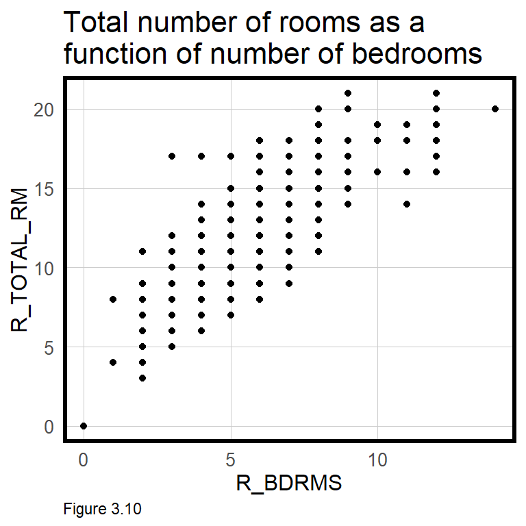
More now on colinearity, as Figure 3.10 indicates a strong (and obvious) correlation between total number of rooms, R_TOTAL_RM, and number of bedrooms R_BDRMS. In reg2, R_BDRMS is significant, but R_TOTAL_RM is not. These two features are ‘colinear’, or correlated with one another, so if both are input into the regression, one is insignificant. In such an instance, retain the feature that leads to a more accurate and generalizable model.
As the crime features are also colinear, only one should be entered in the model. Try iteratively entering each of the crime features into the regression in addition to reg2. crimes.Buffer seems to have the greatest predictive impact. A model (not pictured) suggests that conditional on the other features, an additional crime within the 1/8th mile buffer is associated with an average price decrease of -$4,390.82.
Although the correlation plots in Figure 3.7 suggested little correlation between crime and price, once other variables are controlled for in a multivariate regression, crime becomes significant.
Thus far, our most accurate model (with crimes.buffer) explains just 64% of the variation in SalePrice. In chapter 4, new geospatial features are added to increase the model’s predictive power. In the final section of this chapter however, cross-validation and a new set of goodness of fit metrics are introduced.
3.4 Cross-validation & return to goodness of fit
Generalizability is the most important concept for the public-sector data scientist, defined in section 3.1.1 as a model that can 1) predict accurately on new data and 2) predict accurately across different group contexts, like neighborhoods. In this section, the first definition is explored.
Note that R^2 judges model accuracy on the data used to train the model. Like the age prediction robot, this is not an impressive feat. A higher bar is set below by randomly splitting boston.sf into boston.training and boston.test datasets, training a model on the former and testing on the latter. New goodness of fit indicators are introduced, and we will see how validation on new data is a better way to gauge accuracy and generalizability. This ultimately helps dictate how useful a model is for decision-making.
3.4.1 Accuracy - Mean Absolute Error
Below, the createDataPartition function randomly splits boston.sf into a 60% boston.training dataset and a 40% boston.test dataset.27 Note that the air conditioning feature, R_AC, contains three possible categories, and D appears just once in the data (table(boston.sf$R_AC)). The D observations must be moved into the training set or removed altogether, otherwise, no \(\beta\) coefficient would be estimated, and the model would fail to predict. The parameter y balances factors for three such categories across training and test sets.
Another model is then estimated on the training set, reg.training.
inTrain <- createDataPartition(
              y = paste(boston.sf$NUM_FLOORS.cat, boston.sf$Style, boston.sf$R_AC),
              p = .60, list = FALSE)
boston.training <- boston.sf[inTrain,]
boston.test <- boston.sf[-inTrain,]

reg.training <- lm(SalePrice ~ ., data = st_drop_geometry(boston.training) %>%
                                    dplyr::select(SalePrice, LivingArea, Style,
                                               GROSS_AREA, NUM_FLOORS.cat,
                                               R_BDRMS, R_FULL_BTH, R_HALF_BTH,
                                               R_KITCH, R_AC, R_FPLACE,
                                               crimes.Buffer))
Three new fields are created in boston.test. SalePrice.Predict is the sale price prediction calculated using reg.training to predict onto boston.test. The SalePrice.Error and SalePrice.AbsError calculate differences in predicted and observed prices. Absolute values (abs) may be suitable if over or under-predictions are less of a concern. SalePrice.APE is the ‘Absolute Percent Error’ - the difference between predicted and observed prices on a percentage basis. Any sale with a price greater than $5 million is removed from boston.test.
Keep in mind, these statistics reflect how well the model predicts for data it has never seen before. Relative to R^2, which tests goodness of fit on the training data, this is a more reliable validation approach.
boston.test <-
  boston.test %>%
  mutate(SalePrice.Predict = predict(reg.training, boston.test),
         SalePrice.Error = SalePrice.Predict - SalePrice,
         SalePrice.AbsError = abs(SalePrice.Predict - SalePrice),
         SalePrice.APE = (abs(SalePrice.Predict - SalePrice)) / SalePrice.Predict)%>%
  filter(SalePrice < 5000000)
Now that measures of error are attributed to each sale, some basic summary statistics describe goodness of fit. First, Mean Absolute Error (MAE) is calculated. The error is not trivial given the mean SalePrice for boston.test is $619,070.
mean(boston.test$SalePrice.AbsError, na.rm = T)## [1] 176536Next, Mean Absolute Percent Error is calculated by taking the mean SalePrice.APE. The ‘MAPE’ confirms our suspicion, suggesting the model errs by 34%.
mean(boston.test$SalePrice.APE, na.rm = T)## [1] 0.3364525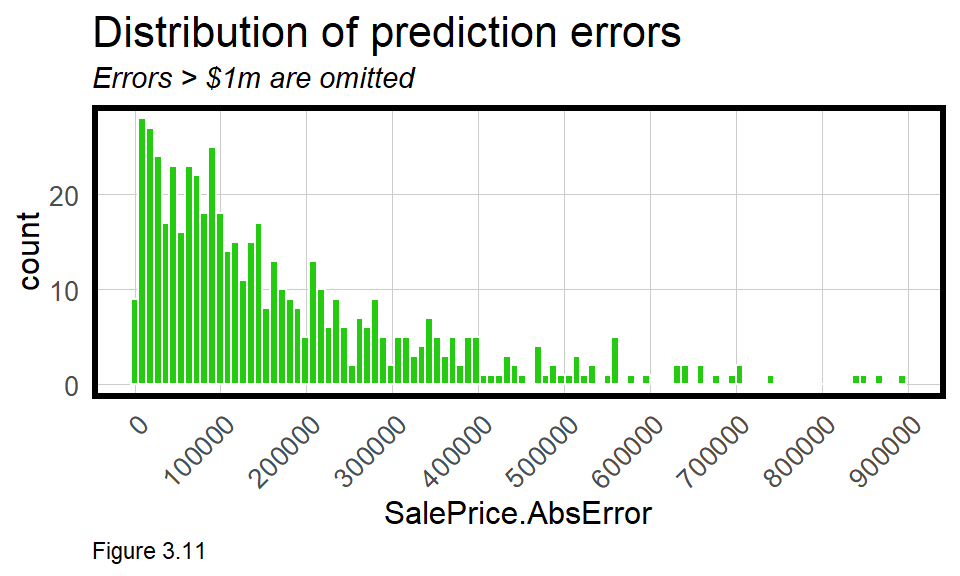
Data visualizations are also useful for diagnosing models. The geom_histogram in Figure 3.11 reveals some very high, outlying errors. In this plot, scale_x_continuous ensures x-axis labels at $100k intervals.
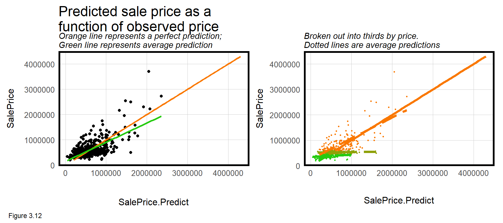
Perhaps the most useful visualization is the leftmost of Figure 3.12 which plots SalePrice as a function of SalePrice.Predict. The orange line represents a perfect fit and the green line represents the average predicted fit. If the model were perfectly fit, the green and orange lines would overlap. The deviation suggests that across the range of prices, model predictions are slightly higher than observed prices, on average.
That is not the entire story, however. The rightmost panel in Figure 3.12 is the same as the left, but divides prices in to three groups to show that the extent of over-prediction is much higher for lower-priced sales. A good machine learner will use diagnostic plots like these to understand what additional features may be helpful for improving the model. Here the lesson is more features are needed to account for lower prices.
3.4.2 Generalizability - Cross-validation
Predicting for a single hold out test set is a good way to gauge performance on new data, but testing on many holdouts is even better. Enter cross-validation.
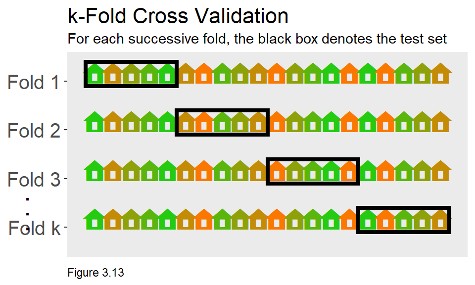
Cross-validation ensures that the goodness of fit results for a single hold out is not a fluke. While there are many forms of cross-validation, Figure 3.13 visualizes an algorithm called ‘k-fold’ cross-validation, which works as such:
- Partition the
boston.sfdata frame into k equal sized subsets (also known as “folds”). - For a given fold, train on a subset of observations, predict on a test set, and measure goodness of fit.
- Average goodness of fit across all k folds.
The caret package and the train function is used for cross-validating. Below, a parameter called fitControl is set to specify the number of k-fold partitions - in this case 100. In the code below, set.seed ensures reproducible folds. An object reg.cv, is estimated using the same regression as specified in reg.training.
fitControl <- trainControl(method = "cv", number = 100)
set.seed(825)

reg.cv <-
  train(SalePrice ~ ., data = st_drop_geometry(boston.sf) %>%
                                dplyr::select(SalePrice,
                                LivingArea, Style, GROSS_AREA,
                                NUM_FLOORS.cat, R_BDRMS, R_FULL_BTH,
                                R_HALF_BTH, R_KITCH, R_AC,
                                R_FPLACE, crimes.Buffer),
     method = "lm", trControl = fitControl, na.action = na.pass)

reg.cv
## Linear Regression
##
## 1485 samples
## 11 predictor
##
## No pre-processing
## Resampling: Cross-Validated (100 fold)
## Summary of sample sizes: 1471, 1469, 1470, 1471, 1471, 1469, ...
## Resampling results:
##
## RMSE Rsquared MAE
## 272949.7 0.4866642 181828.1
##
## Tuning parameter 'intercept' was held constant at a value of TRUEThe cross-validation output provides very important goodness of fit information. The value of each metric is actually the mean value across all folds. The train function returns many objects (names(reg.cv)), one of which is resample which provides goodness of fit for each of the 100 folds. Below, the first 5 are output.
reg.cv$resample[1:5,]## RMSE Rsquared MAE Resample
## 1 183082.9 0.4978145 138100.8 Fold001
## 2 580261.8 0.9449456 299042.0 Fold002
## 3 314298.3 0.1778472 217442.4 Fold003
## 4 441588.1 0.7750248 250324.4 Fold004
## 5 193053.7 0.4765171 138188.8 Fold005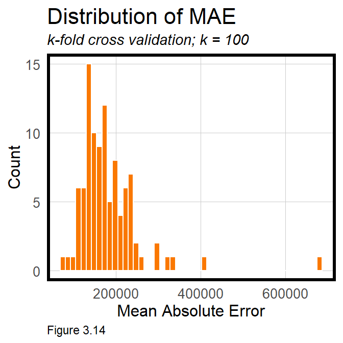
mean(reg.cv$resample[,3]) returns the mean for all 100 MAE observations, which should be exactly the same as the average MAE shown above.
If the model is generalizable to new data, we should expect comparable goodness of fit metrics across each fold. There are two ways to see if this is true. The first is simply by taking the standard deviation, sd, of the MAE across all folds. $74,391 suggests significant variation across folds. This variation can also be visualized with a histogram of across-fold MAE. If the model generalized well, the distribution of errors would cluster tightly together. Instead, this range of errors suggests the model predicts inconsistently, and would likely be unreliable for predicting houses that have not recently sold. This is an important connection for readers to make.
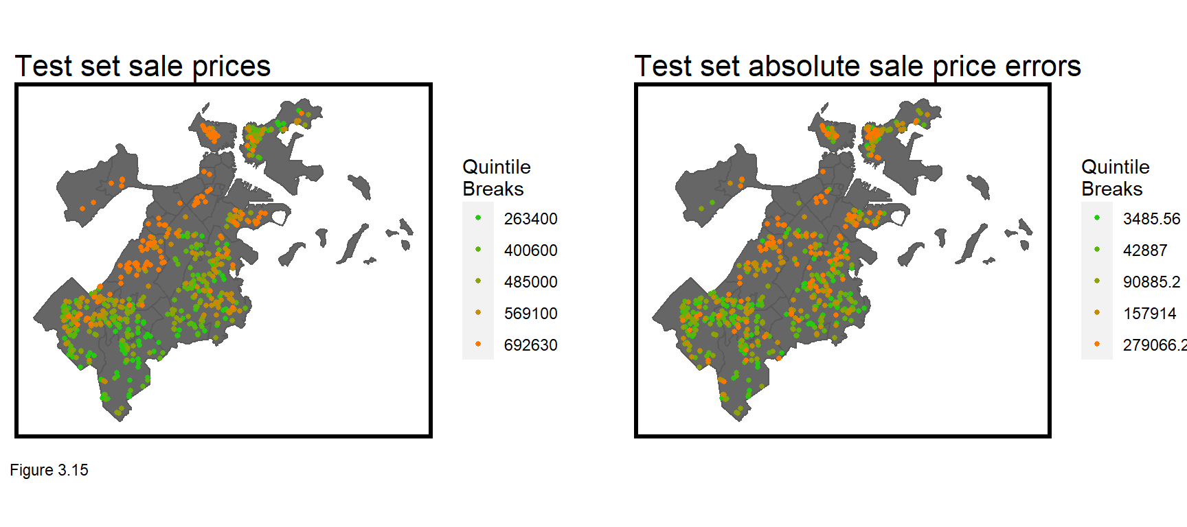
One reason the model may not generalize to new data is that it is simply not powerful enough, as indicated by the high MAE. Figure 3.15 below maps sale prices and absolute errors for boston.test. What do you notice about the errors? Do they look like random noise or are they systematically distributed across space? What is the spatial process behind these errors? These questions will be explored in the next chapter.
3.5 Conclusion - Our first model
In this chapter, geospatial machine learning was introduced by way of home price prediction, an important use case for local governments that use prediction to assess property taxes. The goal of geospatial machine learning is to ‘borrow the experience’ of places where data exists (the training set) and test whether that experience generalizes to new places (the test set). Accuracy and generalizability were introduced as two critical themes of prediction, and we will return to these frequently in the coming chapters.
If this chapter is your first exposure to regression, than I think it would be helpful to really understand key concepts before moving forward. Why is feature engineering so important? Why is identifying colinearity important? What does it mean for regression errors to be random noise? How does cross-validation help to understand generalizability?
Keep in mind that the three components of home prices that need to be modeled are internal/parcel characteristics, public services/amenities and the spatial process of prices. Omitting the spatial process lead to errors that are clearly non-random across space. Chapter 4 will teach us how to account for this missing variation.
3.6 Assignment - Predict house prices
When I teach this module to my students, the homework is a three-week long home price predictive modeling competition. I give the students a training set of prices and tax parcel ids in a city, keeping a subset of prices hidden. Students then work in pairs to wrangle these data with other open datsets, and build models with minimal errors.
Cash prizes are awarded for the top two best performing teams and a third prize for data visualization and R markdown presentation. Unless you are taking my class, I have no cash for you (sorry to say), but that should not stop you from replicating this analysis on any number of open home sale datasets across the country.
Your focus should not only be on developing an accurate and generalizable model but on presenting the work flow for a non-technical decision-maker.
“1925 Plan for Cincinnati, Chapter 1, Community Development”↩︎
This definition of generalizability should be familiar to social scientists who look for ‘external validity’ - meaning their conclusions can be applied in settings outside of the current study.↩︎
There are some key assumptions of the hedonic model, including that all buyers and sellers have access to the same market information; and that all buyers share the same preferences for goods like school quality. The model can also be used for goods other than housing. See Greenstone, M. (2017). The continuing impact of Sherwin Rosen’s “Hedonic prices and implicit markets: product differentiation in pure competition”. Journal of Political Economy, 125(6), 1891-1902.↩︎
Analyze Boston - Crime Incident Reports - https://data.boston.gov/dataset/crime-incident-reports-august-2015-to-date-source-new-system↩︎
I provide a very remedial definition of p-value. Interestingly, many statisticians struggle to define it. For more on this, see: Aschwanden, Christie (2015). Not even scientists can easily explain p-values. FiveThirtyEight. http://fivethirtyeight.com/features/not-even-scientists-can-easily-explain-p-values/↩︎
A p-value of 0.05 is the typical threshold of statistical significance, but the appropriate threshold of p depends on the context for the test. Strong statistical significance is indicative of a strong predictive feature, but features with p-values greater than 0.05 may also help predict. The only way to know is to assess model accuracy and generalizability with and without a given feature.↩︎
Interestingly, the Pearson Correlation, r, for
LivingAreawas estimated to be 0.36. Squaring that value gives the R^2 estimated for this regression.↩︎When 2+ features are added to the regression, the two-dimensional scatterplot now becomes an n-dimensional ‘scatter-cloud’. The least squares approach still seeks to minimize the errors between the predicted fit and observed values.↩︎
As
createDataPartitionrandomly partitions the data, the reader’s partition (and results) will be different than the one presented here.↩︎