Chapter 8 Predicting rideshare demand
8.1 Introduction - ride share
This last chapter returns to spatial problem solving to predict space/time demand for ride share in Chicago. Companies like Uber & Lyft generate and analyze tremendous amounts of data to incentivize ride share use; to employ dynamic or ‘surge’ pricing; to solve routing problems; and to forecast ride share demand to minimize driver response times. This last use case is the focus of this chapter.
The model developed here is similar to the other geospatial machine learning models built thus far, with two exceptions. First, this chapter focuses on time effects, adding additional complexity to our models, and two, social costs are less important here than they have been in previous chapters.
We have dealt with time once previously. Recall the Predictive Policing algorithm was trained on 2017 burglaries and validated on 2018 (5.5.4). Here, time was not an explicit parameter in the model. Instead, it was assumed that the 2017 burglary experience generalized to 2018.
To forecast ride share, time must be explicitly accounted for. Conceptually, modeling time is not all that different from modeling space. Spatial autocorrelation posits that values here are in part, a function of nearby values. In the case of temporal or ‘serial correlation’, a similar hypothesis can be posited - that the value now is in part, a function of values in the past.
There are many examples of serial correlation. Gas prices today are related to gas prices yesterday. Same with stock prices, traffic, and daily temperatures. Just as an understanding of the underlying spatial process is the key to a strong spatial model, the key to a strong time series model is an understanding of the underlying temporal process.
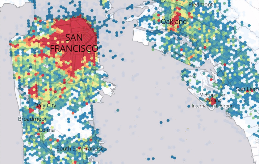
Figure 8.1, Source: https://eng.uber.com/forecasting-introduction/
Uber describes its Marketplace Algorithm as one that, “enables us to predict user supply and demand in a spatio-temporal fine granular fashion to direct driver-partners to high demand areas before they arise, thereby increasing their trip count and earnings.”67 They go on to remark, “Spatio-temporal forecasts are still an open research area.” Figure 8.1 provides an example from the quoted Uber Engineering blog.
In a word, this is a dispatch problem, and there are two general approaches to consider. The more naive is to route drivers in response to space/time demand spikes as they emerge in real time. The problem with this approach is that by the time drivers reach a hot spot, the spike may have ended. Not only might this improperly allocate vehicles in the short run, but feedback effects may increase response times to other parts of the city in the long run.
The second approach is to generalize from recent ride share experiences to predict demand in the near future. Take rush hour for example - demand occurs in the same locations at the same times, Monday through Friday. Thus, rush hour demand on Tuesday can be used to predict rush hour demand on Wednesday.
An actual ride share forecast would likely predict trip demand or Trip_Count for very high resolution space/time intervals, like for every 5 minutes for every 100x100 ft. fishnet grid cell. Our model will take a low resolution approach, reducing millions of Chicago ride share trips from November through December, 2018, into a 20% subsample and aggregating to hourly intervals and a subset of Chicago Census tracts.
We will learn new approaches for manipulating temporal data and creating time-based features using the lubridate package. We also learn the purrr family of functions to loop through the validation of many different regressions. Data is wrangled in the next section. Exploratory Analysis then analyzes space/time patterns in the data. The final section trains and validates a space/time forecast.
8.2 Data Wrangling - ride share
Begin by loading the required libraries and functions. The ride share data is then read in and wrangled along with weather data. Ride share trip data is then wrangled into a complete ‘panel’ of observations that include every possible space/time combination.
library(tidyverse)
library(sf)
library(lubridate)
library(tigris)
library(gganimate)
library(riem)
library(gridExtra)
library(knitr)
library(kableExtra)

options(tigris_class = "sf")
source("https://raw.githubusercontent.com/urbanSpatial/Public-Policy-Analytics-Landing/master/functions.r")

palette5 <- c("#eff3ff","#bdd7e7","#6baed6","#3182bd","#08519c")
palette4 <- c("#D2FBD4","#92BCAB","#527D82","#123F5A")
palette2 <- c("#6baed6","#08519c")
The ride share data for November and December 2018 is read in. These data exist on the Chicago Open Data portal, but because they are so large, querying with the API can take a very long time.68 Instead, the data below is a ~20% sample (n = ~1.793 million rows) of the original data.
root.dir = "https://raw.githubusercontent.com/urbanSpatial/Public-Policy-Analytics-Landing/master/DATA/"
ride <- read.csv(file.path(root.dir,"Chapter8/chicago_rideshare_trips_nov_dec_18_clean_sample.csv"))
To keep the data size manageable, only 3 pertinent fields are included in the data and defined in the table below.
| Variable_Name | Description |
|---|---|
| Trip.Start.Timestamp | Date/time trip started |
| Pickup.Census.Tract | Census Tract origin |
| Dropoff.Census.Tract | Census Tract destination |
|
|
|
| Table 8.1 |
8.2.1 Lubridate
Next, temporal data wrangling is performed using the fantastically simple lubridate package. One of the more powerful features of lubridate is its ability to standardize date/time stamps. In the code block below, a list contains my birthday written four different ways. Subjecting that list to the ymd function miraculously standardizes three of the four items.
ymd(c("1982-09-06", "1982-Sep-6", "1982-Sept-06", "1982-Sept-six"))## [1] "1982-09-06" "1982-09-06" "1982-09-06" NAymd is a one of several components of the parse_date_time function. As below, these functions standardize the Trip.Start.Timestamp field (when a trip departed) into the 60 minute and 15 minute intervals needed for our analysis. Functions like week, wkday and hour convert the data/time stamp into week of the year, day of the week, and hour of the day, respectively.
Two Pickup.Census.Tract units for Chicago’s O’Hare International Airport are dropped. Surely ride share companies forecast airport demand, but they likely employ additional features/models that account for takeoff and landing patterns.
ride2 <-
  ride %>%
  mutate(interval60 = floor_date(mdy_hms(Trip.Start.Timestamp), unit = "hour"),
         interval15 = floor_date(mdy_hms(Trip.Start.Timestamp), unit = "15 mins"),
         week = week(interval60),
         dotw = wday(interval60, label=TRUE),
         Pickup.Census.Tract = as.character(Pickup.Census.Tract),
         Dropoff.Census.Tract = as.character(Dropoff.Census.Tract)) %>%
  filter(Pickup.Census.Tract != "17031980000" & Pickup.Census.Tract != "17031770602")

ride2[1:3, c(1,4:7)]
## Trip.Start.Timestamp interval60 interval15 week dotw
## 1 12/07/2018 04:30:00 PM 2018-12-07 16:00:00 2018-12-07 16:30:00 49 Fri
## 2 12/30/2018 06:00:00 PM 2018-12-30 18:00:00 2018-12-30 18:00:00 52 Sun
## 3 11/24/2018 07:45:00 AM 2018-11-24 07:00:00 2018-11-24 07:45:00 47 Sat8.2.2 Weather data
One might reasonably assume that inclement weather in the Windy City would incentivize ride share. There once were a host of open weather data APIs available to the rstats community, but that changed when IBM bought Weather Company and Weather Underground, two giant aggregators of weather data. Recently, the good people at the Iowa Environment Mesonet released the riem package69, which provides free space/time weather data.
The riem_measures function downloads weather.Data for O’Hare Airport between November 1, 2018 and January 1, 2019. Note that the O’Hare weather station sufficiently provides temporal weather for all of Chicago.
weather.Data <-
  riem_measures(station = "ORD", date_start = "2018-11-01", date_end = "2019-01-01")
In this chapter, several ‘panel’ datasets are created. A panel is long form data, typically giving repeat observations for particular items. An example would be a dataset tracking student grades over time. Here, each row would represent a student/year pair. Every twelve rows would represent one student’s grades across twelve years of schooling.
Below a weather.Panel is generated to summarize temperature, precipitation, and wind speed for every hour between November and December. In the code block, mutate_if and replace_na converts any character or numeric field with NA to 0. The first mutate function creates interval60 by converting the date/time stamp, valid, from 5 minute intervals to 60 minute intervals. Note what ?substr does. Then group_by each hour (interval60) to summarize a final set of hourly weather indicators.
Below the weather data is plotted as a time series using grid.arrange.
weather.Panel <-
  weather.Data %>%
    mutate_if(is.character, list(~replace(as.character(.), is.na(.), "0"))) %>%
    replace(is.na(.), 0) %>%
    mutate(interval60 = ymd_h(substr(valid, 1, 13))) %>%
    mutate(week = week(interval60),
           dotw = wday(interval60, label=TRUE)) %>%
    group_by(interval60) %>%
    summarize(Temperature = max(tmpf),
              Percipitation = sum(p01i),
              Wind_Speed = max(sknt)) %>%
mutate(Temperature = ifelse(Temperature == 0, 42, Temperature))grid.arrange(top = "Weather Data - Chicago - November & December, 2018",
ggplot(weather.Panel, aes(interval60,Percipitation)) + geom_line() +
labs(title="Percipitation", x="Hour", y="Percipitation") + plotTheme(),
ggplot(weather.Panel, aes(interval60,Wind_Speed)) + geom_line() +
labs(title="Wind Speed", x="Hour", y="Wind Speed") + plotTheme(),
ggplot(weather.Panel, aes(interval60,Temperature)) + geom_line() +
labs(title="Temperature", x="Hour", y="Temperature") + plotTheme())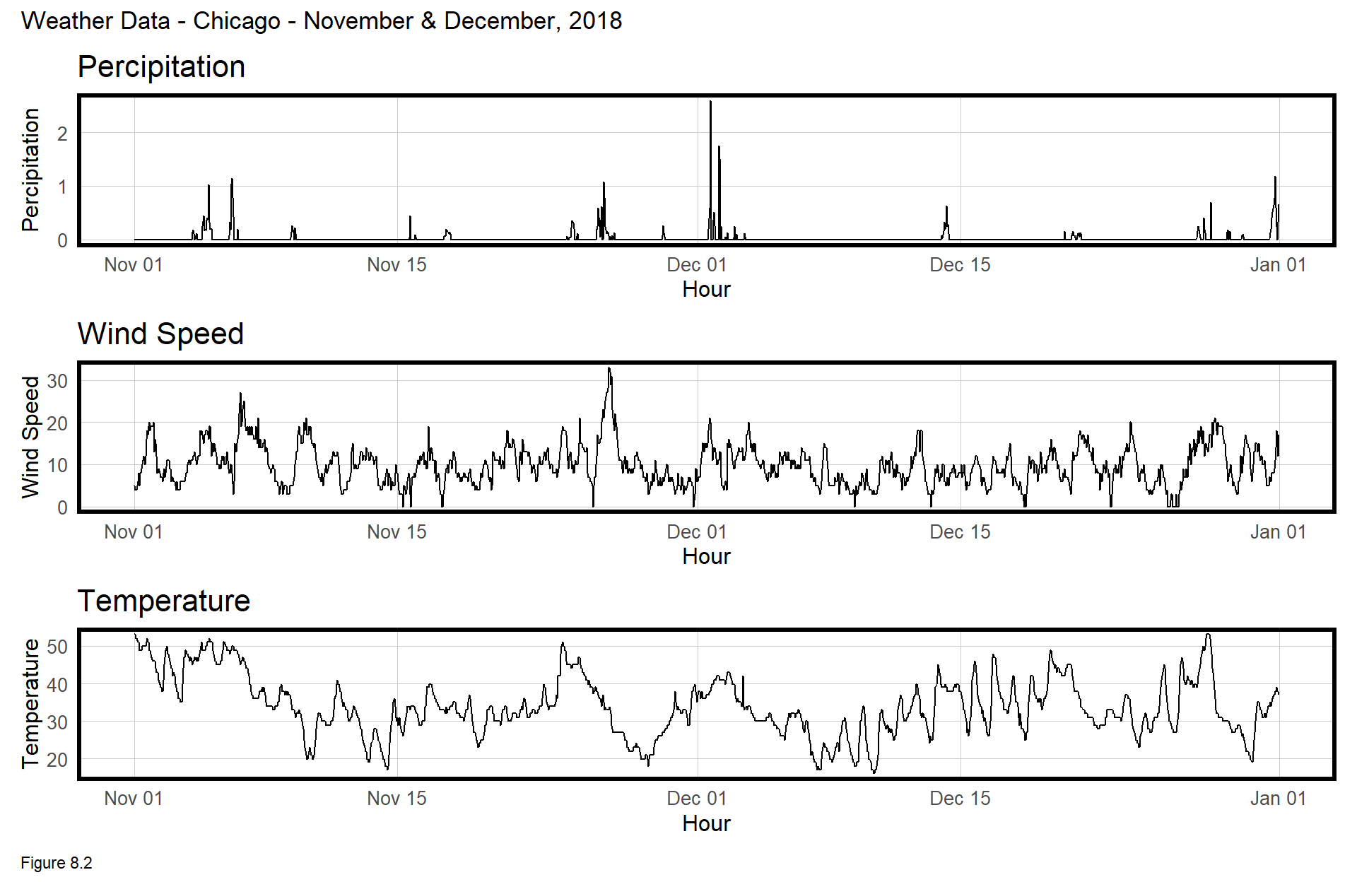
8.2.3 Subset a study area using neighborhoods
A ride share forecast for every Cook County tract, for every hour, for 8 weeks, would yield a time/space panel (data frame) consisting of nrow(chicagoTracts) * 24 * 7 * 8 = 1,771,392 rows. A regression that size will melt your laptop. Instead, 201 Census tracts are subset across Chicago’s downtown, the Loop, up through Wrigleyville and Lincoln Square.
The code block below pulls all tract geometries from the tigris package, loads a neighborhood geojson and subsets those found in a neighborhoodList. st_intersection then finds studyArea.tracts. The plot below maps studyArea.tracts relative to chicagoTracts.
chicagoTracts <-
  tigris::tracts(state = "Illinois", county = "Cook") %>%
  dplyr::select(GEOID) %>% filter(GEOID != 17031990000)

neighborhoodList <-
  c("Grant Park","Printers Row","Loop","Millenium Park","West Loop","United Center",
    "West Town","East Village","Ukranian Village","Wicker Park","River North",
    "Rush & Division","Streeterville","Gold Coast","Old Town","Bucktown","Lincoln Park",
    "Sheffield & DePaul","Lake View","Boystown","Wrigleyville","North Center","Uptown",
    "Lincoln Square","Little Italy, UIC")

nhoods <-
  st_read("https://data.cityofchicago.org/api/geospatial/bbvz-uum9?method=export&format=GeoJSON") %>%
  st_transform(st_crs(chicagoTracts)) %>%
  filter(pri_neigh %in% neighborhoodList)

studyArea.tracts <-
  st_intersection(chicagoTracts, st_union(nhoods))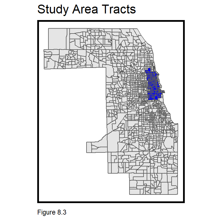
8.2.4 Create the final space/time panel
The dataset for this analysis must be a complete panel with an observation for every possible space/time combination. The ride2 data frame is incomplete as some space/time intervals saw no trips. In the code blocks below, the panel is completed by finding all unique space/time intervals and inserting 0 trips where necessary. Additional feature engineering is also performed.
The complete study.panel includes 8 weeks of ride share trips. How many total space/time combinations exist over 8 weeks? 24 hours a day * 7 days a week * 8 weeks = 1,344 possible time units. That multiplied by 201 tracts in studyArea.tracts = 270,144 unique space/time units. Thus, the final data frame must also have precisely this many rows.
The first step is ride.template which filters for the 8 weeks of interest and uses semi_join to return only those trips in the studyArea.tracts. A quick calculation shows ride.template captures all the needed unique space/time units.
ride.template <-
  filter(ride2, week %in% c(45:52)) %>%
  semi_join(st_drop_geometry(studyArea.tracts),
            by = c("Pickup.Census.Tract" = "GEOID"))

length(unique(ride.template$interval60)) * length(unique(ride.template$Pickup.Census.Tract))
## [1] 270144An empty data frame, study.panel, is then created with the complete space/time panel. This is done using the expand.grid function and unique. nrow shows that the space/time count is still correct.
study.panel <-
  expand.grid(interval60 = unique(ride.template$interval60),
              Pickup.Census.Tract = unique(ride.template$Pickup.Census.Tract))

nrow(study.panel)
## [1] 270144The final ride.panel is created by merging space/time intervals from actual trips in ride.template with intervals that saw no trips in study.panel.
A Trip_Counter is created in ride.template giving 1 for each trip. right_join then returns non-trip space/time intervals from study.panel. If a trip occurred at a given interval, Trip_Counter returns 1, otherwise NA. Trips are then grouped by each space/time interval and Trip_Count is set equal to the sum of Trip_Counter. na.rm = T prevents sum from returning NA.
Next, the weather.Panel and studyArea.tracts are joined to provide weather and geometry information, respectively. Finally, features denoting week and day of the week are created with lubridate.
The output is a complete panel. Note that nrow(ride.template) == sum(ride.panel$Trip_Count) == TRUE.
ride.panel <-
  ride.template %>%
    mutate(Trip_Counter = 1) %>%
    right_join(study.panel) %>%
      group_by(interval60, Pickup.Census.Tract) %>%
      summarize(Trip_Count = sum(Trip_Counter, na.rm=T)) %>%
      left_join(weather.Panel, by = "interval60") %>%
        left_join(studyArea.tracts, by = c("Pickup.Census.Tract" = "GEOID")) %>%
          mutate(week = week(interval60),
                 dotw = wday(interval60, label = TRUE)) %>%
          st_sf()
To test for serial (temporal) correlation, additional feature engineering creates time lags. arrange sorts the data by space then time; group_by groups by tract, and lag returns the Trip-Count for the previous nth time period.
ride.panel <-
  ride.panel %>%
    arrange(Pickup.Census.Tract, interval60) %>%
    group_by(Pickup.Census.Tract) %>%
    mutate(lagHour = dplyr::lag(Trip_Count,1),
           lag2Hours = dplyr::lag(Trip_Count,2),
           lag3Hours = dplyr::lag(Trip_Count,3),
           lag4Hours = dplyr::lag(Trip_Count,4),
           lag12Hours = dplyr::lag(Trip_Count,12),
           lag1day = dplyr::lag(Trip_Count,24)) %>%
   ungroup()

as.data.frame(filter(
    ride.panel, Pickup.Census.Tract == "17031831900"))[1:6, c(1:3,10:11)]
## interval60 Pickup.Census.Tract Trip_Count lagHour lag2Hours
## 1 2018-11-05 00:00:00 17031831900 2 NA NA
## 2 2018-11-05 01:00:00 17031831900 2 2 NA
## 3 2018-11-05 02:00:00 17031831900 0 2 2
## 4 2018-11-05 03:00:00 17031831900 0 0 2
## 5 2018-11-05 04:00:00 17031831900 0 0 0
## 6 2018-11-05 05:00:00 17031831900 3 0 08.2.5 Split training and test
How might generalizability be tested for in this use case? Random k-fold cross-validation or spatial cross-validation (5.5.1) both seem reasonable. LOGO-CV could even be used to cross-validate in time, across hours, days, or days of the week.
Here, a time series approach is taken, training on 5 weeks of data, weeks 45-49, and testing on the following 3 weeks, 50-52. If the time/space experience is generalizable, it can be used to project into the near future. The below code splits the data by week.
ride.Train <- filter(ride.panel, week < 50)
ride.Test <- filter(ride.panel, week >= 50)
8.2.6 What about distance features?
Why not measure exposure or distance to points of interest, as we have in previous chapters? It seems reasonable for instance, that ride share trips would decline as distance to subway stations decline, as riders trade-off car trips for transit. Why not account for this? Check out the table below.
| time | tract | Distance_to_subway | Trip_Count |
|---|---|---|---|
| 1 | 1 | 200 | 10 |
| 2 | 1 | 200 | 13 |
| 3 | 1 | 200 | 18 |
| 4 | 1 | 200 | 22 |
| 5 | 1 | 200 | 24 |
| 1 | 2 | 1890 | 45 |
| 2 | 2 | 1890 | 62 |
| 3 | 2 | 1890 | 89 |
| 4 | 2 | 1890 | 91 |
| 5 | 2 | 1890 | 100 |
|
|
|||
| Table 8.2 |
The first two columns in the table are examples of a short, 2 space/time interval panel. Note the similarity between Distance_to_subway and tract and note the coefficient on Distance_to_subway when it is included in a regression with time and tract.
The missing coefficient reflects the fact that Distance_to_Subway is perfectly colinear with tract. The lesson is that these exposure variables are not needed for panel data, when Pickup.Census.Tract is controlled for directly. It may be hard to conceptualize, but controlling for tract-level variation in part, controls for exposure to points of interest.
| Trip_Count | |
| time | 8.800*** (2.248) |
| tract | 60.000*** (6.359) |
| Distance_to_subway | |
| Constant | -69.000*** (12.107) |
| N | 10 |
| R2 | 0.937 |
| Adjusted R2 | 0.919 |
| Residual Std. Error | 10.054 (df = 7) |
| F Statistic | 52.178*** (df = 2; 7) |
| ⋆p<0.1; ⋆⋆p<0.05; ⋆⋆⋆p<0.01 | |
8.3 Exploratory Analysis - ride share
In this section, the ride share data is explored for time, space, weather, and demographic relationships. Section 8.3.1 and 8.3.2 illustrate temporal and spatial trends, respectively, while 8.3.3 creates a space/time animation. Finally, 8.3.4 explores correlations with weather.
8.3.1 Trip_Count serial autocorrelation
Should Trip_Count exhibit serial (temporal) correlation, then the time lag features will lead to better predictions. Several tests are conducted below, beginning with a time series visualization. geom_vline is used to visualize mondays as well as Thanksgiving and Christmas (dotted lines).
There are some interesting trends to note. Most weeks exhibit remarkably comparable time series patterns with consistent peaks and troughs. This suggests the presence of serial correlation. Weeks surrounding Thanksgiving and Christmas appear as clear outliers, however.
mondays <-
  mutate(ride.panel,
         monday = ifelse(dotw == "Mon" & hour(interval60) == 1,
                         interval60, 0)) %>%
  filter(monday != 0)

tg   <- as.POSIXct("2018-11-22 01:00:00 UTC")
xmas <- as.POSIXct("2018-12-24 01:00:00 UTC")

st_drop_geometry(rbind(
  mutate(ride.Train, Legend = "Training"),
  mutate(ride.Test, Legend = "Testing"))) %>%
    group_by(Legend, interval60) %>%
      summarize(Trip_Count = sum(Trip_Count)) %>%
      ungroup() %>%
      ggplot(aes(interval60, Trip_Count, colour = Legend)) + geom_line() +
        scale_colour_manual(values = palette2) +
        geom_vline(xintercept = tg, linetype = "dotted") +
        geom_vline(xintercept = xmas, linetype = "dotted") +
        geom_vline(data = mondays, aes(xintercept = monday)) +
        labs(title="Rideshare trips by week: November-December",
             subtitle="Dotted lines for Thanksgiving & Christmas",
             x="Day", y="Trip Count") +
plotTheme() + theme(panel.grid.major = element_blank()) 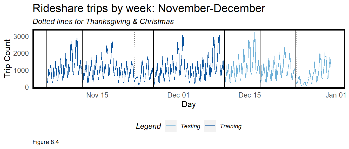
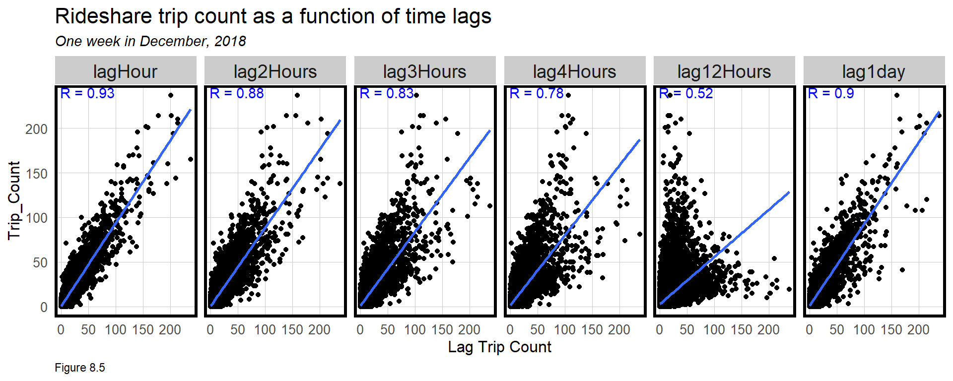
Next, the time lag features are tested for correlation with Trip_Count. plotData.lag returns the Trip_Count and time lag features for week 45. fct_relevel reorders the lag levels. Omit that line and try levels(plotData.lag$Variable).
Pearson correlation is then calculated for each Variable in correlation.lag.
plotData.lag <-
  filter(as.data.frame(ride.panel), week == 45) %>%
  dplyr::select(starts_with("lag"), Trip_Count) %>%
  gather(Variable, Value, -Trip_Count) %>%
  mutate(Variable = fct_relevel(Variable, "lagHour","lag2Hours","lag3Hours",
                                          "lag4Hours","lag12Hours","lag1day"))
correlation.lag <-
  group_by(plotData.lag, Variable) %>%
    summarize(correlation = round(cor(Value, Trip_Count, use = "complete.obs"), 2))
The very strong Trip_Count correlations are visualized below. Note that the correlation decreases with each additional lag hour, but predictive power returns with the 1 day lag. These features should be strong predictors in a model. See 5.4.1 to overlay correlation coefficients in a ggplot.
8.3.2 Trip_Count spatial autocorrelation
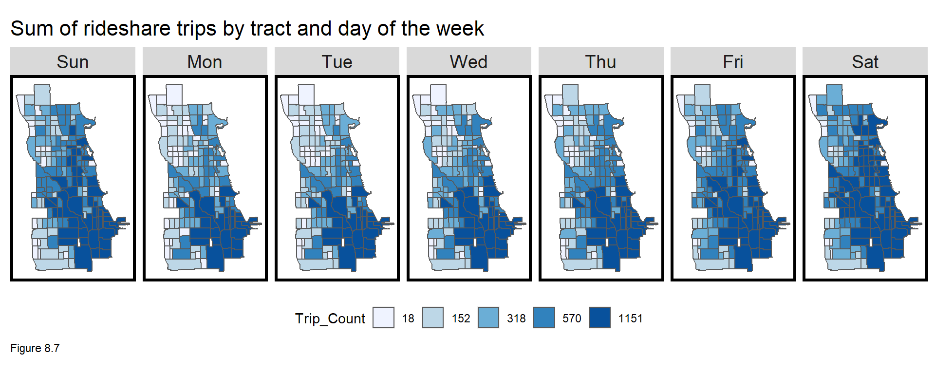
Ride share exhibits strong temporal correlation, but how about spatial autocorrelation? Figures 8.6 and 8.7 map tract Trip_Count sums by week and by day of the week, respectively. Sum is chosen over mean here to avoid tract/time pairs with 0 counts. Even during the holidays, the spatial pattern appears consistent, with trips concentrated in Chicago’s central business district, The Loop (southeastern portion of the study area).
Note the q5 function is used to map quintile breaks, but a list of labels are fed to scale_fill_manual. Set the data wrangling portion of the below code block to a temp.df and run qBr(temp.df, "Sum_Trip_Count") to get the breaks.
group_by(ride.panel, week, Pickup.Census.Tract) %>%
  summarize(Sum_Trip_Count = sum(Trip_Count)) %>%
  ungroup() %>%
  ggplot() + geom_sf(aes(fill = q5(Sum_Trip_Count))) +
    facet_wrap(~week, ncol = 8) +
    scale_fill_manual(values = palette5,
                      labels = c("16", "140", "304", "530", "958"),
                      name = "Trip_Count") +
    labs(title="Sum of rideshare trips by tract and week") +
mapTheme() + theme(legend.position = "bottom") 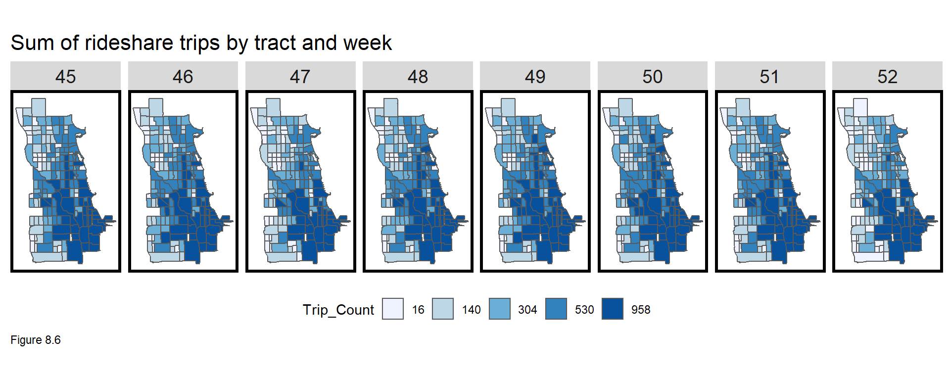
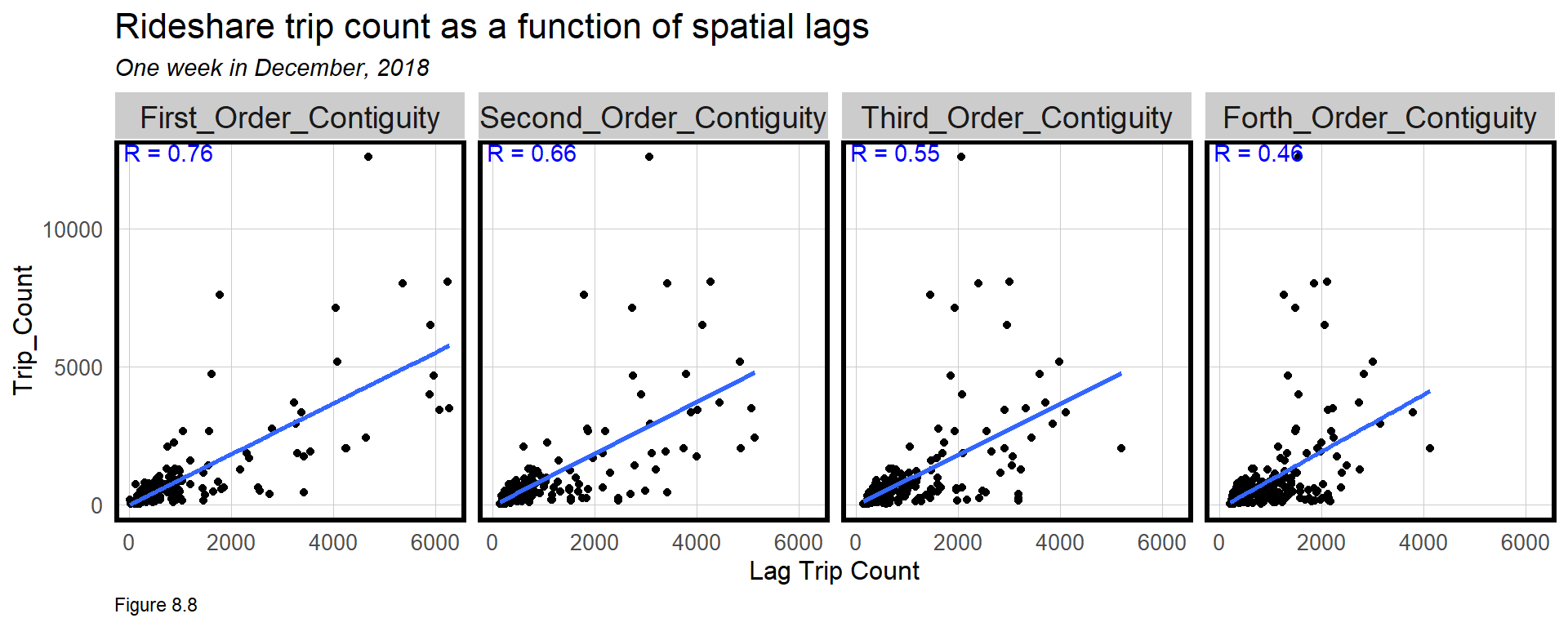
Finally, spatial autocorrelation is tested for by visualizing spatial lag correlations (4.2). A queen contiguity spatial weights matrix (5.4) relates tract t to adjacent tracts. “First order contiguity” refers to those tracts that touch tract t. “Second order” refers to the tracts that touch those tracts, etc.
This code is a bit verbose and thus withheld. These features will not be used in the model, but the resulting plot does show that there is strong spatial autocorrelation in ride share.
8.3.3 Space/time correlation?
Ride share in Chicago exhibits very strong space/time dependencies, so why not visualize both together? Below, the gganimate package is used to build an animated gif map of ride share trips over space and time. Here, the 15 minute intervals, interval15, are used from a single Monday in week45.panel. Tract geometries are pulled from ride2.
week45 <-
  filter(ride2 , week == 45 & dotw == "Mon")

week45.panel <-
  expand.grid(
    interval15 = unique(week45$interval15),
    Pickup.Census.Tract = unique(ride2$Pickup.Census.Tract))
A ride.animation.data panel is created following the same routine as 8.2.4 above. Recall, we are using a 20% sample of the data, so the actual number of trips is much higher. Nevertheless, the space/time pattern emanating outward from the Loop is apparent. Note again, the use of fct_relevel.
ride.animation.data <-
  mutate(week45, Trip_Counter = 1) %>%
    right_join(week45.panel) %>%
    group_by(interval15, Pickup.Census.Tract) %>%
    summarize(Trip_Count = sum(Trip_Counter, na.rm=T)) %>%
    ungroup() %>%
    left_join(chicagoTracts, by=c("Pickup.Census.Tract" = "GEOID")) %>%
    st_sf() %>%
    mutate(Trips = case_when(Trip_Count == 0 ~ "0 trips",
                             Trip_Count > 0 & Trip_Count <= 3 ~ "1-3 trips",
                             Trip_Count > 3 & Trip_Count <= 6 ~ "4-6 trips",
                             Trip_Count > 6 & Trip_Count <= 10 ~ "7-10 trips",
                             Trip_Count > 10 ~ "11+ trips")) %>%
    mutate(Trips  = fct_relevel(Trips, "0 trips","1-3 trips","4-6 trips",
                                       "7-10 trips","10+ trips"))
The animation object is created below. Install and load the gifski package. transition_manual is set to interval15 to suggest a new map be generated for each 15 minute interval. animate creates the gif, setting duration to ensure that the entire animation lasts only 20 seconds.
rideshare_animation <-
  ggplot() +
    geom_sf(data = ride.animation.data, aes(fill = Trips)) +
    scale_fill_manual(values = palette5) +
    labs(title = "Rideshare pickups for one day in November 2018",
         subtitle = "15 minute intervals: {current_frame}") +
    transition_manual(interval15) +
mapTheme()animate(rideshare_animation, duration=20, renderer = gifski_renderer())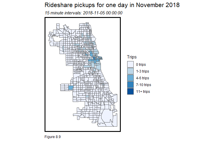
The below code can be used to write the animated gif to your local machine.
anim_save("rideshare_local", rideshare_animation, duration=20, renderer = gifski_renderer())8.3.4 Weather
ride.panel includes three weather-related variables. The below bar plot removes the spatial variation and creates a dummy variable, isPercip, to ask whether precipitation effects mean Trip_Count. There appears to be little effect.
st_drop_geometry(ride.panel) %>%
  group_by(interval60) %>%
  summarize(Trip_Count = mean(Trip_Count),
            Percipitation = first(Percipitation)) %>%
  mutate(isPercip = ifelse(Percipitation > 0,"Rain/Snow", "None")) %>%
  group_by(isPercip) %>%
  summarize(Mean_Trip_Count = mean(Trip_Count)) %>%
    ggplot(aes(isPercip, Mean_Trip_Count)) + geom_bar(stat = "identity") +
      labs(title="Does ridership vary with percipitation?",
           x="Percipitation", y="Mean Trip Count") +
      plotTheme()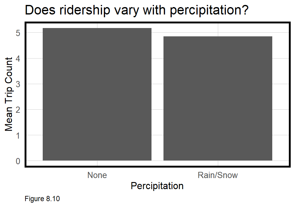
Do more people take ride share when it is colder? Below, Trip_Count is plotted as a function of Temperature by week. These plots suggest the opposite - that in most weeks, ride share increases as temps warm. If that sounds strange for November and December, it is because this correlation is ‘spurious’.
A key relationship has been omitted - namely that both temperature and ride share increase with the hour of the day. Temperature may still be an important predictor, but only when time is controlled for. A couple of quick regressions can illustrate this point. Regressing Trip_Count as a function of Temperature, estimates that a one degree increase in temps leads to a 5.54 increase in trips.
When hourly fixed effects are added to the regression, the model suggests a one degree increase in temps leads to a -7.47 decrease in Trip_Count. This is what we would expect - that all else equal, as temperature increases, travelers are less likely to take ride share versus, say walking.
st_drop_geometry(ride.panel) %>%
  group_by(interval60) %>%
  summarize(Trip_Count = mean(Trip_Count),
            Temperature = first(Temperature)) %>%
  mutate(week = week(interval60)) %>%
  ggplot(aes(Temperature, Trip_Count)) +
    geom_point() + geom_smooth(method = "lm", se= FALSE) +
    facet_wrap(~week, ncol=8) +
    labs(title="Trip Count as a fuction of Temperature by week",
         x="Temperature", y="Mean Trip Count") +
plotTheme() 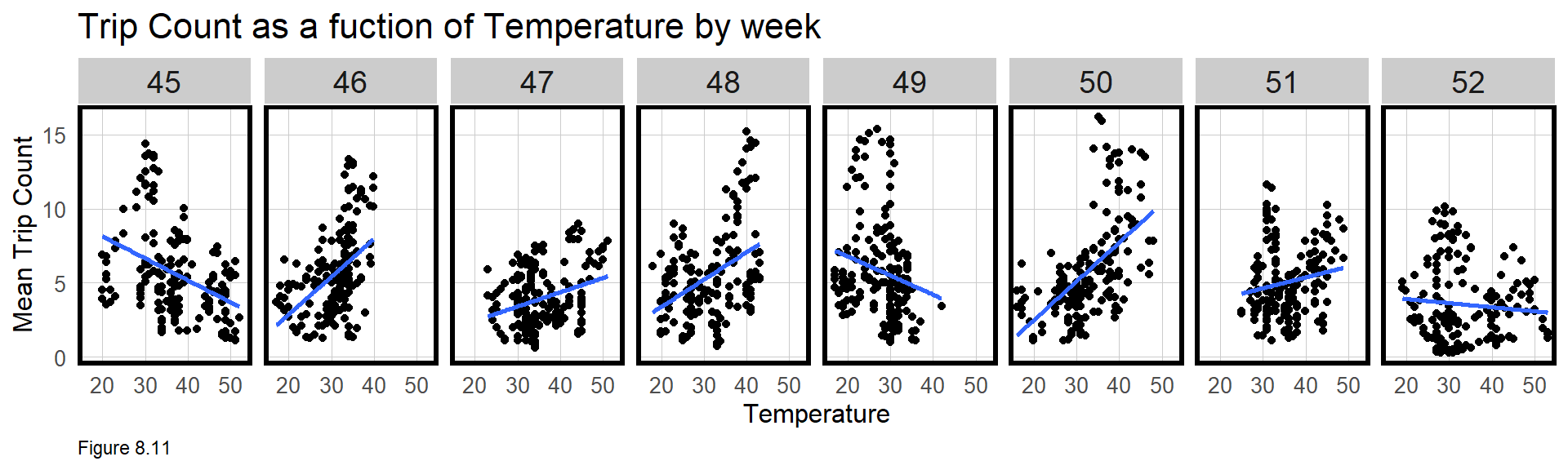
8.4 Modeling and validation using purrr::map
In this section, models are estimated from ride.Train and tested on ride.Test to gauge how well the space/time features forecast ride share demand. The purrr family of functions will be used to loop through a set of ‘nested’ data frames to efficiently compare across different model specifications. This functionality is very powerful, and programmatically, is a step up from the tidy used thus far.
8.4.1 A short primer on nested tibbles
Let’s return to the example space/time panel created above, colinear_df, by re-engineering this data frame as a nested tibble. A tibble is a like a data frame with more bells and whistles. In the code block below, colinear_df is converted as.tibble. nest then embeds 5 separate tibbles in colinear_nested, delineated by time. This gives a tibble of tibbles.
colinear_nested <- nest(as.tibble(colinear_df), -time)
colinear_nested
## # A tibble: 5 x 2
## time data
## <dbl> <list>
## 1 1 <tibble [2 x 3]>
## 2 2 <tibble [2 x 3]>
## 3 3 <tibble [2 x 3]>
## 4 4 <tibble [2 x 3]>
## 5 5 <tibble [2 x 3]>Nesting allows one to split and wrangle data in all sorts of interesting ways. Any nested tibble can be unnested with:
unnest(colinear_nested[1,2])## # A tibble: 2 x 3
## tract Distance_to_subway Trip_Count
## <dbl> <dbl> <dbl>
## 1 1 200 10
## 2 2 1890 458.4.3 Validate test set by time
In this section, Mean Absolute Error (MAE) is calculated on ride.Test for each model. ride.Test includes 3 weeks and is highly influenced by the Christmas holiday. To understand if models generalize to the holiday and non-holiday weeks, ride.Test.weekNest nests ride.Test by week. Note that the data field contains 3 sf tibbles (with geometries), and unnest(ride.Test.weekNest[1,2]) returns one week’s worth of simple features data.
ride.Test.weekNest <-
  as.data.frame(ride.Test) %>%
  nest(-week)

ride.Test.weekNest
## # A tibble: 3 x 2
## week data
## <dbl> <list>
## 1 50 <tibble [33,768 x 14]>
## 2 51 <tibble [33,768 x 14]>
## 3 52 <tibble [33,768 x 14]>Next, a small function is created that takes a tibble, dat and a regression model, fit as its inputs, and outputs predictions as pred. This function is used to predict for each week in ride.Trest.weekNest.
model_pred <- function(dat, fit){
   pred <- predict(fit, newdata = dat)}
The nested format allows one to loop through each model for each week and mutate summary statistics. In the code block below, week_predictions are calculated for each week in ride.Test. The map function applies the model_pred function to each nested tibble.
Take the first line of the below mutate, for example. A new column, Time_FE, includes predictions for reg1 - the time fixed effects model. The predictions are created by mapping the function, model_pred, to each row of data, parameterizing fit as the reg1 model.
week_predictions <-
  ride.Test.weekNest %>%
    mutate(A_Time_FE = map(.x = data, fit = reg1, .f = model_pred),
           B_Space_FE = map(.x = data, fit = reg2, .f = model_pred),
           C_Space_Time_FE = map(.x = data, fit = reg3, .f = model_pred),
           D_Space_Time_Lags = map(.x = data, fit = reg4, .f = model_pred))

week_predictions
## # A tibble: 3 x 6
## week data A_Time_FE B_Space_FE C_Space_Time_FE D_Space_Time_La~
## <dbl> <list> <list> <list> <list> <list>
## 1 50 <tibble [33,7~ <dbl [33,76~ <dbl [33,7~ <dbl [33,768]> <dbl [33,768]>
## 2 51 <tibble [33,7~ <dbl [33,76~ <dbl [33,7~ <dbl [33,768]> <dbl [33,768]>
## 3 52 <tibble [33,7~ <dbl [33,76~ <dbl [33,7~ <dbl [33,768]> <dbl [33,768]>The output shows that each new column is a list of predictions for each model by week. Once columns are moved to long form with gather, four new columns are generated in the code blow below.
Observed is the actual space/time Trip_Count for that week, created by looping through (map) each nested tibble in the data field and pulling Trip_Count. Absolute_Error is created with map2, which maps over two inputs. In this case, Observed and Prediction are fed into a function (~) that calculates the absolute value of their difference.
To calculate MAE, map_dbl, a variant of map, is used to loop through Absolute_Error, calculating the mean. The same function calculates the standard deviation of absolute error, sd_AE, which is a useful measure of generalizability.
week_predictions <- week_predictions %>%
    gather(Regression, Prediction, -data, -week) %>%
    mutate(Observed = map(data, pull, Trip_Count),
           Absolute_Error = map2(Observed, Prediction,  ~ abs(.x - .y)),
           MAE = map_dbl(Absolute_Error, mean),
           sd_AE = map_dbl(Absolute_Error, sd))
The resulting data frame shows goodness of fit by week and model. The MAE for the time effects model (reg1) in week 50 is comparable to the mean observed Trip_Count of 5.86. However, with increasing sophistication, the model becomes more accurate and more generalizable.
This nested framework makes it easy to plot MAE by model by week, as below. Both the spatial fixed effects and time lags add significant predictive power.
week_predictions %>%
  dplyr::select(week, Regression, MAE) %>%
  gather(Variable, MAE, -Regression, -week) %>%
  ggplot(aes(week, MAE)) +
    geom_bar(aes(fill = Regression), position = "dodge", stat="identity") +
    scale_fill_manual(values = palette5) +
    labs(title = "Mean Absolute Errors by model specification and week") +
  plotTheme()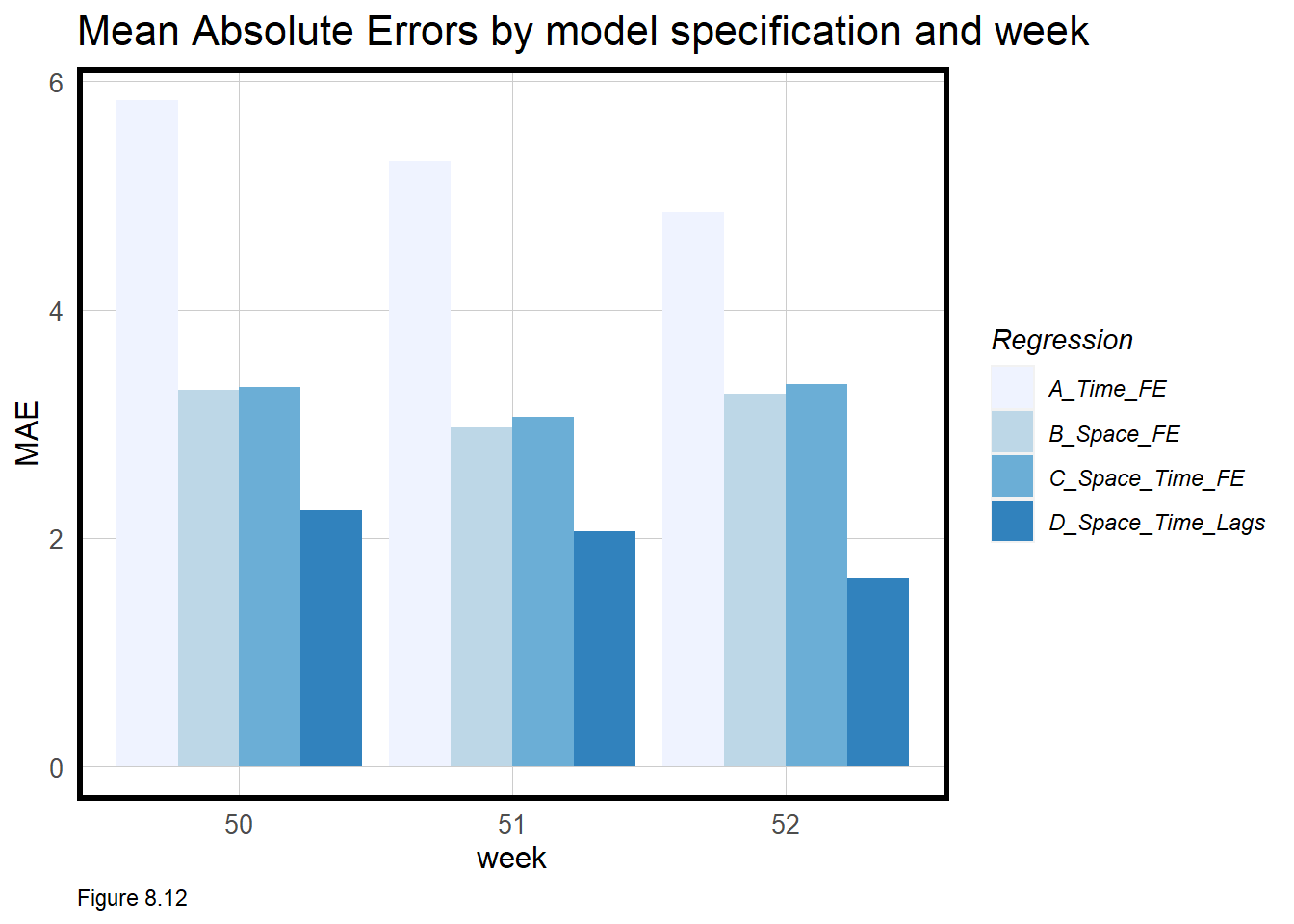
For each model, predicted and observed Trip_Count is taken out of the spatial context and their means plotted in time series form below. Models A and C appear to have the same time trend because again, the spatial context has been removed.
With more sophistication comes the ability to predict for the highest peaks, and the time lags help make this happen. The time series does show that the model over-predicts trips for some of the days around Christmas. This may be because the training data suggests more trips should otherwise occur during those times.
week_predictions %>%
  mutate(interval60 = map(data, pull, interval60),
         Pickup.Census.Tract = map(data, pull, Pickup.Census.Tract)) %>%
  dplyr::select(interval60, Pickup.Census.Tract, Observed, Prediction, Regression) %>%
  unnest() %>%
  gather(Variable, Value, -Regression, -interval60, -Pickup.Census.Tract) %>%
    group_by(Regression, Variable, interval60) %>%
    summarize(Value = mean(Value)) %>%
    ggplot(aes(interval60, Value, colour=Variable)) + geom_line(size = 1.1) +
      facet_wrap(~Regression, ncol=1) +
      scale_colour_manual(values = palette2) +
      labs(title = "Mean Predicted/Observed ride share by hourly interval",
           x = "Hour", y= "Rideshare Trips") +
      plotTheme()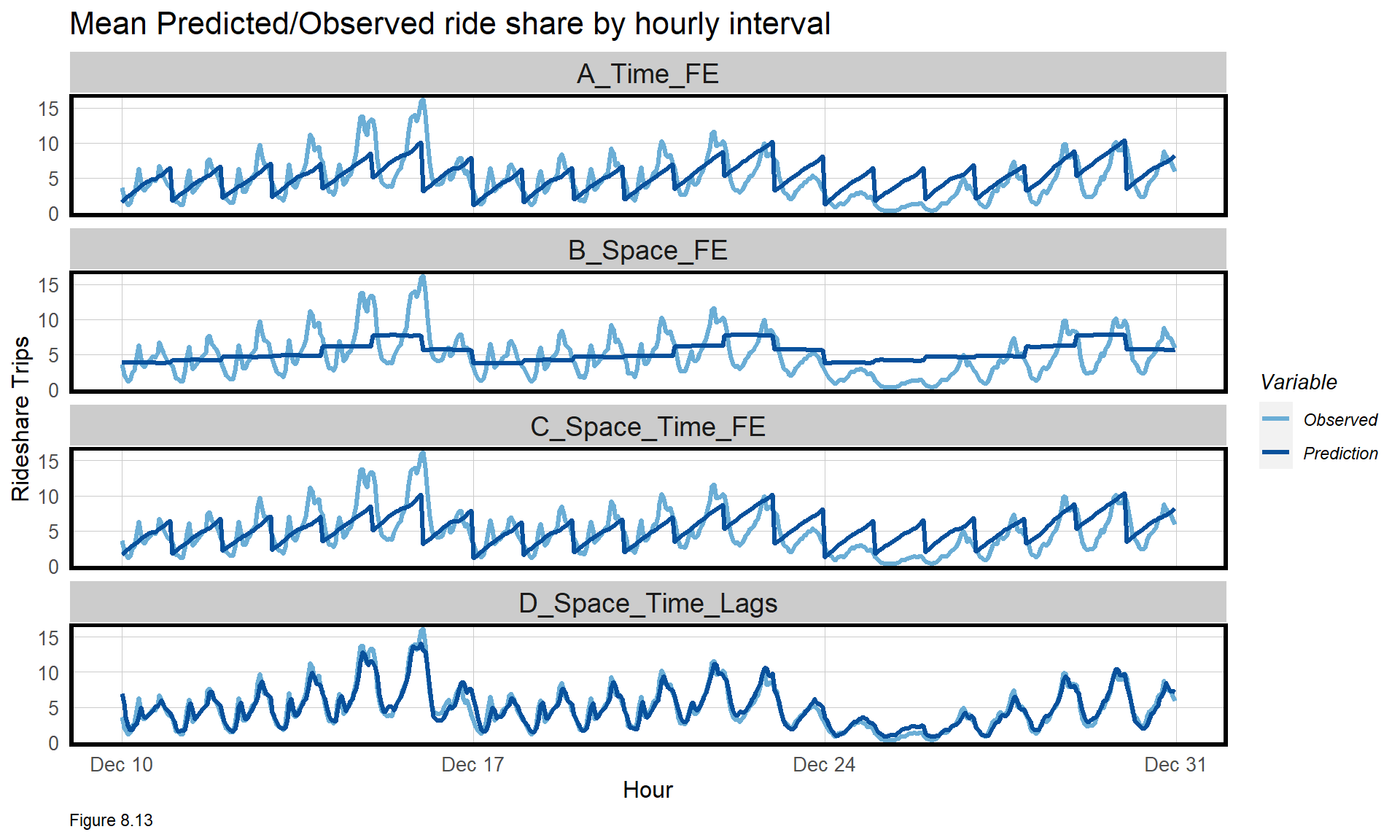
8.4.4 Validate test set by space
error.byWeek <-
  filter(week_predictions, Regression == "D_Space_Time_Lags") %>%
  unnest() %>% st_sf() %>%
  dplyr::select(Pickup.Census.Tract, Absolute_Error, week, geometry) %>%
  gather(Variable, Value, -Pickup.Census.Tract, -week, -geometry) %>%
    group_by(Variable, Pickup.Census.Tract, week) %>%
    summarize(MAE = mean(Value))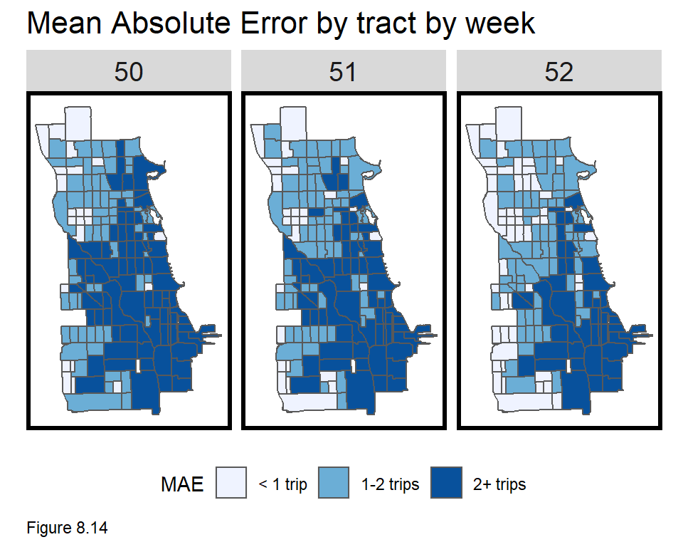
Above, MAE for reg4 is mapped, by unnesting it from week_predictions. Errors for all time periods are averaged by Pickup.Census.Tract and week. The highest errors are in the Loop where more trips occur and there are some interesting error patterns along arterial routes running west and north from downtown.
MAE is then mapped by hour for Monday of the 50th week. Errors cluster in The Loop but are otherwise distributed throughout. Each map below could be tested for spatial autocorrelation which may suggest the addition of new features. Given the use case however, is there an incentive to have a really generalizable model?
We have been weary of geospatial machine learning models with errors that vary systematically across space. In other uses cases, the concern was that these differences could drive disparate impact. Do ride share companies have an incentive to be fair in the communities they serve? Could errors in this model be driven by selection bias in the training data?
It is possible that ride share drivers select in to neighborhoods based on passenger perception but what incentive do ride share companies have to ensure that everyone who wants a ride gets one?
error.byHour <-
  filter(week_predictions, Regression == "D_Space_Time_Lags") %>%
    unnest() %>%
    st_sf() %>%
    dplyr::select(Pickup.Census.Tract, Absolute_Error, geometry, interval60) %>%
    gather(Variable, Value, -interval60, -Pickup.Census.Tract, -geometry) %>%
    filter(wday(interval60, label = TRUE) == "Mon" & week(interval60) == 50) %>%
    group_by(hour = hour(interval60), Pickup.Census.Tract) %>%
summarize(MAE = mean(Value)) 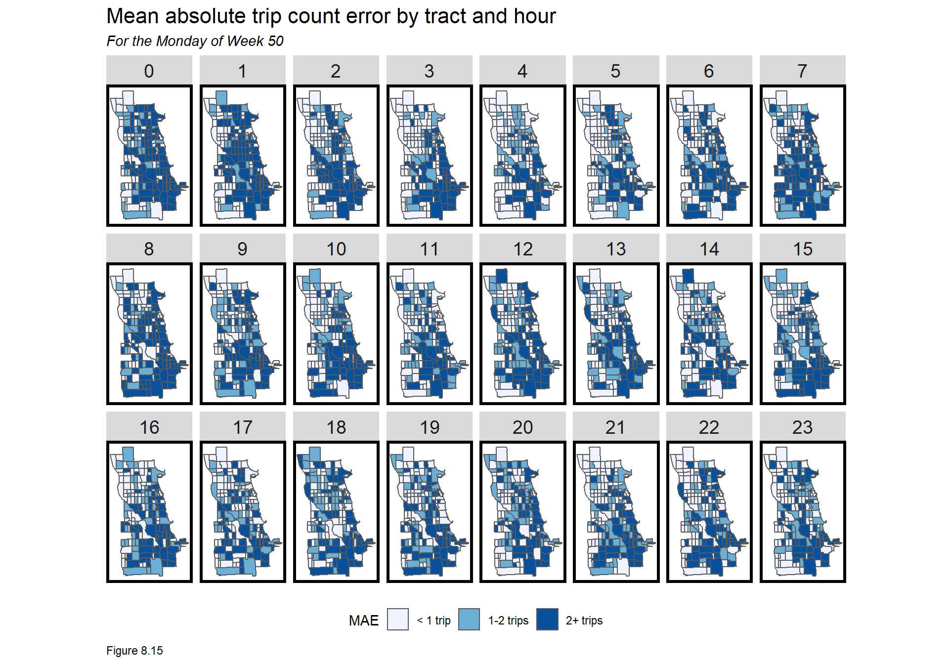
8.5 Conclusion - Dispatch
Why does our model predict so well?
It is rare that linear models have such small errors, but in this case, the time lag features are very strong predictors. These very high resolution time lags can reasonably be included because the dispatch use case allows for near real time predictions - like the next hour. Many temporal forecasts have much longer time horizons.
Unlike previous chapters, no cross-validation was performed, and thus, it is possible that our model is not actually as useful as the results suggest. Random k-fold or spatial cross-validation are options. One might also cross-validate by hour, day of the week or some other time unit to understand how well our model generalizes across time. Space/time cross-validation is also possible.
A dispatch algorithm
Uber’s Marketplace Algorithm is an example of how Uber uses space/time forecasting to reduce response times, save money and maybe even lower automobile congestion. How can Uber be sure that a given algorithm is optimized for these bottom lines?
Ride share companies take many thousands of trips every day. To find the optimal approach, imagine randomly allocating two or more dispatch algorithms across 1000 Chicago drivers over the course of a week. Such a Randomized Control Trial, or what tech companies sometimes call ‘A/B testing’, could help reveal the most optimal algorithm.
What about the public sector use of this algorithm?
What space/time prediction problems might public sector data scientists wrestle with? Any public or private entity that needs to ‘rebalance’ an asset like bike share bikes or personal scooters, would benefit from understanding near future demand. Public parking authorities could maximize parking ticket revenues by allocating patrols to time/space units predicted to have illegal parkers. Emergency Management offices can use metrics like this to strategically place ambulances to reduce response times. Finally, this is an obvious extension to the predictive policing use case discussed in Chapter 5 which would allocate police cruisers in space and time.
Bell, Franziska & Smyl, Slawek (2018). Forecasting at Uber: An Introduction. https://eng.uber.com/forecasting-introduction/↩︎
Chicago Data Portal. (2020). Transportation Network Providers - Trips. https://data.cityofchicago.org/Transportation/Transportation-Network-Providers-Trips/m6dm-c72p↩︎
Maëlle Salmon (2016). riem: Accesses Weather Data from the Iowa Environment Mesonet. R package version 0.1.1. https://CRAN.R-project.org/package=riem↩︎