Chapter 5 Geospatial risk modeling - Predictive Policing
5.1 New predictive policing tools
Of the few public sector machine learning algorithms in use, few are as prevalent or as despised as the suite of algorithms commonly referred to as ‘Predictive Policing’. There are several flavors of Predictive Policing from forecasting where crime will happen, who will commit crime, judicial response to crime, as well as investigative outcomes.
Policing has driven public-sector machine learning because law enforcement has significant planning and resource allocation questions. In 2017, the Chicago Police Department recorded 268,387 incidents or 735 incidents per day, on average. Nearly 12,000 sworn officers patrol a 228 square mile area. How should police commanders strategically allocate these officers in time and space?
As discussed in 0.3, data science is an ideal planning tool to ensure that the supply of a limited resource (e.g. policing), matches the demand for those resources (e.g. crime). For many years now, police departments have been all-in on using crime-related data for planning purposes.
New York City’s CompStat program, which began in the mid-1990s, was setup to promote operational decision-making through the compilation of crime statistics and maps. A 1999 survey found that 11% of small and 33% of large sized police departments nationally implemented a CompStat program.29 By 2013, 20% of surveyed police departments said they had at least 1 full time sworn officer “conducting research…using computerized records”, and 38% reported at least one non-sworn full-time personnel.30
Emerging demand for this technology, a growing abundance of cloud services, and sophisticated machine learning algorithms have all given rise to several commercial Predictive Policing products. Several of these focus on placed-based predictions, including PredPol31, Risk Terrain Modeling32, and ShotSpotter Missions.33
Today, with growing awareness that Black Lives Matter and that policing resources in America are allocated in part, by way of systematic racism, critics increasingly charge that Predictive Policing is harmful. Some cities like Santa Cruz, CA have banned the practice outright34, while others like Pittsburgh are pivoting the technology to allocate social services instead of law enforcement.35
With this critique in mind, why include Predictive Policing in this book? First and foremost, this chapter provides important context for how to judge a ‘useful’ machine learning model in government (Section 0.3). Second, it provides an even more nuanced definition of model generalizability. Finally, it is the only open source tutorial on geospatial risk modeling that I am aware of. Whether or not these models proliferate (I don’t see them going away any time soon), it will be helpful for stakeholders to gain a shared understanding of their inner-workings to prevent increased bias and unwarranted surveillance.
5.1.1 Generalizability in geospatial risk models
A geospatial risk model is a regression model, not unlike those covered in the previous two chapters. The dependent variable is the occurrence of discrete events like crime, fires, successful sales calls, locations of donut shops, etc.36 Predictions from these models are interpreted as ‘the forecasted risk/opportunity of that event occurring here’.
For crime, the hypothesis is that crime risk is a function of exposure to a series of geospatial risk and protective factors, such as blight or recreation centers, respectively. The assumption is that as exposure to risk factors increases, so does crime risk.
The goal is to borrow the experience from places where crime is observed and test whether that experience generalizes to places that may be at risk for crime, even if few events are reported. Crime is relatively rare, and observed crime likely discounts actual crime risk. Predictions from geospatial risk models can be thought of as latent risk - areas at risk even if a crime has not actually been reported there. By this definition, it is easy to see why such a forecast would be appealing for police.
Interestingly, a model that predicts crime risk equal to observed crime (a Mean Absolute Error of 0), would not reveal any latent risk. As a resource allocation tool, this would not be any more useful than one which tells police to return to yesterday’s crime scene. Thus, accuracy is not as critical for this use case, as it was in the last use case.
Generalizability, on the other hand, is incredibly important. Of the two definitions previously introduced, the second will be more important here. A generalizable geospatial risk prediction model is one that predicts risk with comparable accuracy across different neighborhoods. When crime is the outcome of interest, this is anything but straightforward.
Consider that home sale prices from Chapters 3 and 4, are pulled from a complete sample - any house that transacted shows up in the data. Not only is say, the location of every drug offense not a complete sample, but it is not likely a representative sample, either. For a drug offense event to appear in the data, it must be observed by law enforcement. Many drug offenses go unobserved, and worse, officers may selectively choose to enforce drug crime more fervently in some communities than others.37
If selective enforcement is the result of an officer’s preconceived or biased beliefs, then this ‘selection bias’ will be baked into the crime outcome. If a model fails to account for this bias, it will fall into the error term of the regression and lead to predictions that do not generalize across space.
One might assume that additional controls for race can help account for the selection bias, but the true nature of the bias is unknown. It may be entirely about race, partially so, or a confluence of factors; and likely some officers are more biased than others. Thus, without observing the explicit selection criteria, it is not possible to fully account for the selection bias.
For this reason, a model trained to predict drug offense risk for instance, is almost certainly not useful. However one trained to predict building fire risk may be. Fire departments cannot selectively choose which building fires to extinguish and which to let rage. Thus, all else equal, the building fire outcome (and ultimately the predictions) are more likely to generalize across space.
Selection bias may exist in the dependent variable, but it may also exist in the features as well. A second reason why these models may not generalize has to do with the exposure hypothesis.
The rationale for the exposure hypothesis can be traced in part to the Broken Windows Theory, which posits a link between community ‘disorder’ and crime.38 The theory is that features of the built environment such as blight and disrepair may signal a local tolerance for criminality. A host of built environment risk factors impact crime risk, but many of these suffer from selection bias.39
Perhaps graffiti is a signal that criminality is more locally accepted. The best source of address-level graffiti data comes from 311 open datasets.40 Assume graffiti was equally distributed throughout the city, but only residents of certain neighborhoods (maybe those where graffiti was rare) chose to file 311 reports. If this reporting criteria is not observed in the model, model predictions would reflect this spatial selection bias and predictions would not generalize.
Operators of ‘risk factors’ like homeless shelters, laundromats, and check cashing outlets may select into certain neighborhoods based on market preferences. Spatial selection here may also be an issue. So why is this important and what role does Broken Windows and selection bias play in Predictive Policing?
5.1.2 From Broken Windows Theory to Broken Windows Policing
There is a wealth of important criminological and social science research on the efficacy of Broken Windows Theory. While I am unqualified to critique these findings, I do think it is useful to consider the consequences of developing a police allocation tool based on Broken Windows Theory.
Racist placed-based policies, like redlining and mortgage discrimination, corralled low-income minorities into segregated neighborhoods without the tools for economic empowerment.41 Many of these communities are characterized by blight and disrepair. A risk model predicated on disrepair (Broken Windows) might only perpetuate these same racist placed-based policies.
In other words, if the data inputs to a forecasting model are biased against communities of color, then the prediction outputs of that model will also be biased against those places. This bias compounds when risk predictions are converted to resource allocation. Surveillance increases, more crimes are ‘reported’, and more risk is predicted.
When a reasonable criminological theory is operationalized into an empirical model based on flawed data, the result is an unuseful decision-making tool.
Because the lack of generalizability is driven in part by unobserved information like selection bias, despite our best efforts below, we still will not know the degree of bias baked in the risk predictions. While a different outcome, like fire, could have been chosen to demonstrate geospatial risk prediction, policing is the most ubiquitous example of the approach, and worth our focus.
In this chapter, a geospatial risk predictive model of burglary is created. We begin by wrangling burglary and risk factor data into geospatial features, correlating their exposure, and estimating models to predict burglary latent risk. These models are then validated in part, by comparing predictions to a standard, business-as-usual measure of geospatial crime risk.
5.1.3 Setup
Begin by loading the requisite packages and functions, including the functions.R script.
library(tidyverse)
library(sf)
library(RSocrata)
library(viridis)
library(spatstat)
library(raster)
library(spdep)
library(FNN)
library(grid)
library(gridExtra)
library(knitr)
library(kableExtra)
library(tidycensus)

root.dir = "https://raw.githubusercontent.com/urbanSpatial/Public-Policy-Analytics-Landing/master/DATA/"
source("https://raw.githubusercontent.com/urbanSpatial/Public-Policy-Analytics-Landing/master/functions.r")
5.2 Data wrangling: Creating the fishnet
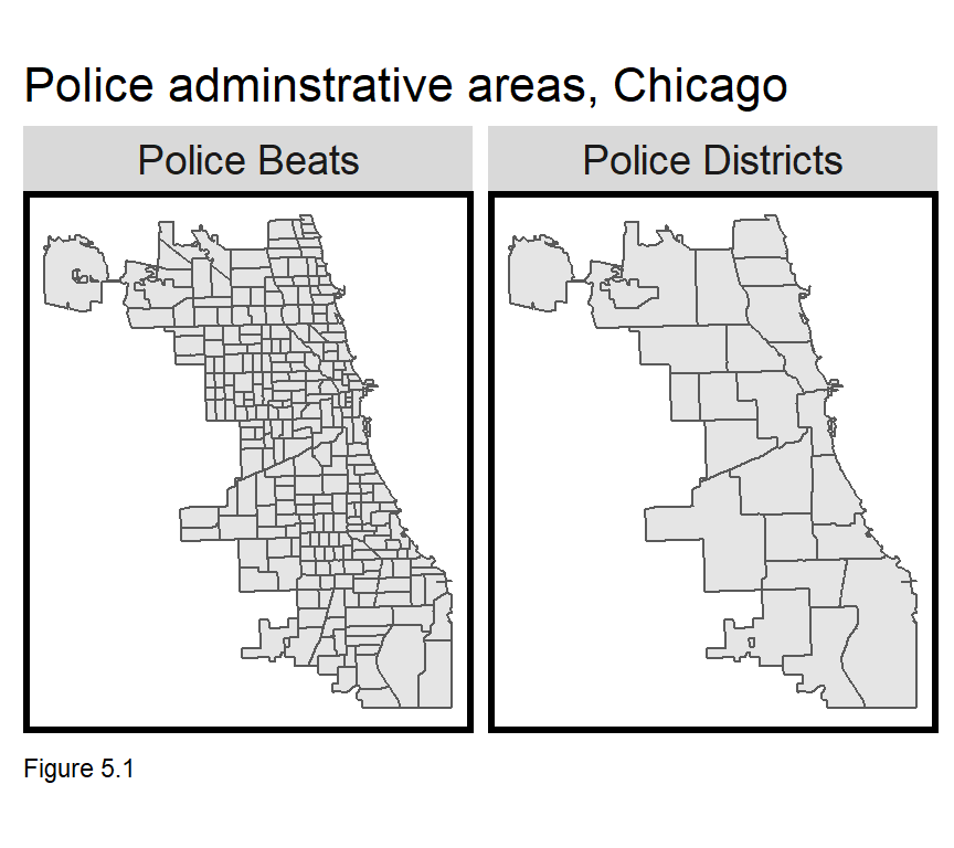
What is the appropriate unit of analysis for predicting geospatial crime risk? No matter the answer, scale biases are likely (Chapter 1). The best place to start however, is with the resource allocation process. Many police departments divide the city into administrative areas in which some measure of decision-making autonomy is allowed. How useful would a patrol allocation algorithm be if predictions were made at the Police Beat or District scale as Figure 5.1?
Tens or hundreds of thousands of people live in a Police District, so a single, District-wide risk prediction would not provide enough precision intelligence on where officers should patrol. In the code below, policeDistricts and policeBeats are downloaded.
policeDistricts <-
  st_read("https://data.cityofchicago.org/api/geospatial/fthy-xz3r?method=export&format=GeoJSON") %>%
  st_transform('ESRI:102271') %>%
  dplyr::select(District = dist_num)

policeBeats <-
  st_read("https://data.cityofchicago.org/api/geospatial/aerh-rz74?method=export&format=GeoJSON") %>%
  st_transform('ESRI:102271') %>%
  dplyr::select(District = beat_num)

bothPoliceUnits <- rbind(mutate(policeDistricts, Legend = "Police Districts"),
                         mutate(policeBeats, Legend = "Police Beats"))
Instead, consider crime risk not as a phenomenon that varies across administrative units, but one varying smoothly across the landscape, like elevation. Imagine that crime clusters in space, and that crime risk dissipates outward from these ‘hot spots’, like elevation dips from mountaintops to valleys. The best way to represent this spatial trend in a regression-ready form, is to aggregate point-level data into a lattice of grid cells.
This grid cell lattice is referred to as the fishnet and created below from a chicagoBoundary that omits O’Hare airport in the northwest of the city. st_make_grid is used to create a fishnet with 500ft by 500ft grid cells.42
chicagoBoundary <-
  st_read(file.path(root.dir,"/Chapter5/chicagoBoundary.geojson")) %>%
  st_transform('ESRI:102271')

fishnet <-
  st_make_grid(chicagoBoundary, cellsize = 500) %>%
  st_sf() %>%
  mutate(uniqueID = rownames(.))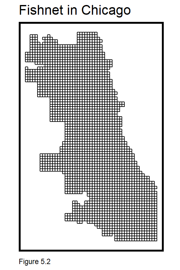
Next, burglaries are downloaded from the Chicago Open Data site using the RSocrata package. Socrata is the creator of the open source platform that Chicago uses to share its data.
The code block below downloads the data and selects only ‘forcible entry’ burglaries. Some additional data wrangling removes extraneous characters from theLocation field with gsub. The resulting field is then converted to separate fields of X and Y coordinates. Those fields are then made numeric, converted to simple features, projected, and duplicate geometries are removed with distinct. The density map (stat_density2d) shows some clear burglary hotspots in Chicago.
burglaries <-
  read.socrata("https://data.cityofchicago.org/Public-Safety/Crimes-2017/d62x-nvdr") %>%
    filter(Primary.Type == "BURGLARY" & Description == "FORCIBLE ENTRY") %>%
    mutate(x = gsub("[()]", "", Location)) %>%
    separate(x,into= c("Y","X"), sep=",") %>%
    mutate(X = as.numeric(X),Y = as.numeric(Y)) %>%
    na.omit() %>%
    st_as_sf(coords = c("X", "Y"), crs = 4326, agr = "constant")%>%
    st_transform('ESRI:102271') %>%
    distinct()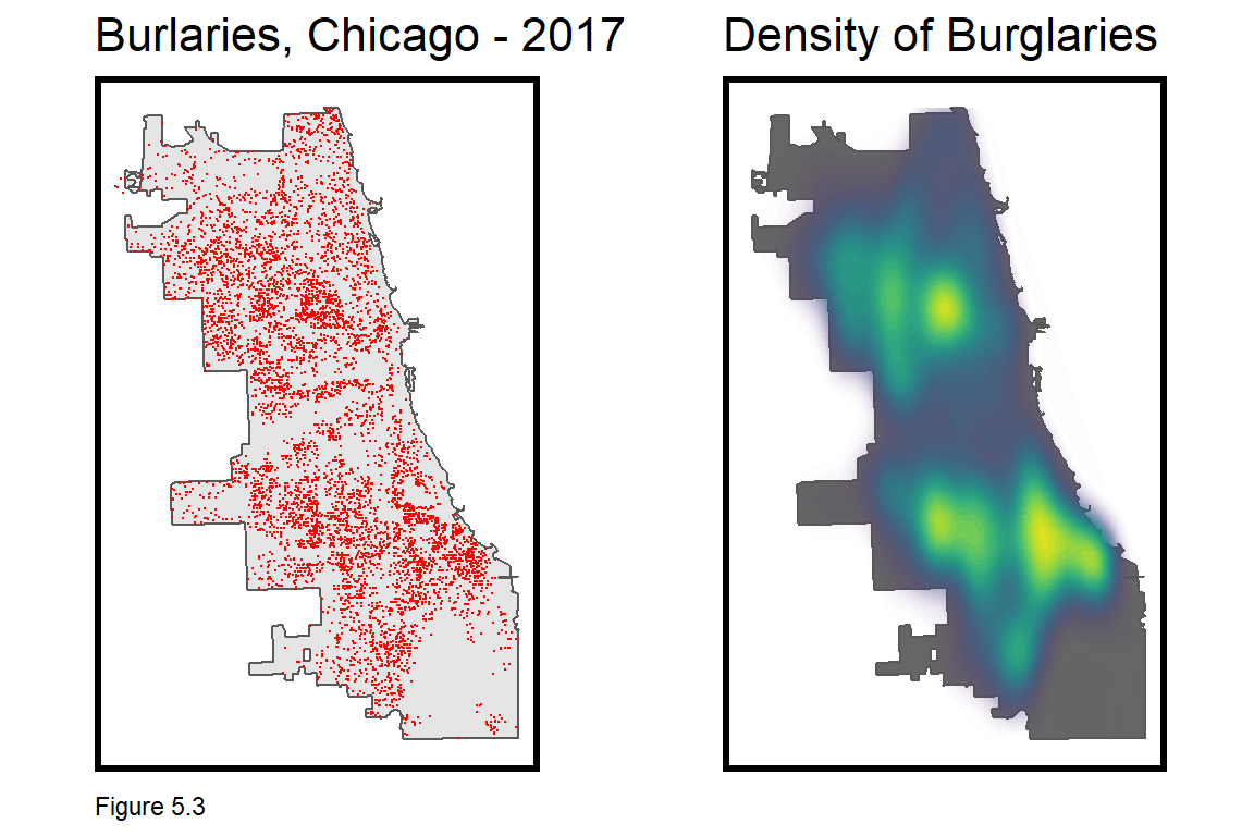
5.2.1 Data wrangling: Joining burglaries to the fishnet
To get the count of burglaries by grid cell, first mutate a ‘counter’ field, countBurglaries, for each burglary event, and then spatial join (aggregate) burglary points to the fishnet, taking the sum of countBurglaries.
A grid cell with no burglaries receives NA which is converted to 0 with replace_na. A random uniqueID is generated for each grid cell, as well as a random group cvID, used later for cross-validation. Roughly 100 cvIDs are generated (round(nrow(burglaries) / 100)) to allow 100-fold cross validation below.
Figure 5.4 maps the count of burglaries by grid cell, and the clustered spatial process of burglary begins to take shape. Notice the use of scale_fill_viridis from the viridis package, which automatically inputs the blue through yellow color ramp.
crime_net <-
  dplyr::select(burglaries) %>%
  mutate(countBurglaries = 1) %>%
  aggregate(., fishnet, sum) %>%
  mutate(countBurglaries = replace_na(countBurglaries, 0),
         uniqueID = rownames(.),
         cvID = sample(round(nrow(fishnet) / 24), size=nrow(fishnet), replace = TRUE))

ggplot() +
  geom_sf(data = crime_net, aes(fill = countBurglaries)) +
  scale_fill_viridis() +
  labs(title = "Count of Burglaires for the fishnet") +
  mapTheme()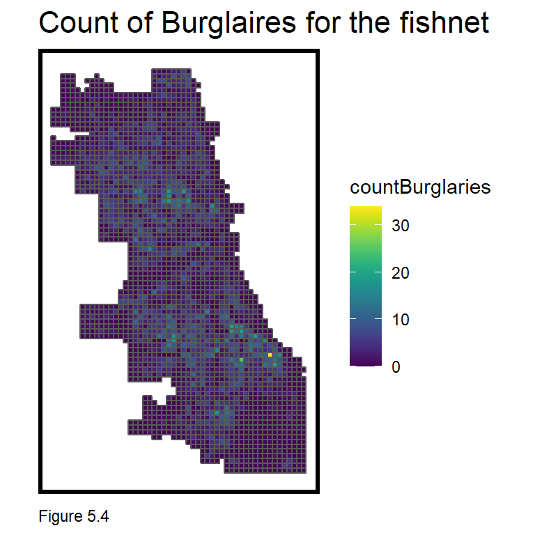
5.2.2 Wrangling risk factors
The crime_net includes counts of the dependent variable, burglary. Next, a small set of risk factor features are downloaded and wrangled to the fishnet. The very simple model created in this chapter is based on a limited set of features. A typical analysis would likely include many more.
Six risk factors are downloaded, including 311 reports of abandoned cars, street lights out, graffiti remediation, sanitation complaints, and abandon buildings, along with a neighborhood polygon layer and the location of retail stores that sell liquor to go.
Take note of the approach used to wrangle each dataset. Data is downloaded; year and coordinates are created; and the latter converted to sf. The data is then projected and a Legend field is added to label the risk factor. This allows each to be rbind into one dataset for small multiple mapping, as shown in Figure 5.5.
The graffiti code block is the first where we have seen the %in% operator, which enables filter to take inputs from a list rather than chaining together several ‘or’ (|) statements.
abandonCars <-
  read.socrata("https://data.cityofchicago.org/Service-Requests/311-Service-Requests-Abandoned-Vehicles/3c9v-pnva") %>%
    mutate(year = substr(creation_date,1,4)) %>% filter(year == "2017") %>%
    dplyr::select(Y = latitude, X = longitude) %>%
    na.omit() %>%
    st_as_sf(coords = c("X", "Y"), crs = 4326, agr = "constant") %>%
    st_transform(st_crs(fishnet)) %>%
    mutate(Legend = "Abandoned_Cars")

abandonBuildings <-
  read.socrata("https://data.cityofchicago.org/Service-Requests/311-Service-Requests-Vacant-and-Abandoned-Building/7nii-7srd") %>%
    mutate(year = substr(date_service_request_was_received,1,4)) %>%  filter(year == "2017") %>%
    dplyr::select(Y = latitude, X = longitude) %>%
    na.omit() %>%
    st_as_sf(coords = c("X", "Y"), crs = 4326, agr = "constant") %>%
    st_transform(st_crs(fishnet)) %>%
    mutate(Legend = "Abandoned_Buildings")

graffiti <-
  read.socrata("https://data.cityofchicago.org/Service-Requests/311-Service-Requests-Graffiti-Removal-Historical/hec5-y4x5") %>%
    mutate(year = substr(creation_date,1,4)) %>% filter(year == "2017") %>%
    filter(where_is_the_graffiti_located_ %in% c("Front", "Rear", "Side")) %>%
    dplyr::select(Y = latitude, X = longitude) %>%
    na.omit() %>%
    st_as_sf(coords = c("X", "Y"), crs = 4326, agr = "constant") %>%
    st_transform(st_crs(fishnet)) %>%
    mutate(Legend = "Graffiti")

streetLightsOut <-
  read.socrata("https://data.cityofchicago.org/Service-Requests/311-Service-Requests-Street-Lights-All-Out/zuxi-7xem") %>%
    mutate(year = substr(creation_date,1,4)) %>% filter(year == "2017") %>%
    dplyr::select(Y = latitude, X = longitude) %>%
    na.omit() %>%
    st_as_sf(coords = c("X", "Y"), crs = 4326, agr = "constant") %>%
    st_transform(st_crs(fishnet)) %>%
    mutate(Legend = "Street_Lights_Out")

sanitation <-
  read.socrata("https://data.cityofchicago.org/Service-Requests/311-Service-Requests-Sanitation-Code-Complaints-Hi/me59-5fac") %>%
    mutate(year = substr(creation_date,1,4)) %>% filter(year == "2017") %>%
    dplyr::select(Y = latitude, X = longitude) %>%
    na.omit() %>%
    st_as_sf(coords = c("X", "Y"), crs = 4326, agr = "constant") %>%
    st_transform(st_crs(fishnet)) %>%
    mutate(Legend = "Sanitation")

liquorRetail <-
  read.socrata("https://data.cityofchicago.org/resource/nrmj-3kcf.json") %>%
    filter(business_activity == "Retail Sales of Packaged Liquor") %>%
    dplyr::select(Y = latitude, X = longitude) %>%
    na.omit() %>%
    st_as_sf(coords = c("X", "Y"), crs = 4326, agr = "constant") %>%
    st_transform(st_crs(fishnet)) %>%
    mutate(Legend = "Liquor_Retail")

neighborhoods <-
  st_read("https://raw.githubusercontent.com/blackmad/neighborhoods/master/chicago.geojson") %>%
st_transform(st_crs(fishnet)) 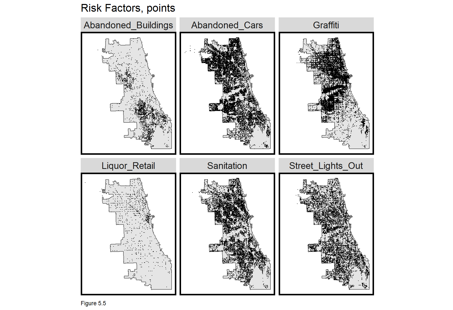
5.3 Feature engineering - Count of risk factors by grid cell
We have already seen feature engineering strategies for measuring exposure, but grid cells are an added nuance. We start by joining a long form layer of crime events to the vars_net fishnet. First, the individual risk factor layers are bound. Next, the fishnet is spatially joined (st_join) to each point. The outcome is a large point data frame with a column for each fishnet uniqueID.
That output is then converted from a long form layer of risk factor points with grid cell uniqueIDs, to a wide form layer of grid cells with risk factor columns. This is done by grouping on grid cell uniqueID and risk factor Legend, then summing the count of events. The full_join adds the fishnet geometries and spread converts to wide form. vars_net, is now regression-ready.
vars_net <-
  rbind(abandonCars,streetLightsOut,abandonBuildings,
        liquorRetail, graffiti, sanitation) %>%
  st_join(., fishnet, join=st_within) %>%
  st_drop_geometry() %>%
  group_by(uniqueID, Legend) %>%
  summarize(count = n()) %>%
    full_join(fishnet) %>%
    spread(Legend, count, fill=0) %>%
    st_sf() %>%
    dplyr::select(-`<NA>`) %>%
    na.omit() %>%
    ungroup()
Now let’s map each vars_net feature as a small multiple map. Each risk factor has a different range (min, max) and at this stage of sf development, facet_wrap is unable to calculate unique legends for each. Instead, a function is used to loop through the creation of individual risk factor maps and compile (i.e. grid.arrange) them into one small multiple plot.
vars_net.long is vars_net in long form; vars is a vector of Variable names; and mapList is an empty list. The loop says for each Variable, i, in vars, create a map by filtering for Variable i and adding it to mapList. Once all six risk factor maps have been created, do.call then loops through the mapList and arranges each map in the small multiple plot. Try to recreate this visualization with facet_wrap and notice the difference in legends.
These risk factors illustrate slightly different spatial processes. Abandoned_Buildings are mainly clustered in South Chicago, while Abandoned_Cars are mostly in the north. 311 complaints for Graffiti tend to cluster along major thoroughfares and Liquor_Retail is heavily clustered in “The Loop”, Chicago’s downtown. In 5.4.1, we’ll test the correlation between these features and burglaries.
vars_net.long <-
  gather(vars_net, Variable, value, -geometry, -uniqueID)

vars <- unique(vars_net.long$Variable)
mapList <- list()

for(i in vars){
  mapList[[i]] <-
    ggplot() +
      geom_sf(data = filter(vars_net.long, Variable == i), aes(fill=value), colour=NA) +
      scale_fill_viridis(name="") +
      labs(title=i) +
      mapTheme()}

do.call(grid.arrange,c(mapList, ncol=3, top="Risk Factors by Fishnet"))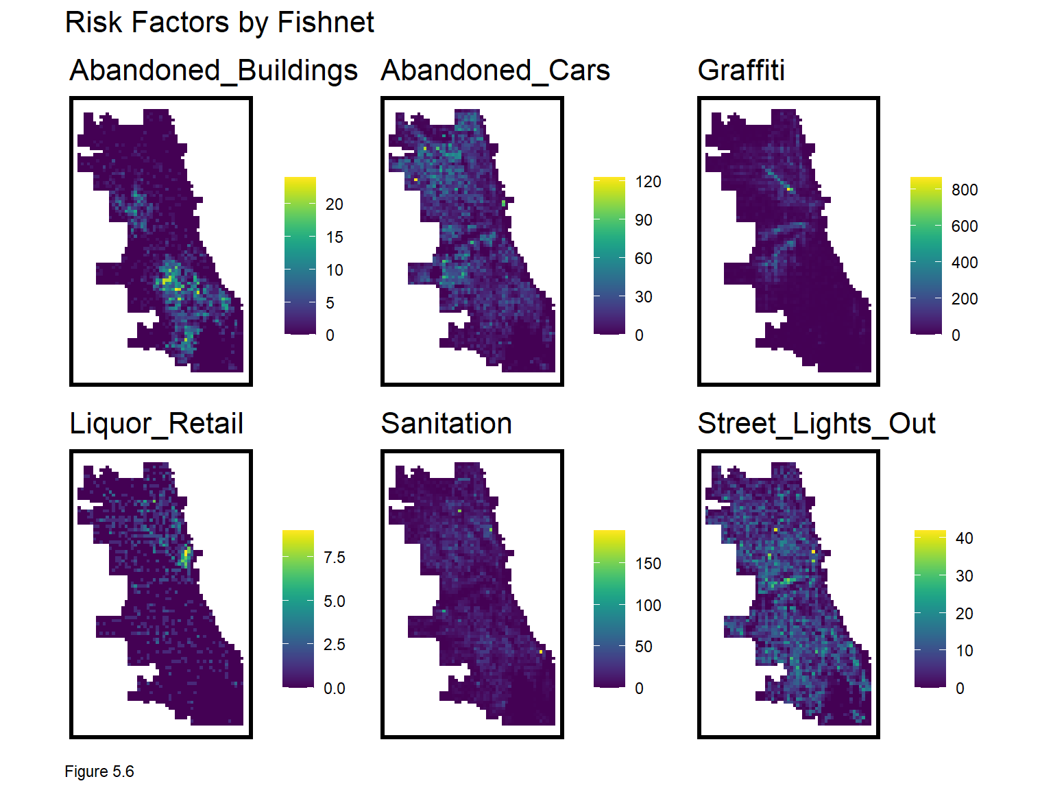
5.3.1 Feature engineering - Nearest neighbor features
Consider how grid cell counts impose a very rigid spatial scale of exposure. Our second feature engineering approach is to calculate average nearest neighbor distance (3.2.1) to hypothesize a smoother exposure relationship across space. Here, the nn_function is used.
Average nearest neighbor features are created by converting vars_net grid cells to centroid points then measuring to k risk factor points. Note, the nn_function requires both input layers to be points. For demonstration purposes k is set to 3, but ideally, one would test different k definitions of scale. Two shortcut functions are created to make the code block less verbose.
st_c <- st_coordinates
st_coid <- st_centroid

vars_net <-
  vars_net %>%
    mutate(
      Abandoned_Buildings.nn =
        nn_function(st_c(st_coid(vars_net)), st_c(abandonBuildings),3),
      Abandoned_Cars.nn =
        nn_function(st_c(st_coid(vars_net)), st_c(abandonCars),3),
      Graffiti.nn =
        nn_function(st_c(st_coid(vars_net)), st_c(graffiti),3),
      Liquor_Retail.nn =
        nn_function(st_c(st_coid(vars_net)), st_c(liquorRetail),3),
      Street_Lights_Out.nn =
        nn_function(st_c(st_coid(vars_net)), st_c(streetLightsOut),3),
      Sanitation.nn =
        nn_function(st_c(st_coid(vars_net)), st_c(sanitation),3))
The nearest neighbor features are then plotted below. Note the use of select and ends_with to map only the nearest neighbor features.
vars_net.long.nn <-
  dplyr::select(vars_net, ends_with(".nn")) %>%
    gather(Variable, value, -geometry)

vars <- unique(vars_net.long.nn$Variable)
mapList <- list()

for(i in vars){
  mapList[[i]] <-
    ggplot() +
      geom_sf(data = filter(vars_net.long.nn, Variable == i), aes(fill=value), colour=NA) +
      scale_fill_viridis(name="") +
      labs(title=i) +
      mapTheme()}

do.call(grid.arrange,c(mapList, ncol = 3, top = "Nearest Neighbor risk Factors by Fishnet"))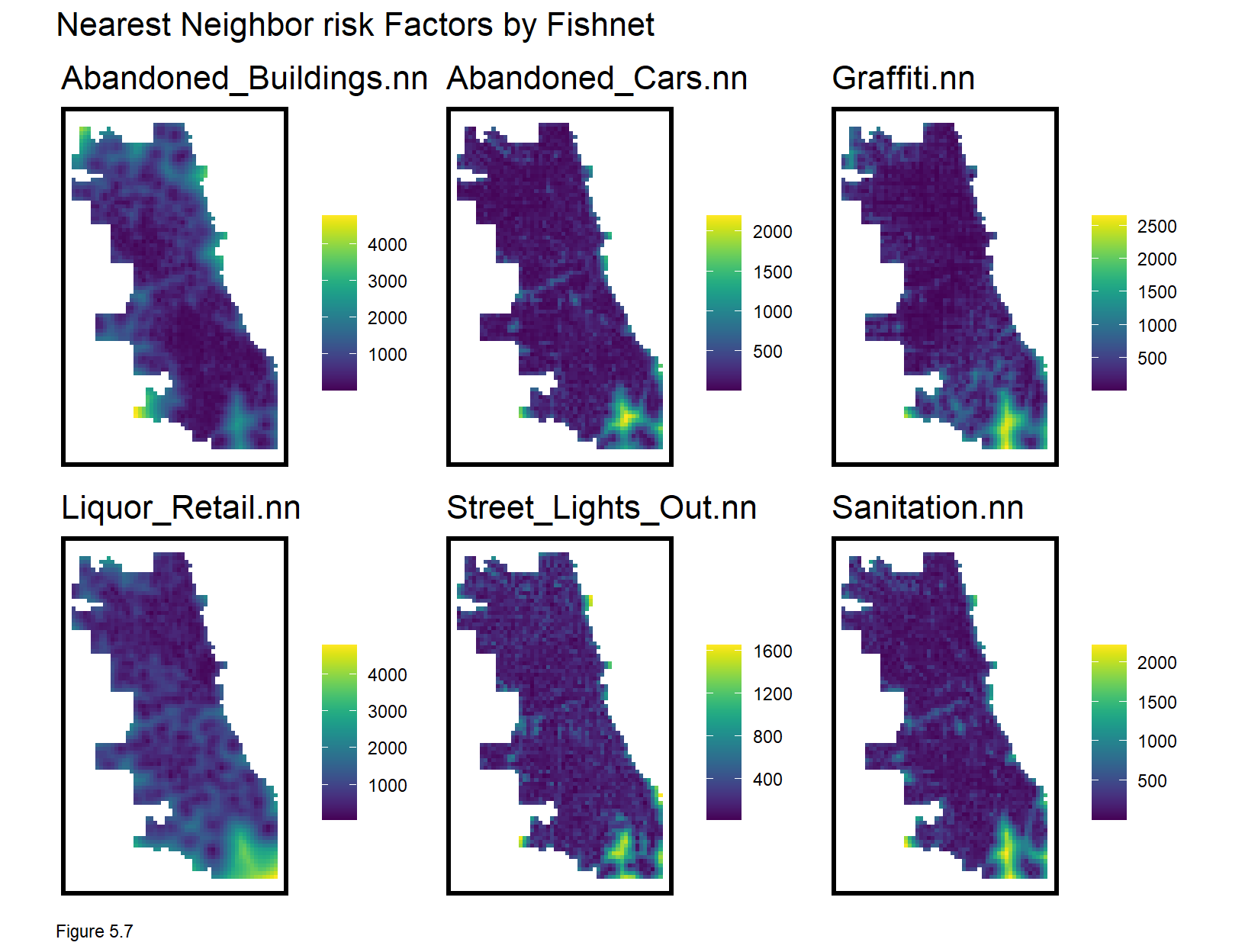
5.3.2 Feature Engineering - Measure distance to one point
It also may be reasonable to measure distance to a single point, like the centroid of the Loop - Chicago’s Central Business District. This is done with st_distance.
loopPoint <-
  filter(neighborhoods, name == "Loop") %>%
  st_centroid()

vars_net$loopDistance =
  st_distance(st_centroid(vars_net),loopPoint) %>%
as.numeric() 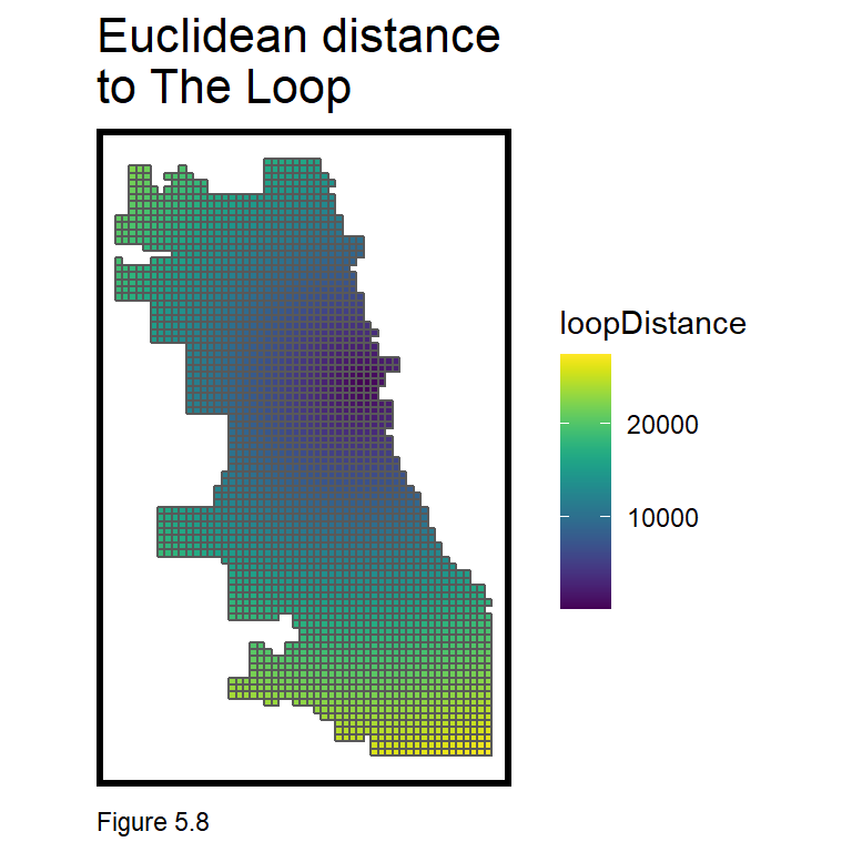
5.3.3 Feature Engineering - Create the final_net
Next, the crime_net and vars_net layers are joined into one regression-ready, final_net. In the code block below, the left_join is enabled by converting vars_net to a data frame with st_drop_geometry.
final_net <-
  left_join(crime_net, st_drop_geometry(vars_net), by="uniqueID")
Neighborhood name and policeDistrict are spatially joined to the final_net using grid cell centroids (1.2.3). The st_drop_geometry and left_join operations then drop the point centroid geometries, joining the result back to grid cell geometries and converting again to sf. Some grid cell centroids do not fall into a neighborhood (returning NA) and are removed with na.omit. Other neighborhoods are so small, they are only represented by one grid cell.
final_net <-
  st_centroid(final_net) %>%
    st_join(dplyr::select(neighborhoods, name)) %>%
    st_join(dplyr::select(policeDistricts, District)) %>%
      st_drop_geometry() %>%
      left_join(dplyr::select(final_net, geometry, uniqueID)) %>%
      st_sf() %>%
  na.omit()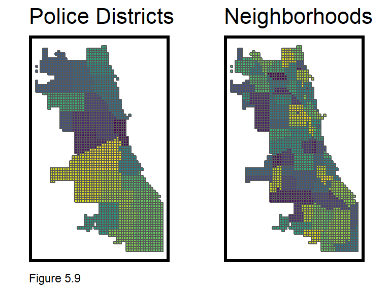
5.4 Exploring the spatial process of burglary
In 4.2.1, ‘Global’ Moran’s I was used to test for spatial autocorrelation (clustering) of home prices and model errors. This information provided insight into the spatial process of home prices, accounting for neighborhood scale clustering, but not clustering at more local scales. Here, that local spatial process is explored.
To do so, a statistic called Local Moran’s I is introduced. Here, the null hypothesis is that the burglary count at a given location is randomly distributed relative to its immediate neighbors.
Like its global cousin, a spatial weights matrix is used to relate a unit to its neighbors. In 4.2, a nearest neighbor weights matrix was used. Here, weights are calculated with ‘polygon adjacency’. The code block below creates a neighbor list, poly2nb, and a spatial weights matrix, final_net.weights using queen contiguity. This means that every grid cell is related to its eight adjacent neighbors (think about how a queen moves on a chess board).
Figure 5.10 below visualizes one grid cell and its queen neighbors. Any one grid cell’s neighbors can be returned like so, final_net.nb[[1457]].
final_net.nb <- poly2nb(as_Spatial(final_net), queen=TRUE)
final_net.weights <- nb2listw(final_net.nb, style="W", zero.policy=TRUE)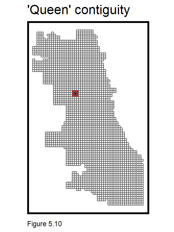
Figure 5.11 below describes the local spatial process of burglary. final_net.localMorans is created by column binding final_net with the results of a localmoran test. The inputs to the localmoran test include countBurglaries and the spatial weights matrix. Several useful test statistics are output including I, the p-value, and Significiant_Hotspots, defined as those grid cells with higher local counts than what might otherwise be expected under randomness (p-values <= 0.05). The data frame is then converted to long form for mapping.
Another grid.arrange loop is used to create a small multiple map of the aforementioned indicators. The legend in Figure 5.11 below, shows that relatively high values of I represent strong and statistically significant evidence of local clustering. Further evidence of this can be seen in the p-value and significant hotspot maps. This test provides insight into the scale, location and intensity of burglary hotspots.
final_net.localMorans <-
  cbind(
    as.data.frame(localmoran(final_net$countBurglaries, final_net.weights)),
    as.data.frame(final_net)) %>%
    st_sf() %>%
      dplyr::select(Burglary_Count = countBurglaries,
                    Local_Morans_I = Ii,
                    P_Value = `Pr(z > 0)`) %>%
      mutate(Significant_Hotspots = ifelse(P_Value <= 0.05, 1, 0)) %>%
      gather(Variable, Value, -geometry)

vars <- unique(final_net.localMorans$Variable)
varList <- list()

for(i in vars){
  varList[[i]] <-
    ggplot() +
      geom_sf(data = filter(final_net.localMorans, Variable == i),
              aes(fill = Value), colour=NA) +
      scale_fill_viridis(name="") +
      labs(title=i) +
      mapTheme() + theme(legend.position="bottom")}

do.call(grid.arrange,c(varList, ncol = 4, top = "Local Morans I statistics, Burglary"))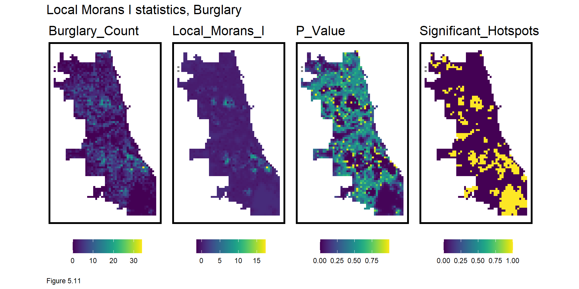
Why is this information useful? A generalizable model must predict equally as well in the hotspots as the coldspots. A model fit only to the coldspots, will underfit the hotspots and vice versa. Not only is this local insight useful exploratory analysis, it can also be engineered into powerful spatial features to control for the local spatial process.
What is the appropriate scale for this local spatial process? Figure 5.12 explores local hotspots by varying the p-value of the Local Moran’s I. The smaller the p-value the more significant the clusters. 0.0000001 conforms to very strong and significant burglary hot spots.
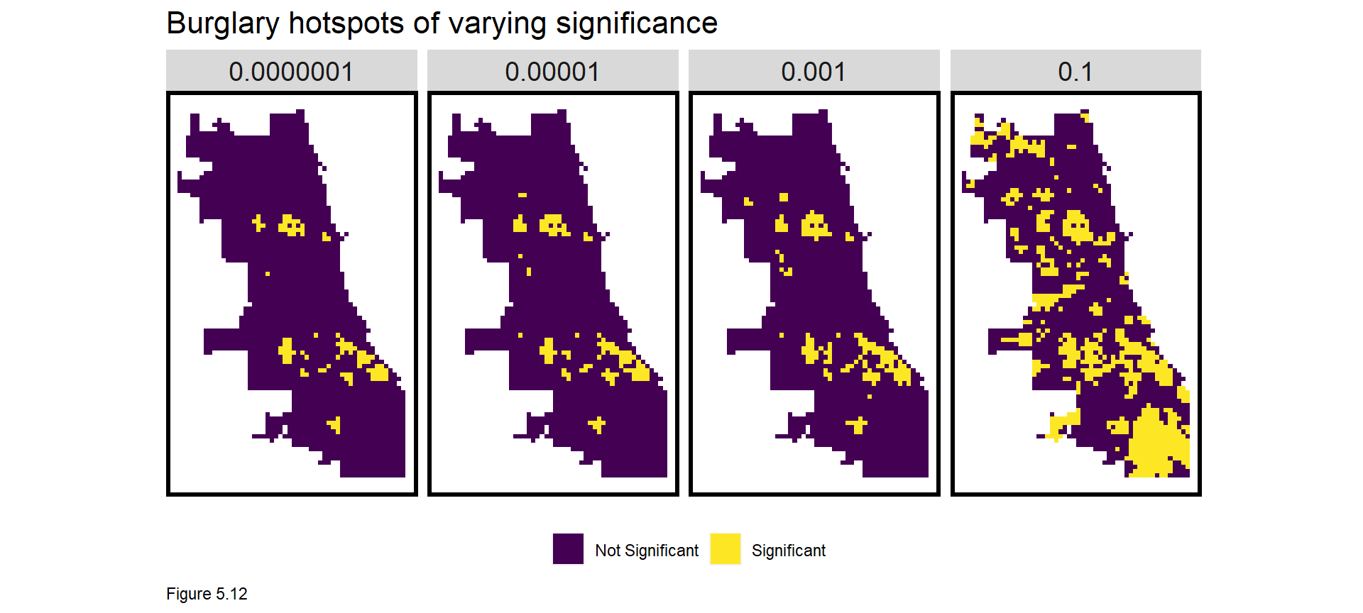
The code block below creates a Local Moran’s I feature in final_net. As before, a dummy variable, burglary.isSig, denotes a cell as part of a significant cluster (a p-value <= 0.0000001). burglary.isSig.dist then measures average nearest neighbor distance from each cell centroid to its nearest significant cluster. We can now model important information on the local spatial process of burglaries.
final_net <-
  final_net %>%
  mutate(burglary.isSig =
           ifelse(localmoran(final_net$countBurglaries,
                             final_net.weights)[,5] <= 0.0000001, 1, 0)) %>%
  mutate(burglary.isSig.dist =
           nn_function(st_coordinates(st_centroid(final_net)),
                       st_coordinates(st_centroid(
                         filter(final_net, burglary.isSig == 1))), 1))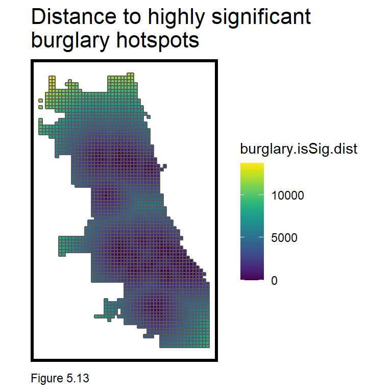
5.4.1 Correlation tests
Correlation gives important context while also providing intuition on features that may predict countBurglaries. The code block below creates a small multiple scatterplot of countBurglaries as a function of the risk factors. correlation.long converts final_net to long form. correlation.cor groups by Variable, and calculates the Pearson R correlation, shown directly on the plot.
Figure 5.14 organizes count and nearest neighbor (nn) correlations side-by-side. While correlation for count features is a bit awkward, this approach can help with feature selection. For a given risk factor, avoid colinearity by selecting either the count or nearest neighbor feature. Just remember, when all features are entered into a multivariate regression, the correlations will change.
correlation.long <-
  st_drop_geometry(final_net) %>%
    dplyr::select(-uniqueID, -cvID, -loopDistance, -name, -District) %>%
    gather(Variable, Value, -countBurglaries)

correlation.cor <-
  correlation.long %>%
    group_by(Variable) %>%
    summarize(correlation = cor(Value, countBurglaries, use = "complete.obs"))

ggplot(correlation.long, aes(Value, countBurglaries)) +
  geom_point(size = 0.1) +
  geom_text(data = correlation.cor, aes(label = paste("r =", round(correlation, 2))),
            x=-Inf, y=Inf, vjust = 1.5, hjust = -.1) +
  geom_smooth(method = "lm", se = FALSE, colour = "black") +
  facet_wrap(~Variable, ncol = 2, scales = "free") +
  labs(title = "Burglary count as a function of risk factors") +
  plotTheme()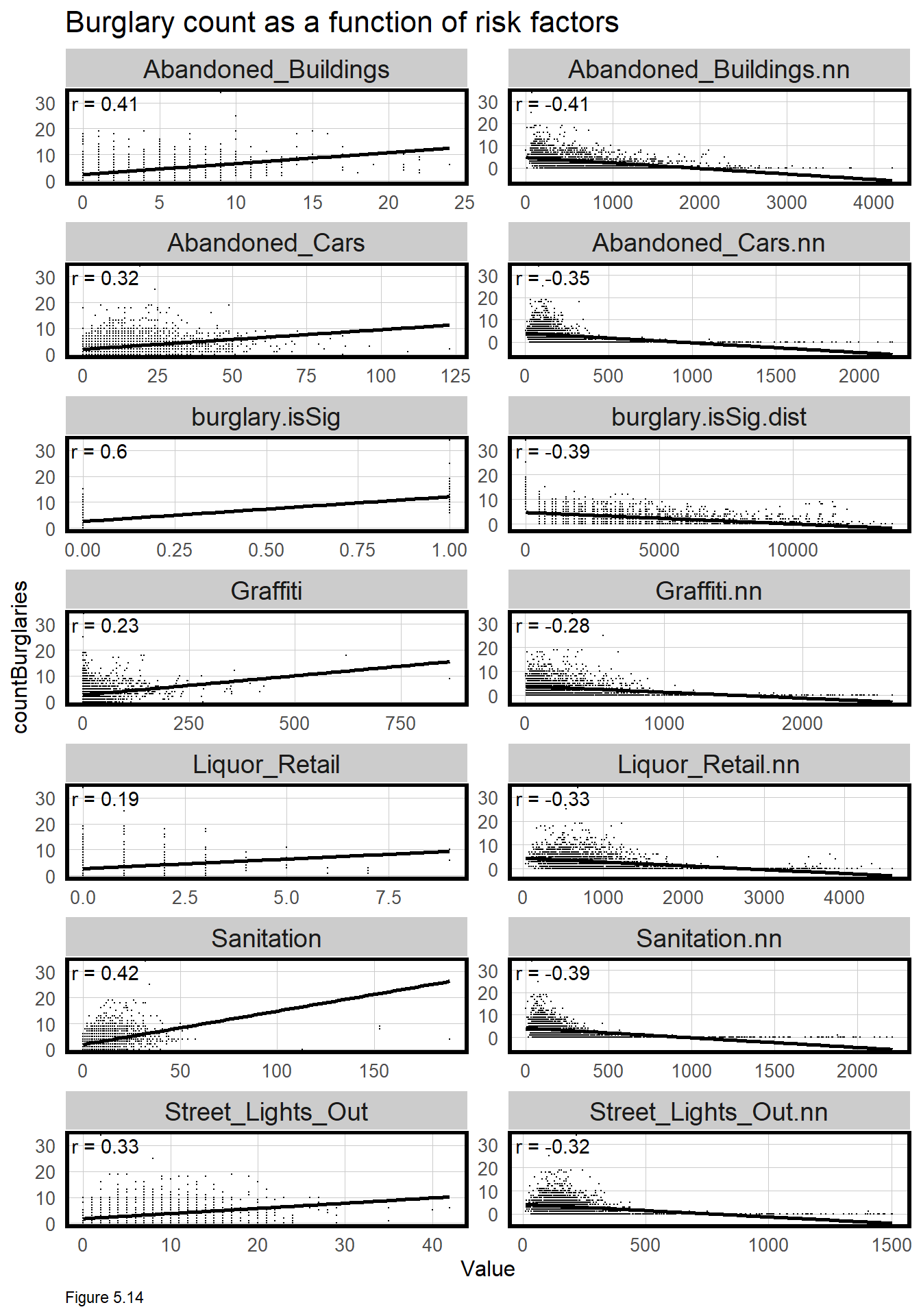
5.5 Poisson Regression
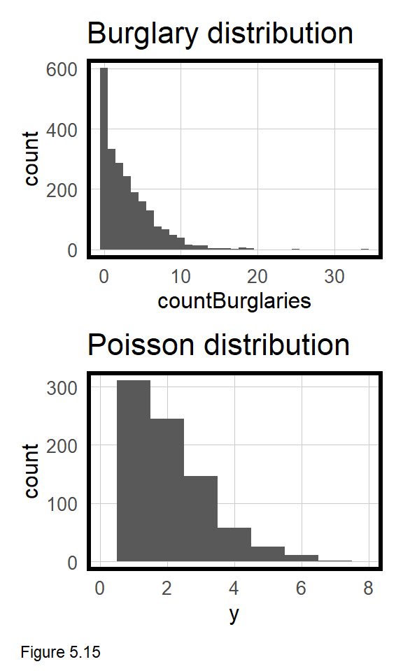
Take a look at the skewed distribution of countBurglaries in the topmost histogram of Figure 5.15. Given burglary is a relatively rare event, it is reasonable for most grid cells to contain no crime events. When data is distributed this way, an OLS regression is inappropriate. In this section, a Poisson Regression is estimated which is uniquely suited to modeling a count outcome like countBurglaries.
There are many different approaches to modeling burglary counts. Here, a Poisson Regression is used, which is based on a Poisson distribution, simulated in the bottommost histogram of Figure 5.15. Does the observed and simulated distributions appear similar? There are many flavors of count-based regression, but the one used here is the most simple.43
5.5.1 Cross-validated Poisson Regression
Recall, generalizability is important 1) to test model performance on new data and 2) on different (spatial) group contexts, like neighborhoods. In this section, both are addressed.
Unlike home prices, final_net is not split into training and test sets. Instead, we move directly to cross-validation, and because geospatial risk models are purely spatial, spatial cross-validation becomes an important option.
A well generalized crime predictive model learns the crime risk ‘experience’ at both citywide and local spatial scales. The best way to test for this is to hold out one local area, train the model on the remaining n - 1 areas, predict for the hold out, and record the goodness of fit. In this form of spatial cross-validation called ‘Leave-one-group-out’ cross-validation (LOGO-CV), each neighborhood takes a turn as a hold-out.
Imagine one neighborhood has a particularly unique local experience. LOGO-CV assumes that the experience in other neighborhoods generalizes to this unique place - which is a pretty rigid assumption.
Three final_net fields can be used for cross-validation. A random generated cvID associated with each grid cell can be used for random k-fold cross-validation. Neighborhood name and Police District can be used for spatial cross-validation.
Below, goodness of fit metrics are generated for four regressions - two including Just Risk Factors (reg.vars), and a second (reg.ss.vars) includes risk factors plus the Local Moran’s I Spatial Process features created in 5.4.1. These features are relatively simple - can you improve on them?
reg.vars <- c("Abandoned_Buildings.nn", "Abandoned_Cars.nn", "Graffiti.nn",
              "Liquor_Retail.nn", "Street_Lights_Out.nn", "Sanitation.nn",
              "loopDistance")

reg.ss.vars <- c("Abandoned_Buildings.nn", "Abandoned_Cars.nn", "Graffiti.nn",
                 "Liquor_Retail.nn", "Street_Lights_Out.nn", "Sanitation.nn",
                 "loopDistance", "burglary.isSig", "burglary.isSig.dist")
The crossValidate function below is very simple and designed to take an input dataset; a cross-validation id; a dependentVariable; and a list of independent variables, indVariables. cvID_list is a list of unique ids which could be numbers or neighborhood name, for instance.
For a given neighborhood name, the function assigns each grid cell not in that neighborhood to the training set, fold.train, and each cell in that neighborhood to the test set, fold.test. A model is trained from the former and used to predict on the latter. The process is repeated until each neighborhood has a turn acting as a hold out. For now, the countBurglaries variable is hardwired into the function, which you will have to change when using this function for future analyses. If you have read in the above functions.r, you can see the function by running crossValidate.
The code block below runs crossValidate to estimate four different regressions.
reg.cvandreg.ss.cvperform random k-fold cross validation usingJust Risk Factorsand theSpatial Processfeatures, respectively.reg.spatialCVandreg.ss.spatialCVperform LOGO-CV, spatial cross-validation on neighborhoodname, using the aforementioned two sets of features.
The function makes it easy to swap out different cross-validation group id’s. k-fold cross validation uses the cvID. LOGO-CV uses the neighborhood name. You may also wish to explore results using the Police districts. Note, in the select operation at the end of the LOGO-CV models, the cross validation id is standardized to cvID.
The result of each analysis is a sf layer with observed and predicted burglary counts.
reg.cv <- crossValidate(
  dataset = final_net,
  id = "cvID",
  dependentVariable = "countBurglaries",
  indVariables = reg.vars) %>%
    dplyr::select(cvID = cvID, countBurglaries, Prediction, geometry)

reg.ss.cv <- crossValidate(
  dataset = final_net,
  id = "cvID",
  dependentVariable = "countBurglaries",
  indVariables = reg.ss.vars) %>%
    dplyr::select(cvID = cvID, countBurglaries, Prediction, geometry)

reg.spatialCV <- crossValidate(
  dataset = final_net,
  id = "name",
  dependentVariable = "countBurglaries",
  indVariables = reg.vars) %>%
    dplyr::select(cvID = name, countBurglaries, Prediction, geometry)

reg.ss.spatialCV <- crossValidate(
  dataset = final_net,
  id = "name",
  dependentVariable = "countBurglaries",
  indVariables = reg.ss.vars) %>%
    dplyr::select(cvID = name, countBurglaries, Prediction, geometry)
5.5.2 Accuracy & Generalzability
A host of goodness of fit metrics are calculated below with particular emphasis on generalizability across space. The code block below creates a long form reg.summary, that binds together observed/predicted counts and errors for each grid cell and for each Regression, along with the cvID, and the geometry.
reg.summary <-
  rbind(
    mutate(reg.cv,           Error = Prediction - countBurglaries,
                             Regression = "Random k-fold CV: Just Risk Factors"),

    mutate(reg.ss.cv,        Error = Prediction - countBurglaries,
                             Regression = "Random k-fold CV: Spatial Process"),

    mutate(reg.spatialCV,    Error = Prediction - countBurglaries,
                             Regression = "Spatial LOGO-CV: Just Risk Factors"),

    mutate(reg.ss.spatialCV, Error = Prediction - countBurglaries,
                             Regression = "Spatial LOGO-CV: Spatial Process")) %>%
    st_sf()
In the code block below, error_by_reg_and_fold calculates and visualizes MAE for each fold across each regression. The Spatial Process features seem to reduce errors overall.
Recall, LOGO-CV assumes the local spatial process from all other neighborhoods generalizes to the hold-out. When the local spatial process is not accounted for (ie. Just Risk Factors), some neighborhood hold-outs have MAEs greater than 4 burglaries. However, those large errors disappear when the Spatial Process features are added. The lesson is that there is a shared local burglary experience across Chicago, and accounting for it improves the model, particularly in the hotspots.
What more can you learn by plotting raw errors in this histogram format?
error_by_reg_and_fold <-
  reg.summary %>%
    group_by(Regression, cvID) %>%
    summarize(Mean_Error = mean(Prediction - countBurglaries, na.rm = T),
              MAE = mean(abs(Mean_Error), na.rm = T),
              SD_MAE = mean(abs(Mean_Error), na.rm = T)) %>%
  ungroup()

error_by_reg_and_fold %>%
  ggplot(aes(MAE)) +
    geom_histogram(bins = 30, colour="black", fill = "#FDE725FF") +
    facet_wrap(~Regression) +
    geom_vline(xintercept = 0) + scale_x_continuous(breaks = seq(0, 8, by = 1)) +
    labs(title="Distribution of MAE", subtitle = "k-fold cross validation vs. LOGO-CV",
         x="Mean Absolute Error", y="Count") +
    plotTheme()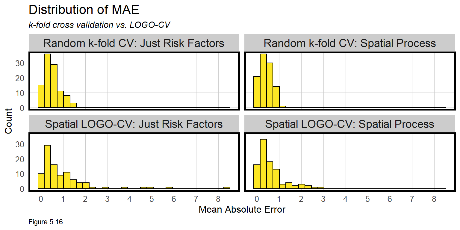
The table below builds on error_by_reg_and_fold to calculate the mean and standard deviation in errors by regression (note the additional group_by). The result confirms our conclusion that the Spatial Process features improve the model. The model appears slightly less robust for the spatial cross-validation because LOGO-CV is such a conservative assumption. For intuition on how severe these errors are, compare them to the observed mean countBurglaries.
st_drop_geometry(error_by_reg_and_fold) %>%
  group_by(Regression) %>%
    summarize(Mean_MAE = round(mean(MAE), 2),
              SD_MAE = round(sd(MAE), 2)) %>%
  kable() %>%
    kable_styling("striped", full_width = F) %>%
    row_spec(2, color = "black", background = "#FDE725FF") %>%
row_spec(4, color = "black", background = "#FDE725FF") | Regression | Mean_MAE | SD_MAE |
|---|---|---|
| Random k-fold CV: Just Risk Factors | 0.49 | 0.35 |
| Random k-fold CV: Spatial Process | 0.42 | 0.29 |
| Spatial LOGO-CV: Just Risk Factors | 0.98 | 1.26 |
| Spatial LOGO-CV: Spatial Process | 0.62 | 0.61 |
| MAE by regression | ||
| Table 5.1 |
Figure 5.17 visualizes the LOGO-CV errors spatially. Note the use of str_detect in the filter operation to pull out just the LOGO-CV regression errors. These maps visualize where the higher errors occur when the local spatial process is not accounted for. Not surprisingly, the largest errors are in the hotspot locations.
error_by_reg_and_fold %>%
  filter(str_detect(Regression, "LOGO")) %>%
  ggplot() +
    geom_sf(aes(fill = MAE)) +
    facet_wrap(~Regression) +
    scale_fill_viridis() +
    labs(title = "Burglary errors by LOGO-CV Regression") +
    mapTheme() + theme(legend.position="bottom")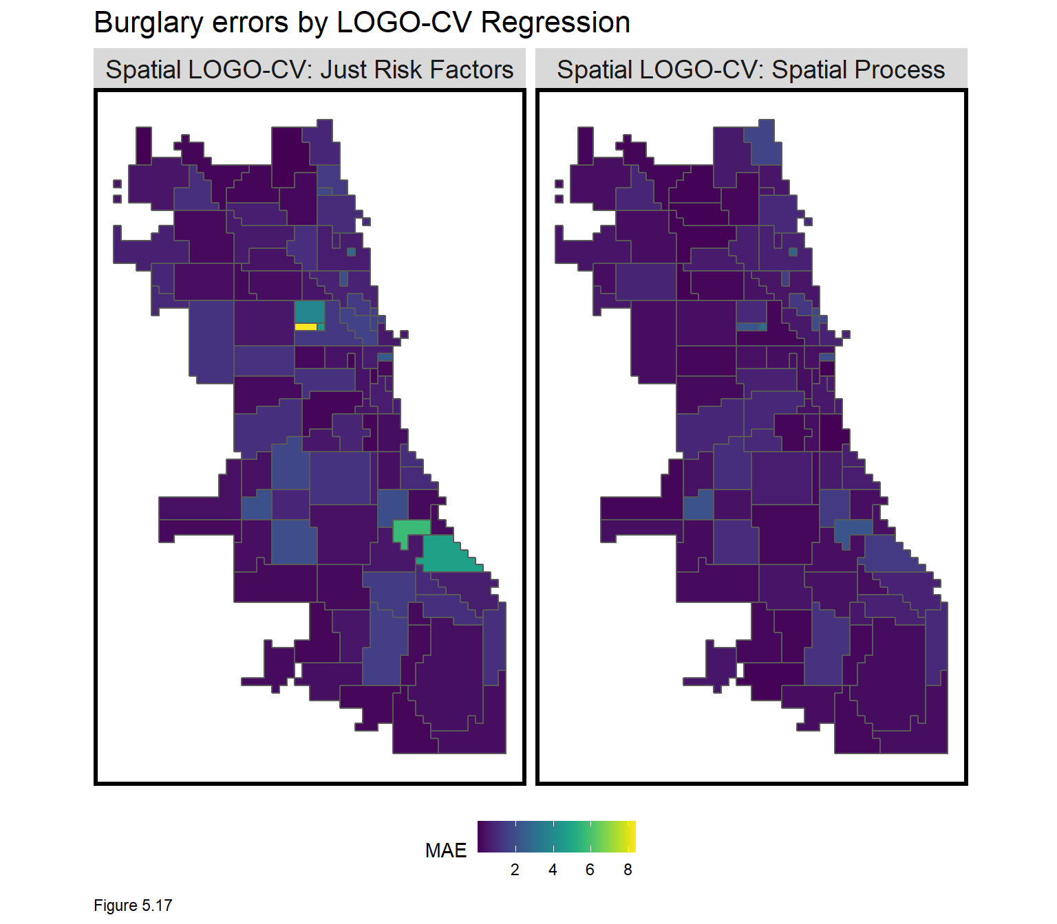
As discussed in Chapter 4, accounting for the local spatial process should remove all spatial variation in countBurglary, which should leave little spatial autocorrelation in model errors. To test this, the code block below calculates a new neighborhood.weights, spatial weights matrix at the neighborhood instead of grid cell scale. Global Moran’s I and p-values are then calculated for each LOGO-CV regression.
This provide more evidence that the Spatial Process features helped account for the spatial variation in burglary, although some still remains. More risk and protective factor features would be the next step to improve this, followed perhaps by engineering improved spatial process features.
neighborhood.weights <-
  filter(error_by_reg_and_fold, Regression == "Spatial LOGO-CV: Spatial Process") %>%
    group_by(cvID) %>%
      poly2nb(as_Spatial(.), queen=TRUE) %>%
      nb2listw(., style="W", zero.policy=TRUE)

filter(error_by_reg_and_fold, str_detect(Regression, "LOGO"))  %>%
    st_drop_geometry() %>%
    group_by(Regression) %>%
    summarize(Morans_I = moran.mc(abs(Mean_Error), neighborhood.weights,
                                 nsim = 999, zero.policy = TRUE,
                                 na.action=na.omit)[[1]],
              p_value = moran.mc(abs(Mean_Error), neighborhood.weights,
                                 nsim = 999, zero.policy = TRUE,
na.action=na.omit)[[3]])| Regression | Morans_I | p_value |
|---|---|---|
| Spatial LOGO-CV: Just Risk Factors | 0.2505835 | 0.001 |
| Spatial LOGO-CV: Spatial Process | 0.1501559 | 0.013 |
| Moran’s I on Errors by Regression | ||
| Table 5.2 |
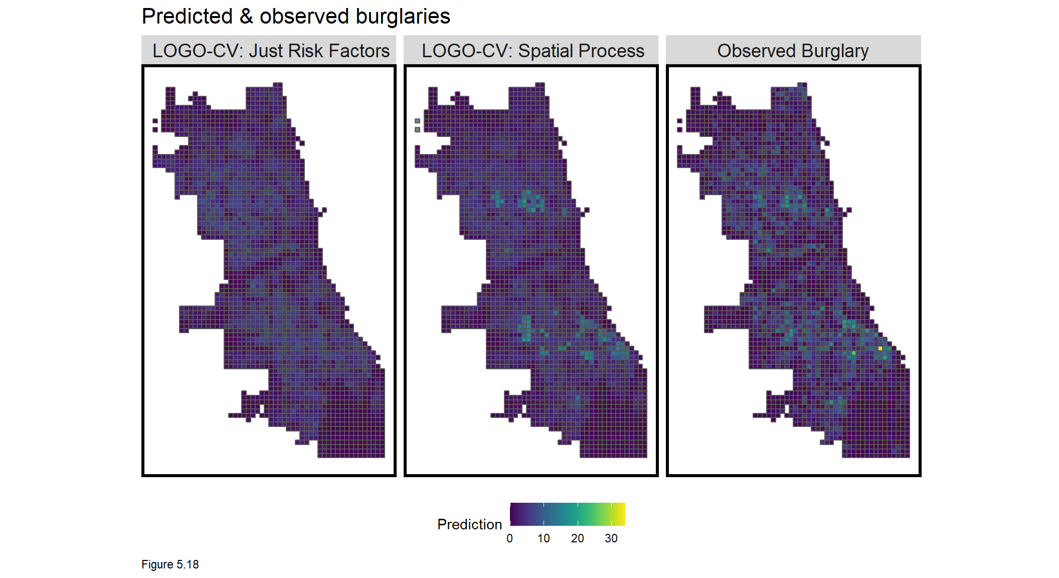
On to model predictions. Figure 5.18 below maps predictions for the LOGO-CV regressions. The Spatial Process features do a better job picking up the hotspots, as intended. Given the rigid assumptions of LOGO-CV, it is impressive that other local hotpots can generally predict hotspots in hold-out neighborhoods.
The spatial process features produce a more ‘smooth’ crime risk surface, relative to the observed counts. These predictions represent ‘latent crime risk’ - areas at risk even if a crime hasn’t actually been observed. Accuracy is not as important as generalizability, nevertheless, of 6817 observed burglaries, Spatial LOGO-CV: Spatial Process predicted 6804 burglaries, Citywide.
Interestingly, Figure 5.19 below shows that all models over-predict in low burglary areas and under-predict in hot spot areas. Over-predictions in lower burglary areas may highlight areas of latent risk. Under-prediction in higher burglary areas may reflect difficulty predicting the hotspots.
Let’s now test for generalizability across racial-neighborhood context, as we did in Chapter 4.
st_drop_geometry(reg.summary) %>%
  group_by(Regression) %>%
    mutate(burglary_Decile = ntile(countBurglaries, 10)) %>%
  group_by(Regression, burglary_Decile) %>%
    summarize(meanObserved = mean(countBurglaries, na.rm=T),
              meanPrediction = mean(Prediction, na.rm=T)) %>%
    gather(Variable, Value, -Regression, -burglary_Decile) %>%
    ggplot(aes(burglary_Decile, Value, shape = Variable)) +
      geom_point(size = 2) + geom_path(aes(group = burglary_Decile), colour = "black") +
      scale_shape_manual(values = c(2, 17)) +
      facet_wrap(~Regression) + xlim(0,10) +
      labs(title = "Predicted and observed burglary by observed burglary decile")  +
      plotTheme()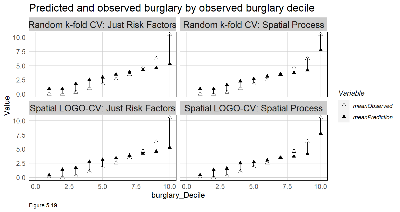
5.5.3 Generalizability by neighborhood context
Does the algorithm generalize across different neighborhood contexts? To test this proposition, tidycensus is used to pull race data by Census tract. percentWhite is calculated and tracts are split into two groups, Majority_White and Majority_Non_White. A spatial subset is used to get tracts within the study area.
Like Boston, Chicago is a very segregated City, as the map below shows.
tracts18 <-
  get_acs(geography = "tract", variables = c("B01001_001E","B01001A_001E"),
          year = 2018, state=17, county=031, geometry=T) %>%
  st_transform('ESRI:102271')  %>%
  dplyr::select(variable, estimate, GEOID) %>%
  spread(variable, estimate) %>%
  rename(TotalPop = B01001_001,
         NumberWhites = B01001A_001) %>%
  mutate(percentWhite = NumberWhites / TotalPop,
         raceContext = ifelse(percentWhite > .5, "Majority_White", "Majority_Non_White")) %>%
  .[neighborhoods,]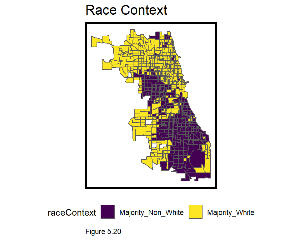
As in Chapter 4, Error is calculated by subtracting the observed burglary count from the prediction. Thus, a positive difference represents an over-prediction. The least ideal result is a model that over-predicts risk in Minority areas, and under-predicts in White areas. If reporting selection bias is an issue, such a model may unfairly allocate police resource disproportionately in Black and Brown communities. The table below compares average (non-absolute) errors for the LOGO-CV regressions by raceContext, by joining the fishnet grid cell centroids to tract boundaries.
The model on average, under-predicts in Majority_Non_White neighborhoods and over-predicts in Majority_White neighborhoods. The Spatial Process model not only reports lower errors overall, but a smaller difference in errors across neighborhood context.
It looks like this algorithm generalizes well with respect to race, right? We will return to this question in the conclusion. In the last stage of the analysis, the utility of this algorithm is judged relative to an alternative police allocation method.
reg.summary %>%
  filter(str_detect(Regression, "LOGO")) %>%
    st_centroid() %>%
    st_join(tracts18) %>%
    na.omit() %>%
      st_drop_geometry() %>%
      group_by(Regression, raceContext) %>%
      summarize(mean.Error = mean(Error, na.rm = T)) %>%
      spread(raceContext, mean.Error) %>%
      kable(caption = "Mean Error by neighborhood racial context") %>%
kable_styling("striped", full_width = F) | Regression | Majority_Non_White | Majority_White |
|---|---|---|
| Spatial LOGO-CV: Just Risk Factors | -0.1164018 | 0.1211148 |
| Spatial LOGO-CV: Spatial Process | -0.0525908 | 0.0421751 |
| Mean Error by neighborhood racial context | ||
| Table 5.3 |
5.5.4 Does this model allocate better than traditional crime hotspots?
Police departments all over the world use hotspot policing to target police resources to the places where crime is most concentrated. In this section, we ask whether risk predictions outperform traditional ‘Kernel density’ hotspot mapping44. To add an element of across-time generalizability, hotspot and risk predictions from these 2017 burglaries are used to predict the location of burglaries from 2018.
Kernel density works by centering a smooth kernel, or curve, atop each crime point such that the curve is at its highest directly over the point and the lowest at the range of a circular search radius. The density in a particular place is the sum of all the kernels that underlie it. Thus, areas with many nearby points have relatively high densities. The key scale assumption in kernel density is the use of a global search radius parameter. Because of its reliance on nearby points, think of Kernel density as one making ‘predictions’ based purely on spatial autocorrelation.
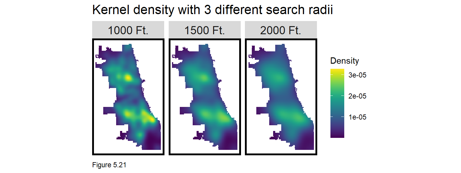
Figure 5.20 visualizes three Kernel density maps at three different scales. Note the different burglary hotspot ‘narratives’ depending on the radius used.
The code block below creates a Kernel density map with a 1000 foot search radius using the spatstat package. as.ppp converts burglary coordinates to a ppp class. The density function creates the Kernel density. To map, the ppp is converted to a data frame and then an sf layer. Points are spatially joined to the final_net and the mean density is taken. Here density is visualized with a sample_n of 1,500 points overlayed on top.
burg_ppp <- as.ppp(st_coordinates(burglaries), W = st_bbox(final_net))
burg_KD <- spatstat::density.ppp(burg_ppp, 1000)

as.data.frame(burg_KD) %>%
  st_as_sf(coords = c("x", "y"), crs = st_crs(final_net)) %>%
  aggregate(., final_net, mean) %>%
   ggplot() +
     geom_sf(aes(fill=value)) +
     geom_sf(data = sample_n(burglaries, 1500), size = .5) +
     scale_fill_viridis(name = "Density") +
     labs(title = "Kernel density of 2017 burglaries") +
     mapTheme()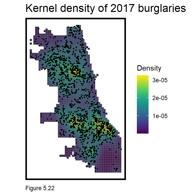
Next, a new goodness of fit indicator is created to illustrate whether the 2017 kernel density or risk predictions capture more of the 2018 burglaries. If the risk predictions capture more observed burglaries than the kernel density, then the risk prediction model provides a more robust targeting tool for allocating police resources. Here are the steps.
- Download
burglaries18from the Chicago Open Data site. - Compute the Kernel Density on 2017
burglaries. - Scale the Kernel density values to run from 1-100 and then reclassify those values into 5 risk categories.
- Spatial join the density to the fishnet.
- Join to the fishnet, the count of burglaries in 2018 for each grid cell.
- Repeat for the risk predictions.
- Take the rate of 2018 points by model type and risk category. Map and plot accordingly.
Step 1 downloads burglaries18.
burglaries18 <-
  read.socrata("https://data.cityofchicago.org/Public-Safety/Crimes-2018/3i3m-jwuy") %>%
  filter(Primary.Type == "BURGLARY" &
         Description == "FORCIBLE ENTRY") %>%
  mutate(x = gsub("[()]", "", Location)) %>%
  separate(x,into= c("Y","X"), sep=",") %>%
  mutate(X = as.numeric(X),
         Y = as.numeric(Y)) %>%
  na.omit %>%
  st_as_sf(coords = c("X", "Y"), crs = 4326, agr = "constant") %>%
  st_transform('ESRI:102271') %>%
  distinct() %>%
  .[fishnet,]
Next, Kernel density is computed on the 2017 burglaries. burg_KDE_sf converts the density to an sf layer; spatial joins (aggregate) it to the fishnet; converts the density to 100 deciles (ntile); and again to 5 risk categories. Finally, one last spatial join adds the count of observed burglaries in 2018.
Check out head(burg_KDE_sf) to see the result.
burg_ppp <- as.ppp(st_coordinates(burglaries), W = st_bbox(final_net))
burg_KD <- spatstat::density.ppp(burg_ppp, 1000)

burg_KDE_sf <- as.data.frame(burg_KD) %>%
  st_as_sf(coords = c("x", "y"), crs = st_crs(final_net)) %>%
  aggregate(., final_net, mean) %>%
  mutate(label = "Kernel Density",
         Risk_Category = ntile(value, 100),
         Risk_Category = case_when(
           Risk_Category >= 90 ~ "90% to 100%",
           Risk_Category >= 70 & Risk_Category <= 89 ~ "70% to 89%",
           Risk_Category >= 50 & Risk_Category <= 69 ~ "50% to 69%",
           Risk_Category >= 30 & Risk_Category <= 49 ~ "30% to 49%",
           Risk_Category >= 1 & Risk_Category <= 29 ~ "1% to 29%")) %>%
  cbind(
    aggregate(
      dplyr::select(burglaries18) %>% mutate(burgCount = 1), ., sum) %>%
    mutate(burgCount = replace_na(burgCount, 0))) %>%
  dplyr::select(label, Risk_Category, burgCount)
The same process is repeated for risk predictions. Note the prediction from the LOGO-CV with the spatial features is being used here.
burg_risk_sf <-
  filter(reg.summary, Regression == "Spatial LOGO-CV: Spatial Process") %>%
  mutate(label = "Risk Predictions",
         Risk_Category = ntile(Prediction, 100),
         Risk_Category = case_when(
           Risk_Category >= 90 ~ "90% to 100%",
           Risk_Category >= 70 & Risk_Category <= 89 ~ "70% to 89%",
           Risk_Category >= 50 & Risk_Category <= 69 ~ "50% to 69%",
           Risk_Category >= 30 & Risk_Category <= 49 ~ "30% to 49%",
           Risk_Category >= 1 & Risk_Category <= 29 ~ "1% to 29%")) %>%
  cbind(
    aggregate(
      dplyr::select(burglaries18) %>% mutate(burgCount = 1), ., sum) %>%
      mutate(burgCount = replace_na(burgCount, 0))) %>%
  dplyr::select(label,Risk_Category, burgCount)
For each grid cell and model type (density vs. risk prediction), there is now an associated risk category and 2018 burglary count. Below a map is generated of the risk categories for both model types with a sample of burglary18 points overlaid. A strongly fit model should show that the highest risk category is uniquely targeted to places with a high density of burglary points.
Is this what we see? High risk categories with few 2018 observed burglaries may suggest latent risk or a poorly fit model. This ambiguity is why accuracy for geospatial risk models is tough to judge. Nevertheless, more features/feature engineering would be helpful.
rbind(burg_KDE_sf, burg_risk_sf) %>%
  na.omit() %>%
  gather(Variable, Value, -label, -Risk_Category, -geometry) %>%
  ggplot() +
    geom_sf(aes(fill = Risk_Category), colour = NA) +
    geom_sf(data = sample_n(burglaries18, 3000), size = .5, colour = "black") +
    facet_wrap(~label, ) +
    scale_fill_viridis(discrete = TRUE) +
    labs(title="Comparison of Kernel Density and Risk Predictions",
         subtitle="2017 burglar risk predictions; 2018 burglaries") +
    mapTheme()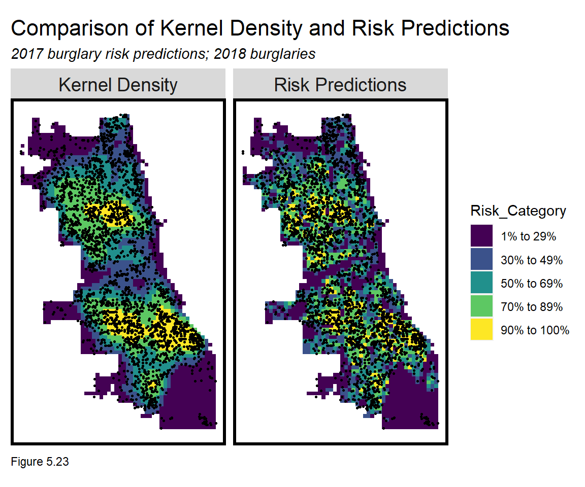
Finally, the code block below calculates the rate of 2018 burglary points by risk category and model type. A well fit model should show that the risk predictions capture a greater share of 2018 burglaries in the highest risk category relative to the Kernel density.
The risk prediction model narrowly edges out the Kernel Density in the top two highest risk categories - suggesting this simple model has some value relative to the business-as-usual hot spot approach. Thus, we may have developed a tool to help target police resources, but is it a useful planning tool?
rbind(burg_KDE_sf, burg_risk_sf) %>%
  st_set_geometry(NULL) %>% na.omit() %>%
  gather(Variable, Value, -label, -Risk_Category) %>%
  group_by(label, Risk_Category) %>%
  summarize(countBurglaries = sum(Value)) %>%
  ungroup() %>%
  group_by(label) %>%
  mutate(Rate_of_test_set_crimes = countBurglaries / sum(countBurglaries)) %>%
    ggplot(aes(Risk_Category,Rate_of_test_set_crimes)) +
      geom_bar(aes(fill=label), position="dodge", stat="identity") +
      scale_fill_viridis(discrete = TRUE) +
      labs(title = "Risk prediction vs. Kernel density, 2018 burglaries") +
      plotTheme() + theme(axis.text.x = element_text(angle = 45, vjust = 0.5))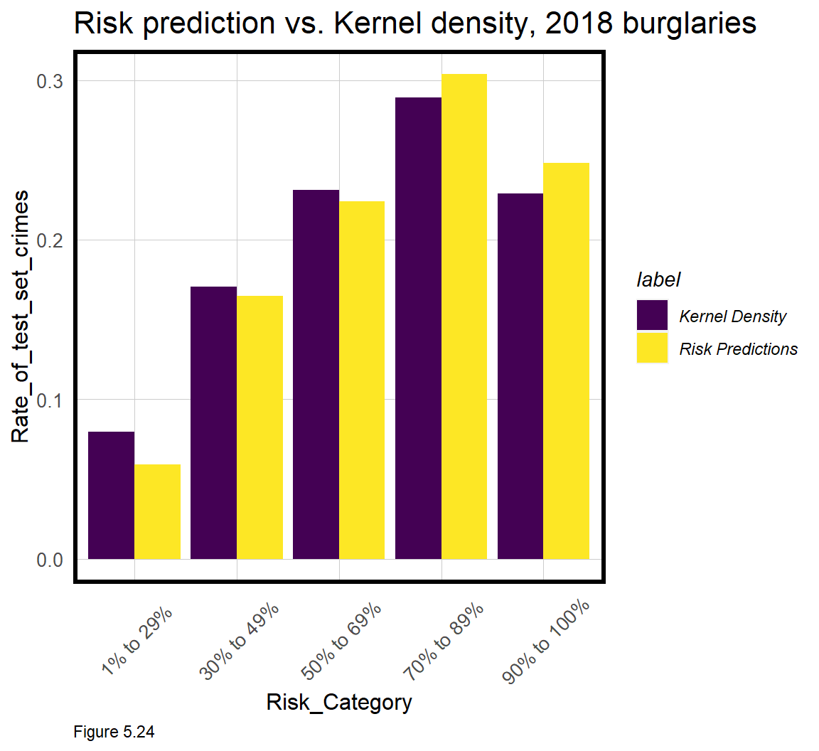
5.6 Conclusion - Bias but useful?
In this chapter, a geospatial risk prediction model borrows the burglary experience in places where it has been observed, and tests whether that experience generalizes to places where burglary risk may be high, despite few actual events. Should these tests hold, the resulting predictions can be thought of as ‘latent risk’ for burglary and can be used to allocate police response across space.
We introduced new and powerful feature engineering strategies to capture the local spatial process. Spatial cross-validation was also introduced as an important test of across-space generalizability.
Despite finding that the model generalizes well across different neighborhood contexts, we cannot be sure the model doesn’t suffer from selection bias. As discussed in 5.1, if law enforcement systemtically over-polices certain communities, and this selection criteria goes unaccounted for in the model, then the model may be biased regardless of the above tests.
Nevertheless, we have demonstrated that even a simple risk prediction algorithm may outperform traditional hot spot analysis. By adding the element of time/seasonality (see Chapter 8) and deploying predictions in an intuitive user interface, this approach could easily compete with commercial Predictive Policing products. Should it?
Imagine if ‘back-testing’ the algorithm on historical data showed that its use would have predicted 20% more burglary than the current allocation process (either Kernel density or otherwise). What if we could show Chicago officials that paying us $100k/year for a license to our algorithm would reduce property crime by $10 million - should they buy it?
Such a cost/benefit argument makes for a powerful sales pitch - and it is why data science is such a fast growing industry. However, as I have mentioned, economic bottom lines are far from the only bottom lines in government.
What if the $10 million in savings lead police to increase enforcement and surveillance disproportionately in Black and Brown communities? Worse, what about feedback effects where steering police to these neighborhoods causes more reported crime, which then leads to increased predicted risk?
Stakeholders will either conclude, “but this tech reduces crime - this is a no-brainer!” or, “this technology perpetuates a legacy of systematic racism, fear, and disenfranchisement!”
Both opinions have merit and the right approach is a function of community standards. Many big cities are currently at this point. Law enforcement sees machine learning as the next logical progression in the analytics they have been building for years. At the same time, critics and community stakeholders see these as tools of the surveillance state.
These two groups need a forum for communicating these views and for agreeing on the appropriate community standard. I refer to such a forum as one being part of the ‘algorithmic governance’ process, discussed in more detail in the book’s Conclusion.
Finally, while these models may not be appropriate for crime prediction, there are a host of other Planning outcomes that could benefit greatly. In the past I have built these models to predict risks for outcomes like fires and child maltreatment. I have also built them to predict where a company’s next retail store should go. I urge readers to think about how these models could be used to predict ‘opportunity’, not just risk.
As always, this begins with an understanding of the use case and the current resource allocation process. The outcome of all this code should not be just a few maps and tables, but a strategic plan that converts these predictions into actionable intelligence.
5.7 Assignment - Predict risk
Your job is to build a version of this model for a different outcome that likely suffers from more selection bias than burglary. You can build this model in Chicago or any other city with sufficient open data resources. Please also add at least two new features not used above, and iteratively build models until you have landed on one that optimizes for accuracy and generalizability.
Your final deliverable should be in R markdown form with code blocks. Please provide the following materials with brief annotations (please don’t forget this):
- A map of your outcome of interest in point form, with some description of what, when, and why you think selection bias may be an issue.
- A map of your outcome joined to the fishnet.
- A small multiple map of your risk factors in the fishnet (counts, distance and/or other feature engineering approaches).
- Local Moran’s I-related small multiple map of your outcome (see 5.4.1)
- A small multiple scatterplot with correlations.
- A histogram of your dependent variable.
- A small multiple map of model errors by random k-fold and spatial cross validation.
- A table of MAE and standard deviation MAE by regression.
- A table of raw errors by race context for a random k-fold vs. spatial cross validation regression.
- The map comparing kernel density to risk predictions for the next year’s crime.
- The bar plot making this comparison.
- Two paragraphs on why or why not you would recommend your algorithm be put into production.
Weisburd, D., Mastrofski, S. D., Greenspan, R., & Willis, J. J. (2004). The growth of Compstat in American policing. Police Foundation Reports, 12.↩︎
Law Enforcement Management and Administrative Statistics (LEMAS), 2013. United States Department of Justice. Office of Justice Programs. Bureau of Justice Statistics↩︎
Sturgill, Kristi (2020). Sant Cruz becomes the first U.S. city to ban predictive policing. Los Angeles Times. https://www.latimes.com/california/story/2020-06-26/santa-cruz-becomes-first-u-s-city-to-ban-predictive-policing↩︎
Murray, A., Giammarise, K. (2020). Pittsburgh suspends policing program that used algorithms to predict crime ‘hot spots’. https://www.post-gazette.com/news/crime-courts/2020/06/23/Pittsburgh-suspends-policing-police-program-algorithms-predict-predictive-hot-spots-crime-data/stories/202006230059↩︎
For this use case, the dependent variable is the count of events, thus the predictions are also counts. Binary and continuous outcomes are also possible. Either way, the predictions generally speaking, can be interpreted as ‘risk’ or ‘opportunity’ of an event.↩︎
See Lum & Isaac (2016) for a terrific discussion of bias in recorded police data. Lum, K., & Isaac, W. (2016). To predict and serve?. Significance, 13(5), 14-19.↩︎
Wilson, J. Q., & Kelling, G. L. (1982). Broken windows. Atlantic monthly, 249(3), 29-38.↩︎
Kennedy, L. W., Caplan, J. M., Piza, E. L., & Buccine-Schraeder, H. (2016). Vulnerability and exposure to crime: Applying risk terrain modeling to the study of assault in Chicago. Applied Spatial Analysis and Policy, 9(4), 529-548.↩︎
311 systems are used by many cities to provide information to residents or collect non-emergency information. A 311 graffiti report could be passed along to a city department to dispatch an abatement crew for clean up.↩︎
A great contemporary recounting of this history is Rothstein, R. (2017). The Color of Law: A forgotten history of how our government segregated America. Liveright Publishing.↩︎
500ft may be a reasonable scale as perhaps it conforms to the size of a city block. It is also helpful to have a distribution of crime counts that follows a theoretical distribution (more on that in 5.5). Finally, 500ft might limit the number of grid cells to be analyzed, and thus the overall computing time.↩︎
More advanced readers might consider negative binomial and its variants. Another option would be to model a ‘binomial’ outcome (Chapter 6) where crime counts are distilled to a
0(no burglaries) and1(>0 burglaries). A prediction from this model would be interpreted as the ‘probability of a burglary being committed here’. 73% of grid cells have at least 1 burglary, which would render most areas as having a high probability. Regressing on a count outcome is useful because it predicts a more continuous quantity of risk.↩︎This analytic is inspired by Daley, D., Bachmann, M., Bachmann, B. A., Pedigo, C., Bui, M. T., & Coffman, J. (2016). Risk terrain modeling predicts child maltreatment. Child abuse & neglect, 62, 29-38.↩︎