Chapter 6 People-based ML models

(I’m a data scientist, not a graphic designer)
6.1 Bounce to work
Most organizations work on behalf of ‘clients’. Government agencies provide services to firms and households; non-profits rely on donors to keep the lights on; and businesses sell products and services to customers. At any point, a client may no longer wish to participate, donate, or purchase a good, which will affect the bottom line of the organization.
We have learned how data science can identify risk and opportunity in space, and not surprisingly, these methods can also be used to identify risk/opportunity for clients. In this chapter, we learn how to predict risk for individuals and use the resulting intelligence to develop cost/benefit analyses. Specifically, the goal is to predict ‘churn’ - the decision of a client not to re-subscribe to a product or service.
Imagine you are the head of sales and marketing for a pogo-transit start-up called ‘Bounce to Work!’. Two years ago, Bounce to Work! rolled out 2,000 dockless, GPS-enabled pogo sticks around the city charging riders $3 per bounce or a membership of $30/month for unlimited bouncing. Bounce to Work!’s first year resulted in more bouncing then the company could have ever imagined, and to keep its customers engaged, the company is looking to embark on a membership drive.
You have noticed that every month, between 20% and 25% of the roughly 30,000 members ‘churn’ or do not renew their membership at month’s end. Not accounting for new members, that is a revenue loss of as much as $225,000 (7,500 members * $30 per membership) per month! This volatility is creating some uncertainty in the company’s expansion efforts. They have asked you to put your data science skills to the test, by predicting for every member, the probability that they will churn, conditional on a host of bouncing data collected by the company. Those predicted probabilities will then be used to prioritize who gets a $2 marketing mailer that includes a 20% off membership coupon (an $8 expenditure, in total).
Predicting churn has all sorts of interesting cost/benefit implications for Bounce to Work!. If your algorithm predicts a customer will not churn and a mailer is not sent, but they do in fact churn (a false negative), then the company is out $30. If you predict a customer will churn and send them a mailer but they had no intention of churning, then you loose $8 (20% off a $30 membership plus a $2 mailer).
While Bounce to Work! is a slightly absurd premise for this chapter, data science can be most impactful (both positively and negatively) when used to target families and individuals for critical services. In this chapter, a classic churn-related dataset from IBM is used, although I have altered the variables names to make it more apropos.45
The next section performs exploratory analysis; Section 3 introduces logistic regression; Sections 4 and 5 focus on goodness of fit for these models as well as cross-validation. Section 6 delves into cost/benefit and 7 concludes. Below is the data dictionary. Each row is a customer and the outcome of interest, Churn, consists of two levels, Churn and No_Churn. Our goal is to predict this ‘binary’ outcome using demographic and ridership-specific variables.
| Variable | Description |
|---|---|
| SeniorCitizen | Whether the customer is a senior citizen or not (1, 0) |
| WeekendBouncer | Does this customer bounce on the weekends or only on weekdays? (Yes, No) |
| avgBounceTime | Average length of a pogo trip in minutes |
| bounceInStreet | Does this customer tend to bounce on streets (Yes) or on sidewalks (No)? |
| phoneType | The operating system of the customer’s phone (IPhone, Android, Unknown) |
| avgBounceDistance | Distance of a customer’s average bounce as a categorical variable (<1 ft., 1-4 ft., 4+ ft.) |
| avgBounceHeight | Height of a customer’s Average bounce as a categorical variable (<1 ft., 1-2 ft., 2+ ft.) |
| PaperlessBilling | Whether the customer has paperless billing or not (Yes, No) |
| monthlyDistanceBounced | The amount of distance in miles coverered last month |
| totalDistanceBounced | The amount of distance in miles coverered since becoming a member |
| Churn | Whether the customer churned or not (Churn or No_Churn) |
| Data Dictionary | |
| Table 6.1 |
options(scipen=10000000)

library(tidyverse)
library(caret)
library(knitr)
library(pscl)
library(plotROC)
library(pROC)
library(scales)

root.dir = "https://raw.githubusercontent.com/urbanSpatial/Public-Policy-Analytics-Landing/master/DATA/"
source("https://raw.githubusercontent.com/urbanSpatial/Public-Policy-Analytics-Landing/master/functions.r")

palette5 <- c("#981FAC","#CB0F8B","#FF006A","#FE4C35","#FE9900")
palette4 <- c("#981FAC","#FF006A","#FE4C35","#FE9900")
palette2 <- c("#981FAC","#FF006A")

churn <- read.csv(file.path(root.dir,"/Chapter6/churnBounce.csv")) %>%
  mutate(churnNumeric = as.factor(ifelse(Churn == "Churn", 1, 0))) %>%
  na.omit()
Let’s start by loading libraries and the data. In the code block above, the outcome is recoded to a binary, 0 and 1 variable called churnNumeric. Any field with NA is removed from the data.
6.2 Exploratory analysis
Churn is defined as a customer not re-subscribing to a service. In this section, the data is explored by visualizing correlation between churn and the predictive features. Correlation for a continuous outcome like home price, can be visualized with a scatterplot. However, when the dependent variable is binary, with two possible outcomes, a different approach is needed. Useful features are those that exhibit significant differences across the Churn and No_Churn outcomes.
First, note that 1869 of 7032 customers in the dataset churned (27%).
Figure 6.1 plots the mean for 2 continuous features grouped by Churn or No_Churn. The interpretation is that the longer a customer bounces, both by trip and historically, the more likely, on average, a customer will re-up their membership (i.e. No_Churn).
churn %>%
  dplyr::select(Churn,avgBounceTime, totalDistanceBounced) %>%
  gather(Variable, value, -Churn) %>%
  ggplot(aes(Churn, value, fill=Churn)) +
    geom_bar(position = "dodge", stat = "summary", fun = "mean") +
    facet_wrap(~Variable, scales = "free") +
    scale_fill_manual(values = palette2) +
    labs(x="Churn", y="Mean",
         title = "Feature associations with the likelihood of churn",
         subtitle = "(Continous outcomes)") +
    plotTheme() + theme(legend.position = "none")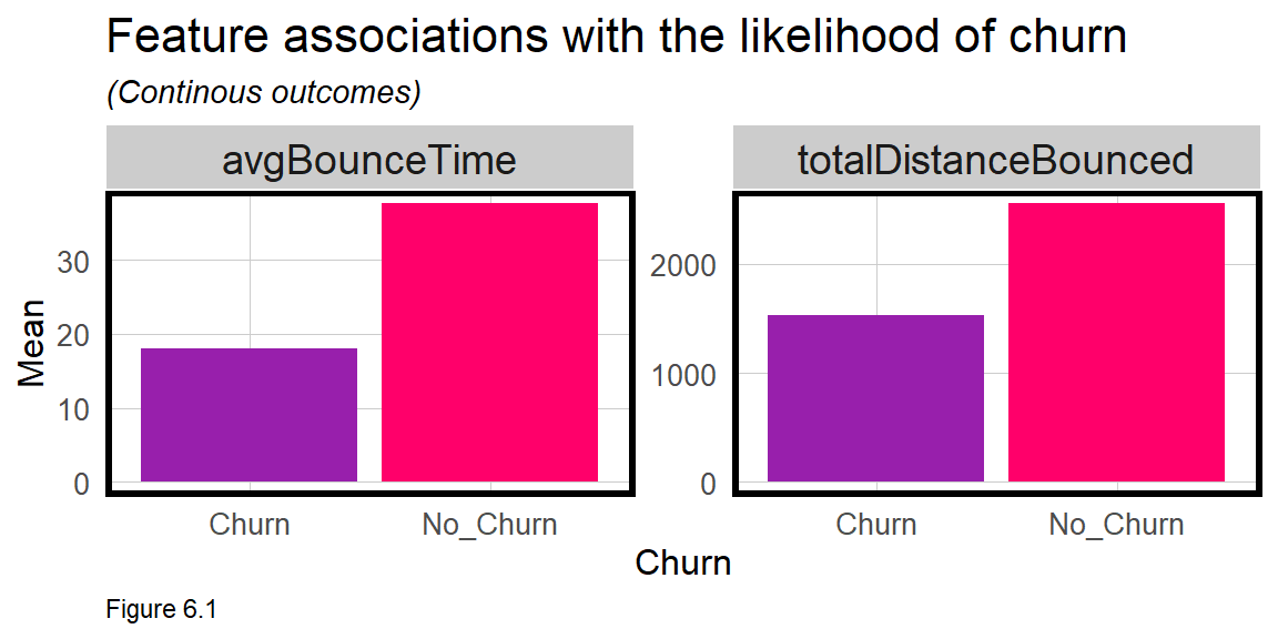
Not only is the dependent variable categorical, most of the features are as well. The plots below illustrate whether differences in customer factors associate with the likelihood that they will churn. The count function below calculates the total number of customers reported as ‘Yes’ for a given feature.
The interpretation is that more people who re-up their membership (No_Churn) tend to bounce in the street, pay by internet, and bounce on weekends.
churn %>%
  dplyr::select(Churn,SeniorCitizen, WeekendBouncer, bounceInStreet, PaperlessBilling) %>%
  gather(Variable, value, -Churn) %>%
  count(Variable, value, Churn) %>%
  filter(value == "Yes") %>%
    ggplot(aes(Churn, n, fill = Churn)) +
      geom_bar(position = "dodge", stat="identity") +
      facet_wrap(~Variable, scales = "free", ncol=4) +
      scale_fill_manual(values = palette2) +
      labs(x="Churn", y="Count",
           title = "Feature associations with the likelihood of churn",
           subtitle = "Two category features (Yes and No)") +
      plotTheme() + theme(legend.position = "none")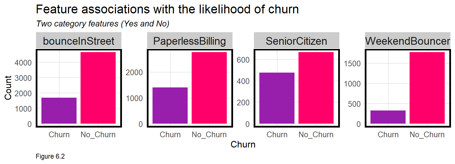
Finally, the code block below plots three category associations. The plot suggests that a customer who bounces 4 feet at a time and upwards of 2 feet in the air, has a lower likelihood of Churn. Clearly, more experienced bouncers are more likely to continue their membership.
churn %>%
  dplyr::select(Churn, phoneType, avgBounceDistance, avgBounceHeight) %>%
  gather(Variable, value, -Churn) %>%
  count(Variable, value, Churn) %>%
  ggplot(aes(value, n, fill = Churn)) +
    geom_bar(position = "dodge", stat="identity") +
    facet_wrap(~Variable, scales="free") +
    scale_fill_manual(values = palette2) +
    labs(x="Churn", y="Count",
         title = "Feature associations with the likelihood of churn",
         subtitle = "Three category features") +
    plotTheme() + theme(axis.text.x = element_text(angle = 45, hjust = 1))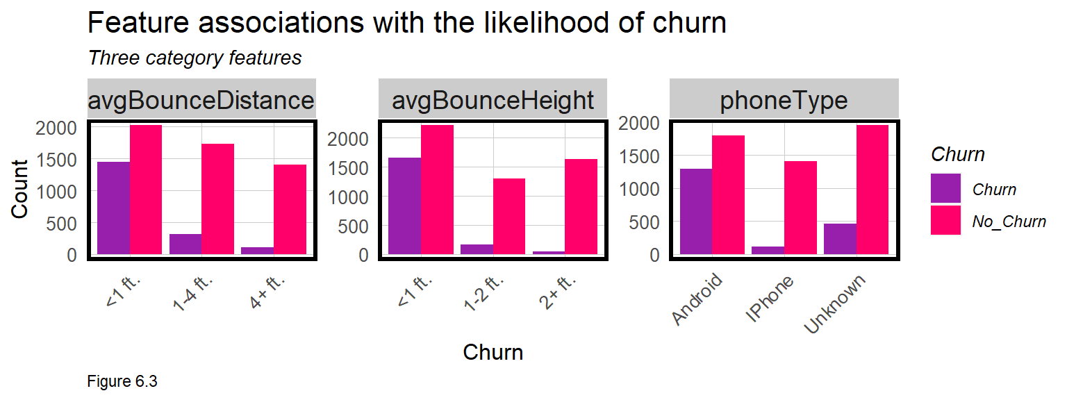
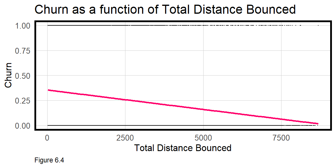
Churn has two possible outcomes, but imagine in Figure 6.4 below, if churnNumeric varied continuously as a function of totalDistanceBounced. The resulting scatterplot is awkward. OLS regression is not appropriate for binomial outcomes. Instead Logistic regression is introduced below.
6.3 Logistic regression
Logistic regression, in the Generalized Linear Model (glm) family, predicts the probability an observation is part of a group, like Churn or Not_Churn, conditional on the features of the model. OLS fits a linear line by minimizing the sum of squared errors, but model fitting in Logistic regression is based on a technique called Maximum Likelihood Estimation. While the math is beyond the scope of this book, the idea is to iteratively fit regression coefficients to the model to maximize the probability of the observed data.
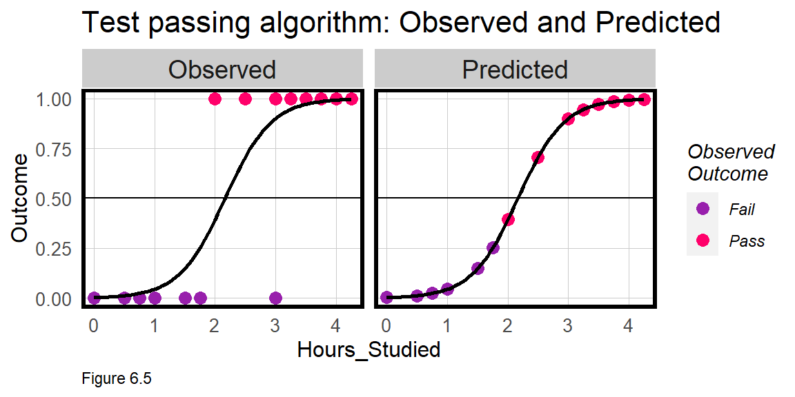
Logistic regression fits an S-shaped logistic curve like the one below. For a simple illustration, imagine I trained an algorithm from the Observed test-taking experience of previous students, to estimate the Predicted probability that current students will pass an exam, conditional on one feature - hours spent studying. According to leftmost panel in Figure 6.5, as Observed study hours increases so does the probability of passing.
The Predicted probabilities for the Logistic model fall along the logistic curve and run from 0% probability of passing to 1, or 100% probability of passing. In the rightmost panel above, a model is fit, and the predicted probabilities are plotted along the fitted line colored by their observed Pass/Fail designation.
The predicted probabilities alone would be useful for the students, but I could also set a threshold above which a student would be ‘classified’ as Pass. Assume the threshold is 50%. The Predicted panel reveals one student who studied for just 2 hours but still passed the test. A threshold of 50% would incorrectly predict or classify that student as having failed the test - a False Negative. As we’ll learn, classification errors are useful for cost/benefit analysis.
6.3.1 Training/Testing sets
Recall, a generalizable model 1) performs well on new data and 2) predicts with comparable accuracy across groups. Bounce to Work! doesn’t collect race or geographic coordinates in the data, so groups will not be the focus. Thus, the focus will be on the first definition, which is critical, given that in a production setting, the model is only useful if it can predict for next month’s churn-ers.
In this section, training and test sets are created. createDataPartition is used to split the data. A 50% sample is used here to reduce processing time.
set.seed(3456)
trainIndex <- createDataPartition(churn$Churn, p = .50,
                                  list = FALSE,
                                  times = 1)
churnTrain <- churn[ trainIndex,]
churnTest  <- churn[-trainIndex,]
6.3.2 Estimate a churn model
Next, a Logistic regression model is estimated as churnreg1. To keep things simple, the features are input as is, without any additional feature engineering or feature selection. As you now know, feature engineering is often the difference between a good and a great predictive model and is a critical part of the machine learning workflow.
Unlike an OLS regression which is estimated with the lm function, the Logistic regression is estimated with the glm function. Here, the select operation is piped directly into glm to remove two features that are marginally significant as well as the Churn feature encoded as a string.46
churnreg1 <- glm(churnNumeric ~ .,
                  data=churnTrain %>% dplyr::select(-SeniorCitizen,
                                                    -WeekendBouncer,
                                                    -Churn),
                  family="binomial" (link="logit"))

summary(churnreg1)
OLS Regression estimates coefficients on the scale of the dependent variable. Logistic regression coefficients are on the scale of ‘log-odds’. Exponentiating (exp()) an estimate provides a coefficient as an ‘odds ratio’. In the regression table below, column 1 suggests, for example, that all else equal, bouncing in the street reduces the likelihood of churn by 45%.
Like OLS, Logistic regression also provides p-value estimates of statistical significance. The missing coefficients may reflect colinearity or small variability across the 3 levels of avgBounceDistance. Perhaps the only signal in this feature that really matters is the 1-4 ft. indicator. Thus, avgBounceDistance is recoded in churnreg2 such that any value that does not equal 1-4 ft. receives Other. New training/testing sets and generated, and the model is estimated once again.
Note there is no R-Squared presented in the summary. Goodness of fit for Logistic regression is not as straightforward as it is for OLS. In the next section, goodness of fit is judged in the context of classification errors.
churn <-
  mutate(churn, avgBounceDistance = ifelse(avgBounceDistance == "1-4 ft.", "1-4 ft.",
                                           "Other"))

set.seed(3456)
trainIndex <- createDataPartition(churn$Churn, p = .50,
                                  list = FALSE,
                                  times = 1)
churnTrain <- churn[ trainIndex,]
churnTest  <- churn[-trainIndex,]

churnreg2 <- glm(churnNumeric ~ .,
                  data=churnTrain %>% dplyr::select(-SeniorCitizen,
                                                    -WeekendBouncer,
                                                    -Churn),
                  family="binomial" (link="logit"))

summary(churnreg2)| churnNumeric | ||
| Churn Regression 1 | Churn Regression 2 | |
| (1) | (2) | |
| avgBounceTime | -0.059*** (0.009) | -0.059*** (0.009) |
| bounceInStreetYes | -0.807*** (0.207) | -0.807*** (0.207) |
| PaperlessBillingYes | 0.494*** (0.103) | 0.494*** (0.103) |
| monthlyDistanceBounced | 0.012** (0.006) | 0.012** (0.006) |
| totalDistanceBounced | 0.0003*** (0.0001) | 0.0003*** (0.0001) |
| phoneTypeIPhone | -1.211*** (0.380) | -1.211*** (0.380) |
| phoneTypeUnknown | -0.559*** (0.195) | -0.559*** (0.195) |
| avgBounceDistance1-4 ft. | -0.490*** (0.123) | |
| avgBounceDistance4+ ft. | ||
| avgBounceDistanceOther | 0.490*** (0.123) | |
| avgBounceHeight1-2 ft. | -0.688*** (0.143) | -0.688*** (0.143) |
| avgBounceHeight2+ ft. | -1.608*** (0.259) | -1.608*** (0.259) |
| Constant | 0.339 (0.417) | -0.151 (0.460) |
| N | 3,517 | 3,517 |
| Log Likelihood | -1,482.423 | -1,482.423 |
| AIC | 2,986.847 | 2,986.847 |
| ⋆p<0.1; ⋆⋆p<0.05; ⋆⋆⋆p<0.01 | ||
6.4 Goodness of Fit
For Logistic regression, a robust model is one which can accurately predict instances of both Churn and No_Churn. In this section, several options are considered.
The first and weakest option is the ‘Psuedo R Squared’, which, unlike regular R-Squared, does not vary linearly from 0 to 1. It does not describe the proportion of the variance in the dependent variable explained by the model. However, it is useful for quickly comparing different model specifications, which may be helpful for feature selection. Below, the ‘McFadden R-Squared’ is demonstrated - the higher, the better.
pR2(churnreg2)[4]## fitting null model for pseudo-r2## McFadden
## 0.2721287A more useful approach to goodness of fit is to predict for churnTest then tally up the rate that Churn and No_Churn are predicted correctly. The first step is to create a data frame of test set probabilities, testProbs, which includes both the observed churn Outcome and predicted probabilities for each observation.
Setting type="response" in the predict function ensures the predictions are in the form of predicted probabilities. Thus, a probability of 0.75 means that customer has a 75% probability of churning.
testProbs <- data.frame(Outcome = as.factor(churnTest$churnNumeric),
                        Probs = predict(churnreg2, churnTest, type= "response"))
head(testProbs)
## Outcome Probs
## 1 0 0.6429831
## 7 0 0.5832574
## 8 0 0.4089603
## 9 1 0.4943297
## 12 0 0.0195177
## 13 0 0.1369811There are a number of interesting data visualizations that can be created by relating the predicted probabilities to the observed churn Outcome. Figure 6.6 shows the distribution of predicted probabilities (x-axis) for Churn and No_Churn, recoded as 1 and 0 (y-axis), respectively.
If churnreg2 was very predictive, the ‘hump’ of predicted probabilities for Churn would cluster around 1 on the x-axis, while the predicted probabilities for No_Churn would cluster around 0. In reality, the humps are where we might expect them, but with long tails.
ggplot(testProbs, aes(x = Probs, fill = as.factor(Outcome))) +
  geom_density() +
  facet_grid(Outcome ~ .) +
  scale_fill_manual(values = palette2) + xlim(0, 1) +
  labs(x = "Churn", y = "Density of probabilities",
       title = "Distribution of predicted probabilities by observed outcome") +
  plotTheme() + theme(strip.text.x = element_text(size = 18),
        legend.position = "none")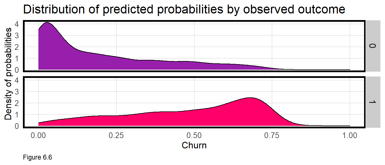
Next, a variable called predOutcome is created that classifies any predicted probability greater than 0.50 (or 50%) as a predicted Churn event. 50% seems like a reasonable threshold to start with, but one that we will explore in great detail below.
testProbs <-
  testProbs %>%
  mutate(predOutcome  = as.factor(ifelse(testProbs$Probs > 0.5 , 1, 0)))

head(testProbs)
## Outcome Probs predOutcome
## 1 0 0.6429831 1
## 2 0 0.5832574 1
## 3 0 0.4089603 0
## 4 1 0.4943297 0
## 5 0 0.0195177 0
## 6 0 0.1369811 0Many interesting questions can now be asked. What is overall accuracy rate? Does the model do a better job predicting Churn or No_Churn? To answer these questions, the code block below outputs a ‘Confusion Matrix’. A positive parameter is specified to let the function know that a value of 1 designates churn.
The table at the top of the output is the Confusion Matrix which shows the number of ‘Reference’ or observed instances of churn that are predicted as such. Each entry in the matrix provides a different comparison between observed and predicted, given the 50% threshold.
There were 506 true positives, instances where observed Churn was correctly predicted as Churn. There were 428 false positives, instances where Churn was incorrectly predicted as No_Churn.
There were 2306 true negatives, instances where observed No_Churn was correctly predicted as No_Churn. Finally, there were 275 false negatives, instances where No_Churn was incorrectly predicted as Churn.
caret::confusionMatrix(testProbs$predOutcome, testProbs$Outcome,
                       positive = "1")
## Confusion Matrix and Statistics
##
## Reference
## Prediction 0 1
## 0 2306 428
## 1 275 506
##
## Accuracy : 0.8
## 95% CI : (0.7864, 0.8131)
## No Information Rate : 0.7343
## P-Value [Acc > NIR] : < 0.00000000000000022
##
## Kappa : 0.4592
##
## Mcnemar's Test P-Value : 0.000000009879
##
## Sensitivity : 0.5418
## Specificity : 0.8935
## Pos Pred Value : 0.6479
## Neg Pred Value : 0.8435
## Prevalence : 0.2657
## Detection Rate : 0.1440
## Detection Prevalence : 0.2222
## Balanced Accuracy : 0.7176
##
## 'Positive' Class : 1
## The confusion matrix also calculates overall accuracy, defined as the number of true positives plus true negatives divided by the total number of observations. Here the Accuracy is 80%. Is that good?
Two other metrics, ‘Sensitivity’ and ‘Specificity’, provide even more useful intelligence. The Sensitivity of the model is the proportion of actual positives (1’s) that were predicted to be positive. This is also known as the “True Positive Rate”. The Specificity of the model is the proportion of actual negatives (0’s) that were predicted to be negatives. Also known as the “True Negative Rate”.
The Sensitivity and Specificity of churnreg2 is 54% and 89%, respectively. The interpretation is that the model is better at predicting those who are not going to churn than those who will. These metrics provide important intuition about how useful our model is as a resource allocation tool. It’s not surprising that the model is better at predicting no churn given that 75% of the data has this outcome. However, given the business process at hand, we would prefer to do a bit better at predicting the churn outcome.
New features, better feature engineering, and a more powerful predictive algorithm would significantly improve this model. Another approach for improving the model is to search for an ‘optimal’ threshold that can limit the most costly errors (from a business standpoint). Most of the remainder of this chapter is devoted to this optimization, beginning with the ‘ROC Curve’ below, a common goodness of fit metric for binary classification models.
6.4.1 Roc Curves
ggplot(testProbs, aes(d = as.numeric(testProbs$Outcome), m = Probs)) +
  geom_roc(n.cuts = 50, labels = FALSE, colour = "#FE9900") +
  style_roc(theme = theme_grey) +
  geom_abline(slope = 1, intercept = 0, size = 1.5, color = 'grey') +
  labs(title = "ROC Curve - churnModel")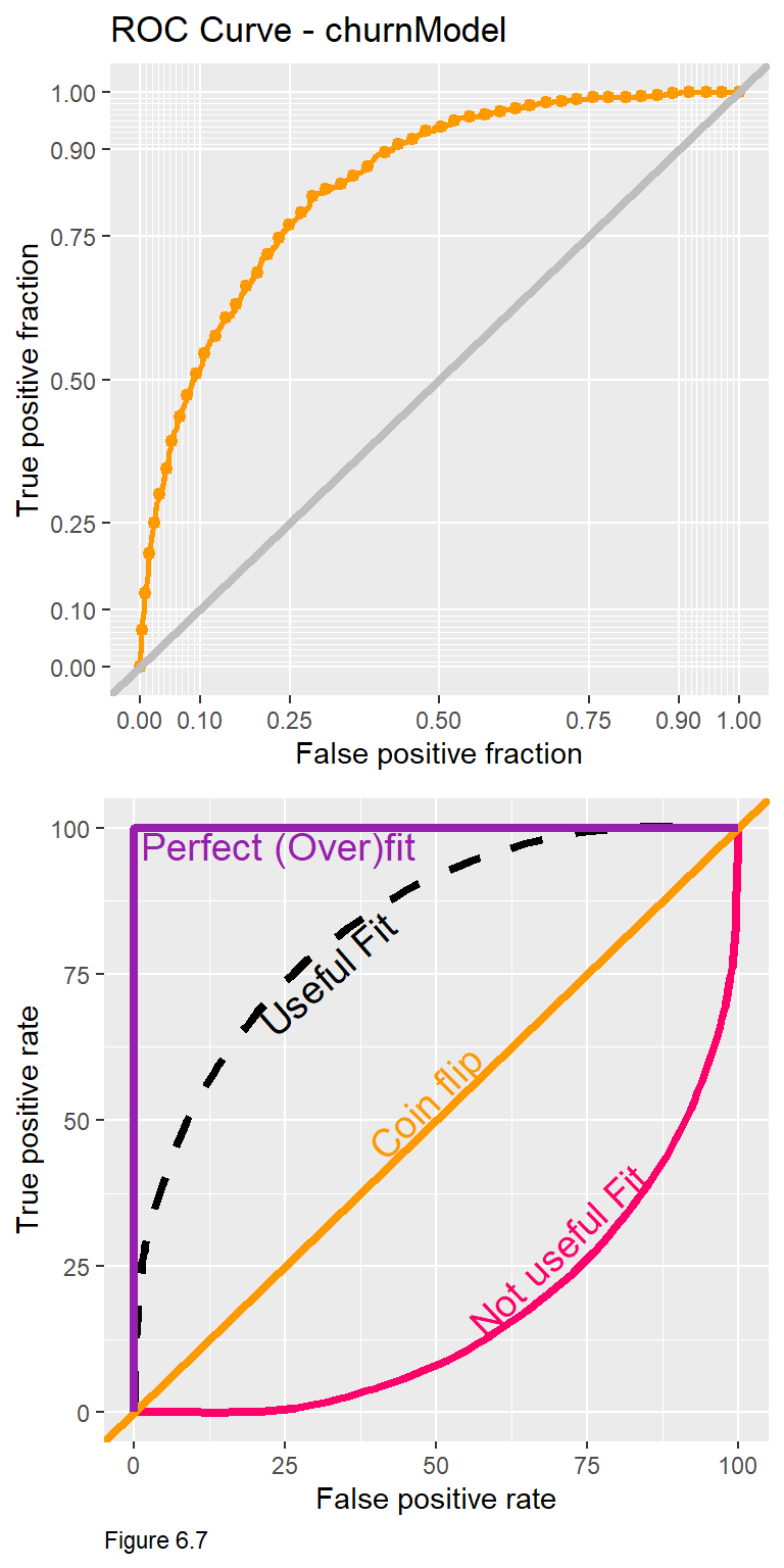
Let’s quickly revisit the business problem: The goal is to identify those customers at risk for churn, so we can offer them a 20% off membership coupon which costs Bounce to Work! $8.
Consider that at each predicted probability threshold, there is a different set of confusion metrics. A threshold of 10% for instance, means that most predictions will be classified as churn, and most customers will receive a coupon. This may mean Bounce to Work! would ultimately loose money on the promotion. As we’ll learn below, different confusion metrics have different costs and benefits, and searching for an optimal threshold, helps ensure we can stay in the black.
The Receiver Operating Characteristic Curve or ROC Curve is useful because it visualizes trade-offs for two important confusion metrics, while also providing a single goodness of fit indicator. The code block above uses the plotROC and ggplot packages to create a ROC Curve for the churnreg2.
The y-axis of the ROC curve (topmost, Figure 6.7) shows the rate of true positives (observed churn, predicted as churn) for each threshold from 0.01 to 1. The x-axis shows the rate of false positives (observed churn, predicted as no churn) for each threshold.
The notion of trade-offs is really important here. Follow the y-axis to 0.75 and then across to the orange curve. According to the ROC Curve, a threshold that predicts churn correctly 75% of the time, will predict Churn incorrectly >20% of the time. The critical question is whether this trade-off is appropriate given the cost/benefit of the business process?
What is really interesting about these trade-offs is that they come with diminishing returns. for every additional improvement in true positive rate, the model will make a greater proportion of false positive errors. Moving from a 75% to a 90% true positive rate dramatically increases the false positive rate.
To understand how the ROC Curve doubles as a goodness of fit tool, it is helpful to start with the diagonal line in the bottom panel of Figure 6.7. Also known as the ‘Coin Flip line’, any true positive rate on this line has an equal corresponding false positive rate. Any classifier with an ROC Curve along the diagonal line is no better than a coin flip. An ROC Curve below the diagonal line represents a very poor fit. Consider along this line, a model that gets it right ~7% of the time, gets it wrong 50% of the time.
A ‘Perfect Fit’ may seem desirable, but it is actually indicative of an overfit model. A ROC Curve like this yields 100% true positives and 0 false positives. If the model is so strongly fit to experiences in the training set, it will not likely generalize to experiences in new data. This is a really important point to remember. As before, we can test this model for its out-of-sample generalizability with cross-validation.
Another look at Figure 6.7 suggests that the usefulness of the algorithm can be judged by the proportion of the plotting area that is under the ROC curve. The ‘Area Under the Curve’ metric or AUC for churnreg2 is 0.8408635. AUC is another quick goodness of fit measure to guide feature selection across different models. 50% of the plotting area is under the Coin Flip line and 100% of the plotting area is underneath the Perfect Fit line. Thus, a reasonable AUC is between 0.5 and 1.
pROC::auc(testProbs$Outcome, testProbs$Probs)## Area under the curve: 0.84096.5 Cross-validation
As a data scientist working at Bounce to Work!, your goal should be to train a predictive model that will be useful for many months to come, rather than re-training a model every month. Thus, the model is only as good as its ability to generalize to new data. This section performs cross-validation using the caret::train function as we saw in Chapter 3.
The trainControl parameter is set to run 100 k-folds and to output predicted probabilities, classProbs, for ‘two classes’, Churn and No_Churn. Additional parameters output AUC (the train function refers to this as ‘ROC’) and confusion metrics for each fold.
Importantly, the three metrics in the cvFit output are for mean AUC, Sensitivity, and Specificity across all 100 folds. Note that the dependent variable here is Churn not churnNumeric.
ctrl <- trainControl(method = "cv", number = 100, classProbs=TRUE, summaryFunction=twoClassSummary)

cvFit <- train(Churn ~ ., data = churn %>%
                                   dplyr::select(
                                   -SeniorCitizen,
                                   -WeekendBouncer,
                                   -churnNumeric),
                method="glm", family="binomial",
                metric="ROC", trControl = ctrl)

cvFit
## Generalized Linear Model
##
## 7032 samples
## 8 predictor
## 2 classes: 'Churn', 'No_Churn'
##
## No pre-processing
## Resampling: Cross-Validated (100 fold)
## Summary of sample sizes: 6961, 6961, 6961, 6962, 6961, 6962, ...
## Resampling results:
##
## ROC Sens Spec
## 0.8407402 0.5333333 0.8949849The means are not as important as the across fold goodness of fit. Figure 6.8 below plots the distribution of AUC, Sensitivity, and Specificity across the 100 folds. names(cvFit) shows that train creates several outputs. cvFit$resample is a data frame with goodness of fit for each of the 100 folds. The code block below joins to this, the mean goodness of fit (cvFit$results), and plots the distributions as a small multiple plot.
The tighter each distribution is to its mean, the more generalizable the model. Our model generalizes well with respect to Specificity - the rate it correctly predicts No_Churn ( the true negatives ). It does not generalize as well with respect to Sensitivity - the rate it correctly predicts Churn ( true positives ). Note that if the model was overfit with an AUC of 1, it would also not generalize well to new data.
It seems our would-be decision-making tool is inconsistent in how it predicts the business-relevant outcome, churn. That inconsistency could be systematic - perhaps it works better for younger bouncers or for more serious bouncers. Or the model could simply lack sufficient predictive power. Either way, this inconsistency will have a direct effect on the business process should this algorithm be put into production.
dplyr::select(cvFit$resample, -Resample) %>%
  gather(metric, value) %>%
  left_join(gather(cvFit$results[2:4], metric, mean)) %>%
  ggplot(aes(value)) +
    geom_histogram(bins=35, fill = "#FF006A") +
    facet_wrap(~metric) +
    geom_vline(aes(xintercept = mean), colour = "#981FAC", linetype = 3, size = 1.5) +
    scale_x_continuous(limits = c(0, 1)) +
    labs(x="Goodness of Fit", y="Count", title="CV Goodness of Fit Metrics",
         subtitle = "Across-fold mean reprented as dotted lines") +
    plotTheme()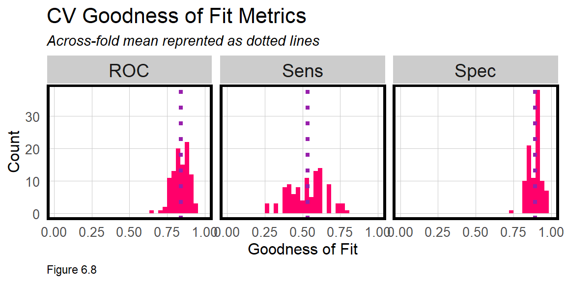
6.6 Generating costs and benefits
Our goal again, is to target those at risk of churning with a 20% off coupon that hopefully convinces them to resubscribe. How can our predictive model help improve revenue? Assuming the model successfully predicts churners, and assuming a 20% coupon was enough incentive to stay, can the algorithmic approach help optimize Bounce to Work!’s marketing campaign?
Let’s make the following assumptions about the marketing campaign:
- The membership costs $30.
- Each mailer to a potential churn-er costs $8.00. It includes an offer for 20% off this month’s subscription ($6 off) plus $2.00 for printing/postage.
- Of those would-be churners who are sent a mailer, past campaigns show ~50% of recipients re-subscribe.
While there are many ways to approach a cost/benefit analysis, our approach will be to use the confusion matrix from testProbs. Below the cost/benefit for each outcome in our confusion matrix is calculated, like so47:
- True negative revenue “We predicted no churn, did not send a coupon, and the customer did not churn”: $30 - $0 = $30
- True positive revenue “We predicted churn and sent the mailer”: $30 - $8 = $22 return for 50% of cases that re-subscribe. We lose $30 + $2 = $-32 for 50% of cases who were sent the coupon but did not re-subscribe.
- False negative revenue “We predicted no churn, sent no coupon, and the customer churned”: $0 - 30 = -$30
- False positive revenue “We predicted churn and sent the mailer, the customer was not going churn but used the coupon anyway”: $30 - $8 = $22
For now, note that the greatest cost comes with 50% of the true positives where we offer a coupon but loose the customer anyway. The greatest marginal benefit is in maximizing the number of true negatives - customers who we correctly predict will not churn. To calculate the total cost/benefit, these confusion metrics are multiplied by their corresponding costs below.
cost_benefit_table <-
   testProbs %>%
      count(predOutcome, Outcome) %>%
      summarize(True_Negative = sum(n[predOutcome==0 & Outcome==0]),
                True_Positive = sum(n[predOutcome==1 & Outcome==1]),
                False_Negative = sum(n[predOutcome==0 & Outcome==1]),
                False_Positive = sum(n[predOutcome==1 & Outcome==0])) %>%
       gather(Variable, Count) %>%
       mutate(Revenue =
               case_when(Variable == "True_Negative"  ~ Count * 30,
                         Variable == "True_Positive"  ~ ((30 - 8) * (Count * .50)) +
                                                        (-32 * (Count * .50)),
                         Variable == "False_Negative" ~ (-30) * Count,
                         Variable == "False_Positive" ~ (30 - 8) * Count)) %>%
    bind_cols(data.frame(Description = c(
              "We predicted no churn and did not send a mailer",
              "We predicted churn and sent the mailer",
              "We predicted no churn and the customer churned",
"We predicted churn and the customer did not churn")))| Variable | Count | Revenue | Description |
|---|---|---|---|
| True_Negative | 2306 | 69180 | We predicted no churn and did not send a mailer |
| True_Positive | 506 | -2530 | We predicted churn and sent the mailer |
| False_Negative | 428 | -12840 | We predicted no churn and the customer churned |
| False_Positive | 275 | 6050 | We predicted churn and the customer did not churn |
| Table 6.3 |
Assuming our algorithm was used, the total Revenue (column sum) in the Cost/Benefit Table 6.3 above is $59,860. Assuming no algorithm was used and 934 customers churned (from testProbs), the cost/benefit would be (2,581 instances of no churn * $30 = $77,430) + (934 instances of observed churn * -30 = -$28,020), which leads to a net revenue of $49,410.
Thus, the algorithm would save Bounce to Work! $10,450. This savings is based on a 50% threshold, but maybe other thresholds can yield an even greater cost/benefit. Let’s now try to optimize the threshold.
6.6.1 Optimizing the cost/benefit relationship
Recall, that a different confusion matrix, set of errors and cost/benefit calculation exists for each threshold. Ideally, the ‘optimal’ threshold is the one that returns the greatest cost/benefit. In this section, a function is created to iteratively loop through each threshold, calculate confusion metrics, and total the revenue for each. The results are then visualized for each threshold.
The iterateThresholds function in the functions.R script is based on a while loop. The threshold x, starts at 0.01 and while it is less than 1, a predicted classification, predOutcome, is mutated given x; confusion metrics are calculated; the cost benefit is performed and is appended to a data frame called all_prediction. Finally x is iterated by adding 0.01 and the process continues until x = 1.
iterateThresholds function is run below and includes a host of goodness of fit indicators, several of which are returned below. Recall, each row is a different Threshold.
whichThreshold <-
  iterateThresholds(
     data=testProbs, observedClass = Outcome, predictedProbs = Probs)

whichThreshold[1:5,]
## # A tibble: 5 x 10
## Count_TN Count_TP Count_FN Count_FP Rate_TP Rate_FP Rate_FN Rate_TN Accuracy
## <int> <int> <int> <int> <dbl> <dbl> <dbl> <dbl> <dbl>
## 1 350 929 5 2231 0.995 0.864 0.00535 0.136 0.364
## 2 576 926 8 2005 0.991 0.777 0.00857 0.223 0.427
## 3 697 923 11 1884 0.988 0.730 0.0118 0.270 0.461
## 4 818 918 16 1763 0.983 0.683 0.0171 0.317 0.494
## 5 904 913 21 1677 0.978 0.650 0.0225 0.350 0.517
## # ... with 1 more variable: Threshold <dbl>Next, the result is moved to long form and Revenue is calculated for each confusion metric at each threshold.
whichThreshold <-
  whichThreshold %>%
    dplyr::select(starts_with("Count"), Threshold) %>%
    gather(Variable, Count, -Threshold) %>%
    mutate(Revenue =
             case_when(Variable == "Count_TN"  ~ Count * 30,
                       Variable == "Count_TP"  ~ ((30 - 8) * (Count * .50)) +
                                                 (-32 * (Count * .50)),
                       Variable == "Count_FN"  ~ (-30) * Count,
                       Variable == "Count_FP"  ~ (30 - 8) * Count))
Figure 6.9 below plots the Revenue for each confusion metric by threshold. This is a plot of trade-offs. Each is described below:
- False negative revenue: “We predicted no churn and the customer churned” - As the threshold increases we see more customers churn that a mailer did not get sent to. As fewer mailers go out, the losses mount.
- False positive revenue: “We predicted churn and sent the mailer, the customer did not churn but used the coupon anyway” - A low threshold assumes few customers are predicted to churn, which limits the revenue hit from those who used the coupon anyway, despite their intention to renew.
- True negative revenue: “We predicted no churn, did not send a mailer, and the customer did not churn” - As the threshold goes up, the number of full price paying customers goes up. At higher thresholds, the model assumes no churn and the no revenue is lost to false negatives.
- True positive revenue: “We predicted churn and sent the mailer” - Although the coupon convincing 50% of members to re-subscribe saves some revenue, the cost of actual churn leads to losses for most thresholds.
whichThreshold %>%
  ggplot(.,aes(Threshold, Revenue, colour = Variable)) +
  geom_point() +
  scale_colour_manual(values = palette5[c(5, 1:3)]) +
  labs(title = "Revenue by confusion matrix type and threshold",
       y = "Revenue") +
  plotTheme() +
guides(colour=guide_legend(title = "Confusion Matrix")) 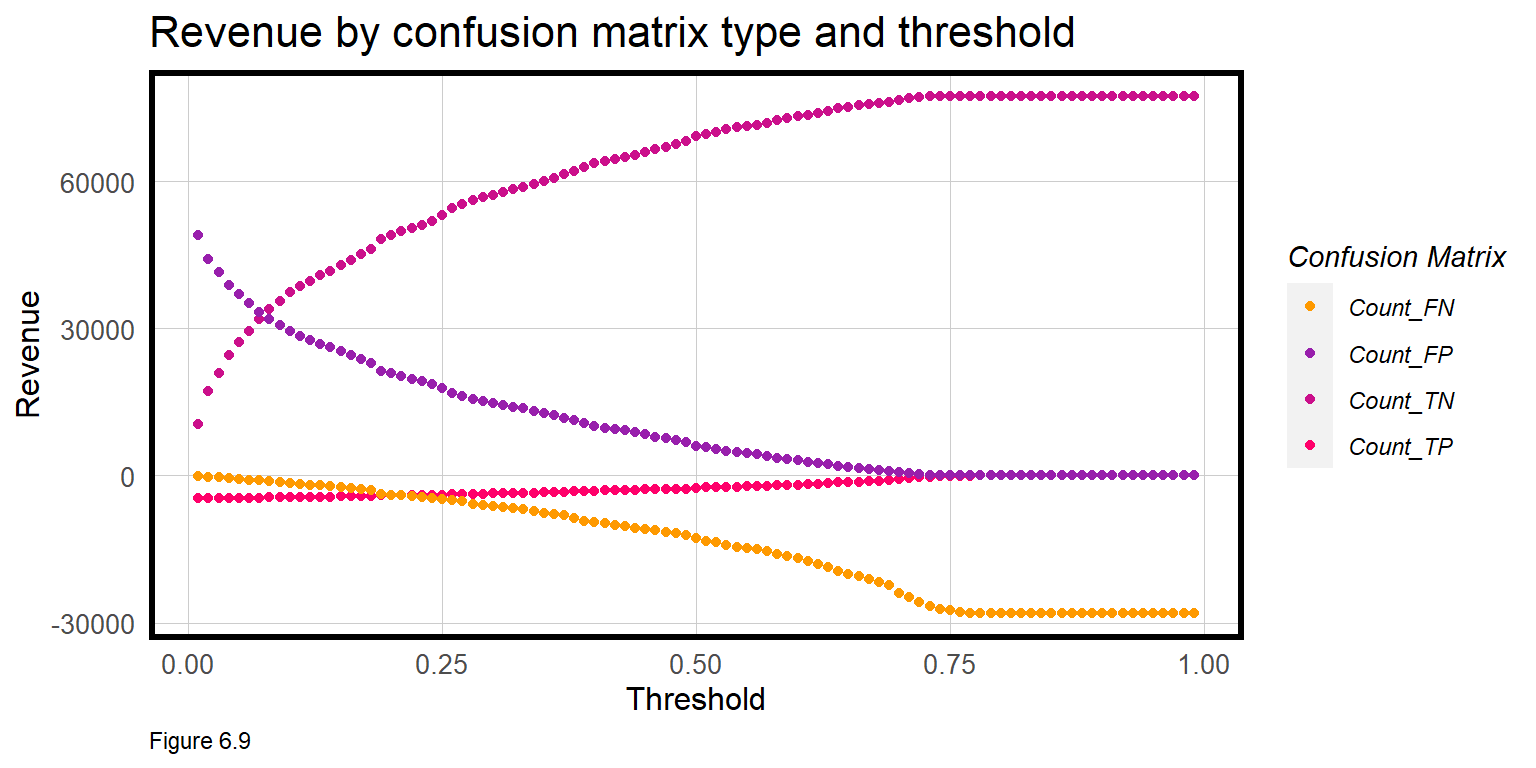
The next step of the cost/benefit analysis is to calculate the total Revenue across confusion metrics for each threshold.
Below, actualChurn and Actual_Churn_Rate include 50% of the True Positives (who were not swayed by the coupon) and all of the False Negatives (those who never even received a coupon). Actual_Churn_Revenue_Loss is loss from this pay period, and Revenue_Next_Period is for the next, assuming no new customers are added.
Assuming testProbs is representative of Bounce to Work!’s customers, 934 (27%) of customers will churn resulting in a net loss of -$28,020 and a net revenue of $49,410. How do the other thresholds compare?
whichThreshold_revenue <-
  whichThreshold %>%
    mutate(actualChurn = ifelse(Variable == "Count_TP", (Count * .5),
                         ifelse(Variable == "Count_FN", Count, 0))) %>%
    group_by(Threshold) %>%
    summarize(Revenue = sum(Revenue),
              Actual_Churn_Rate = sum(actualChurn) / sum(Count),
              Actual_Churn_Revenue_Loss =  sum(actualChurn * 30),
              Revenue_Next_Period = Revenue - Actual_Churn_Revenue_Loss)

whichThreshold_revenue[1:5,]
## # A tibble: 5 x 5
## Threshold Revenue Actual_Churn_Rate Actual_Churn_Revenue_L~ Revenue_Next_Peri~
## <dbl> <dbl> <dbl> <dbl> <dbl>
## 1 0.01 54787 0.134 14085 40702
## 2 0.02 56520 0.134 14130 42390
## 3 0.03 57413 0.134 14175 43238
## 4 0.04 58256 0.135 14250 44006
## 5 0.05 58819 0.136 14325 44494A threshold of 26% is optimal and yields the greatest revenue at $62,499. After that mark, losses associated with False Negatives begin to mount (see Figure 6.9 above).
Revenue (this period) and Revenue_Next_Period are plotted below for each Threshold. Here we assume no new customers are added next pay period.
whichThreshold_revenue %>%
  dplyr::select(Threshold, Revenue, Revenue_Next_Period) %>%
  gather(Variable, Value, -Threshold) %>%
  ggplot(aes(Threshold, Value, colour = Variable)) +
    geom_point() +
    geom_vline(xintercept = pull(arrange(whichThreshold_revenue, -Revenue)[1,1])) +
    scale_colour_manual(values = palette2) +
    plotTheme() + ylim(0,70000) +
    labs(title = "Revenue this pay period and the next by threshold",
         subtitle = "Assuming no new customers added next period. Vertical line denotes optimal threshold")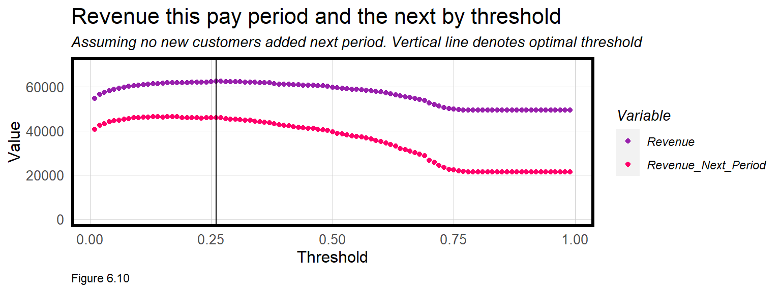
These cost/benefit functions are incredibly revealing. It’s clear that Revenue (this_period) declines after the 26% threshold. The trend for Revenue_Next_Period is similar, but interestingly, the slope of the line is much steeper. Why do you think this is?
Table 6.4 shows the Revenue and the rate of churn for no model, the default 50% threshold and the optimal threshold. Not only does the optimal threshold maximize Revenue this pay period but it also prevents fewer customers from actually churning in the next pay period, helping to maximize revenues in the long term as well.
| Model | Revenue_This_Period | Lost_Customers_Next_Period |
|---|---|---|
| No predictive model | $49,410 | 27% |
| 50% Threshold | $59,860 | 19% |
| 26% Threshold | $62,499 | 16% |
| Table 6.4 |
6.7 Conclusion - churn
The goal of this chapter is to help pogo-transit company Bounce to Work! maximize revenues by reducing the number of customers who might not otherwise renew their membership (i.e. churn). A Logistic regression model was estimated to predict Churn as a function of customer data and the relevant goodness of fit indicators were introduced. To demonstrate how machine learning can directly influence a business problem, these ‘confusion metrics’ were used to calculate the Revenue implications of the model relative to the business-as-usual approach, sans model. More experienced readers can swap out glm for more advanced machine learning algorithms, and notice an immediate improvement in predictive performance.
Unlike every other chapter in this book, this one focused on resource allocation for a for-profit company. It may not seem like ‘cost/benefit’ and ‘customer’ are terms that apply to government - but they absolutely do. Every taxpayer, household, child, parent, and senior is a client of government and all deserve a government that works to their benefit.
The difference is in finding the ‘optimal’ resource allocation approach. This may be possible if the only bottom line is revenue, but it is largely impossible in government, which has many unquantifiable bottom lines like equity and social cohesion. Armed with the necessary domain expertise, however, government data scientists can still use these methods to improve service delivery.
There are no shortage of use cases in government that could benefit from these models. Which homelessness or drug treatment intervention might increase the probability for success? Which landlords are likely renting and evicting tenants illegally? Which buildings are at risk of falling down? Which gang member is at risk for gun crime? Which medicaid recipient might benefit from in-home nursing care? And the list goes on.
There are two ways to judge the usefulness of these models. First, does the data-driven approach improve outcomes relative to the business-as-usual approach? Chapter 4 compared the geospatial risk model to traditional hot spot mapping. Here, the business-as-usual approach may have just allowed churn; perhaps an employee had a method for choosing which customers receive a coupon; or maybe they pulled names from a hat. Consider that a confusion matrix is possible for each of these approaches.
The second way to judge utility is through the lens of ‘fairness’, which is the subject of the next chapter. Just because the model may improve cost/benefit, doesn’t necessarily make for a more useful decision-making approach if it further disenfranchises one group or another. There are many ways to judge fairness, and our approach, not surprisingly, will be to analyze across-group generalizability.
Ultimately, an algorithm’s usefulness should not be evaluated by an engineer alone, but by a team of engineers and domain experts who can evaluate models within the appropriate context.
6.8 Assignment - Target a subsidy
Emil City is considering a more proactive approach for targeting home owners who qualify for a home repair tax credit program. This tax credit program has been around for close to twenty years, and while the Department of Housing and Community Development (HCD) tries to proactively reach out to eligible homeowners ever year, the uptake of the credit is woefully inadequate. Typically only 11% of eligible homeowners they reach out to take the credit.
The consensus at HCD is that the low conversion rate is due to the fact that the agency reaches out to eligible homeowners at random. Unfortunately, we don’t know the cost/benefit of previous campaigns, but we should assume it wasn’t good. To move toward a more targeted campaign, HCD has recently hired you, their very first data scientist, to convert all the client-level data collected from previous campaigns into a decision-making analytic that can better target their limited outreach resources.
You have been given a random sample of records. Your goal is to train the best classifier you can and use the results to inform a cost/benefit analysis.
The data for this exercise has been adopted from Moro & Rita (2014)48. Some variables have been changed to suit the current use case. The dependent variable is y, which is Yes to indicate the a homeowner took the credit and No to indicate they did not. There are many features related to this outcome described in the table below.
| Variable | Description | Class | Notes |
|---|---|---|---|
| age | Age of homeowner | Numeric | |
| job | Occupation indicator | Category | |
| marital | Marital Status | Category | |
| education | Educational attainment | Category | |
| taxLien | Is there a lien against the owner’s property? | Category | |
| mortgage | Is the owner carrying a mortgage | Category | |
| taxbill_in_phl | Is the owner’s full time residence not in Philadelphia | Category | |
| contact | How have we previously contacted individual? | Category | |
| month | Month we last contacted individual | Category | |
| day_of_week | Day of the week we last contacted individual | Category | |
| campaign | # of contacts for this ind for this campaign | Category | |
| pdays | # days after ind. last contacted from a previous program | Category | 999 = client not previously contacted |
| previous | # of contacts before this campaign for this ind. | Numeric | |
| poutcome | Outcome of the previous marketing campaign | Categorical | |
| unemploy_rate | Unemployment rate at time of campaign | Numeric | |
| cons.price.idx | Consumer Price Idex at campaign time | Numeric | |
| cons.conf.idx | Consumer confidence index at time of campaign | Numeric | |
| inflation_rate | US Inflation Rate | Numeric | daily indicator |
| spent_on_repairs | Amoung annually spent on home repairs | Numeric | |
| y | Indicates the individual took the credit | Category | Yes/No (but you may wish to recode to numeric) |
| Table 6.5 |
After studying the credit program and related materials, you construct some stylized facts to help guide your cost/benefit analysis. If we predict that a household will take the credit, then HCD is willing to allocate $2,850 per homeowner which includes staff and resources to facilitate mailers, phone calls, and information/counseling sessions at the HCD offices. Given the new targeting algorithm, we should now assume 25% of contacted eligible homeowners take the credit. The remainder receive the marketing allocation but do not take the credit.
The credit costs $5,000 per homeowner which can be used toward home improvement. Academic researchers in Philadelphia evaluated the program finding that houses that transacted after taking the credit, sold with a $10,000 premium, on average. Homes surrounding the repaired home see an aggregate premium of $56,000, on average. Below is a run down of the costs and benefits for each potential outcome of the model you will build. This is a public-sector use case, so the cost/benefit is not as straightforward as Bounce to Work! If you feel that changing a constraint would be helpful, then please do so.
- True Positive - Predicted correctly homeowner would take the credit; allocated the marketing resources, and 25% took the credit.
- True Negative - Predicted correctly homeowner would not take the credit, no marketing resources were allocated, and no credit was allocated.
- False Positive - Predicted incorrectly homeowner would take the credit; allocated marketing resources; no credit allocated.
- False Negative - We predicted that a homeowner would not take the credit but they did. These are likely homeowners who signed up for reasons unrelated to the marketing campaign. Thus, we ‘0 out’ this category, assuming the cost/benefit of this is $0.
Deliverables:
- One paragraph on the motivation for the analysis.
- Develop and interpret data visualizations that describe feature importance/correlation.
- Split your data into a 65/35 training/test set.
- The Sensitivity (True Positive Rate) for a model with all the features is very low. Engineer new features that significantly increase the Sensitivity.
- Interpret your new features in one paragraph.
- Show a regression summary for both the kitchen sink and your engineered regression.
- Cross validate both models; compare and interpret two facetted plots of ROC, Sensitivity and Specificity.
- Output an ROC curve for your new model and interpret it.
- Develop a cost benefit analysis.
- Write out the cost/benefit equation for each confusion metric.
- Create the ‘Cost/Benefit Table’ as seen above.
- Plot the confusion metric outcomes for each Threshold.
- Create two small multiple plots that show
Thresholdas a function ofTotal_RevenueandTotal_Count_of_Credits. Interpret this. - Create a table of the
Total_RevenueandTotal_Count_of_Creditsallocated for 2 categories.50%_Thresholdand yourOptimal_Threshold.
- Conclude whether and why this model should or shouldn’t be put into production. What could make the model better? What would you do to ensure that the marketing materials resulted in a better response rate?
https://www.kaggle.com/blastchar/telco-customer-churn/home↩︎
These two features may be significant at the p < 0.10 level, depending your random train/test split. Marginally significant features may be included in a model but are removed here to demonstrate the how
selectembedded inglmmakes it easy to experiment with different feature selections.↩︎It may be reasonable to assume the false negative revenue is $0 rather than -$30. However, I choose to count these errors as a $30 loss because I want to penalize both the non-algorithm and algorithmic business process for actual instances of churn. This also provides an incentive to improve the model and thus reduce the marginal costs associated with false negatives.↩︎