Chapter 7 People-Based ML Models: Algorithmic Fairness
7.1 Introduction
The churn use case from Chapter 6 is one example of how machine learning algorithms increasingly make decisions in place of humans. Marketing campaigns, insurance, credit cards, bank loans, news and shopping recommendations, are all now allocated with these methods. Bestsellers like Cathy O’Neil’s, “Weapons of Math Destruction” and relentless news coverage of tech company data mining, suggests these algorithms can bring as much peril as they do promise.49
Government is still unsure how to regulate private-sector algorithms - their inner-workings cast as intellectual property and closed off from public scrutiny. In the public-sector however, there is an expectation that algorithms are open and transparent. While governments today are using algorithms to automate their decision-making, many lack the regulatory or Planning wherewithal to ensure these models are fair.
In this chapter, we learn how to open the black box of these algorithms to better judge them for fairness and better understand the pertinent social costs. A person-based model is estimated to predict ‘recidivism’ - the term given to an offender released from prison, who then re-offends and must go back to prison. These algorithms have exploded in recent years - another example of the criminal justice system as an early adopter of machine learning.
A recidivism predictive model may be used by a judge to inform sentencing or parole decisions. It may also be used to prioritize who gets access to prisoner reentry programs like job training, for example.
If churn was the only context we had for the efficacy of these tools, we might think applying machine learning to recidivism is a no-brainer. This could not be further from the truth. Here, as was the case in Predictive Policing (Chapter 5), we will see that when human bias is baked into machine learning predictions, the result is a decision-making tool that is not useful.
As before, a model that is not useful is one that lacks generalizability across groups. With churn, generalizability was not considered, and the costs of getting it wrong is simply a loss of revenue. In geospatial Predictive Policing, the cost is racially discriminate police surveillance. With recidivism, the costs are the systematic and disproportional over-imprisonment of one race relative to another.
In other words, a biased business algorithm can cost money, but a biased government algorithm can cost lives and livelihoods. The associated social and economic costs could be massive, and we must learn to evaluate these models with these costs in mind.
One example of bias in the recidivism use case is higher False Positive rates for African American ex-offenders compared to Caucasians. A False Positive in this context means that the algorithm predicted an ex-offender would recidivate but they did not. If a judge uses a predicted recidivism ‘risk score’ to aid in his or her sentencing decision, and such a bias exists, then a disproportional number of African Americans may be incarcerated for longer than they otherwise deserve. Taken across tens of thousands of citizens in one metropolitan area, the social costs are unfathomable.
7.1.1 The spectre of disparate impact
Social Scientists are familiar with issues of fairness and discrimination, but identifying algorithmic discrimination is just as nuanced as it would be in say, housing and labor markets. It is unlikely that a jurisdiction would create a discriminatory algorithm on purpose. Given the black box nature of these models, it is more likely they would create a decision-making tool that has a “disparate impact” on members of a protected class. Disparate impact is a legal theory positing that although a policy or program may not be discriminatory prima facie, it still may have an adverse discriminatory effect, even if unintended.
Recall our need to ensure that geospatial predictive algorithms generalize from one urban context to the next. This same rationale applies with people-based models, but the concern is generalizability across different protected classes, like gender and race.
If an algorithm does not generalize to one group, its use for resource allocation may have a disparate impact on that group. The False Positive example for African Americans relative to Caucasians is one such example. This may occur because the algorithm lacks appropriate features to accurately model the African American “experience”. It may also be that the training data itself is biased, a critique discussed at length in Chapter 5.
As a reminder, systematic over-policing of historically disenfranchised communities creates a feedback loop where more reported crime leads to more cops on patrol, who then report more crimes, that ultimately lead to more convictions. In a predictive setting, if this selection bias goes unobserved, the systematic error will move into the error term and lead to bias and unintended social costs.
It is impossible to identify the effect of unobserved variables. As an alternative, researchers have very recently developed a series of fairness metrics that can be used to judge disparate impact.50 A 2018 review by Verma & Rubin is particularly relevant for policy-makers interested in learning more about fairness metrics.51
For example, in 2016, journalists from ProPublica released an evaluation of the COMPAS recidivism prediction algorithm built by a company called Northpointe, finding that while the algorithm had comparable accuracy rates across different racial groups, there were clear racial differences for errors that had high social costs.52 This paradox lead ProPublica to ask a fascinating question - “how could an algorithm simultaneously be fair and unfair?”53 In this chapter, we will make use of the COMPAS data ProPublica used for their analysis and develop fairness metrics that can help identify disparate impact.
7.1.2 Modeling judicial outcomes
In the criminal justice system, as in life, decisions are made by weighing risks. Among a host of Federal sentencing guidelines, judges are to “protect the public from further crimes of the defendant.”54 Rhetorically, this sounds straightforward - identify the risk that an individual will cause the public harm and impose a sentence to reduce this risk. However, bias always plays a role in decision-making. We would never ask the average citizen to weigh risks and punish accordingly because we do not believe the average citizen could act with impartiality. Although this is the standard we impose on judges, even they make systematic mistakes.55
And the use of these data-driven risk models in the criminal justice system is only increasing in recent years.56 Algorithms are predicting risk for a host of use cases including bail hearings57, parole58, and to support sentencing decisions by assessing future criminal behavior.59
Can an algorithm help judges make better decisions? Recent research determined that even with much less data on hand, people without a criminal justice background make recidivism predictions as accurately as the COMPAS algorithm.60 Very importantly, studies have also shown that introducing prediction into the decision-making process can reduce the odds of re-arrests.61
Collectively, this research suggests that there may be benefits for governments in adopting these tools - but do these benefits outweigh the social costs? No doubt, more research is needed on the social justice implications of these algorithms. However, the more timely need is for government to proactively explore biases in the models they are currently developing.
As was the case with churn, the confusion metrics are instrumental in communicating biases to non-technical decision-makers because they directly reflect the business process at hand.
7.1.3 Accuracy and generalizability in recidivism algorithms
Accuracy and generalizability continue to be the two yardsticks we use to measure the utility of our algorithms. The goal of a recidivism classifier is to predict two binary outcomes - Recidivate and notRecidivate. While the “percent of correct predictions” is a simple measure of accuracy, it lacks the nuance needed to detect disparate impact. As they were in Chapter 6, confusion metrics will continue to be key.
The basic premise of the recidivism model is to learn the recidivism experience of ex-offenders in the recent past and test the extent to which this experience generalizes to a population for which the propensity to recidivate is unknown. The prediction from the model is a “risk score” running from 0 to 1, interpreted as “the probability person i will recidivate.” The model can then be validated by comparing predicted classifications to observed classifications, giving a host of more nuanced errors including:
True Positive (“Sensitivity”) - “The person was predicted to recidivate and actually recidivated.”
True Negative (“Specificity”) - “The person was predicted not to recidivate and actually did not recidivate.”
False Positive - “The person was predicted to recidivate and actually did not recidivate.”
False Negative - “The person was predicted not to recidivate and actually did recidivate.”
7.2 Data and exploratory analysis
Begin by loading the necessary R packages, reading in the plotTheme with the source file, and some color palettes.
library(lubridate)
library(tidyverse)
library(caret)
library(kableExtra)
library(ModelMetrics)
library(plotROC)
library(knitr)
library(grid)
library(gridExtra)
library(QuantPsyc)

root.dir = "https://raw.githubusercontent.com/urbanSpatial/Public-Policy-Analytics-Landing/master/DATA/"
source("https://raw.githubusercontent.com/urbanSpatial/Public-Policy-Analytics-Landing/master/functions.r")

palette_9_colors <- c("#FF2AD4","#E53AD8","#CC4ADC","#996AE5","#7F7BE9",
                      "#668BED","#33ABF6","#19BBFA","#00CCFF")
palette_3_colors <- c("#FF2AD4","#7F7BE9","#00CCFF")
palette_2_colors <- c("#FF2AD4", "#00CCFF")
palette_1_colors <- c("#00CCFF")
The data for this chapter comes directly from ProPublica’s Github repository62, and was the impetus for a series of articles on bias in criminal justice algorithms.63
At the time of writing, no data dictionary had been posted, thus much of the feature engineering routines employed below were copied directly from ProPublica’s IPython Notebook.64 While this is not ideal, it is at times, the nature of working with open data. The below table shows each variable used in the analysis.
| Variable | Description |
|---|---|
| sex | Categorical variables that indicates whether the ex-offender is male or female |
| age | The age of the person |
| age_cat | Variable that categories ex-offenders into three groups by age: Less than 25, 25 to 45, Greater than 45 |
| race | The race of the person |
| priors_count | The number of prior crimes committed |
| two_year_recid | Numerical binary variable of whether the person recidivated or not, where 0 is not recidivate and 1 is the person recidivated |
| r_charge_desc | Description of the charge upon recidivating |
| c_charge_desc | Description of the original criminal charge |
| c_charge_degree | Degree of the original charge |
| r_charge_degree | Degree of the charge upon recidivating |
| juv_other_count | Categorical variable of the number of prior juvenile convictions that are not considered either felonies or misdemeanors |
| length_of_stay | How long the person stayed in jail |
| Recidivated | Character binary variable of whether the person recidivated (Recidivate) or not (notRecidivate) |
|
|
|
| Table 7.1 |
The cleaned dataset describes 6,162 ex-offenders screened by COMPAS in 2013 and 2014. There are 53 columns in the original data describing length of jail stays, type of charges, the degree of crimes committed, and criminal history. Many variables were added by Northpointe, the original author of the COMPAS algorithm, and are not relevant to the model building process. Also, noticeably absent, are economic and educational outcomes for these individuals. The model developed below is simplistic - it is not a replication of the existing Northpointe algorithm.
raw_data <- read.csv(file.path(root.dir,"Chapter7/compas-scores-two-years.csv"))

df <-
  raw_data %>%
  filter(days_b_screening_arrest <= 30) %>%
  filter(days_b_screening_arrest >= -30) %>%
  filter(is_recid != -1) %>%
  filter(c_charge_degree != "O") %>%
  filter(priors_count != "36") %>%
  filter(priors_count != "25") %>%
  mutate(length_of_stay = as.numeric(as.Date(c_jail_out) - as.Date(c_jail_in)),
         priors_count = as.factor(priors_count),
         Recidivated = as.factor(ifelse(two_year_recid == 1,"Recidivate","notRecidivate")),
         recidivatedNumeric = ifelse(Recidivated == "Recidivate", 1, 0),
         race2 = case_when(race == "Caucasian"        ~ "Caucasian",
                           race == "African-American" ~ "African-American",
                           TRUE                       ~ "Other")) %>%
  dplyr::select(sex,age,age_cat,race,race2,priors_count,two_year_recid,r_charge_desc,
         c_charge_desc,c_charge_degree,r_charge_degree,juv_other_count,
         length_of_stay,priors_count,Recidivated,recidivatedNumeric) %>%
  filter(priors_count != 38)
Figure 7.1 illustrates the most frequent initial charge. Crimes of varying severity are included in the dataset. Note the use of reorder and FUN = max in the ggplot call.
group_by(df, c_charge_desc) %>%
  summarize(count = n()) %>%
  mutate(rate = count / sum(count)) %>%
  arrange(-rate) %>% head(9) %>%
  ggplot(aes(reorder(c_charge_desc, rate, FUN = max),
             rate, fill = c_charge_desc)) +
    geom_col() + coord_flip() +
    scale_fill_manual(values = palette_9_colors) +
    labs(x = "Charge", y = "Rate", title= "Most frequent initial charges") +
plotTheme() + theme(legend.position = "none") 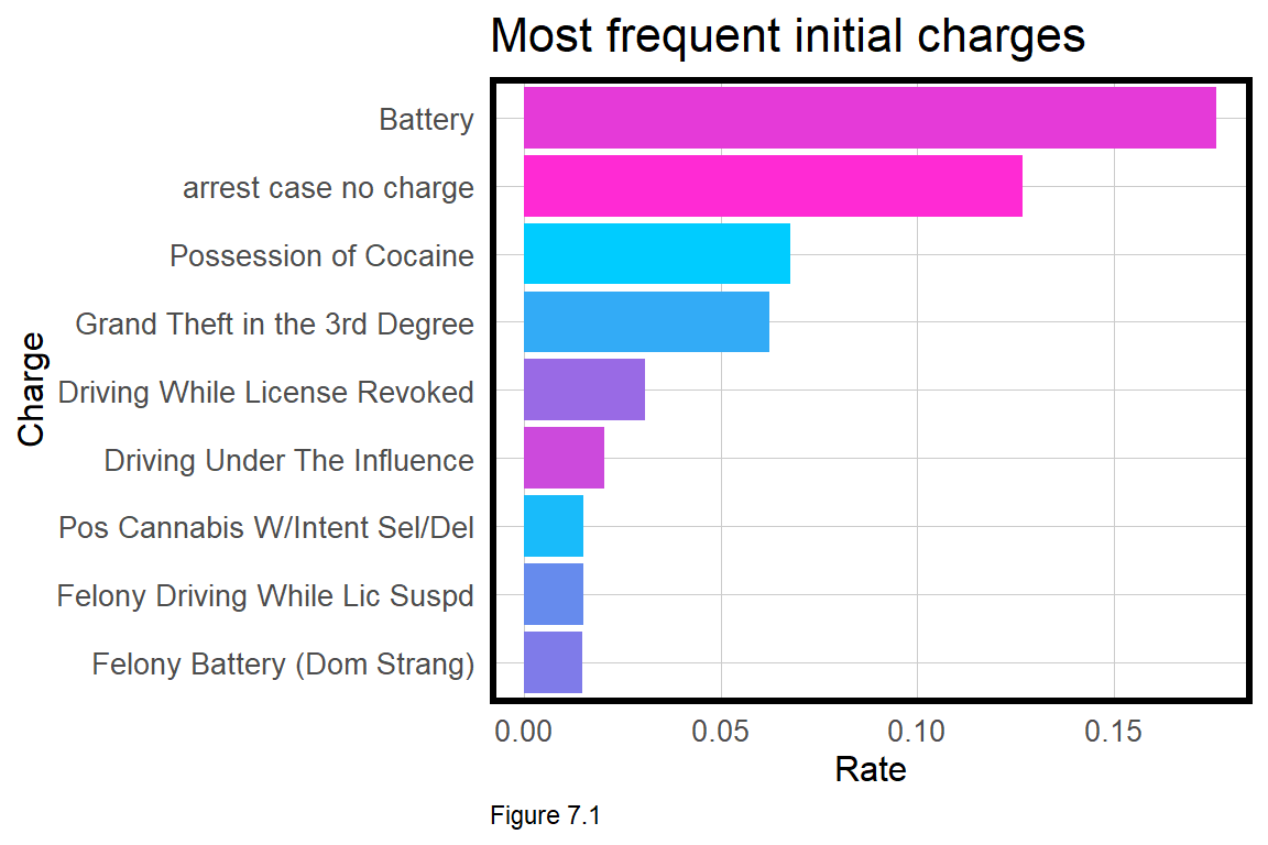
Figure 7.2 visualizes the rate of recidivism by race. Note the rate of recidivism for African Americans is twice that (59%) of Caucasians (29%). If this reported rate is driven by reporting or other bias, then it may have important implications for the model’s usefulness.
df %>%
    group_by(Recidivated, race) %>%
    summarize(n = n()) %>%
    mutate(freq = n / sum(n)) %>% filter(Recidivated == "Recidivate") %>%
    ggplot(aes(reorder(race, -freq), freq)) +
    geom_bar(stat = "identity", position = "dodge", fill = palette_2_colors[2]) +
    labs(title = "Recidivism rate by race",
         y = "Rate", x = "Race") +
    plotTheme() + theme(axis.text.x = element_text(angle = 45, hjust = 1))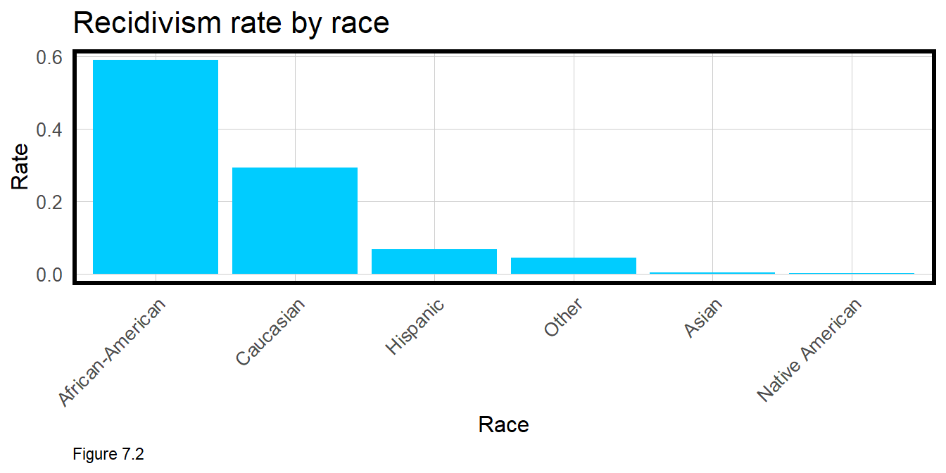
7.3 Estimate two recidivism models
“You mustn’t include race in the model because that will ensure resource allocation decisions will in part, be guided by race”. I’ve heard this line countless times in my career. but as we will learn, the bottom line is that if racial bias is baked into the training data, then controlling explicitly for race, is not likely to remove it. This section tests this theory by estimating a Logistic regression with race and one without.
The dependent variable is Recidivated which is coded as 1 for inmates who experienced a recidivism event and 0 for those that did not. Aside from race, the below two models include sex, age, the number of “other” convictions as a juvenile, the count of prior adult convictions, and the length of stay in prison.
The data is split into a 75% training set and a 25% test set using a simple dplyr approach.
train <- df %>% dplyr::sample_frac(.75)
train_index <- as.numeric(rownames(train))
test <- df[-train_index, ]
reg.noRace and reg.withRace are estimated below. summary(reg.noRace) shows that all features are statistically significant and their signs reasonable. For example, as age increases, the probability of recidivism decreases. Conversely, the longer length_of_stay in the prison system, the greater the likelihood that an individual recidivates.
Note that priors_count is input as a factor. If it were input as a continuous feature, the interpretation would be ‘a one unit increase in priors leads to a corresponding increase in the propensity to recidivate.’ By converting to factor, the interpretation is that there is a statistically significant difference between 0 and n priors. Most of these fixed effects are significant.
reg.noRace <- glm(Recidivated ~ ., data =
                    train %>% dplyr::select(sex, age, age_cat,
                                juv_other_count, length_of_stay,
                                priors_count, Recidivated),
                family = "binomial"(link = "logit"))

reg.withRace <- glm(Recidivated ~ ., data =
                      train %>% dplyr::select(sex, age, age_cat, race,
                                  juv_other_count, length_of_stay,
                                  priors_count, Recidivated),
                family = "binomial"(link = "logit"))
The summary of reg.withRace is quite revealing. You may try two specifications with both the current 6-category race feature or an alternative race2 feature including categories for just Caucasian, African-American, and Other. In both instances the race variables are largely insignificant suggesting that differences in race are not driving propensity to recidivate.
How can that be given the differences illustrated in Figure 7.2 above? To explore further, try to estimate another regression, the same as reg.withRace, but with race2 (instead of race) and without priors_count.
Why is race significant when priors_count is removed? Figure 7.3 below shows the mean priors_count by race. African Americans are reported to have far higher prior rates than other races. Thus, race and priors_count tell the same story, and this colinearity renders race insignificant when both are included in the model.
As race plays no role in the usefulness of our model, reg.noRace is used for the remainder of the analysis.
group_by(df, race2) %>%
  summarize(averagePriors = mean(as.numeric(priors_count))) %>%
  ggplot(aes(race2, averagePriors, fill = race2)) +
    geom_bar(stat="identity", position = "dodge") +
    labs(title="Mean priors by race", y = "Mean Priors", x = "Race") +
    scale_fill_manual(values = palette_3_colors, name = "Recidivism") +
plotTheme() + theme(legend.position = "none") 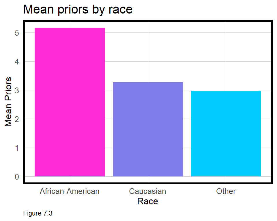
7.3.1 Accuracy & Generalizability
Both accuracy and the confusion metrics are discussed here with emphasis on generalizability across race. To begin, the code below calculates a predicted recidivism class, predClass, for any predicted probability over 0.50.
testProbs <-
  data.frame(class = test$recidivatedNumeric,
             probs = predict(reg.noRace, test, type = "response"),
             Race = test$race2)
The first cause for concern comes in Figure 7.4 below which contrasts observed and predicted recidivism rates given the 50% threshold. About 45% of ex-offenders are observed to recidivate across all races, but only 40% are predicted to do so. This underprediction is far more pronouced for Caucasians and other races, relative to African Americans.
mutate(testProbs, predClass = ifelse(probs >= .5, 1, 0)) %>%
  group_by(Race) %>%
  summarize(Observed.recidivism = sum(class) / n(),
            Predicted.recidivism = sum(predClass) / n()) %>%
  gather(Variable, Value, -Race) %>%
  ggplot(aes(Race, Value)) +
    geom_bar(aes(fill = Race), position="dodge", stat="identity") +
    scale_fill_manual(values = palette_3_colors) +
    facet_wrap(~Variable) +
    labs(title = "Observed and predicted recidivism", x = "Race", y = "Rate") +
    plotTheme() + theme(axis.text.x = element_text(angle = 45, hjust = 1))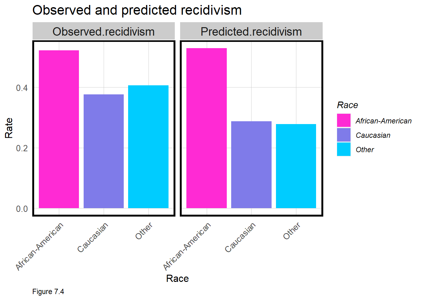
Let’s delve a bit deeper by visualizing confusion metrics by race. Northpointe, the company that markets decision-making tools based on these data, has argued that the algorithm is fair because of the comparable across-race accuracy rates.65 Table 7.2 below, confirms this claim - but that is far from the entire story.
Despite equal accuracy rates, the issue is in the disparities for each confusion metric. The iterateThreshold function, first used in Chapter 6, will be used again to calculate confusion metrics for each threshold by race.
The function takes several inputs including the data frame of predicted probabilities; an observedClass; a column of predicted probabilities, predictedProbs, and an optional group parameter that provides confusion metrics by race.
Below, the function is run and the results are filtered for just the 50% threshold. Accuracy and the confusion metrics as rates are selected out, converted to long form and then plotted as a grouped bar plot. Let’s interpret each metric in the context of social cost.
iterateThresholds <- function(data, observedClass, predictedProbs, group) {
  observedClass <- enquo(observedClass)
  predictedProbs <- enquo(predictedProbs)
  group <- enquo(group)
  x = .01
  all_prediction <- data.frame()

  if (missing(group)) {

    while (x <= 1) {
    this_prediction <- data.frame()

    this_prediction <-
      data %>%
      mutate(predclass = ifelse(!!predictedProbs > x, 1,0)) %>%
      count(predclass, !!observedClass) %>%
      summarize(Count_TN = sum(n[predclass==0 & !!observedClass==0]),
                Count_TP = sum(n[predclass==1 & !!observedClass==1]),
                Count_FN = sum(n[predclass==0 & !!observedClass==1]),
                Count_FP = sum(n[predclass==1 & !!observedClass==0]),
                Rate_TP = Count_TP / (Count_TP + Count_FN),
                Rate_FP = Count_FP / (Count_FP + Count_TN),
                Rate_FN = Count_FN / (Count_FN + Count_TP),
                Rate_TN = Count_TN / (Count_TN + Count_FP),
                Accuracy = (Count_TP + Count_TN) /
                           (Count_TP + Count_TN + Count_FN + Count_FP)) %>%
      mutate(Threshold = round(x,2))

    all_prediction <- rbind(all_prediction,this_prediction)
    x <- x + .01
  }
  return(all_prediction)
  }
  else if (!missing(group)) {
   while (x <= 1) {
    this_prediction <- data.frame()

    this_prediction <-
      data %>%
      mutate(predclass = ifelse(!!predictedProbs > x, 1,0)) %>%
      group_by(!!group) %>%
      count(predclass, !!observedClass) %>%
      summarize(Count_TN = sum(n[predclass==0 & !!observedClass==0]),
                Count_TP = sum(n[predclass==1 & !!observedClass==1]),
                Count_FN = sum(n[predclass==0 & !!observedClass==1]),
                Count_FP = sum(n[predclass==1 & !!observedClass==0]),
                Rate_TP = Count_TP / (Count_TP + Count_FN),
                Rate_FP = Count_FP / (Count_FP + Count_TN),
                Rate_FN = Count_FN / (Count_FN + Count_TP),
                Rate_TN = Count_TN / (Count_TN + Count_FP),
                Accuracy = (Count_TP + Count_TN) /
                           (Count_TP + Count_TN + Count_FN + Count_FP)) %>%
      mutate(Threshold = round(x, 2))

    all_prediction <- rbind(all_prediction, this_prediction)
    x <- x + .01
  }
  return(all_prediction)
  }
}
testProbs.thresholds <-
iterateThresholds(data=testProbs, observedClass = class,
predictedProbs = probs, group = Race)
filter(testProbs.thresholds, Threshold == .5) %>%
dplyr::select(Accuracy, Race, starts_with("Rate")) %>%
gather(Variable, Value, -Race) %>%
ggplot(aes(Variable, Value, fill = Race)) +
geom_bar(aes(fill = Race), position = "dodge", stat = "identity") +
scale_fill_manual(values = palette_3_colors) +
labs(title="Confusion matrix rates by race",
subtitle = "50% threshold", x = "Outcome",y = "Rate") +
plotTheme() + theme(axis.text.x = element_text(angle = 45, hjust = 1)) 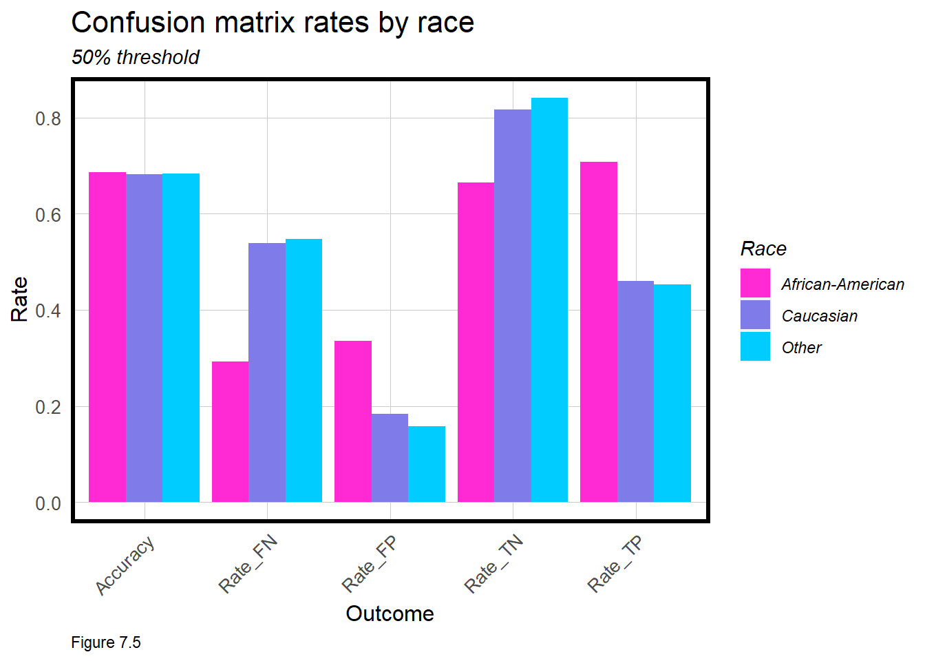
False Negatives - The rate at which African Americans are incorrectly predicted not to recividate is noticeably lower than for other races. A judge granting paroll errant in this way, means an individual is incorrectly released from prison only to commit another crime. Here, the social cost is on society not the ex-offender. In the context of disparate impact, Caucasians will be incorrectly released at greater rates than African Americans.
False Positives - The rate at which African Americans are incorrectly predicted to recidivate is noticeably higher than for other races. A judge faced with a paroll decision when this error comes into play will incorrectly prevent a prisoner from being released. Here, the social cost is most certainly with the ex-offender, with a much greater disparate impact for African Americans.
These two metrics alone suggest that the use of this algorithm may have a disparate impact on African Americans. Thus, we should be weary of how useful this algorithm is for making criminal justice decisions.
7.4 What about the threshold?
As we learned in the previous chapter, the threshold at which an individual outcome is classified to be true can make all the difference. The same is true in this use case, but can finding an optimal threshold help to erase the disparate impact? Let’s explore some metrics related to the threshold, beginning with an across race ROC Curve.
The ROC Curve measures trade-offs in true positive and false positive rates for each threshold. Recall from Figure 6.7 (the ‘football plot’), that the diagonal ‘coin flip line’ suggests a classifier which gets it right 50% of the time, but also gets it wrong 50% of the time. Anything classified on or below the coin flip line is not useful.
aucTable <-
  testProbs %>%
  group_by(Race) %>%
  summarize(AUC = auc(class,probs)) %>%
  mutate(AUC = as.character(round(AUC, 3)))

mutate(testProbs.thresholds, pointSize = ifelse(Threshold == .48, 24, 16)) %>%
  ggplot(aes(Rate_FP, Rate_TP, colour=Race)) +
  geom_point(aes(shape = pointSize)) + geom_line() + scale_shape_identity() +
  scale_color_manual(values = palette_3_colors) +
  geom_abline(slope = 1, intercept = 0, size = 1.5, color = 'grey') +
  annotation_custom(tableGrob(aucTable, rows = NULL), xmin = .65, xmax = 1, ymin = 0, ymax = .25) +
  labs(title="ROC Curves by race", x="False Positive Rate", y="True Positive Rate") +
  plotTheme()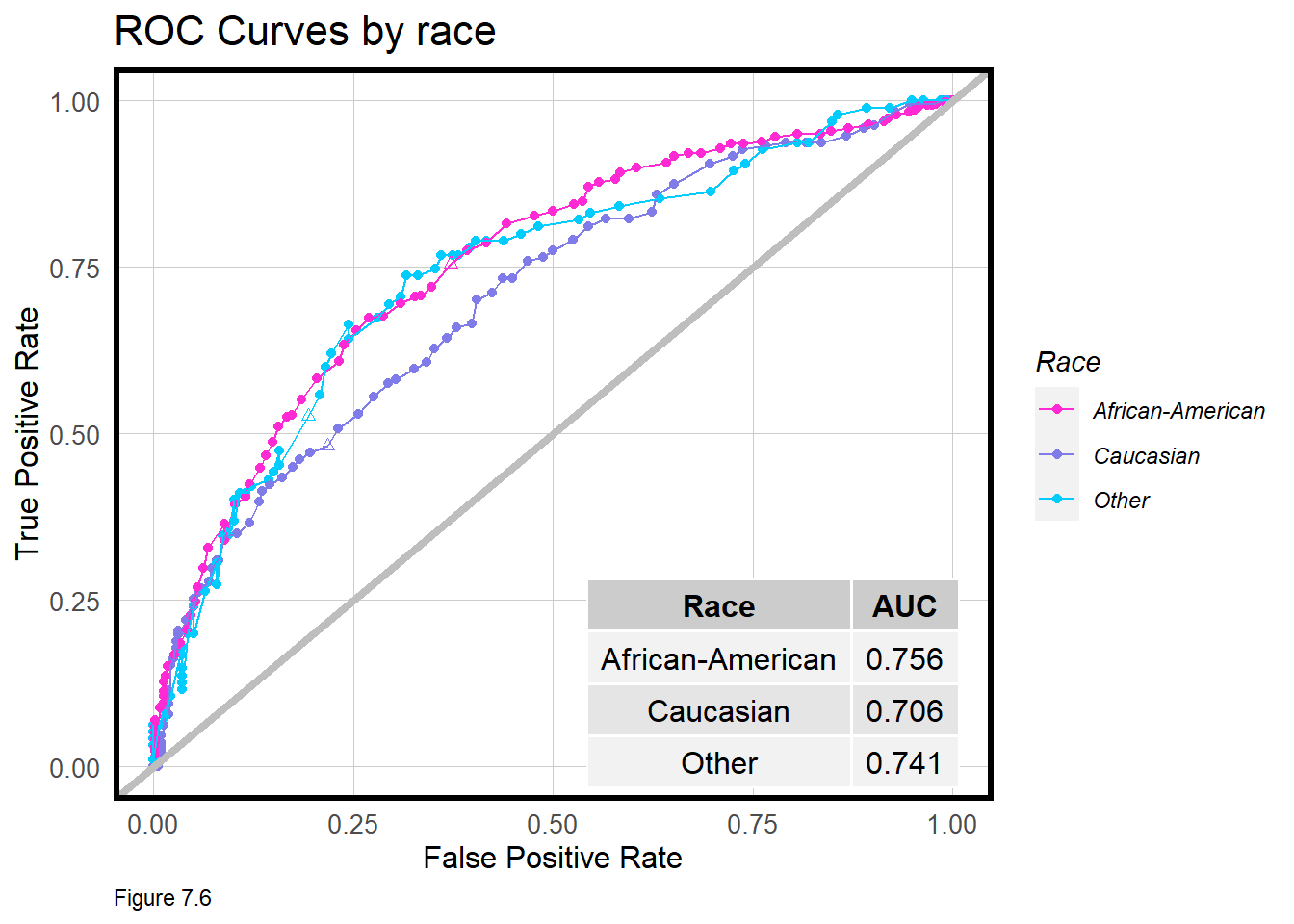
Above, the ROC curve is generated for each race and shows there are really three different curves. testProbs.thresholds shows that a threshold that gives an African American True Positive rate of roughly 76% of the time, gives one for Caucasians 48% of the time. At that same threshold however, the model makes more False Positives for African Americans (37%) than it does for Caucasians (22%).
To see evidence of these disparities, note the triangles in the figure above or try filter(testProbs.thresholds, Threshold == 0.48).
What is the appropriate risk score threshold at which we should conclude an ex-offender will recidivate? The ROC curves suggest a threshold suitable for one race may not be robust for another. It stands to reason then that perhaps a different threshold for each race may help to equalize some of these confusion metric differences.
7.5 Optimizing ‘equitable’ thresholds
If a given predicted threshold leads to a disparate impact for one race, then it is inequitable. Let’s explore the possibility of reducing disparate impact by searching for an equitable threshold for each race. I was first exposed to the idea of equitable thresholds through the work of colleagues at Oregon’s State Department of Child Protective Services, who develop machine learning models to predict child welfare outcomes and allocate limited social worker resources. Fairness is a key concern for the development team who published a paper on their approach for ‘fairness correction’.66 In this section, I replicate a more simple version of that work.
Consider a simple measure of disparity that argues for a comparable absolute difference in False Positive (Rate_FP) and False Negative (Rate_FN) rates across both races. The below table shows what that disparity looks like at the 50% threshold. We see a comparable Difference in accuracy, but diverging error rates across races.
| Var | African-American | Caucasian | Difference |
|---|---|---|---|
| Accuracy | 0.6871089 | 0.6824458 | 0.0046631 |
| Rate_FN | 0.2925659 | 0.5392670 | 0.2467011 |
| Rate_FP | 0.3350785 | 0.1835443 | 0.1515342 |
| Disparities in across-race confusion metrics (50% threshold) | |||
| Table 7.2 |
Let’s try to achieve equitable thresholds that:
- Exhibit little difference in across-race False Positive and Negative Rates; while ensuring both rates are relatively low.
- Exhibit little difference in across-race Accuracy rates; while ensuring these rates are relatively high.
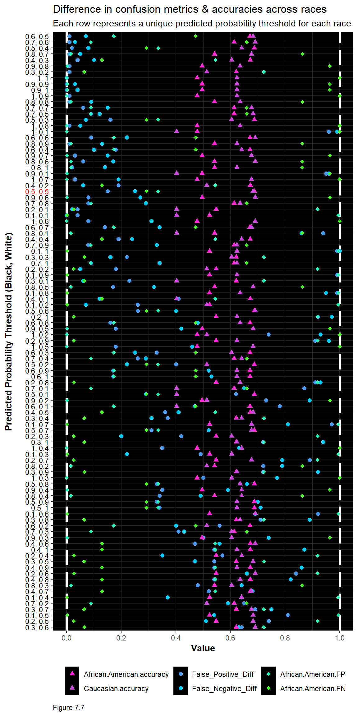
To create this optimization, across-race confusion metrics and accuracies are calculated for each possible threshold combination. Here, to keep it simple, thresholds are analyzed at 10% intervals and only for two races. Doing so results in the below visualization.
Here, the x-axis runs from 0 (no difference in across-race confusion metrics) and 1 (perfect accuracy). The y-axis shows each threshold pair. Shades of purple represent accuracy rates - which we hope are close to 1 and comparable, across races. Shades of blue represent differences in across-rate confusion metrics, which should be close to 0 and comparable. False error rates in shades of green are shown for only African Americans, given the associated social costs.
The plot is sorted in a way that maximizes the (euclidean) distance between accuracies and differences, such that a distance of 1 would mean both differences are 0 and both accuracies are 1.
When the 0.5, 0.5 threshold (in red) is visualized this way, it is clear that a 50% default is far from ideal. There are some interesting candidates here for most equitable - but tradeoffs exist. 0.6, 0.5 has high and comparable accuracy rates; differences in false positives close to 0; but an overall high false negative rate for African Americans. Consider how this contrasts with 0.5, 0.4, which lowers the threshold for Caucasians instead of increasing it for African Americans. What more can you say about the seemingly most equitable threshold pair, 0.6, 0.5?
Below is table of results for each threshold pair. Note that these results are likely influenced by the results of the training/test split. Iteratively sampling or ‘bootstrapping’ many splits, and calculating equitable thresholds for each, would be a better approach. In addition, estimating results using thresholds at the hundredths of a percent may be more robust than at the tenths of a percent.
| threshold | False_Negative_Diff | False_Positive_Diff | African.American.accuracy | Caucasian.accuracy | African.American.FP | African.American.FN |
|---|---|---|---|---|---|---|
| 0.6, 0.5 | 0.07 | 0.01 | 0.6708385 | 0.6824458 | 0.1727749 | 0.4724221 |
| 0.7, 0.6 | 0.03 | 0.01 | 0.6132666 | 0.6903353 | 0.0890052 | 0.6594724 |
| 0.5, 0.4 | 0.08 | 0.02 | 0.6871089 | 0.6410256 | 0.3350785 | 0.2925659 |
| 0.8, 0.7 | 0.05 | 0.01 | 0.5419274 | 0.6765286 | 0.0157068 | 0.8633094 |
| 0.4, 0.3 | 0.10 | 0.04 | 0.6720901 | 0.6035503 | 0.5445026 | 0.1294964 |
| 0.9, 0.8 | 0.01 | 0.01 | 0.4956195 | 0.6351085 | 0.0026178 | 0.9640288 |
| 0.3, 0.2 | 0.01 | 0.01 | 0.6207760 | 0.5128205 | 0.7225131 | 0.0647482 |
| 1, 1 | 0.00 | 0.00 | 0.4780976 | 0.6232742 | 0.0000000 | 1.0000000 |
| 0.9, 0.9 | 0.03 | 0.00 | 0.4956195 | 0.6232742 | 0.0026178 | 0.9640288 |
| 0.9, 1 | 0.04 | 0.00 | 0.4956195 | 0.6232742 | 0.0026178 | 0.9640288 |
| 1, 0.9 | 0.01 | 0.01 | 0.4780976 | 0.6232742 | 0.0000000 | 1.0000000 |
| 0.8, 0.8 | 0.09 | 0.01 | 0.5419274 | 0.6351085 | 0.0157068 | 0.8633094 |
| 0.7, 0.7 | 0.15 | 0.06 | 0.6132666 | 0.6765286 | 0.0890052 | 0.6594724 |
| 0.7, 0.5 | 0.12 | 0.09 | 0.6132666 | 0.6824458 | 0.0890052 | 0.6594724 |
| 0.5, 0.3 | 0.07 | 0.16 | 0.6871089 | 0.6035503 | 0.3350785 | 0.2925659 |
| 1, 0.8 | 0.05 | 0.01 | 0.4780976 | 0.6351085 | 0.0000000 | 1.0000000 |
| 1, 0.1 | 0.99 | 0.96 | 0.4780976 | 0.4023669 | 0.0000000 | 1.0000000 |
| 0.6, 0.6 | 0.22 | 0.09 | 0.6708385 | 0.6903353 | 0.1727749 | 0.4724221 |
| 0.8, 0.9 | 0.13 | 0.01 | 0.5419274 | 0.6232742 | 0.0157068 | 0.8633094 |
| 0.6, 0.4 | 0.10 | 0.18 | 0.6708385 | 0.6410256 | 0.1727749 | 0.4724221 |
| 0.9, 0.7 | 0.15 | 0.03 | 0.4956195 | 0.6765286 | 0.0026178 | 0.9640288 |
| 0.8, 0.6 | 0.17 | 0.06 | 0.5419274 | 0.6903353 | 0.0157068 | 0.8633094 |
| 0.8, 1 | 0.14 | 0.02 | 0.5419274 | 0.6232742 | 0.0157068 | 0.8633094 |
| 0.9, 0.1 | 0.96 | 0.95 | 0.4956195 | 0.4023669 | 0.0026178 | 0.9640288 |
| 1, 0.7 | 0.19 | 0.03 | 0.4780976 | 0.6765286 | 0.0000000 | 1.0000000 |
| 0.4, 0.2 | 0.06 | 0.19 | 0.6720901 | 0.5128205 | 0.5445026 | 0.1294964 |
| 0.5, 0.5 | 0.25 | 0.15 | 0.6871089 | 0.6824458 | 0.3350785 | 0.2925659 |
| 0.9, 0.6 | 0.27 | 0.08 | 0.4956195 | 0.6903353 | 0.0026178 | 0.9640288 |
| 0.7, 0.8 | 0.29 | 0.08 | 0.6132666 | 0.6351085 | 0.0890052 | 0.6594724 |
| 0.2, 0.1 | 0.02 | 0.04 | 0.5469337 | 0.4023669 | 0.9188482 | 0.0263789 |
| 0.1, 0.1 | 0.00 | 0.04 | 0.5231539 | 0.4023669 | 0.9947644 | 0.0023981 |
| 1, 0.6 | 0.31 | 0.08 | 0.4780976 | 0.6903353 | 0.0000000 | 1.0000000 |
| 0.6, 0.7 | 0.34 | 0.14 | 0.6708385 | 0.6765286 | 0.1727749 | 0.4724221 |
| 0.8, 0.1 | 0.86 | 0.94 | 0.5419274 | 0.4023669 | 0.0157068 | 0.8633094 |
| 0.4, 0.4 | 0.24 | 0.19 | 0.6720901 | 0.6410256 | 0.5445026 | 0.1294964 |
| 0.7, 0.9 | 0.33 | 0.08 | 0.6132666 | 0.6232742 | 0.0890052 | 0.6594724 |
| 0.1, 1 | 1.00 | 0.99 | 0.5231539 | 0.6232742 | 0.9947644 | 0.0023981 |
| 0.3, 0.3 | 0.16 | 0.22 | 0.6207760 | 0.6035503 | 0.7225131 | 0.0647482 |
| 0.7, 1 | 0.34 | 0.09 | 0.6132666 | 0.6232742 | 0.0890052 | 0.6594724 |
| 0.2, 0.2 | 0.05 | 0.18 | 0.5469337 | 0.5128205 | 0.9188482 | 0.0263789 |
| 0.1, 0.9 | 0.99 | 0.99 | 0.5231539 | 0.6232742 | 0.9947644 | 0.0023981 |
| 0.3, 0.1 | 0.06 | 0.23 | 0.6207760 | 0.4023669 | 0.7225131 | 0.0647482 |
| 0.8, 0.5 | 0.32 | 0.17 | 0.5419274 | 0.6824458 | 0.0157068 | 0.8633094 |
| 0.1, 0.8 | 0.95 | 0.99 | 0.5231539 | 0.6351085 | 0.9947644 | 0.0023981 |
| 0.4, 0.1 | 0.12 | 0.41 | 0.6720901 | 0.4023669 | 0.5445026 | 0.1294964 |
| 0.1, 0.2 | 0.07 | 0.26 | 0.5231539 | 0.5128205 | 0.9947644 | 0.0023981 |
| 0.5, 0.6 | 0.40 | 0.26 | 0.6871089 | 0.6903353 | 0.3350785 | 0.2925659 |
| 0.2, 1 | 0.97 | 0.92 | 0.5469337 | 0.6232742 | 0.9188482 | 0.0263789 |
| 0.6, 0.8 | 0.48 | 0.16 | 0.6708385 | 0.6351085 | 0.1727749 | 0.4724221 |
| 0.9, 0.5 | 0.42 | 0.18 | 0.4956195 | 0.6824458 | 0.0026178 | 0.9640288 |
| 1, 0.2 | 0.93 | 0.74 | 0.4780976 | 0.5128205 | 0.0000000 | 1.0000000 |
| 0.2, 0.9 | 0.96 | 0.91 | 0.5469337 | 0.6232742 | 0.9188482 | 0.0263789 |
| 1, 0.5 | 0.46 | 0.18 | 0.4780976 | 0.6824458 | 0.0000000 | 1.0000000 |
| 0.6, 0.3 | 0.25 | 0.33 | 0.6708385 | 0.6035503 | 0.1727749 | 0.4724221 |
| 0.7, 0.4 | 0.29 | 0.26 | 0.6132666 | 0.6410256 | 0.0890052 | 0.6594724 |
| 0.5, 0.2 | 0.22 | 0.40 | 0.6871089 | 0.5128205 | 0.3350785 | 0.2925659 |
| 0.6, 0.9 | 0.52 | 0.17 | 0.6708385 | 0.6232742 | 0.1727749 | 0.4724221 |
| 0.6, 1 | 0.53 | 0.17 | 0.6708385 | 0.6232742 | 0.1727749 | 0.4724221 |
| 0.2, 0.8 | 0.93 | 0.91 | 0.5469337 | 0.6351085 | 0.9188482 | 0.0263789 |
| 0.7, 0.1 | 0.65 | 0.87 | 0.6132666 | 0.4023669 | 0.0890052 | 0.6594724 |
| 0.5, 0.1 | 0.29 | 0.62 | 0.6871089 | 0.4023669 | 0.3350785 | 0.2925659 |
| 0.9, 0.2 | 0.89 | 0.73 | 0.4956195 | 0.5128205 | 0.0026178 | 0.9640288 |
| 0.6, 0.1 | 0.47 | 0.78 | 0.6708385 | 0.4023669 | 0.1727749 | 0.4724221 |
| 0.4, 0.5 | 0.41 | 0.36 | 0.6720901 | 0.6824458 | 0.5445026 | 0.1294964 |
| 0.3, 0.4 | 0.31 | 0.37 | 0.6207760 | 0.6410256 | 0.7225131 | 0.0647482 |
| 0.1, 0.7 | 0.81 | 0.97 | 0.5231539 | 0.6765286 | 0.9947644 | 0.0023981 |
| 0.5, 0.7 | 0.52 | 0.31 | 0.6871089 | 0.6765286 | 0.3350785 | 0.2925659 |
| 0.2, 0.3 | 0.20 | 0.42 | 0.5469337 | 0.6035503 | 0.9188482 | 0.0263789 |
| 0.3, 1 | 0.94 | 0.72 | 0.6207760 | 0.6232742 | 0.7225131 | 0.0647482 |
| 1, 0.4 | 0.63 | 0.35 | 0.4780976 | 0.6410256 | 0.0000000 | 1.0000000 |
| 0.1, 0.3 | 0.22 | 0.49 | 0.5231539 | 0.6035503 | 0.9947644 | 0.0023981 |
| 0.2, 0.7 | 0.79 | 0.89 | 0.5469337 | 0.6765286 | 0.9188482 | 0.0263789 |
| 0.8, 0.2 | 0.79 | 0.72 | 0.5419274 | 0.5128205 | 0.0157068 | 0.8633094 |
| 0.3, 0.9 | 0.92 | 0.72 | 0.6207760 | 0.6232742 | 0.7225131 | 0.0647482 |
| 1, 0.3 | 0.77 | 0.50 | 0.4780976 | 0.6035503 | 0.0000000 | 1.0000000 |
| 0.5, 0.8 | 0.66 | 0.33 | 0.6871089 | 0.6351085 | 0.3350785 | 0.2925659 |
| 0.9, 0.4 | 0.59 | 0.35 | 0.4956195 | 0.6410256 | 0.0026178 | 0.9640288 |
| 0.8, 0.4 | 0.49 | 0.34 | 0.5419274 | 0.6410256 | 0.0157068 | 0.8633094 |
| 0.5, 0.9 | 0.70 | 0.33 | 0.6871089 | 0.6232742 | 0.3350785 | 0.2925659 |
| 0.5, 1 | 0.71 | 0.34 | 0.6871089 | 0.6232742 | 0.3350785 | 0.2925659 |
| 0.1, 0.6 | 0.69 | 0.92 | 0.5231539 | 0.6903353 | 0.9947644 | 0.0023981 |
| 0.3, 0.8 | 0.89 | 0.71 | 0.6207760 | 0.6351085 | 0.7225131 | 0.0647482 |
| 0.6, 0.2 | 0.40 | 0.56 | 0.6708385 | 0.5128205 | 0.1727749 | 0.4724221 |
| 0.7, 0.3 | 0.43 | 0.41 | 0.6132666 | 0.6035503 | 0.0890052 | 0.6594724 |
| 0.9, 0.3 | 0.74 | 0.50 | 0.4956195 | 0.6035503 | 0.0026178 | 0.9640288 |
| 0.4, 0.6 | 0.56 | 0.47 | 0.6720901 | 0.6903353 | 0.5445026 | 0.1294964 |
| 0.4, 1 | 0.87 | 0.54 | 0.6720901 | 0.6232742 | 0.5445026 | 0.1294964 |
| 0.2, 0.4 | 0.35 | 0.57 | 0.5469337 | 0.6410256 | 0.9188482 | 0.0263789 |
| 0.3, 0.5 | 0.47 | 0.54 | 0.6207760 | 0.6824458 | 0.7225131 | 0.0647482 |
| 0.4, 0.9 | 0.86 | 0.54 | 0.6720901 | 0.6232742 | 0.5445026 | 0.1294964 |
| 0.2, 0.6 | 0.66 | 0.84 | 0.5469337 | 0.6903353 | 0.9188482 | 0.0263789 |
| 0.4, 0.8 | 0.82 | 0.54 | 0.6720901 | 0.6351085 | 0.5445026 | 0.1294964 |
| 0.8, 0.3 | 0.64 | 0.48 | 0.5419274 | 0.6035503 | 0.0157068 | 0.8633094 |
| 0.4, 0.7 | 0.68 | 0.52 | 0.6720901 | 0.6765286 | 0.5445026 | 0.1294964 |
| 0.1, 0.4 | 0.37 | 0.64 | 0.5231539 | 0.6410256 | 0.9947644 | 0.0023981 |
| 0.7, 0.2 | 0.59 | 0.65 | 0.6132666 | 0.5128205 | 0.0890052 | 0.6594724 |
| 0.3, 0.7 | 0.75 | 0.69 | 0.6207760 | 0.6765286 | 0.7225131 | 0.0647482 |
| 0.1, 0.5 | 0.54 | 0.81 | 0.5231539 | 0.6824458 | 0.9947644 | 0.0023981 |
| 0.2, 0.5 | 0.51 | 0.74 | 0.5469337 | 0.6824458 | 0.9188482 | 0.0263789 |
| 0.3, 0.6 | 0.63 | 0.64 | 0.6207760 | 0.6903353 | 0.7225131 | 0.0647482 |
Does engineering equitable thresholds help reduce disparate impact? Perhaps, but like many interesting social science phenomena, trade-offs must be made and no threshold is perfect. Consider how such an outcome relates to the across-race selection bias in these data. In this chapter, the focus is has been on social costs - which is just one of many potential decision-making bottom lines in government.
While it is often difficult to qualitatively or quantitatively judge the social costs and benefits of algorithms, I urge you to try. The results may not communicate neatly with dollar signs. Instead, careful discussion is needed on the decision-making process, the business-as-usual approach, the underlying data and all the many trade-offs. More so, terms like ‘False Positive’, ROC curves etc. will likely be lost on the Police Chief, Mayor or other non-technical decisions-makers.
That’s fine. The Police Chief has enough domain expertise to understand how the trade-offs effect the efficiency and effectiveness of her agency - so long as you or a member of your team can communicate well. Keep in mind, that these decisions are already being made by human beings, and you can create a confusion matrix for the business-as-usual decision-making.
By now, it is clear that these methods are imperfect. Algorithms make mistakes, as do humans and even judges. The question is, are these methods useful?
Judging a useful algorithm thus requires far more than data science prowess. For use cases with potentially significant social costs, proper governance is key. We return to the role of ‘Algorithmic Governance’ next, in the book’s conclusion.
7.6 Assignment - Memo to the Mayor
Let’s see how good you are at communicating these very nuanced data science results to non-technical domain experts. Assume you are a data scientist working for the Department of Prisons and you are to make recommendations to your city’s Mayor about whether or not she should adopt a new recidivism algorithm into how the City allocates an ex-offender job training program. Some in the Administration have expressed their concern that expanding the City’s limited job training resources on ex-offenders who recidivate shortly after their release is not good policy. What do you think?
Begin by sketching out the basics of the job training program, quantifying the program costs. Although our concern is social costs, research the financial costs to individuals and society related to imprisonment. Calculate costs and benefits using this research as well as your own sensible assumptions; choose a threshold from testProbs.thresholds, and use it to develop a qualitative and quantitative cost/benefit analysis.
In your memo, no shorter than 600 words and no longer than 800 words, you must argue for the use of the algorithm, including the following information:
- Explain the job training program, why the City is considering an algorithm to allocate the program and how the algorithm works, in brief.
- Acknowledge and explain to the Mayor why she should be concerned with algorithmic fairness.
- Present your cost/benefit analysis for your equitable threshold of choice including an across-race grouped bar plot of each confusion metric the 0.5, 0.5 threshold and your optimal threshold.
- Interpret the trade-off between accuracy and generalizability as it relates to the use of this algorithm in prioritizing a job training program and advocate that the Mayor adopt the algorithm.
Remember, if your memo is too technical, you will lose the Mayor’s attention. If you are disingenuous about disparate impact, the press and other advocates will eventually get hold of your memo and use it to hurt the Mayor politically. If you are too strong about the implications for fairness, the Mayor will not agree to use the algorithm and your boss, may fire you. The best hint I can give you is to focus your memo on the use case at hand - but don’t forget, politics are an important consideration.
O’Neil, C. (2016). Weapons of math destruction: How big data increases inequality and threatens democracy. Broadway Books.)↩︎
Angwin, Julia & Larson, Jeff (2016) Bias in Criminal Risk Scores is Mathematically Inevitable, Researchers Say. ProPublica. https://www.propublica.org/article/bias-in-criminal-risk-scores-is-mathematically-inevitable-researchers-say↩︎
Verma, S., & Rubin, J. (2018). Fairness definitions explained. In 2018 IEEE/ACM International Workshop on Software Fairness (FairWare) (pp. 1-7). IEEE.↩︎
Larson et al. (2016). How We Analyzed the COMPAS Recidivism Algorithm. https://www.propublica.org/article/how-we-analyzed-the-compas-recidivism-algorithm.↩︎
Ibid.↩︎
18 U.S. Code § 3553. Imposition of a sentence. https://www.law.cornell.edu/uscode/text/18/3553↩︎
Guthrie, C., Rachlinski, J. J., & Wistrich, A. J. (2000). Inside the judicial mind. Cornell L. Rev., 86, 777↩︎
Barry-Jester, Anna Maria et al. (2020). The New Science of Sentencing↩︎
Kleinberg, J., Lakkaraju, H., Leskovec, J., Ludwig, J., & Mullainathan, S. (2018). Human decisions and machine predictions. The quarterly journal of economics, 133(1), 237-293.↩︎
Berk, R. (2017). An impact assessment of machine learning risk forecasts on parole board decisions and recidivism. Journal of Experimental Criminology, 13(2), 193-216.↩︎
Silver, E., & Chow-Martin, L. (2002). A multiple models approach to assessing recidivism risk: Implications for judicial decision making. Criminal justice and behavior, 29(5), 538-568.↩︎
Dressel, J., & Farid, H. (2018). The accuracy, fairness, and limits of predicting recidivism. Science advances, 4(1).↩︎
Berk, R. (2017). An impact assessment of machine learning risk forecasts on parole board decisions and recidivism. Journal of Experimental Criminology, 13(2), 193-216↩︎
https://www.propublica.org/article/how-we-analyzed-the-compas-recidivism-algorithm↩︎
https://github.com/propublica/compas-analysis/blob/master/Compas%20Analysis.ipynb↩︎
Dieterich et al. (2016). COMPAS Risk Scales: Demonstrating Accuracy Equity and Predict Parity. http://go.volarisgroup.com/rs/430-MBX-989/images/ProPublica_Commentary_Final_070616.pdf↩︎
Purdy & Glass (2020). The Pursuit of Algorithmic Fairness: On “Correcting” Algorithmic Unfairness in a Child Welfare Reunification Success Classifier. https://arxiv.org/abs/2010.12089↩︎