Chapter 4 Intro to geospatial machine learning, Part 2
4.1 On the spatial process of home prices
Recall the three components of the hedonic home price model - internal characteristics, like the number of bedrooms; neighborhood amenities/public services, like crime exposure; and the underlying spatial process of prices. Modeling the first two in the previous chapter still left nearly one third of the variation in price unexplained.
In this chapter, the spatial process is added and we learn why generalizability across space is so important for geospatial machine learning. Let’s start with the relevant spatial process in home prices.
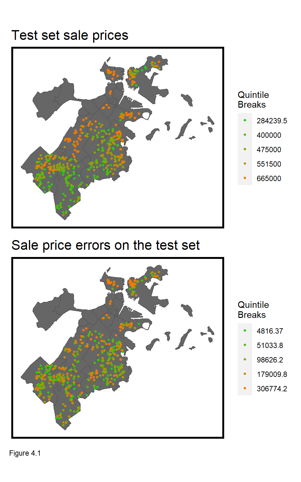
To me, the most interesting housing market dynamic is that from individual real estate transactions emerges a systematic spatial pattern of house prices. The top most map in Figure 4.1 illustrates this pattern. As discussed in the Introduction, these patterns result both from external and internal decision-making.
External decision-makers, like Planners, enact zoning regulations dictating what can be built, where, while internal decision-makers, like home buyers, bid on locations according to their preferences. Both preferences and zoning can be accounted for in the first two components of the hedonic model - so what is left unexplained in the error term?
First, imagine that all nearby houses have a backyard pool valued at $10k. If the pool was the only component left unaccounted for in the model, then each nearby house should exhibit regression errors (of $10k) that cluster in space.
Second, homes are ‘appraised’ by looking at ‘comparable’ houses, nearby. This means that these comparable houses, nearby are a ‘price signal’, and if that signal is left unaccounted for, regression errors will also cluster in space.28
The key to engineering features that account for this spatial process is understanding the spatial scale of comparable houses, nearby. This is challenging because, as Figure 4.1 illustrates, prices in Boston exhibit clustering at different spatial scales - both within and across neighborhoods.
The goal in this chapter is to engineer features that account for neighborhood-scale clustering. We will test for generalizability of model predictions with and without these features, and conclude by considering the implications of deploying a property tax assessment algorithm that does not generalize across space.
In the next section, clustering of home price and regression errors is explored, followed by the creation of a ‘neighborhood fixed effect’ feature.
4.1.1 Setup & Data Wrangling
In this section, libraries are loaded; the final Chapter 3 dataset, including crime features, is read in and split into training and test sets. The reg.training model is estimated again, and goodness of fit metrics are calculated on the boston.test set.
library(tidyverse)
library(sf)
library(spdep)
library(caret)
library(ckanr)
library(grid)
library(gridExtra)
library(knitr)
library(kableExtra)
library(tidycensus)
library(scales)

palette5 <- c("#25CB10", "#5AB60C", "#8FA108",   "#C48C04", "#FA7800")
The data and functions are loaded.
root.dir = "https://raw.githubusercontent.com/urbanSpatial/Public-Policy-Analytics-Landing/master/DATA/"
source("https://raw.githubusercontent.com/urbanSpatial/Public-Policy-Analytics-Landing/master/functions.r")

boston.sf <- st_read(file.path(root.dir,"/Chapter3_4/boston_sf_Ch1_wrangled.geojson")) %>%
  st_set_crs('ESRI:102286')

nhoods <-
  st_read("http://bostonopendata-boston.opendata.arcgis.com/datasets/3525b0ee6e6b427f9aab5d0a1d0a1a28_0.geojson") %>%
  st_transform('ESRI:102286')
Here the data is split into training and test sets, modeled, and predictions are estimated for a Baseline Regression.
inTrain <- createDataPartition(
              y = paste(boston.sf$Name, boston.sf$NUM_FLOORS.cat,
                        boston.sf$Style, boston.sf$R_AC),
              p = .60, list = FALSE)
boston.training <- boston.sf[inTrain,]
boston.test <- boston.sf[-inTrain,]

reg.training <-
  lm(SalePrice ~ ., data = as.data.frame(boston.training) %>%
                             dplyr::select(SalePrice, LivingArea, Style,
                                           GROSS_AREA, NUM_FLOORS.cat,
                                           R_BDRMS, R_FULL_BTH, R_HALF_BTH,
                                           R_KITCH, R_AC, R_FPLACE, crimes.Buffer))

boston.test <-
  boston.test %>%
  mutate(Regression = "Baseline Regression",
         SalePrice.Predict = predict(reg.training, boston.test),
         SalePrice.Error = SalePrice.Predict - SalePrice,
         SalePrice.AbsError = abs(SalePrice.Predict - SalePrice),
         SalePrice.APE = (abs(SalePrice.Predict - SalePrice)) / SalePrice.Predict)%>%
  filter(SalePrice < 5000000)
4.2 Do prices & errors cluster? The Spatial Lag
So we now understand that even if a regression perfectly accounts for internal characteristics and public services/amenities, it may still have errors that cluster in space. The best way to test for this is to simply map the errors, as Figure 4.1.
Clustering is also known as spatial autocorrelation - the idea that nearer things are more related than farther things. Let’s consider a spatial autocorrelation test that correlates home prices with nearby home prices.
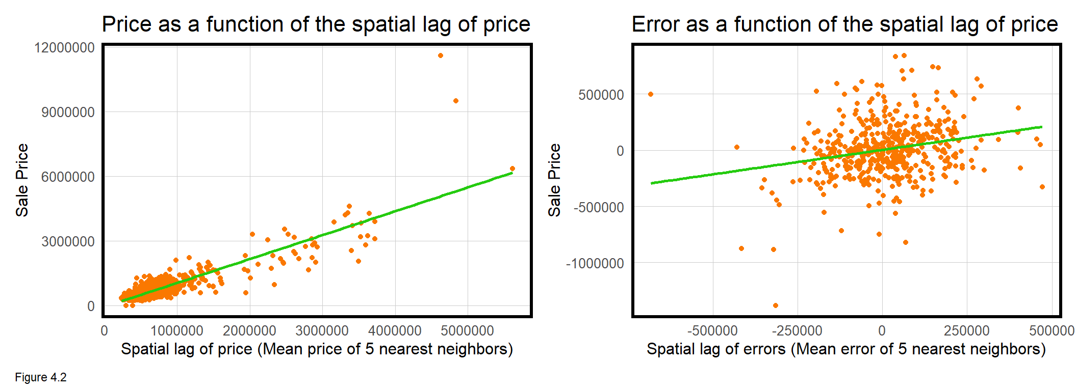
To do so, the code block below introduces new feature engineering that calculates for each home sale, the average sale price of its k nearest neighbors. In spatial analysis parlance, this is the ‘spatial lag’, and it is measured using a series of functions from the spdep package.
First, a data frame of coords, is created by taking the st_coordinates of boston.sf. The knn2nb function creates a neighborList, coding for each point, its 5 nearest neighbors. Next, a ‘spatial weights matrix’ is created, formally relating each sale price observation to those in the neighborList. Finally, the lag.listw function calculates a spatial lag of price, boston.sf$lagPrice, which is the average price of a home sale’s 5 nearest neighbors. The leftmost panel of Figure 4.2 above plots SalePrice as a function of lagPrice.
coords <- st_coordinates(boston.sf)

neighborList <- knn2nb(knearneigh(coords, 5))

spatialWeights <- nb2listw(neighborList, style="W")

boston.sf$lagPrice <- lag.listw(spatialWeights, boston.sf$SalePrice)
The interpretation of this plot is that as price increases, so does the price of nearby houses. The correlation for this spatial lag relationship is 0.87 and is highly statistically significant. This is substantial evidence for clustering of home prices.
How about for model errors? The code block below replicates the spatial lag procedure for SalePrice.Error, calculating the lag directly in the mutate of ggplot. The relationship is visualized in rightmost plot above and describes a marginal but significant correlation of 0.24. The interpretation is that as home price errors increase, so does nearby home price errors. That model errors are spatially autocorrelated suggests that critical spatial information has been omitted from the model. Let’s now demonstrate a second approach for measuring spatial autocorrelation - Moran’s I.
coords.test <-  st_coordinates(boston.test)

neighborList.test <- knn2nb(knearneigh(coords.test, 5))

spatialWeights.test <- nb2listw(neighborList.test, style="W")

boston.test %>%
  mutate(lagPriceError = lag.listw(spatialWeights.test, SalePrice.Error)) %>%
  ggplot(aes(lagPriceError, SalePrice.Error))
4.2.1 Do model errors cluster? - Moran’s I
Moran’s I is based on a null hypothesis that a given spatial process is randomly distributed. The statistic analyzes how local means deviate from the global mean. A positive I near 1, describes positive spatial autocorrelation, or clustering. An I near -1 suggests a spatial process where high and low prices/errors ‘repel’ one another, or are dispersed. Where positive and negative values are randomly distributed, the Moran’s I statistic is near 0.
A statistically significant p-value overturns the null hypothesis to conclude a clustered spatial process. The Moran’s I p-value is estimated by comparing the observed Moran’s I to the I calculated from many random permutations of points, like so:
- The point geometries of home sale observations remain fixed in space.
- Values of
SalePrice.Errorare randomly assigned to observed home sale locations. - Moran’s I is calculated for that permutation.
- The process is repeated over n permutations creating a distribution of permuted Moran’s I values, which is then sorted.
- If the observed Moran’s I value is greater than say, 95% of the permuted I values, then conclude that the observed spatial distribution of errors exhibit greater clustering than expected by random chance alone (a p-value of 0.05).
Figure 4.3 demonstrates Moran’s I values for the three spatial processes. The moran.mc function (mc stands for ‘Monte Carlo’) is used for the random permutation approach. 999 random permutations of I are calculated plus 1 observed I, giving a total distribution of 1000 Moran’s I observations.
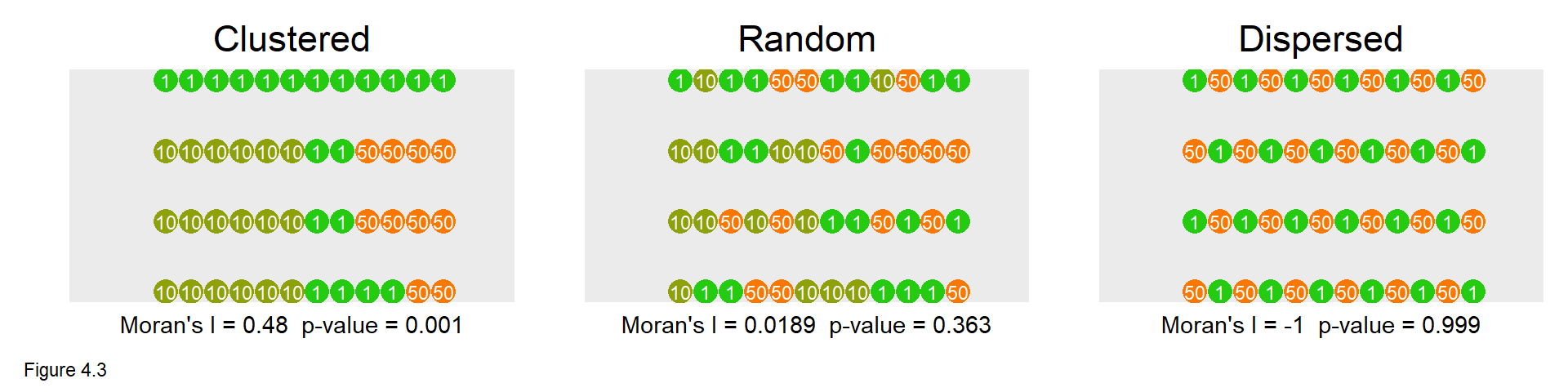
The Clustered point process yields a middling I of 0.48, but a p-value of 0.001 suggests that the observed point process is more clustered than all 999 random permutations (1 / 999 = 0.001) and is statistically significant. In the Random case, the I is close to 0 at 0.0189, and the p-value is insignificant at 0.363. Here, about a third of the random permutations had higher Moran’s I than the observed configuration. Finally, the Dispersed case has an I of -1 suggesting perfect dispersion of values. The p-value is 0.999, with all random permutations having Moran’s I greater than the configuration pictured (999/1000 = 0.999).
The moran.mc function below calculates Moran’s I for the SalePrice.Error in boston.test. Note the inclusion of the spatialWeights.test built above. The observed Moran’s I of 0.13 seems marginal, but the p-value of 0.001 suggests model errors cluster more than what we might expect due to random chance alone.
In Figure 4.4, the frequency of all 999 randomly permutated I are plotted as a histogram with the Observed I indicated by the orange line. That the observed I is higher then all of the 999 randomly generated I’s provides visual confirmation of spatial autocorrelation. Both the spatial lag and Moran’s I test show that model errors exhibit spatial autocorrelation. Again, this suggests that variation in price likely related to the spatial process has been omitted from our current model.
In the next section, new geospatial features are created to account for some this spatial variation.
moranTest <- moran.mc(boston.test$SalePrice.Error,
                      spatialWeights.test, nsim = 999)

ggplot(as.data.frame(moranTest$res[c(1:999)]), aes(moranTest$res[c(1:999)])) +
  geom_histogram(binwidth = 0.01) +
  geom_vline(aes(xintercept = moranTest$statistic), colour = "#FA7800",size=1) +
  scale_x_continuous(limits = c(-1, 1)) +
  labs(title="Observed and permuted Moran's I",
       subtitle= "Observed Moran's I in orange",
       x="Moran's I",
       y="Count") +
  plotTheme()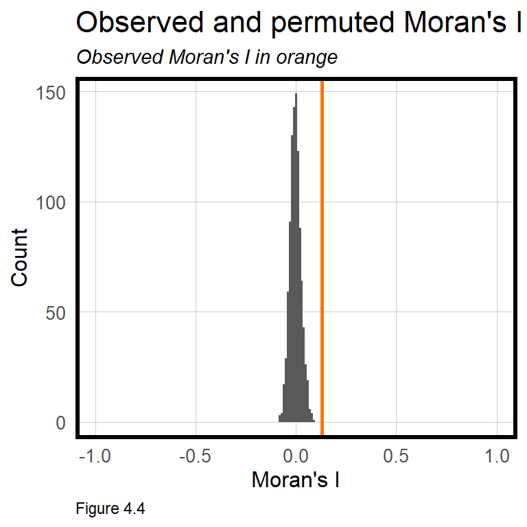
4.3 Accounting for neighborhood
Now onto new geospatial features to help account for the spatial process at the neighborhood scale. To do so, a ‘neighborhood fixed effect’ feature is created.
Fixed effects were discussed in the previous chapter. These are categorical features, like architectural Style, that hypothesize statistically significant differences in price. summary(reg.training) shows that some of the Style fixed effects are statistically significant and help to predict price. The same hypothesis can be extended to categorical, neighborhood fixed effects.
For some intuition, the code block below regresses SalePrice as a function of neighborhood fixed effects, Name. A table is created showing that for each neighborhood, the mean SalePrice and the meanPrediction are identical. Thus, accounting for neighborhood effects accounts for the neighborhood mean of prices, and hopefully, some of the spatial process that was otherwise omitted from the model. Try to understand how left_join helps create the below table.
left_join(
  st_drop_geometry(boston.test) %>%
    group_by(Name) %>%
    summarize(meanPrice = mean(SalePrice, na.rm = T)),
  mutate(boston.test, predict.fe =
                        predict(lm(SalePrice ~ Name, data = boston.test),
                        boston.test)) %>%
    st_drop_geometry %>%
    group_by(Name) %>%
      summarize(meanPrediction = mean(predict.fe))) %>%
kable() %>% kable_styling()| Name | meanPrice | meanPrediction |
|---|---|---|
| Beacon Hill | 2996000.0 | 2996000.0 |
| Charlestown | 904948.6 | 904948.6 |
| Dorchester | 524021.5 | 524021.5 |
| East Boston | 506665.8 | 506665.8 |
| Hyde Park | 413728.0 | 413728.0 |
| Jamaica Plain | 894167.9 | 894167.9 |
| Mattapan | 411423.7 | 411423.7 |
| Mission Hill | 1442000.0 | 1442000.0 |
| Roslindale | 481714.3 | 481714.3 |
| Roxbury | 536004.8 | 536004.8 |
| South Boston | 740452.7 | 740452.7 |
| South End | 3548250.0 | 3548250.0 |
| West Roxbury | 534254.5 | 534254.5 |
|
|
||
| Table 4.1 |
Let’s see how much new predictive power these neighborhood effects generate by re-estimating the regression with the neighborhood Name feature. Note that Name was included in the createDataPartition function above to ensure that neighborhoods with few sale price observations are moved into the training set.
The code block below estimates reg.nhood and creates a data frame, boston.test.nhood, with all goodness of fit metrics.
reg.nhood <- lm(SalePrice ~ ., data = as.data.frame(boston.training) %>%
                                 dplyr::select(Name, SalePrice, LivingArea,
                                               Style, GROSS_AREA, NUM_FLOORS.cat,
                                               R_BDRMS, R_FULL_BTH, R_HALF_BTH,
                                               R_KITCH, R_AC, R_FPLACE,crimes.Buffer))

boston.test.nhood <-
  boston.test %>%
  mutate(Regression = "Neighborhood Effects",
         SalePrice.Predict = predict(reg.nhood, boston.test),
         SalePrice.Error = SalePrice.Predict- SalePrice,
         SalePrice.AbsError = abs(SalePrice.Predict- SalePrice),
         SalePrice.APE = (abs(SalePrice.Predict- SalePrice)) / SalePrice)%>%
  filter(SalePrice < 5000000)
4.3.1 Accuracy of the neighborhood model
How well do neighborhood fixed effects improve the model relative to the Baseline Regression? summary(reg.nhood) indicates that the neighborhood effects are very significant, but have rendered the Style fixed effects insignificant, suggesting perhaps that architectural style and neighborhood are colinear. How might this make sense? The code block below binds error metrics from bothRegresions, calculating a lagPriceError for each.
bothRegressions <-
  rbind(
    dplyr::select(boston.test, starts_with("SalePrice"), Regression, Name) %>%
      mutate(lagPriceError = lag.listw(spatialWeights.test, SalePrice.Error)),
    dplyr::select(boston.test.nhood, starts_with("SalePrice"), Regression, Name) %>%
      mutate(lagPriceError = lag.listw(spatialWeights.test, SalePrice.Error)))
First, a table is created describing the MAE and MAPE for bothRegressions. The Neighborhood Effects model is more accurate on both a dollars and percentage basis. Interestingly, the R^2 of reg.nhood is 0.92, which would be very high to a social scientist. To a data scientist however, a MAPE of 18% ($109,446 at the mean price) suggests this model still needs much improvement to be used in the real world.
st_drop_geometry(bothRegressions) %>%
  gather(Variable, Value, -Regression, -Name) %>%
  filter(Variable == "SalePrice.AbsError" | Variable == "SalePrice.APE") %>%
  group_by(Regression, Variable) %>%
    summarize(meanValue = mean(Value, na.rm = T)) %>%
    spread(Variable, meanValue) %>%
kable()| Regression | SalePrice.AbsError | SalePrice.APE |
|---|---|---|
| Baseline Regression | 183140.4 | 0.7445456 |
| Neighborhood Effects | 105697.1 | 0.1832663 |
|
|
||
| Table 4.2 |
Next, predicted prices are plotted as a function of observed prices. Recall the orange line represents a would-be perfect fit, while the green line represents the predicted fit. The Neighborhood Effects model clearly fits the data better, and does so for all price levels, low, medium and high. Note, for these plots, Regression is the grouping variable in facet_wrap.
The neighborhood effects added much predictive power, perhaps by explaining part of the spatial process. As such, we should now expect less clustering or spatial autocorrelation in model errors.
bothRegressions %>%
  dplyr::select(SalePrice.Predict, SalePrice, Regression) %>%
    ggplot(aes(SalePrice, SalePrice.Predict)) +
  geom_point() +
  stat_smooth(aes(SalePrice, SalePrice),
             method = "lm", se = FALSE, size = 1, colour="#FA7800") +
  stat_smooth(aes(SalePrice.Predict, SalePrice),
              method = "lm", se = FALSE, size = 1, colour="#25CB10") +
  facet_wrap(~Regression) +
  labs(title="Predicted sale price as a function of observed price",
       subtitle="Orange line represents a perfect prediction; Green line represents prediction") +
  plotTheme()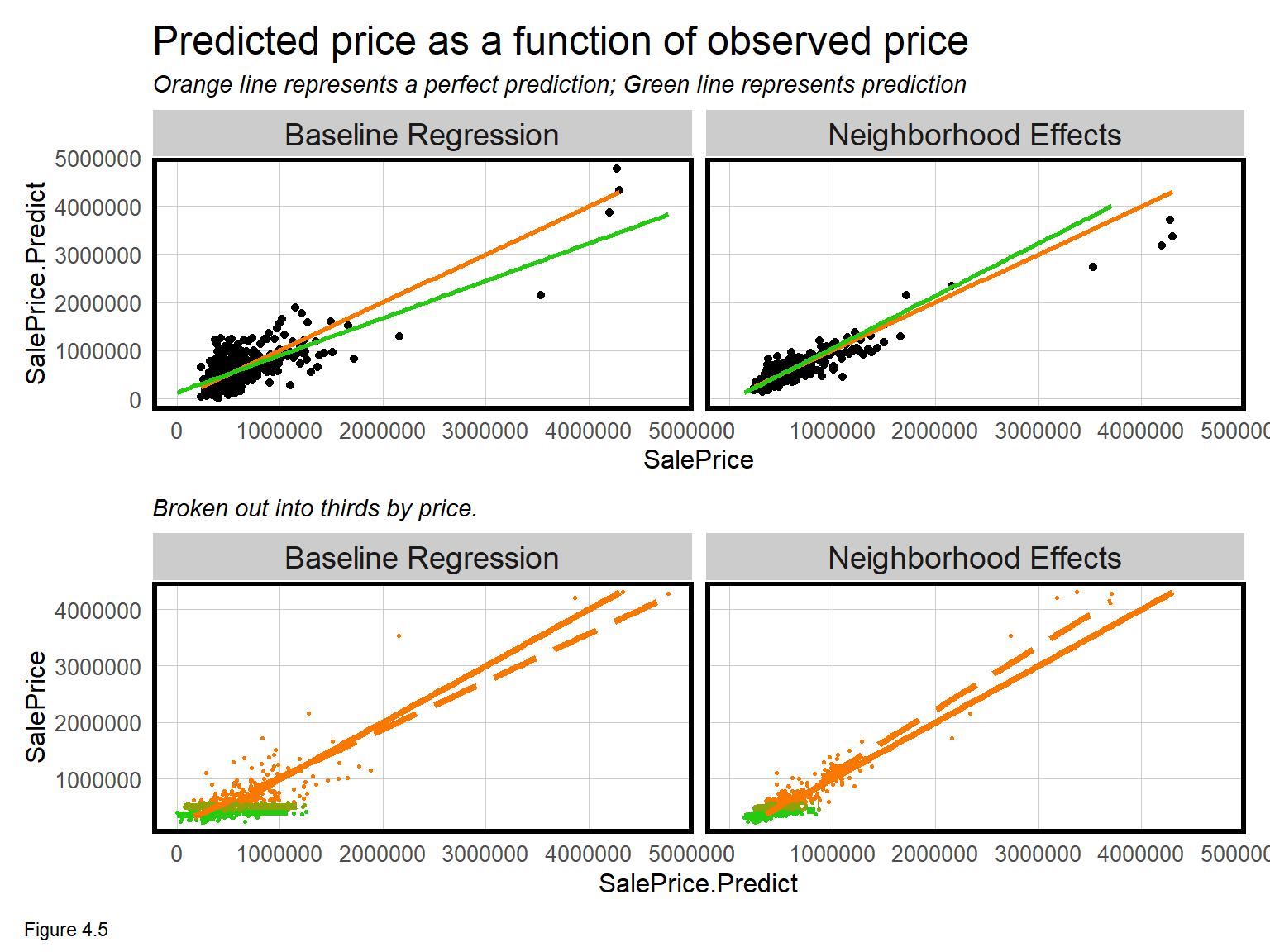
4.3.2 Spatial autocorrelation in the neighborhood model

Model errors that cluster in space reflect a regression that has omitted the spatial process. Given that the neighborhood fixed effects improved model accuracy, we might expect errors to be less spatially autocorrelated.
To test this hypothesis, Figure 4.6 maps model errors across bothRegressions. Does it look like the errors from the Neighborhood Effects are more randomly distributed in space relative to the Baseline?
The Moran’s I for the Baseline and Neighborhood Effects regression errors are 0.13 and 0.2, respectively, and both are statistically significant.
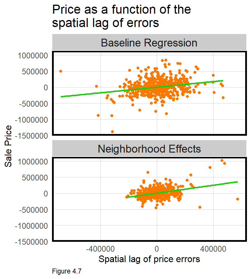
Figure 4.7 plots errors as a function of lagged model errors for both regressions. Note that range of errors is smaller for the Neighborhood Effects regression because it is more accurate. The correlations for the Baseline and Neighborhood Effects are 0.24 and 0.35, respectively, and are also statistically significant.
What does this all mean? We hypothesized that neighborhood effects could help account for the otherwise missing spatial process. Doing so, reduced errors by nearly half, but spatial autocorrelation remained. Why?
For one, the neighborhood fixed effect may be controlling for omitted public services/amenity features like schools, access to transit etc. Second, these features account the spatial process across neighborhoods. Is it possible that other spatial processes exist within neighborhoods? Can you think of some features that might help account for the spatial process at even smaller spatial scales? We return to this question in Chapter 5.
4.3.3 Generalizability of the neighborhood model
Recall the two definitions of generalizability: First, the ability to predict accurately on new data - which was the focus of cross-validation in Chapter 3. Second, the ability to predict with comparable accuracy across different group contexts, like neighborhoods. Here, the focus will be on the latter. It is paramount that a geospatial predictive model generalize to different neighborhood contexts. If it does not then the algorithm may not be fair.
Generalizability across space is very challenging with OLS, because OLS focuses on relationships at the mean. A model trained on Boston will not perform well on Phoenix, for example, because the urban context (at the mean) varies so significantly. Similarly, a model trained on eight low-income neighborhoods and used to predict for a ninth wealthy, neighborhood, will also perform poorly.
Two approaches for testing across-neighborhood generalizability are demonstrated. The first simply maps Mean Absolute Percent Errors (MAPE) by neighborhood. The second gathers Census data to test how well each model generalizes to different group contexts - like race and income.
Figure 4.8 below maps the mean MAPE by nhoods for bothRegressions. Not only is the Neighborhood Effects model more accurate in general, but its accuracy is more consistent across neighborhoods. This consistency suggests the Neighborhood Effects model is more generalizable. Note the left_join which attaches mean.MAPE to neighborhood geometries.
st_drop_geometry(bothRegressions) %>%
  group_by(Regression, Name) %>%
  summarize(mean.MAPE = mean(SalePrice.APE, na.rm = T)) %>%
  ungroup() %>%
  left_join(nhoods) %>%
    st_sf() %>%
    ggplot() +
      geom_sf(aes(fill = mean.MAPE)) +
      geom_sf(data = bothRegressions, colour = "black", size = .5) +
      facet_wrap(~Regression) +
      scale_fill_gradient(low = palette5[1], high = palette5[5],
                          name = "MAPE") +
      labs(title = "Mean test set MAPE by neighborhood") +
      mapTheme()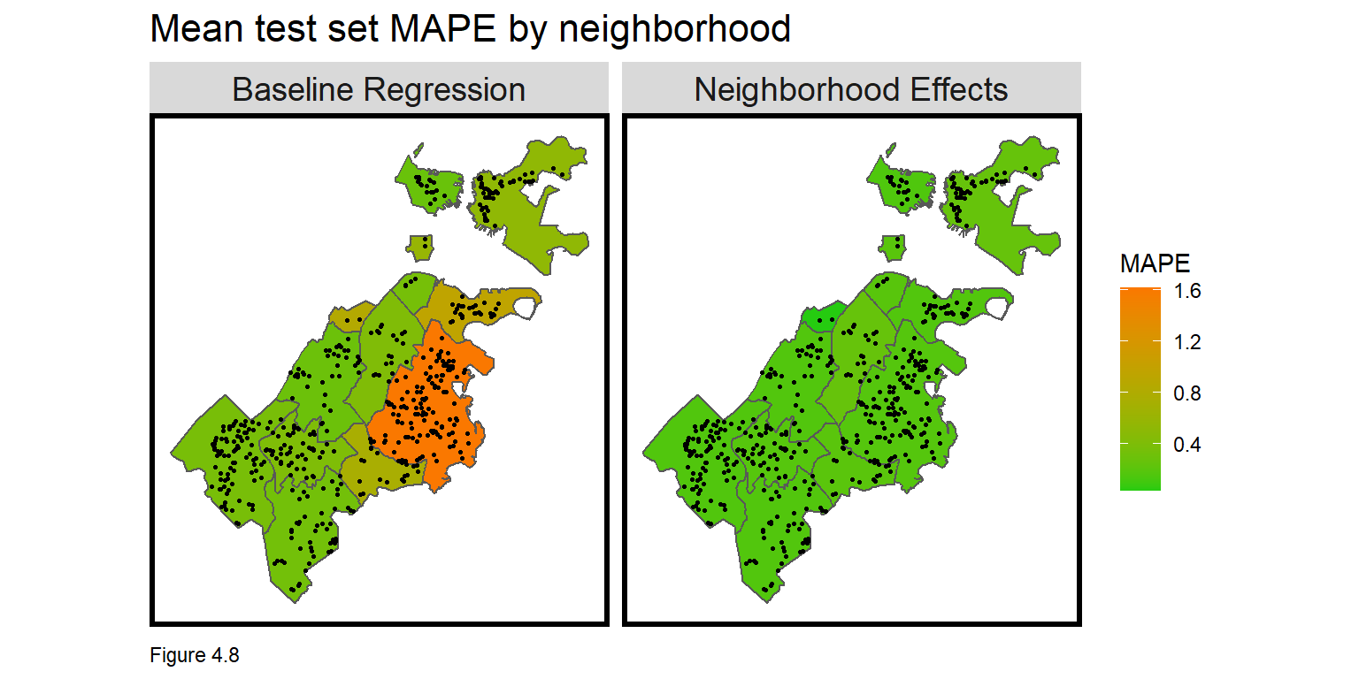
To test generalizability across urban contexts, tidycensus downloads Census data to define a raceContext and an incomeContext (don’t forget your census_api_key). output = "wide" brings in the data in wide form. Census tracts where at least 51% of residents are white receive a Majority White designation. Tracts with incomes greater than the citywide mean receive a High Income designation.
These designations are arbitrary and suffer from MAUP bias but are still useful for providing descriptive context of generalizability. Figure 4.9 below maps the two neighborhood contexts. As these outcomes have different categorical labels, facet_wrap cannot be used to create a small multiple map. Instead grid.arrange binds both maps together over two columns (ncol=2).
tracts17 <-
  get_acs(geography = "tract", variables = c("B01001_001E","B01001A_001E","B06011_001"),
          year = 2017, state=25, county=025, geometry=T, output = "wide") %>%
  st_transform('ESRI:102286')  %>%
  rename(TotalPop = B01001_001E,
         NumberWhites = B01001A_001E,
         Median_Income = B06011_001E) %>%
  mutate(percentWhite = NumberWhites / TotalPop,
         raceContext = ifelse(percentWhite > .5, "Majority White", "Majority Non-White"),
         incomeContext = ifelse(Median_Income > 32322, "High Income", "Low Income"))

grid.arrange(ncol = 2,
  ggplot() + geom_sf(data = na.omit(tracts17), aes(fill = raceContext)) +
    scale_fill_manual(values = c("#25CB10", "#FA7800"), name="Race Context") +
    labs(title = "Race Context") +
    mapTheme() + theme(legend.position="bottom"),
  ggplot() + geom_sf(data = na.omit(tracts17), aes(fill = incomeContext)) +
    scale_fill_manual(values = c("#25CB10", "#FA7800"), name="Income Context") +
    labs(title = "Income Context") +
    mapTheme() + theme(legend.position="bottom"))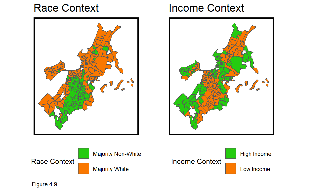
Figure 4.9 shows that Boston is very segregated with respect to both race and income. In the code block below, MAPE is calculated across bothRegressions and both neighborhood contexts. There is a significant difference in goodness of fit across the races, but the gap is closer for the Neighborhood Effects model.
st_join(bothRegressions, tracts17) %>%
  group_by(Regression, raceContext) %>%
  summarize(mean.MAPE = scales::percent(mean(SalePrice.APE, na.rm = T))) %>%
  st_drop_geometry() %>%
  spread(raceContext, mean.MAPE) %>%
kable(caption = "Test set MAPE by neighborhood racial context")| Regression | Majority Non-White | Majority White |
|---|---|---|
| Baseline Regression | 119% | 43% |
| Neighborhood Effects | 20% | 17% |
|
|
||
| Table 4.3 |
The same trend is evident for income, with the Baseline Regression exhibiting much higher error rate differences across income contexts. It is now clear how the inclusion of neighborhood effects makes the model more generalizable. What would be the consequences of deploying the Baseline Regression to assess property taxes?
What do you notice when calculating mean price error by group? SalePrice.Error is calculated by subtracting observed price from predicted, meaning that a positive price represents an over-prediction. If put into production, this algorithm would disproportionately over-assess and overtax poorer, minority neighborhoods. Such an outcome would be both grossly unfair and a political liability. This ‘disparate impact’ will be the focus of several chapters to come.
st_join(bothRegressions, tracts17) %>%
  filter(!is.na(incomeContext)) %>%
  group_by(Regression, incomeContext) %>%
  summarize(mean.MAPE = scales::percent(mean(SalePrice.APE, na.rm = T))) %>%
  st_drop_geometry() %>%
  spread(incomeContext, mean.MAPE) %>%
kable(caption = "Test set MAPE by neighborhood income context")| Regression | High Income | Low Income |
|---|---|---|
| Baseline Regression | 43% | 115% |
| Neighborhood Effects | 16% | 21% |
|
|
||
| Table 4.4 |
4.4 Conclusion - Features at multiple scales
Chapter 3 introduced the geospatial machine learning framework, culminating in a model that did not account for the spatial process of home prices. In this chapter, new methods have been introduced for quantifying spatial autocorrelation. Neighborhood features were added to control for at least part of the spatial process.
These neighborhood ‘fixed effects’ increased the accuracy and generalizability of the model, but model errors remained clustered. What makes home prices so difficult to predict (and such a great first use case), is that prices cluster at different spatial scales. We successfully accounted for the neighborhood scale, but other spatial relationships exist at smaller scales.
Some readers will be drawn to the idea of location-based fixed effects and seek to engineer neighborhoods that better account for within and across price variation. This is a slippery slope. One reasonable approach may be to ‘cluster’ prices into a set of optimal neighborhoods, but quickly, one will realize that smaller neighborhoods are better. Imagine the smallest neighborhood - a fixed effect for each house. The model would trend perfect, but fail if used to predict for a new property (for which no coefficient has been estimated).
This is referred to as ‘overfitting’. The models in these two chapters lack accuracy and are ‘underfit’. Conversely, a model with an R^2 of 1 or a MAPE of 0% are ‘overfit’ and would fail on new data. I have provided some tests to help, but no one statistic can conclude whether a model is under or overfit. Accuracy and generalizability are trade-offs, and the best way to judge a model is by relating it to the decision-making process.
Finally, neighborhood controls created a more generalizable model, presumably because it successfully ‘borrowed’ a diverse set of housing market ‘experiences’ across different communities (ie. low-income and wealthy). However, as we will learn in the next chapter, if the data gathering process itself does not generalize across space, it is unlikely the predictions generated from those data will generalize either. We will continue to see how generalizability is the most significant consideration in public-sector predictive modeling.
The first issue is often referred to as the ‘Spatial Error’. For a terrific discussion of both dynamics, see Anselin, L., & Rey, S. (1991). Properties of tests for spatial dependence in linear regression models. Geographical analysis, 23(2), 112-131.↩︎