Chapter 2 Expanding the Urban Growth Boundary
2.1 Introduction - Lancaster development
Cheap housing, cheap gas, and a preference for ‘country living’ have lured American families to the suburbs for decades, but at what cost?
Development patterns that promote lengthy car commutes and oversized ‘McMansions’ are generally not sustainable. We know that sprawl generates air and water pollution and degrades the quality of ecosystem services - but what about economic competitiveness?
Lancaster County, Pennsylvania, a lush, rolling agricultural county 60 miles west of Philadelphia, has been wrestling with sprawl for more than three decades, as new development swallows up the farms that help drive the local economy. The rate of farm workers in Lancaster is nearly three times the rate statewide.15 According to the 2017 Census of Agriculture, agricultural commodity sale totals were estimated at more than $1 billion dollars in Lancaster, making it the 55th highest grossing county nationally (top 2%) and the highest in Pennsylvania.16
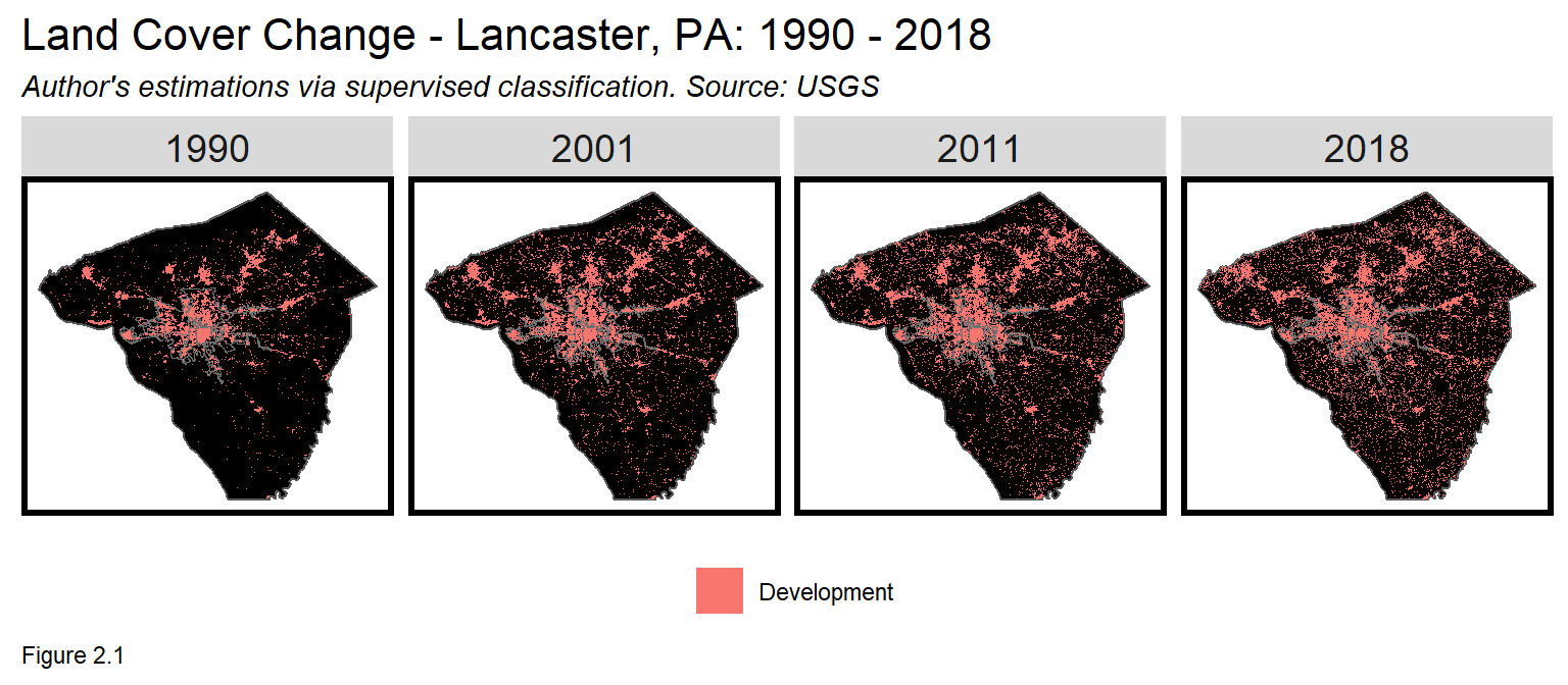
Lancaster’s farmland is quite valuable, but increasingly, that land is being paved over in favor of suburban housing. Figure 2.1 visualizes the rate of suburban expansion in Lancaster since 1990. Over the last 30 years, Between 1990 and 2018, Lancaster’s population grew 17% while developed land increased 140% - a clear indicator of sprawl.
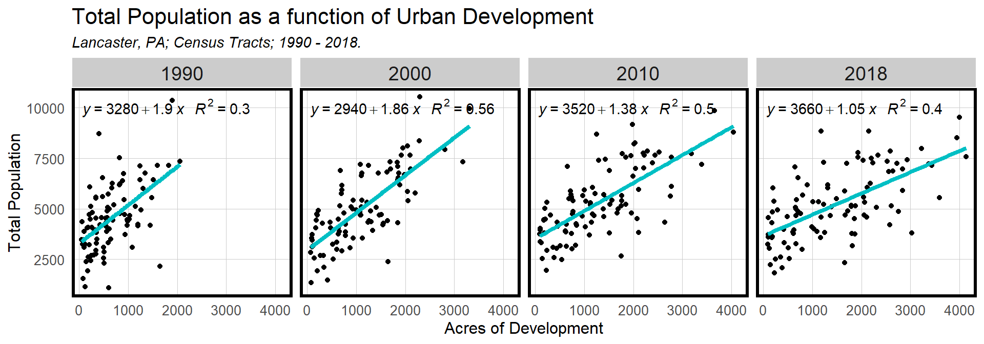
What does the relationship between Lancaster development and population growth teach us about sprawl? Figure 2.2a plots Census tract population (y-axis) by acres of developed land (x-axis) by decade. Note the decreasing line slopes. In 1990, one acre of development is associated with ~2 people, but by 2018, despite an overall population increase, the figure halved to ~1 person per acre.
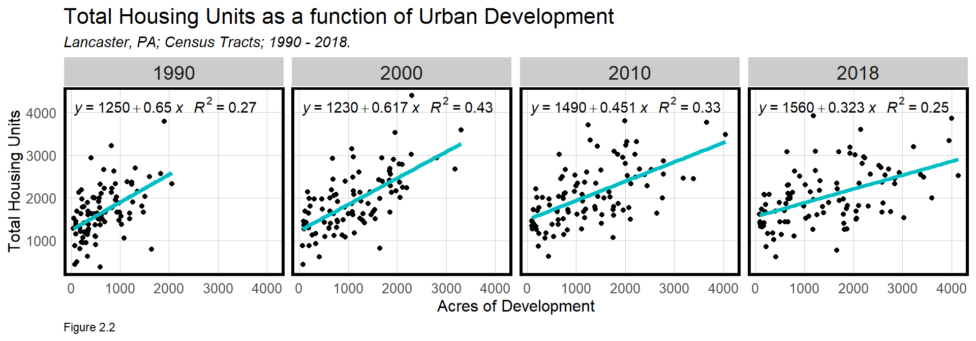
Figure 2.2b visualizes the same relationship but with housing units. Here the trend is similar. In 1990, a one acre increase in development was associated with ~2/3 of a housing unit - already at a very low density. Again, by 2018, despite population increases, that figure fell half.
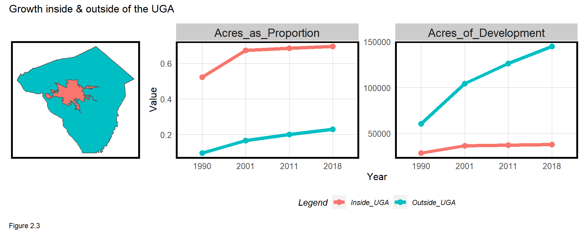
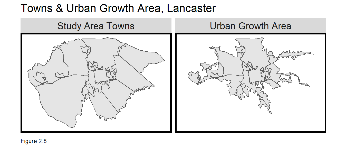
To stem the sprawl, savvy Lancaster Planners in the 1990s worked with politicians, conservationists, and other stakeholders to develop a set of Urban Growth Areas (UGA) (Figure 2.3) to encourage development inside the urban core while discouraging development outside on outlying farmland. To what extent has the UGA succeeded to date?
Figure 2.3 plots development change inside and outside the UGA boundary between 1990 and 2018. Areas inside the UGA are developing much faster - which is the purpose of the UGA. However, the UGA represents just 8.6% of the total area of the County, and as it fills, the development trend flattens. On an acreage basis, development outside of the UGA has skyrocketted from more than 60,000 acres in 1990 to nearly 145,000 acres in 2018. This suggests the UGA is not sufficiently containing sprawl.
One reasonable policy solution might be to increase development restrictions outside the UGA, while strategically expanding the existing UGA to promote infill development. In this chapter, we will develop a simple economic model to identify towns best suited for expanding its growth area.
In the previous chapter’s discussion of the Modifiable Areal Unit Problem (MAUP), we discussed how boundaries can be a liability for the spatial analyst. In this chapter, however, boundaries are an asset, leveraged for their discontinuous nature to understand their affect on development.
The next section introduces the economic model used to identify towns suitable for UGA expansion. In Section 2.2, analytics are created to delineate areas inside and outside of the UGA. 2.3 uses the result as an input to the economic model. 2.4 concludes.
2.1.1 The bid-rent model
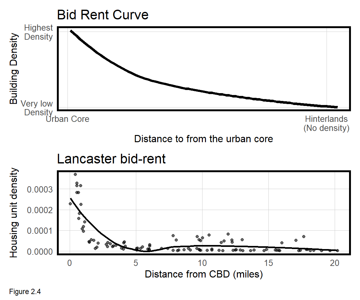
The bid-rent model of urban land markets is used to understand the spatial pattern of density, price, and land uses in market-oriented cities.17 Illustrated in the top panel of Figure 2.4, the model suggests that as distance from the city center increases, building density decreases. Building density is closely correlated to population density and it also reflects locational demand.
As demand for a place increases, firms and households are willing to pay a premium, even for marginally less space. Like all ‘models’, bid-rent is a simple abstraction of reality, but this simplicity can provide important insight into the problem at hand.
The bottom panel of Figure 2.4 shows the bid-rent curve for Lancaster County with housing unit density on the y-axis. Compared to the theoretical curve, density in Lancaster flattens dramatically at the 5 mile mark continuing flat out to the county boundary. As we’ll learn below, this sharp drop-off pattern is heavily influenced by the UGA.
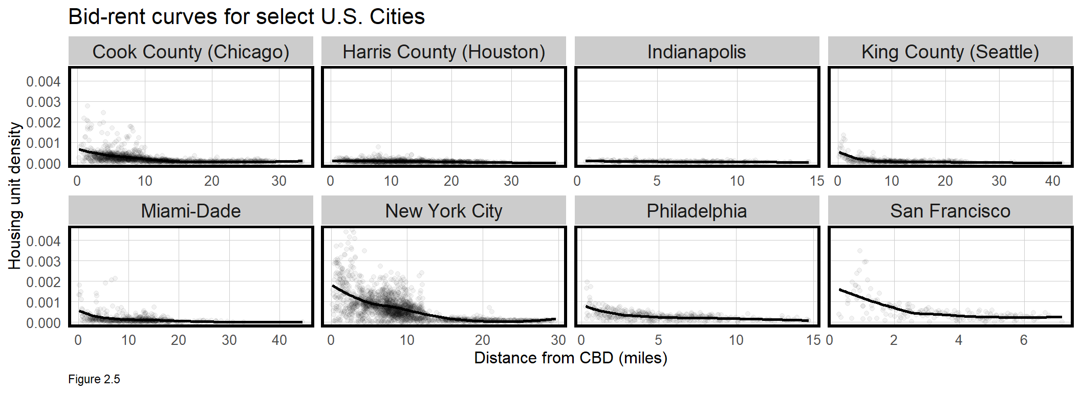
For contrast, Figure 2.5 visualizes bid-rent curves for 8 cities/metro areas throughout the U.S. In most dense, post-industrial cities like New York, Philadelphia, and San Francisco, the bid rent curve decreases exponentially out from the urban core. In more sprawling metro areas like Houston and Indianapolis, the downward curve is more linear and flat.
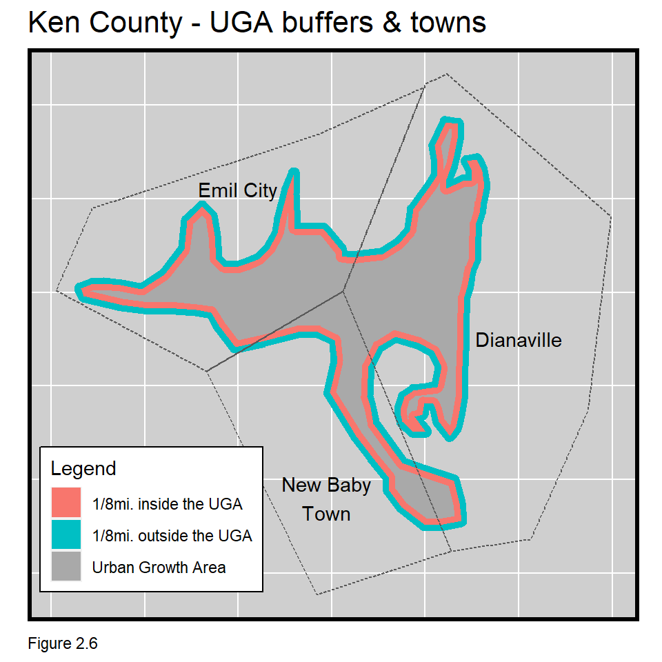
How can bid-rent help us understand where to expand the UGA? Let’s take a look at a map of the fictitious ‘Ken County’, its UGA, and the three towns within (Figure 2.6). Assume Emil City is the urban core and contains higher density development compared to Dianaville and New Baby Town.
In the map below, two polygons are drawn at 1/8 mile radial distance out from and in from the UGA, respectively. These buffers are drawn to delineate areas just outside and just inside the UGA, and can be used to calculate differences in housing unit density across the boundary. Comparing these densities on either side of the UGA in a bid-rent context can help identify in which Ken County town to expand the UGA boundary.
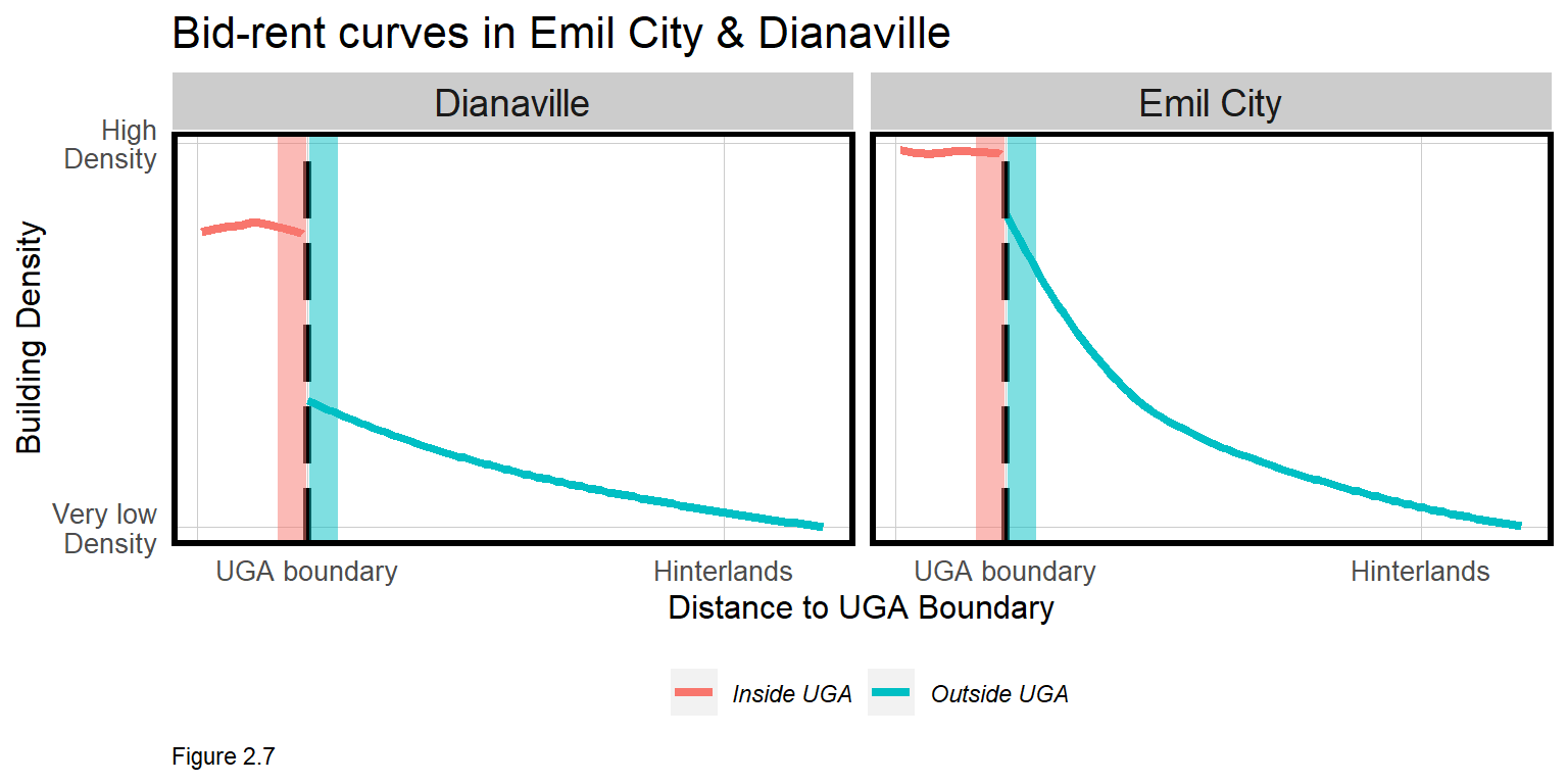
Let’s visualize bid-rent curves in Emil City and Dianaville in Figure 2.7 below. Emil City is the urban core and while density is greatest within the UGA, areas outside are also relatively high density. Conversely, inside Dianaville’s UGA there is some density, but just outside, density falls dramatically.
Currently, density and land value just outside the UGA are artificially low because land use regulations make it difficult to develop. If that restriction were to suddenly be lifted, however, potential building density and land values would likely rise to meet those just inside the UGA. Assuming the optimal town for UGA expansion is the one with the maximum economic impact, Dianaville would be the choice.
Which is the optimal town in Lacaster County? Let’s find out.
2.1.2 Setup Lancaster data
Begin by loading the requisite libraries, turning off scientific notation, and reading in the mapTheme and plotTheme.
options(scipen=999)

library(tidyverse)
library(sf)
library(gridExtra)
library(grid)
library(kableExtra)

root.dir = "https://raw.githubusercontent.com/urbanSpatial/Public-Policy-Analytics-Landing/master/DATA/"
source("https://raw.githubusercontent.com/urbanSpatial/Public-Policy-Analytics-Landing/master/functions.r")
The data for this analysis is read in, including:
studyAreaTowns- A polygon layer of town polygons inside of the Lancaster County study area. Note that there is aMUNIor municipal town name for each town polygon.uga- A polygon layer of the spatial extent of Lancaster County’s Urban Growth Area.lancCounty- A polygon layer of the spatial extent of Lancaster County.buildings- A polygon layer of the footprint for all buildings in the study area.greenSpace- A polygon layer showing areas classified as non-developed land cover as classified by the USGS.
lancCounty <- st_read(file.path(root.dir,"/Chapter2/LancasterCountyBoundary.geojson")) %>%
  st_transform('ESRI:102728')

uga <- st_read(file.path(root.dir,"/Chapter2/Urban_Growth_Boundary.geojson")) %>%
  st_transform('ESRI:102728')

studyAreaTowns <- st_read(file.path(root.dir,"/Chapter2/StudyAreaTowns.geojson")) %>%
  st_transform('ESRI:102728')
buildings <- st_read(file.path(root.dir,"/Chapter2/LancasterCountyBuildings.geojson")) %>%
  st_transform('ESRI:102728')
greenSpace <- st_read(file.path(root.dir,"/Chapter2/LancasterGreenSpace.geojson")) %>%
  st_transform('ESRI:102728')
2.2 Identifying areas inside & outside of the Urban Growth Area
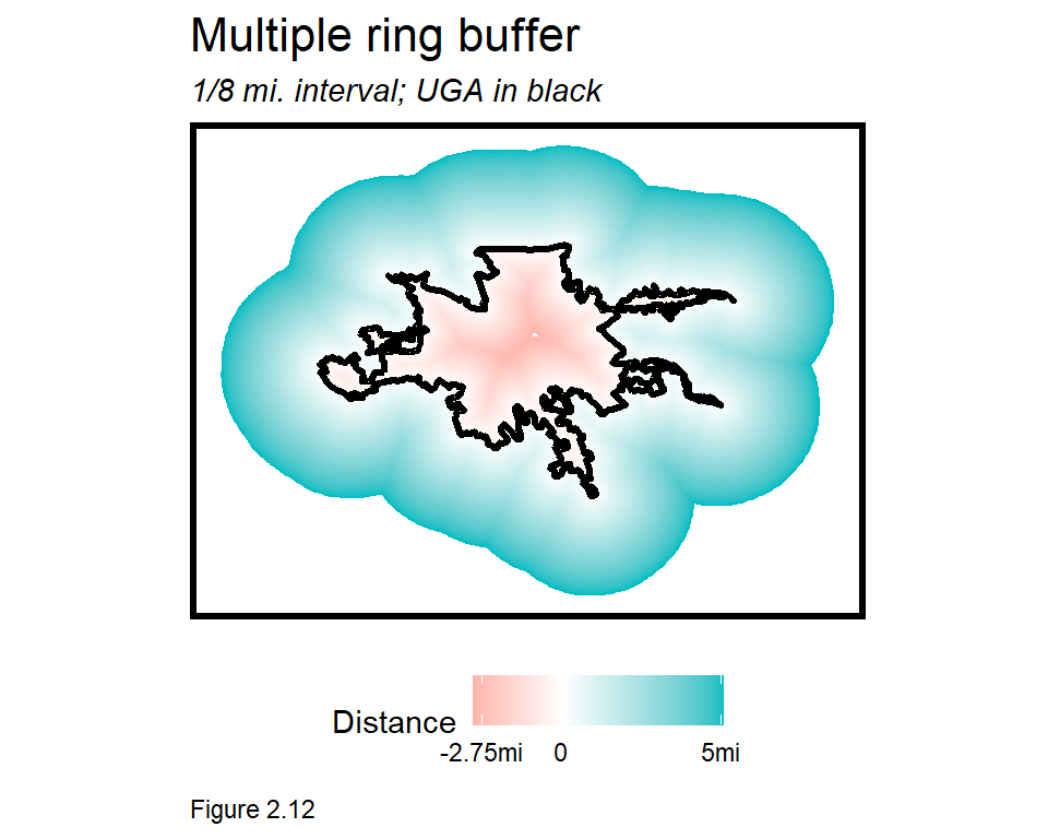
In this section, a polygon layer is produced where each unit is assigned 1) the town it is in and 2) whether it is 1/8th mile inside the UGA or 1/8th mile outside. This layer is created from just two inputs: studyAreaTowns, which delineates the 14 towns in Lancaster County, and uga, the boundary of the Urban Growth Area. Figure 2.12 visualizes those boundaries.
The uga layer is used to find areas 1/8th mile inside and outside of the UGA. To make this easier, the code block below dissolves away (st_union) the towns leaving just the UGA boundary. The st_buffer is a quick way to remove some of the extraneous slivers that otherwise appear in the middle of the UGA.
uga_union <-
  st_union(uga) %>%
  st_buffer(1) %>%
  st_sf()
Next, steps are taken to find areas 1/8th mile inside and outside the UGA. Here is the process:
st_bufferis used to find areas 1/8th mile outside of theuga_union. This results in a polygon larger than the originaluga_union.st_differenceis then used to erase the original extent ofuga_union, leaving only the 1/8th mileoutsideBuffer.- To get areas 1/8th mile inside of the
uga_union, a negative parameter is input tost_bufferto shrink the diameter ofuga_union. st_differenceis used again to erase part of the geometry. This time however, the placement of the.means that the negative buffer polygon cookie cutters the largeruga_unionleaving just the area 1/8th mileinsideBuffer.
Note the Legend mutated for each buffer denoting its position inside or outside, and the creation of bothBuffers.
outsideBuffer <-
  st_buffer(uga_union, 660) %>%
  st_difference(uga_union) %>%
  mutate(Legend = "Outside")

insideBuffer <-
  st_buffer(uga_union, dist = -660) %>%
  st_difference(uga_union, .) %>%
  mutate(Legend = "Inside")

bothBuffers <- rbind(insideBuffer, outsideBuffer)
Finally, bothBuffers are plotted below.
ggplot() +
  geom_sf(data = bothBuffers, aes(fill = Legend)) +
  scale_fill_manual(values = c("#F8766D", "#00BFC4")) +
  labs(title = "1/8mi buffer inside & outside UGA") +
  mapTheme()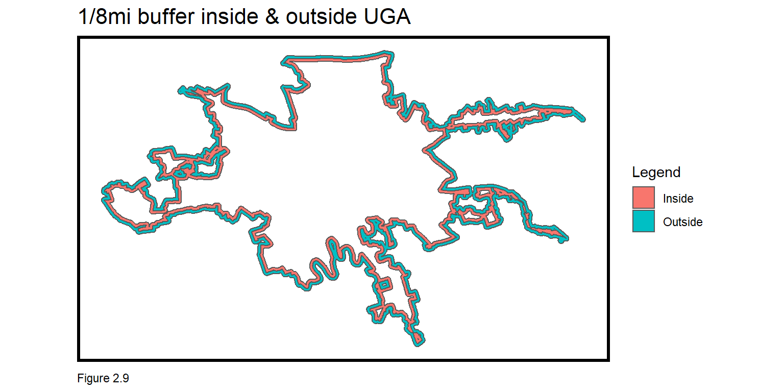
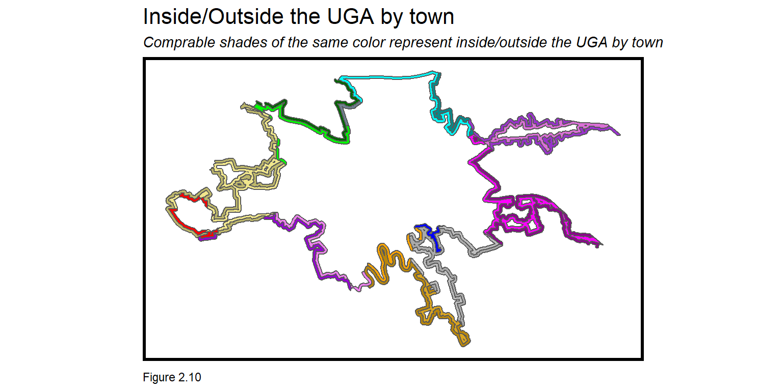
2.2.1 Associate each inside/outside buffer with its respective town.
Additional wrangling associates a town with each buffer. table(st_is_valid(studyAreaTowns)) will likely tell you that there is a broken geometry in this layer. In the code block below, st_make_valid corrects the issue.
The goal is for the intersection to yield an Inside feature and an Outisde feature for each town. Two towns only show up on one side of the boundary and are thus removed. arrange(buffersAndTowns, MUNI) %>% print(n=25) shows the remaining features.
buffersAndTowns <-
  st_intersection(st_make_valid(studyAreaTowns), bothBuffers) %>%
  filter(MUNI != "MOUNTVILLE BOROUGH" & MUNI != "MILLERSVILLE BOROUGH")
Finally, the below map can be produced which shows for each town, areas inside and outside the UGA. I have purposely mislabeled this map and omitted a legend. Can you build a better data visualization than this?
2.2.2 Building density by town & by inside/outside the UGA
The bid-rent model suggests that the town best suited for UGA expansion has the greatest infill potential, defined as the difference in building density on either side of the UGB. In this section, building density is calculated inside/outside the UGA by town, and the difference is taken.
To do so, each building must know its town and its place Inside or Outside the UGA. These relationships are calculated below.
The first code block below converts the building polygon layer to point centroids (st_centroid). A counter field is set to 1, and will be used to sum the number of buildingsCentroids that fall into each town by inside/outside polygon.
The second code block uses aggregate to spatially join buildingCentroids to buffersAndTowns, taking the sum of counter, to get the count of buildings. cbind marries the spatial join to the original buffersAndTowns layer; mutate replaces NA with 0 for polygons with no buildings, and Area is calculated (st_area).
buildingCentroids <-
  st_centroid(buildings) %>%
  mutate(counter = 1) %>%
  dplyr::select(counter)

buffersAndTowns_Buildings <-
  aggregate(buildingCentroids, buffersAndTowns, sum) %>%
  cbind(buffersAndTowns) %>%
  mutate(counter = replace_na(counter, 0),
         Area = as.numeric(st_area(.)))
The resulting data is grouped and summarized to get the sum of buildings and area for each town by inside/outside polygon. Building_Density is then calculated. Check out the buffersAndTowns_Buildings_Summarize layer to see the result.
buffersAndTowns_Buildings_Summarize <-
  buffersAndTowns_Buildings %>%
  group_by(MUNI, Legend) %>%
    summarize(Building_Count = sum(counter),
              Area = sum(Area)) %>%
    mutate(Building_Density = Building_Count / Area)
The code block below calculates the inside/outside density difference by town. Note this requires the data be moved to wide form with spread. The resulting Building_Difference is sorted in descending order and the results can be used with other metrics to plan UGA expansion. 2.3 below provides additional context for these differences.
Which towns seem like good candidates for UGA expansion?
buildingDifferenceTable <-
  st_drop_geometry(buffersAndTowns_Buildings_Summarize) %>%
    dplyr::select(MUNI, Legend, Building_Density) %>%
    spread(Legend, Building_Density) %>%
      mutate(Building_Difference = Inside - Outside) %>%
arrange(desc(Building_Difference)) | MUNI | Inside | Outside | Building_Difference |
|---|---|---|---|
| EAST PETERSBURG BOROUGH | 0.0000304 | 0.0000000 | 0.0000304 |
| WEST LAMPETER TOWNSHIP | 0.0000190 | 0.0000021 | 0.0000169 |
| WEST HEMPFIELD TOWNSHIP | 0.0000198 | 0.0000033 | 0.0000165 |
| UPPER LEACOCK TOWNSHIP | 0.0000177 | 0.0000033 | 0.0000144 |
| EAST LAMPETER TOWNSHIP | 0.0000170 | 0.0000050 | 0.0000120 |
| COLUMBIA BOROUGH | 0.0000100 | 0.0000000 | 0.0000100 |
| MANHEIM TOWNSHIP | 0.0000094 | 0.0000020 | 0.0000074 |
| PEQUEA TOWNSHIP | 0.0000113 | 0.0000048 | 0.0000065 |
| LANCASTER TOWNSHIP | 0.0000065 | 0.0000000 | 0.0000065 |
| MANOR TOWNSHIP | 0.0000094 | 0.0000038 | 0.0000057 |
| EAST HEMPFIELD TOWNSHIP | 0.0000061 | 0.0000037 | 0.0000024 |
| CITY OF LANCASTER | 0.0000014 | 0.0000000 | 0.0000014 |
|
|
|||
| Table 2.1 |
2.2.3 Visualize buildings inside & outside the UGA
For a more precise look a single town, the map below shows buildings inside and outside West Hempfield Township’s UGA, and a cutout map situating the town within the larger county.
The first step to create this map is to classify West Hempfield buildings by whether they are inside or outside the UGA. Start by intersecting the UGA and the West Hemptfield township to find areas in the UGA and the town (uga_WH).
buildings_WH is a layer of buildings labeled by their location Inside UGA and Outside UGA. This layer is created by first using a spatial selection to find all the buildings within the uga_WH polygon. To find buildings without (ie. outside) the UGA, a spatial selection finds all buildings in West Hempfield, which is then passed to another spatial selection to remove (st_disjoint) all buildings not in West Hempfield’s UGA. This leaves buildings in West Hempfield but not in its UGA.
westHempfield <-
  filter(studyAreaTowns, MUNI == "WEST HEMPFIELD TOWNSHIP")

uga_WH <-
  st_intersection(uga, westHempfield) %>%
  st_union() %>%
  st_sf()

buildings_WH <-
  rbind(
    buildings[uga_WH,] %>%              #Within
      mutate(Legend = "Inside UGA"),
    buildings[westHempfield,] %>%       #Without
      .[uga_WH, , op = st_disjoint] %>%
      mutate(Legend = "Outside UGA"))
Can you re-create the below map? There are two maps that need to be created - one for West Hempfield and one for the cutout.
The West Hempfield map contains three geom_sf calls that 1) plot the boundary of westHempfield; 2) plot the st_intersection of greenSpace and westHempfield to find all the green space in town; and 3) plot buildings_WH colored by the Inside/Outside Legend.
The cutout includes two geom_sf calls that 1) plot all studyAreaTowns in grey and 2) plot WestHempfield in black.
The two ggplot layers are then print in succession below. The second line adds the cutout map and specifies where on the plot it should be located.
print(WestHempfield_BuildingsPlot)
print(studyAreaCutoutMap, vp=viewport(.32, .715, .35, .5))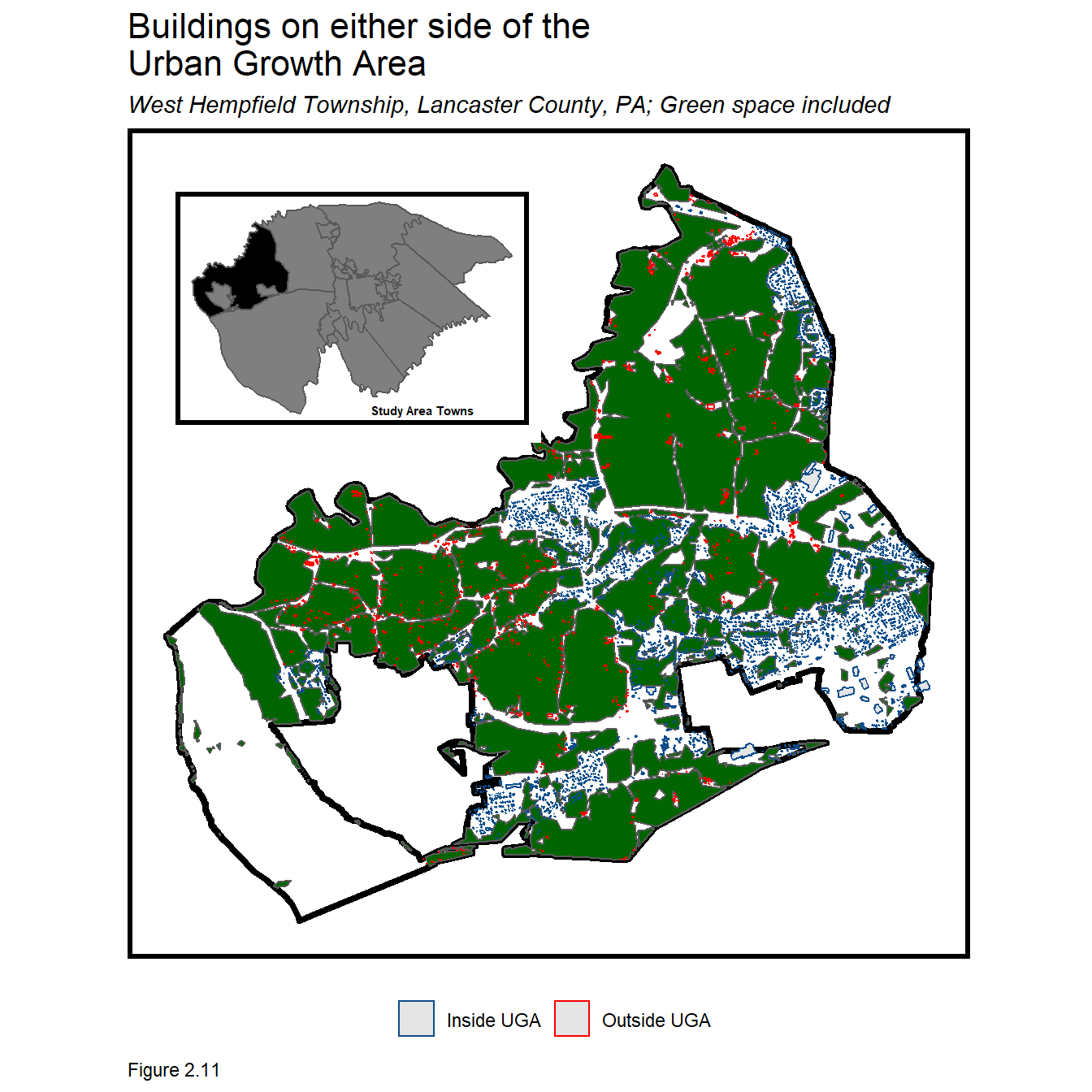
2.3 Return to Lancaster’s Bid Rent
Section 2.1.1 suggested that development restrictions just outside of the UGA keeps building density artificially low and if those restrictions were lifted, a short term increase to building density (and land values) might be expected just outside.
In this section, we visualize density as a function of distance to the UGA, much like a bid-rent curve. These plots should provide visual evidence of a sharp discontinuity in density at the UGA boundary.
Figure 2.7 calculated housing unit density from aggregated Census tract data, but here, building density is calculated with the actual building_centroids, as it was in 2.2.2. Instead of calculating densities on either immediate side of the UGA, it is calculated at multiple distance intervals using the multipleRing buffer tool.
The multipleRing function iteratively draws buffers at successive intervals inside and outside the UGA. The code block below uses the function twice - drawing negative buffers first and positive buffers second, both at 1/8 mile intervals. Note that the negative buffer can only extend so far into the interior of the UGA - in this case, 2.75 miles (14,250 ft).
The map plots the multiple ring buffer without buffer boundaries. scale_fill_gradient2 is used to create the dual color gradient that diverges at Distance == 0.
multipleRing <-
  rbind(
    multipleRingBuffer(uga_union, -14520, -660) %>%
    mutate(Legend = "Inside the UGA"),
      multipleRingBuffer(uga_union, 26400, 660) %>%
      mutate(Legend = "Outside the UGA"))
Figures 2.13 and 2.14 below visualize the bid-rent curve for the study area and by town, respectively. To calculate these plots, the code in 2.2.2 is extended. As before, each building must know its location Inside or Outside the UGA; the studyAreaTown in which it is located; and now, its distance to/from the uga.
First, buildingCentroids is intersected with the multipleRing buffer. As before, aggregate spatial joins buildingCentroids to the RingsAndTowns polygons, calculating the sum of buildings for each. Area is calculated and ring/town polygons with no buildings have NA changed to 0.
RingsAndTowns <-
  st_intersection(multipleRing, st_make_valid(studyAreaTowns))

buildings.in.RingsAndTowns <-
  aggregate(buildingCentroids,
            RingsAndTowns, sum) %>%
  cbind(RingsAndTowns) %>%
  dplyr::select(-geometry.1) %>%
  mutate(counter = replace_na(counter, 0),
         Area = as.numeric(st_area(.)))
Figure 2.13 plots building density as a function to and from the UGA. To create this plot, the sf layer is converted to a data frame with st_drop_geometry. The data is grouped by the distance interval and inside/outside and Building_Density is calculated.
geom_vline is used to create the vertical line at the UGA and the line break is created by setting colour = Legend in the aes parameter of ggplot. geom_smooth(method="loess", se=F) fits a ‘local regression’ (loess) line to the scatterplot relationship between distance and Building_Density.
This ‘boundary discontinuity’ plot highlights how the bid-rent conditions change on either immediate side of the UGA. How does it look for each town?
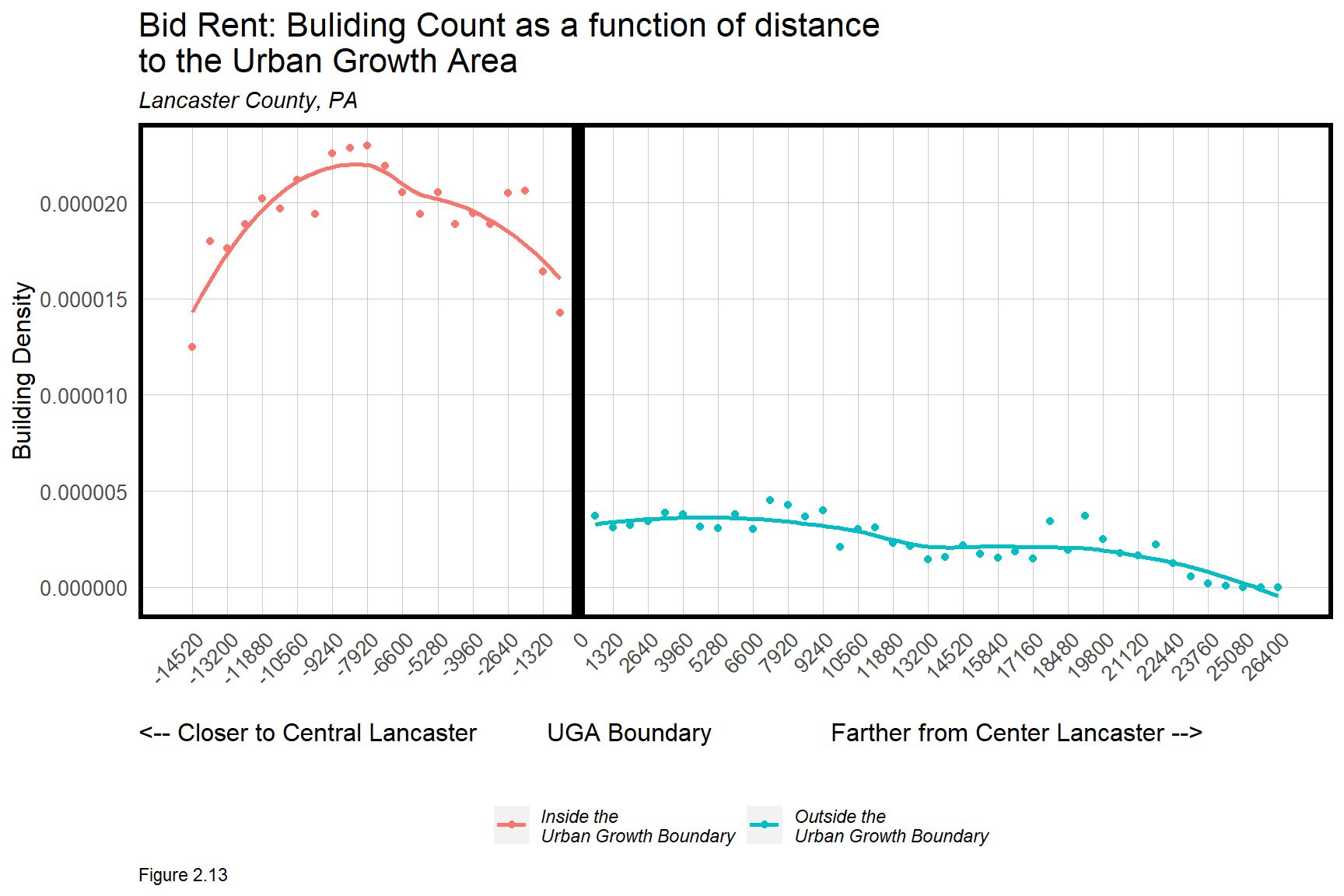
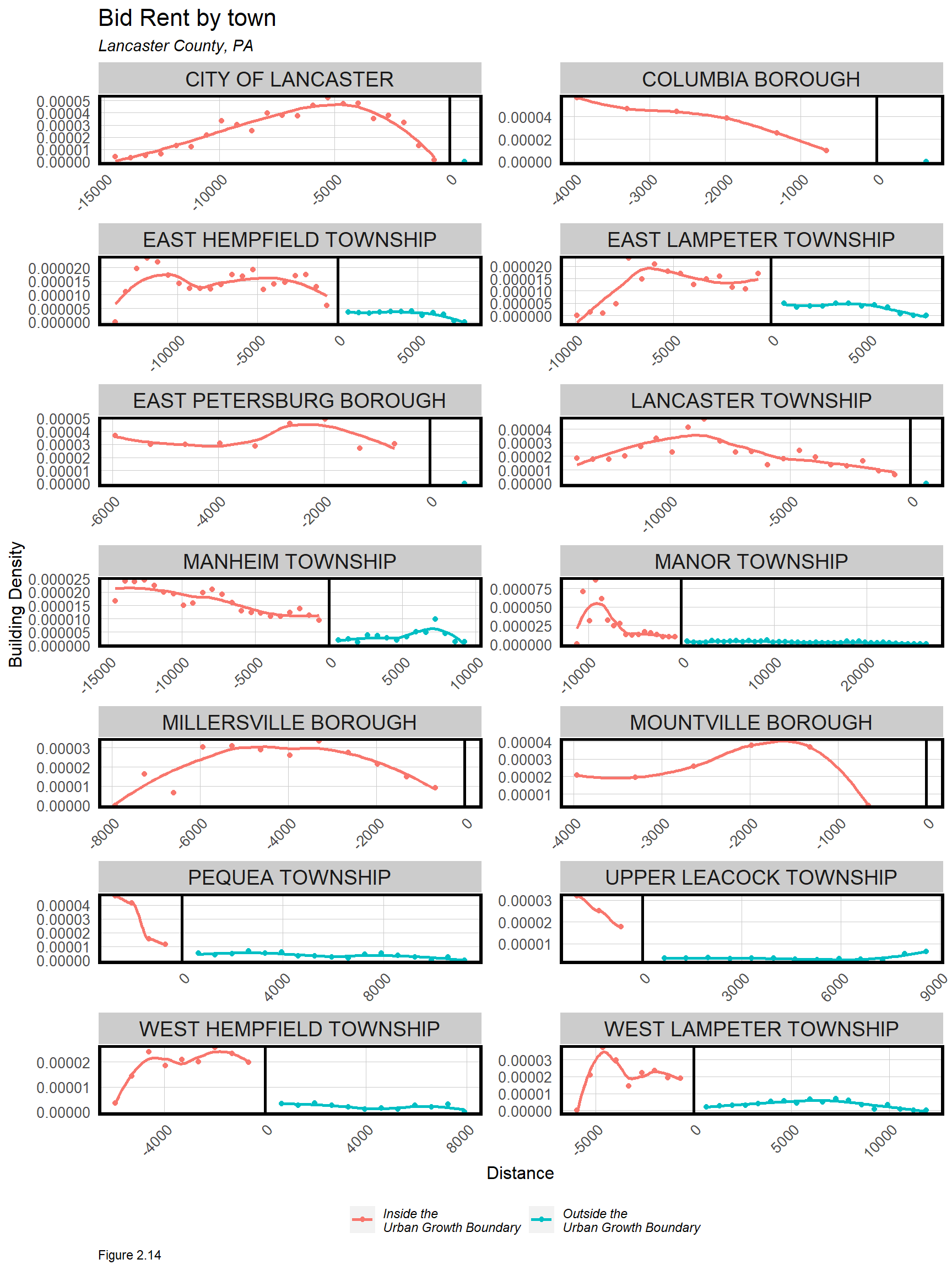
Figure 2.14 is created below in the same way that Figure 2.13 is created but with the addition of MUNI in the group_by, as well as facet_wrap. Some towns are completely within the UGA, and thus have no Building_Density outside. These plots again help reveal towns likely suitable for UGA expansion.
2.4 Conclusion - On boundaries
Boundaries are a ubiquitous feature of the American landscape. States, counties, school districts, Congressional districts, and municipalities are all delineated by exacting boundaries that divide the landscape into neighborhoods, enclaves, political regimes, and economies. Boundaries dictate the haves and have-nots; who pays more taxes and who pays less; who can access resources, and who cannot. Boundaries dictate the allocation of resources across space.
At times, boundaries are drawn to prevent phenomena from spilling out across space. In this chapter, the concern was with suburban sprawl spilling out onto hinter farmlands and hurting Lancaster County’s agrarian economy. To make room for more development, the bid-rent model was used to identify towns suitable for UGA expansion. Our assumption was that once expanded, building density, land values, and real estate prices just outside the UGA would adjust to those just inside.
Thus far, the reader has learned a series of analytical and visualization strategies for working with geospatial data. These methods will be invaluable as we move into more complex data science in the chapters to follow.
2.5 Assignment - Boundaries in your community
At the periphery of an Urban Growth Area is a hard boundary, a wall, with a different legal regime on either side. Interestingly, cities and regions are divided by many soft boundaries as well, with appreciably different conditions on either side, but not because of any legal mandate. Many historical inequities partitioned America into economic and racial enclaves, the results of which are still evident today.
What soft boundaries exist in your city, and how do they separate the communities on either side? In this assignment, you will wrangle together a significant street, avenue or other soft boundary of your choosing and create discontinuity plots similar to Figure 2.13 above.
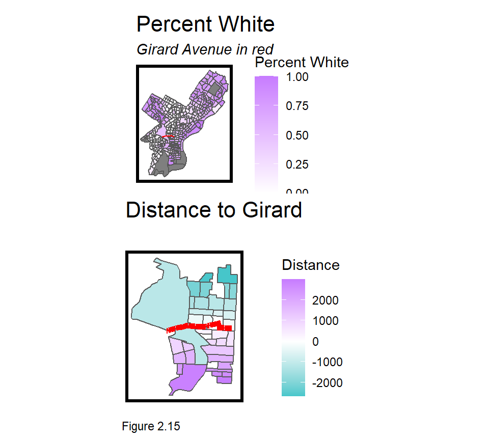
Take Philadelphia’s Girard Avenue (Figure 2.15), a clear dividing line between gentrified neighborhoods to the South (adjacent to Center City), and those to the North, which have been slower to change.
The code block below calculates distance from each tract to the Girard Avenue line (Figure 2.16). tract.centroids.NS stamps tract.centroids with their location in either a North or South-side buffer. Note that these are one-sided buffers (singleSide = TRUE). tract.centroids.distance column binds (cbind) together the resulting data frame with a column measuring distance to girard.
The dist2Line function from the geosphere package, takes two inputs. The first is a matrix of tract.centroids projected into decimal degrees (4326). The second is the girard avenue line, also in decimal degrees. dist2Line does not take an sf however, but a layer converted to the older R geospatial standard sp, with as_Spatial. Finally, mutate sets all distances north of Girard negative to enable the plots in Figure 2.16 below. As always, run each line separately to understand the process.
tract.centroids.NS <-
  st_intersection(tract.centroids,
    rbind(
      st_buffer(girard, 10000, singleSide = TRUE) %>% mutate(Side = "South"),
      st_buffer(girard, -10000, singleSide = TRUE) %>% mutate(Side = "North")))

tract.centroids.distance <-
  cbind(
    tract.centroids.NS,
    dist2Line(
      st_coordinates(st_transform(tract.centroids.NS, 4326)),
      as_Spatial(st_transform(girard, 4326)))) %>%
  mutate(distance = ifelse(Side == "North", distance * -1, distance))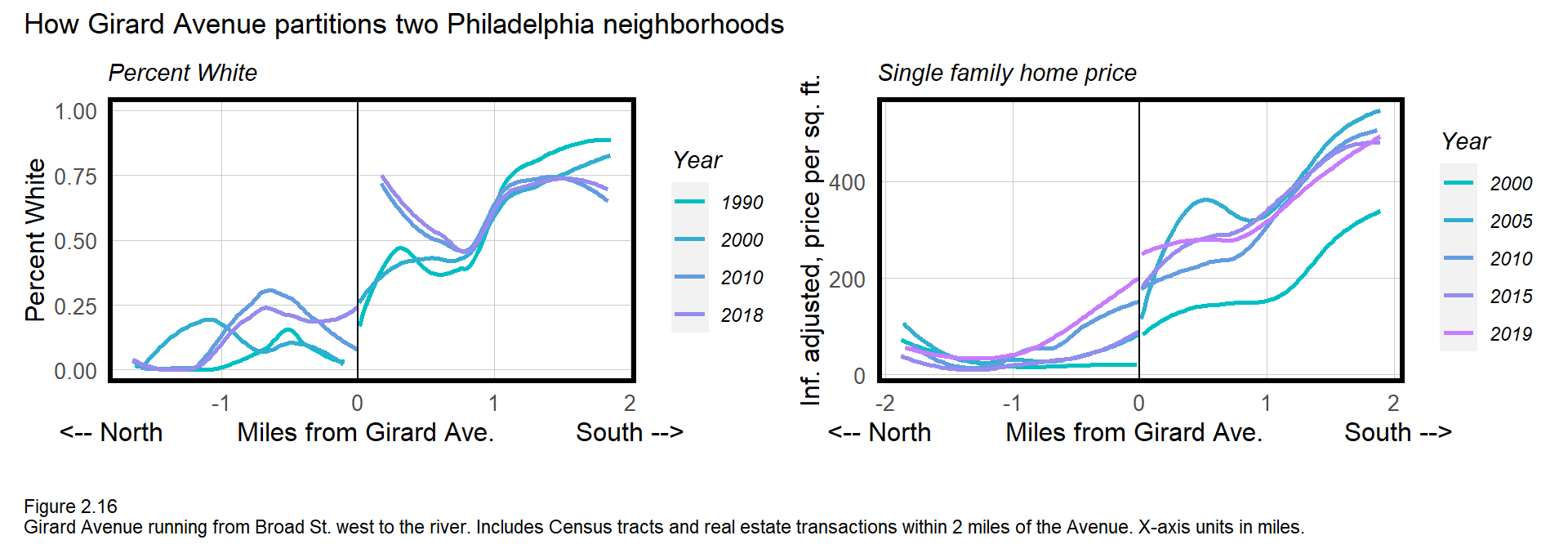
The resulting discontinuity plots (Figure 2.16) for both Percent_White and single-family house price show significant differences at the Girard Ave. boundary, and these differences seem to increase with time. The deliverables for this assignment include:
Wrangle street (line) data, Census and other open data for your study area. Buffer the street line and use it to subset tracts/data from the larger city. Measure the distance from a tract centroid or other outcome to the boundary line with
geosphere::dist2Line.Choose 2 Census outcomes and two other point-level outcomes from local open data, such as crime, home prices, construction permits etc. Develop maps and discontinuity plots to show across-boundary differences.
Write a short research brief asking, ‘How does the such-and-such-boundary partition my community?’ Motivate your analysis; provide some historical context in your community; present your maps and plots; and conclude.
Bonus: After you have finished this book and have a better understanding of fixed effects regression, estimate a regression of say, house price as a function of a boundary-side fixed effect and year. Interact or multiply the side and year variables. What is the interpretation of the resulting estimate?
Referring to the ‘Location Quotient’ - Lancaster County Profile - January, 2020; PA. Dept of Labor and Industry; https://www.workstats.dli.pa.gov/Documents/County%20Profiles/Lancaster%20County.pdf↩︎
National Agricultural Statistics Service, Quick Stats. https://quickstats.nass.usda.gov↩︎
See Alonso (1964), Location and Land Use: Toward a General Theory of Land Rent, Harvard University Press, Cambridge and any other urban economic text for more information.↩︎